Personal Diary.
When is black and white photography more effective than colour photography?
In all fields of photography. I want to explore black and white photography in more than just portrait and landscape to see when black and white is more effective and also when it isn't.
THE PHOTOGRAPHERS GALLERYGALLERY ONE |
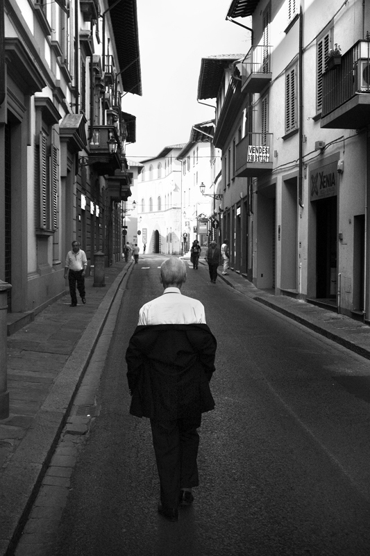
Umberto Verdoliva
Umberto has degree in Regional Planning and Urban Design and works for an international construction company. Photography is his passion and he enjoys the way it can reflect his love for mankind simply by capturing moments of life. His passion for street photography is contagious and over time he has developed an elegant, ironic and sensitive style. His main objective with photography is to transform the ordinary into the extraordinary, to highlight the poetry and the simple feeling of human endeavour.
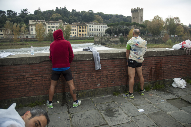
I liked that Umberto has photos in both black and white and colour but there were more black and white.
I liked that Umberto has photos in both black and white and colour but there were more black and white.
Black and white.
Colour.
|
VS.
|
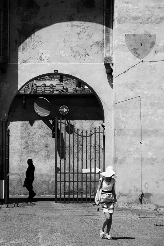
I liked the fact that these two images both have shadows which makes them similar to each other. But, as most black and white images tend to, the black and white images looks more mysterious. The image in colour looks more fun and exciting because of the pop of bright orange. Also both image contain archways which drew the two images together.
|
|
|
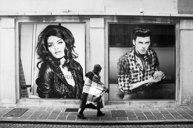
Because of the setting, I thought these two images looked similar. And also because their is a subject in the centre. Umberto's black and white images appear to have more thought put into them as they are much clearer. The lack of colour in many of his photos causes the attention to move to one thing rather than multiple.
|
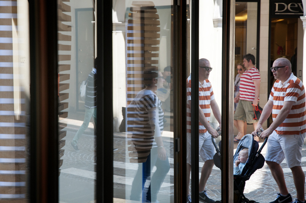
Umberto Verdoliva replication
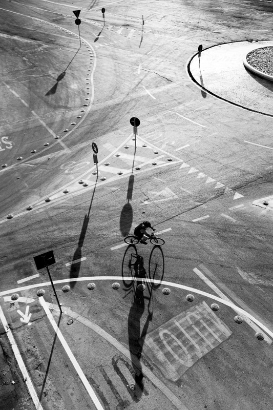
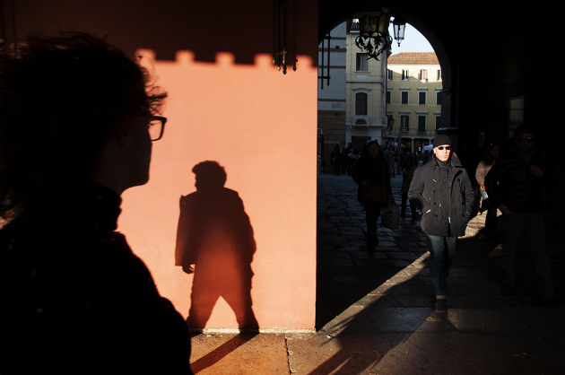
When I in Paris I took it as an opportunity to experiment with taking pictures in Umberto's style. When I was replicating his photographs I tried to capture the street style he uses. I liked the roughness of his photo's and how they seem busy. I tried to experiment with capturing movement and creating different tones with the lighting which worked well when I changed the image into black and white.
|
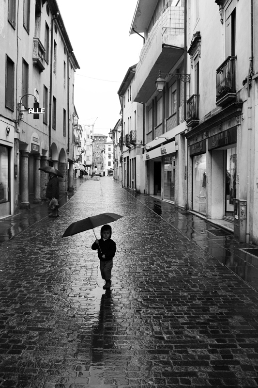
These photo's in colour appear more alive and welcoming. Because of the busyness of the city, the use of the contrasting colours of the street make the photos feel younger and more exciting. There is more meaning behind these photo's because of the expression that the colour shows.
|
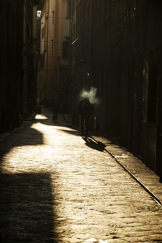
Whereas the black and white images have a more dated feel to them. It has the ability to make the images have a more sophisticated look. This adds more character to the photography and allows more interpretation from the viewer of the photo. The back and white eliminates some of the story and makes more room for individuals to make up the meaning of the photo.
|
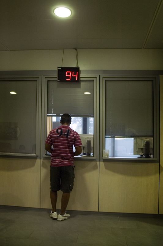
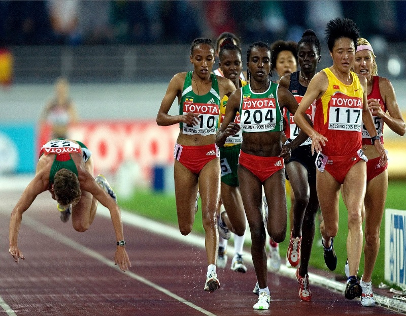
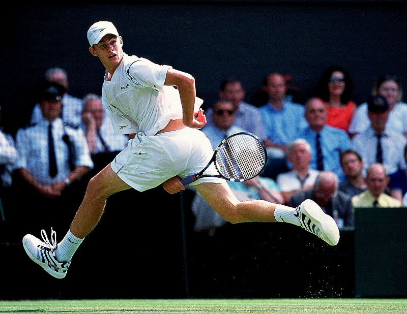
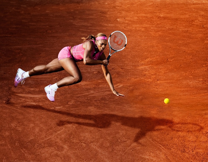
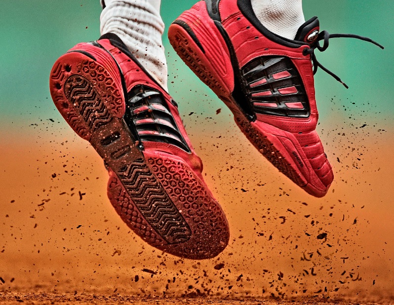
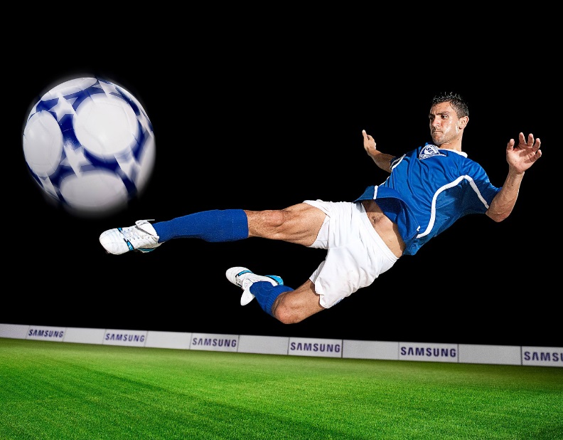
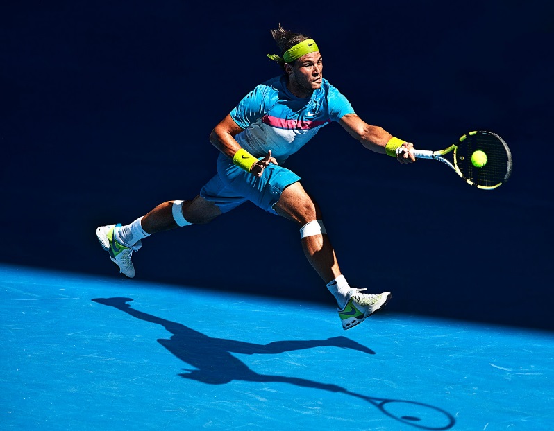
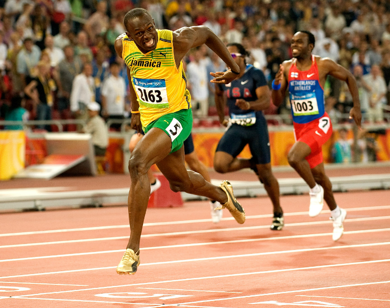
Bob Martin
Bob Martin is a multi-award winning sports photographer specialising in shooting action, graphic and editorial pictures for advertising.Bob has photographed every major sporting event and his work has taken him to some of the most beautiful corners of the world. His work has been published in major magazines such as Sports Illustrated and The Times. I decided to work in the style of Bob Martin to experiment with more than just portrait and landscape photography. His colors are also very vibrant which I think enhances the movement in the photo so I want to explore and see if they would still be as effective in black and white.
Colour.
|
|
I compared these two images because they were both bright and vibrant but with different colour schemes.
|
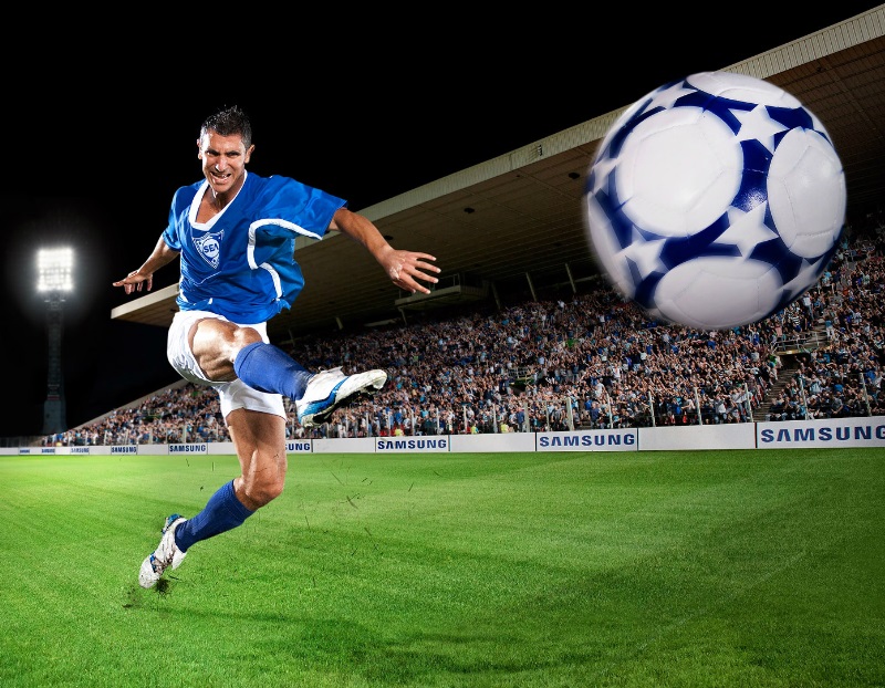
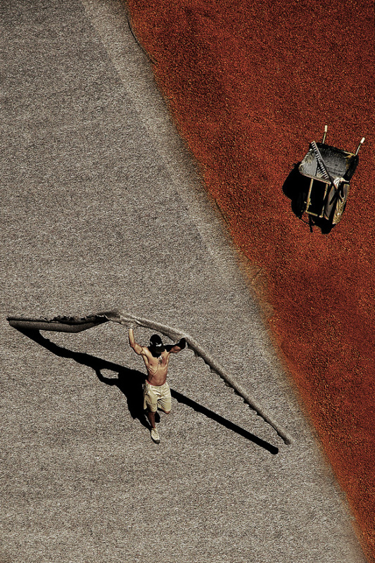
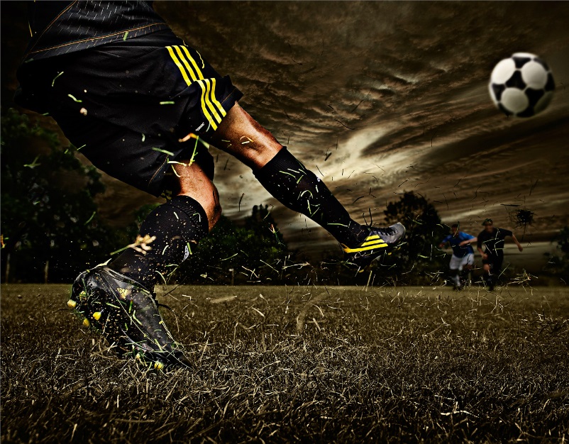
Bob Martin replication
I took these moving pictures of people playing football because I thought it would show a nice similarity to Bob's photos as they feature fluid movement. I thought combining an interesting and colorful background with moving people in the foreground would relate to Bob's busy pictures as there is a lot going on in them. I tried to replicate his style by showing a specific movement.
Colour VS Black & White
|
|
|
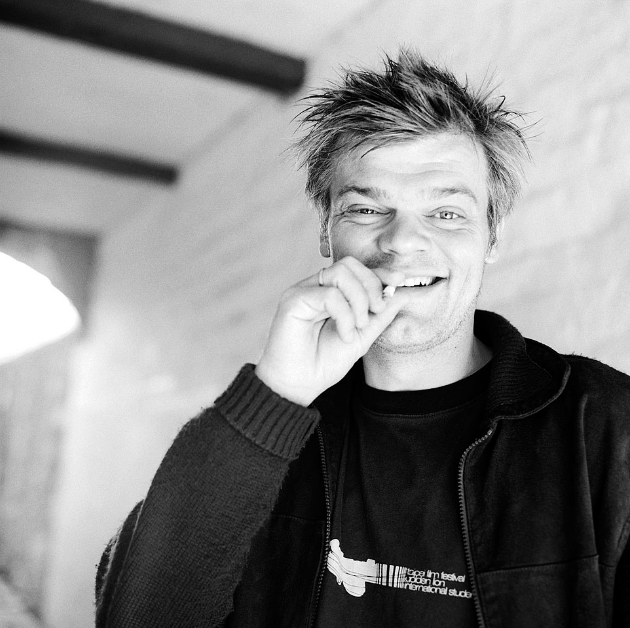
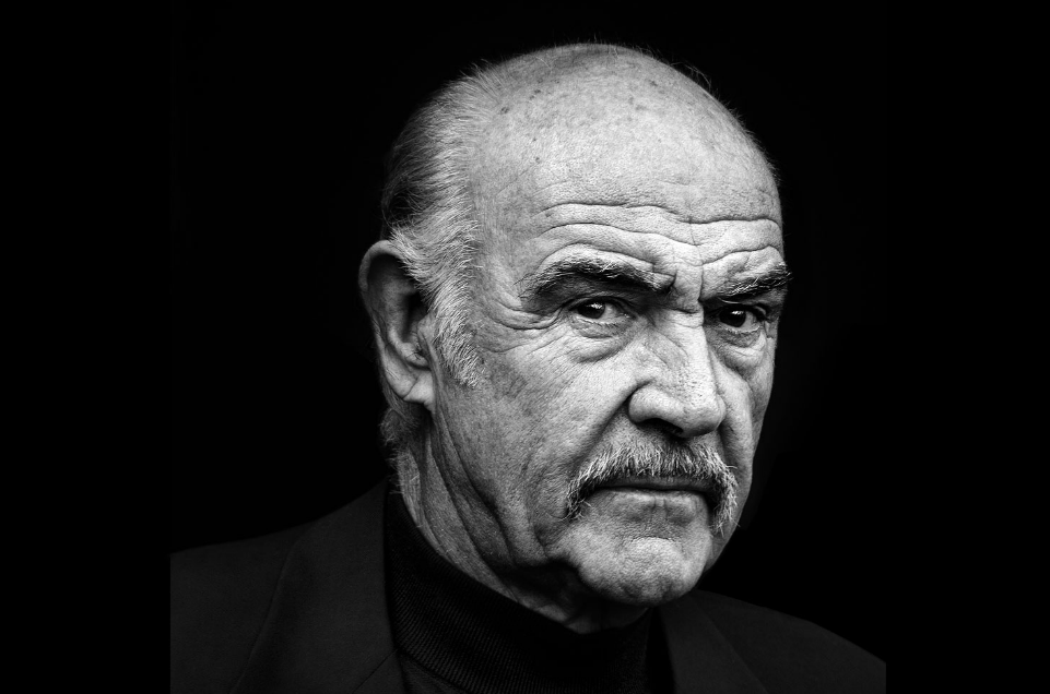
Chris Gloag
Chris Gloag is a talented portrait and lifestyle photographer providing studio and location images for agency, editorial and corporate clients. His shooting style is professional, relaxed and focussed on the art work. Chris also runs a still life studio in Central London where he and his creative team of stylists and editors shoot large scale Ecommerce projects for major global brands.
He has work in both colour and black and white.
I chose this photographer because he has a house style to them which makes them all similar even though they all contain different things.
He has work in both colour and black and white.
I chose this photographer because he has a house style to them which makes them all similar even though they all contain different things.
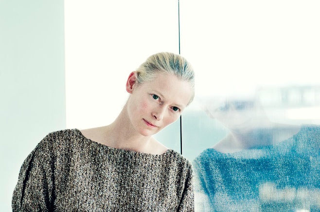
Black and white.
Colour.
|
VS.
|
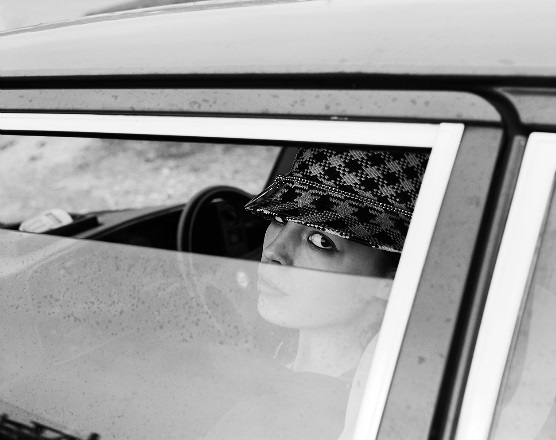
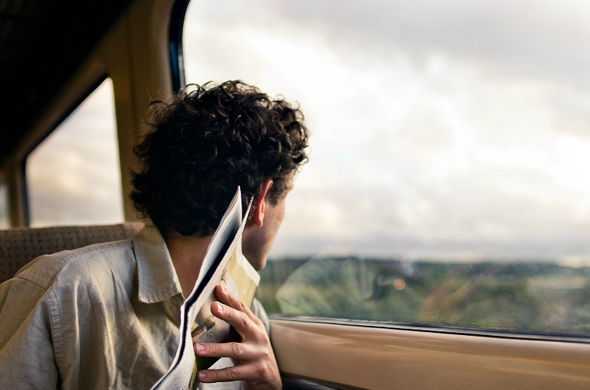
I compared these two images because they have a lot in common as they are both in vehicles. I think the photograph in colour shows a more adventurous side to the train journey because of the field of green in the background however, by having the other image in black and white it shows the edginess of the model and brings the focus to the whiteness in her eyes.
|
|
|
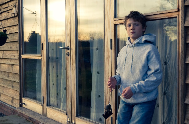
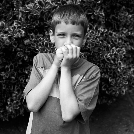
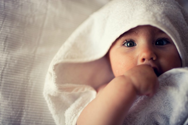
I also thought these would images would compare really well because of the subjects of the photo. In this case, the black and white photograph is contributing to the excitement of the boy as exaggerating his innocence through the lack of colour around him. The picture in colour has the same effect of showing the child's innocence because you can see the happiness through the colour in his face.
|
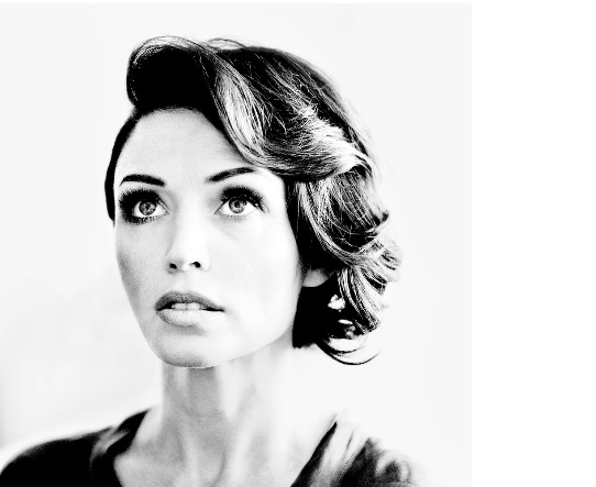
Chris Gloag replication
For this photo shoot I wanted to take Chris Gloags approach to portraiture by taking a photo of a model and having various different lightings. There are differences in his portraiture photos and they are not all serious. Some of them are more intense and sharp whereas the contrast on some create quite a blank, smooth finish to the photo.
For this photoshoot, I used different models, lighting and facial expressions to make sure I was experimenting with those qualities too. This way I can see if they have their own effects on portraiture in black and white. Also, Chris Gloag has some very contrasting images (e.g the Dani Minogue photo) so I wanted to replicate his effects and not all of his models have serious facial expressions.
|
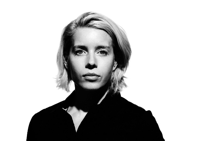
I like the photos that are in colour because they create happier moods and makes the models face stand out against the background more which i like.
|
However this image looks much more effective because of how the models face blends in with the shadow. The black and white images strip away some of the emotion and instead the photos become more to do with curves and shadows .
|
Conclusion
Overall, through experimentation I found that black and white can be much more effective depending what the purpose of the photograph is. For example trying to achieve a certain mood or atmosphere can be achieved better if the photo is in colour because each colour is representative of different emotions. Most landscape photos appear to be more interesting in black and white as it allows the mind to be more imaginative with what colours were there.
