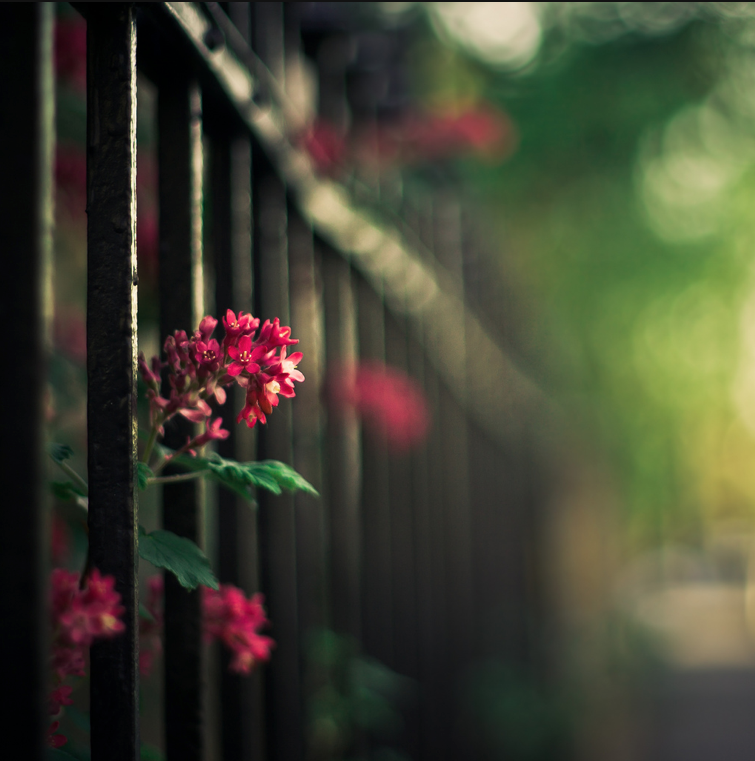
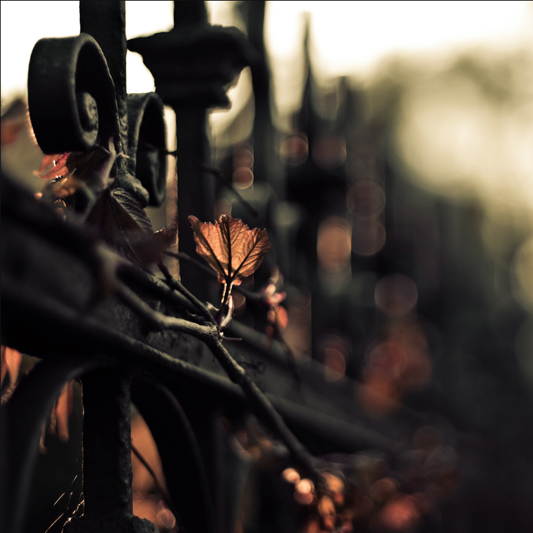
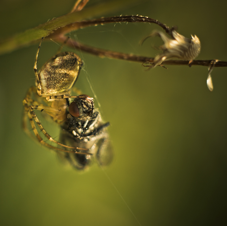
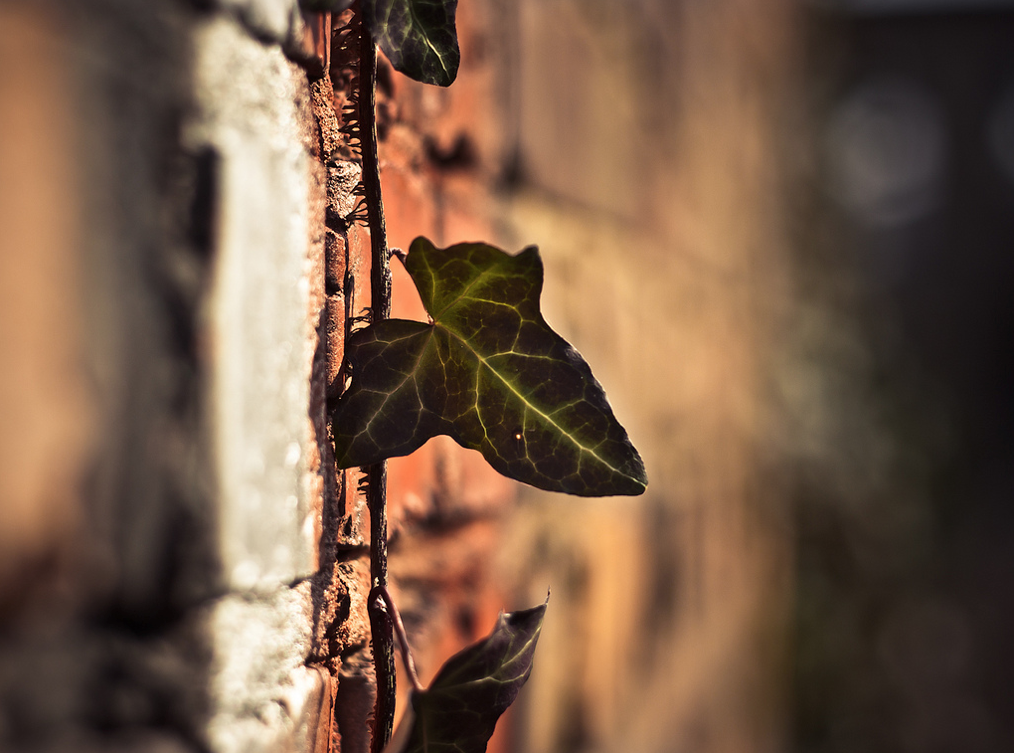
on the road
ao1 contextual understanding
Develop my ideas through sustained and focus investigations informed by contexual and other sources, demonstrating analytical and critical understanding.
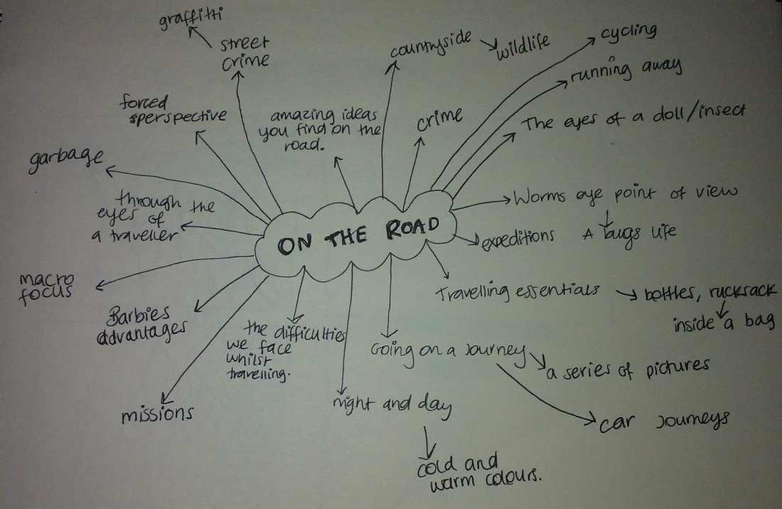
brainstorm
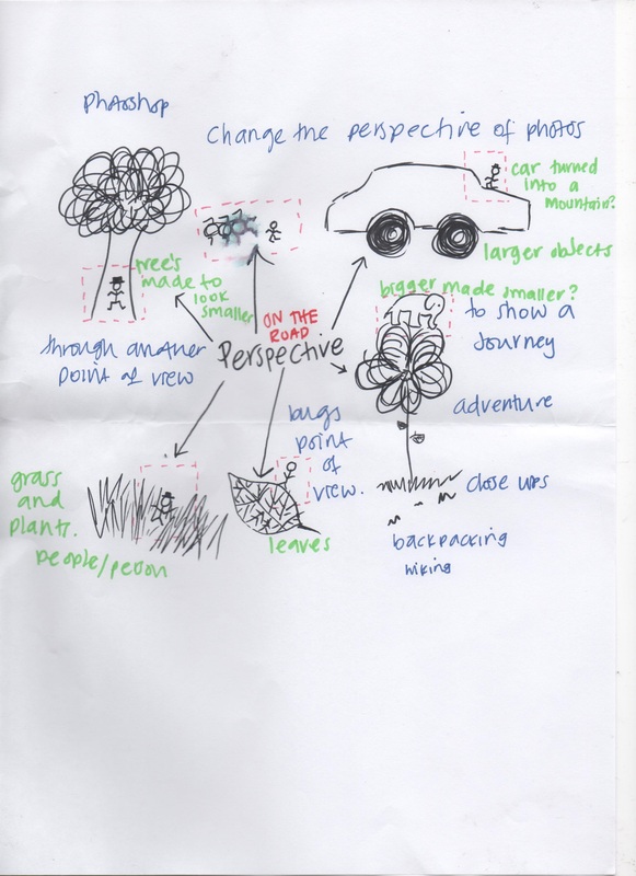
IDEA 1 - Take a series of macro images and create a certain emotion or link to being 'on the road' through colour, texture or patterns. I could enhance the image to make it more interesting.
IDEA 2 - Take macro photos and add a person in it to show the perspective (using photoshop). This could show the different perspective of the images. Or make it look more natural as if it was somewhere the miniature person could belong.
IDEA 3 - Use objets that people generally use 'on the road' e.g water bottle, backpack, sunglasses, bandages, shoes, food and recreate them into something else.
IDEA 4 - Go on a journey anywhere and take 'journalistic/blog-like' photo's on the way to show 'on the road'.
idea sheets
michael rohde
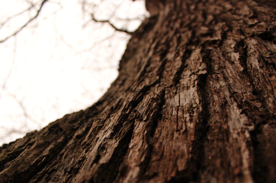
Michael is a German artist who has taken a lower approach to photography with stunning results. His from-below photos of different rooms are well constructed, and quite illusional. They were created by stitching together images of the undersides of the objects he chose.
There so upside-down that some have been said to even create a slightly nauseating effect, which has also been said to be ironic as it's creating the view of someone who's drunk -(fallen on the floor looking up at its surroundings.)
As I want to take images from a bugs point of view, these helped me consider working indoors.
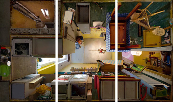
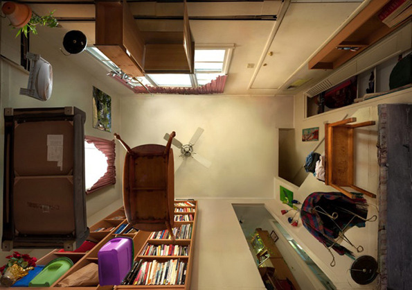
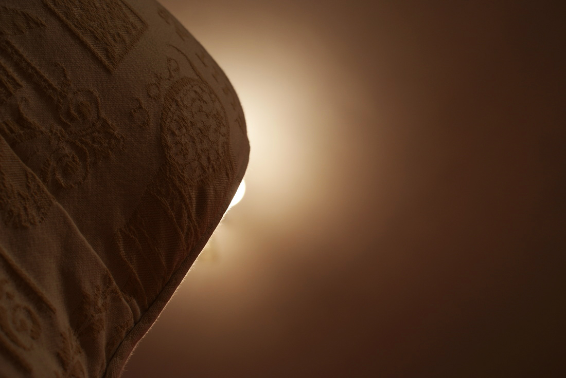
I like this image because compared to the others, there is a lot of ceiling in the image and I like the space. I think angle is interesting as the perspective makes the objects in the room look smaller as they get (further way) higher. I like the different colours which creates a positive mood in the mood. I like the way the bookcase looks in the image so it inspired me to want to take photo's from underneath the objects so it looks like an ant looking up at something.
|
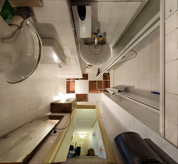
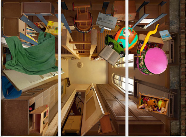
I like the fact that you can see outside of the room with this photo. It creates another element in the room and makes it feel bigger than it is. It has inspired me to take images in that angle so that the person looking at it feels smaller. I think the bathroom adds on to the nauseating feeling and makes the photo even more delusional than the other because you can see out of the room when all the others are more closed.
|
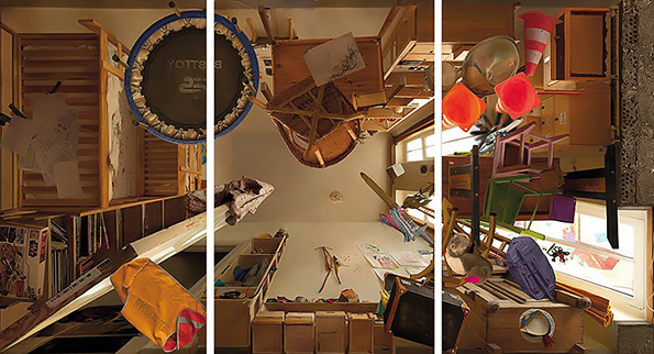
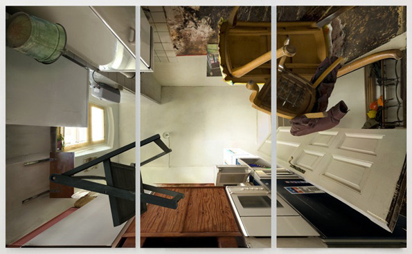
I don't like this photo as much as the others because there are too many different objects in the room and it feels over-crowded. If I recreated pictures like this I would want it to be less busy because there are too many different things going on in this picture. This image was taken in three parts and out together to create the final image of the floor. If there was less different colours in the image I would prefer it. If I was going to replicate it I would use less objects and have a more blank ceiling. However, after looking at his images it helped me realize I would prefer working outdoor with more natural light and a less crowded feeling.
|
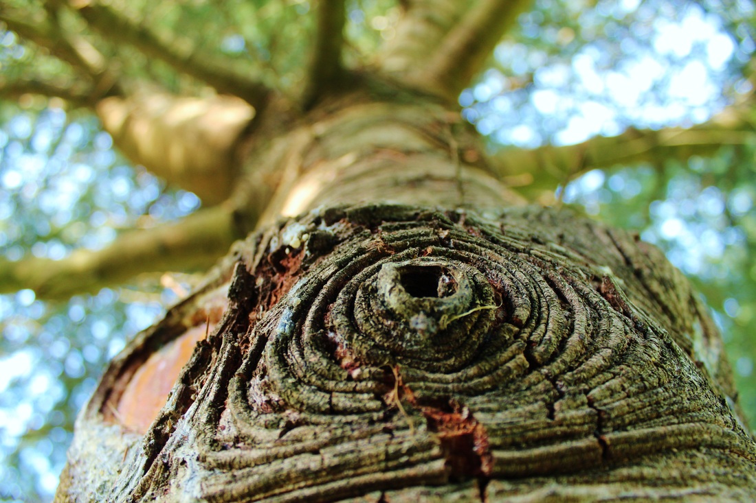
photoshoot 1: Michael rohde inspired
After looking at Michael Rodhe's work it inspired me to experiment with taking low angle shots but indoors. His pictures contain a variety of objects and he has many colours filling his photo. I took photos of different objects around the house to experiment with low angle shots and macro to experience life through the eyes of a bug. I think the photoshoot went well but it made me realize how different the concept would be if it was outdoor. I enjoyed taking macro photographs and I liked how it shows a different perspective of things that are around everyday.
|
I chose this image from my Michael Rodhe inspired photo shoot because I think it shows the most similar colours than any of other images because it's bright and a lot of other colours in it compared to the others. Michaeals photo's are bright and have different shapes and lines in them which I think is also the same here. I was not able to recreate the image in the way he takes his photo's so my interpretation of it was to take photo's looking upwards in a worms eye view style.
|
|
I like the composure of this photo and how the darkness spreads in from the center. I like the angle of the image as it shows how looking up at things make objects look very different. It shows a different mood to the others because of the lack of colour.
|
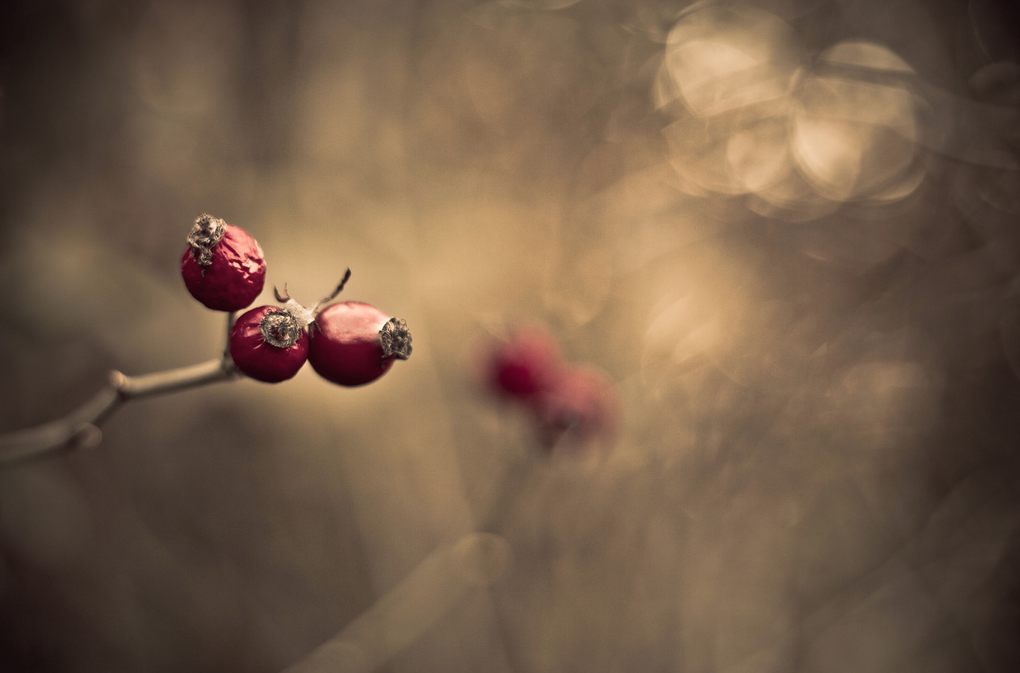
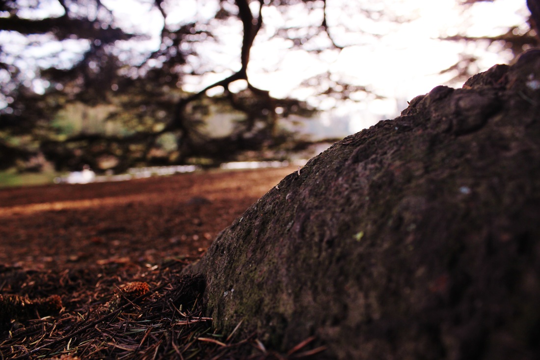
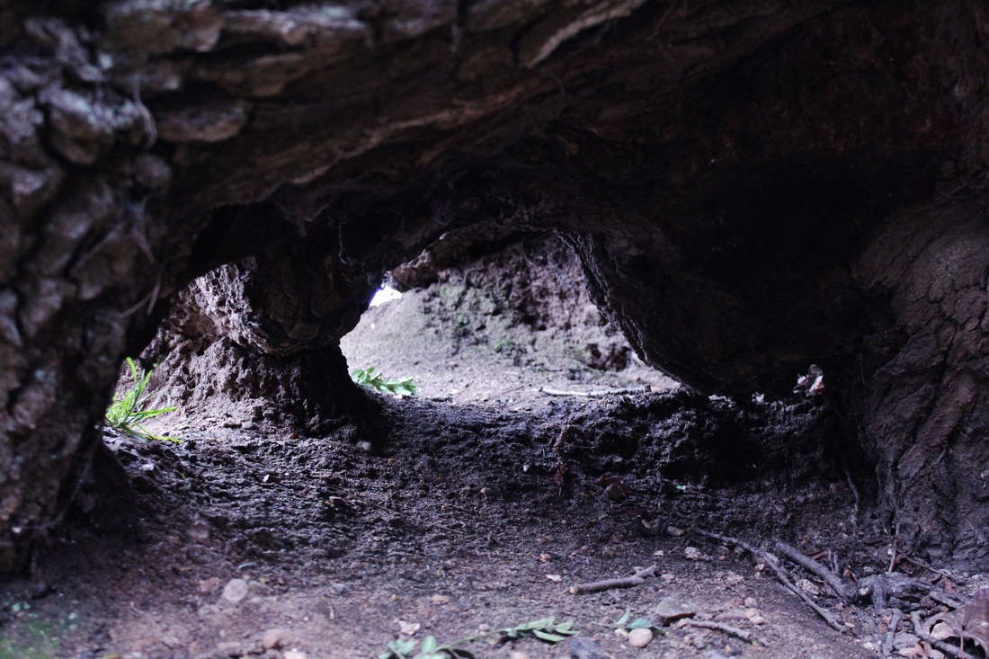
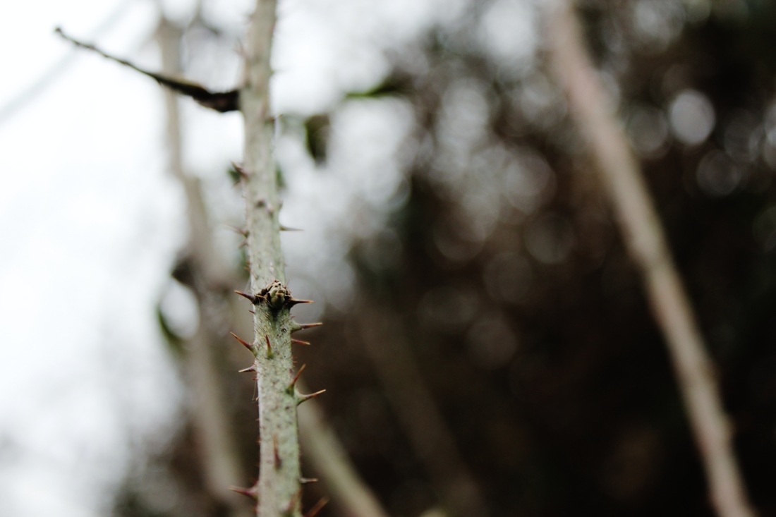
worm eye photography inspiration
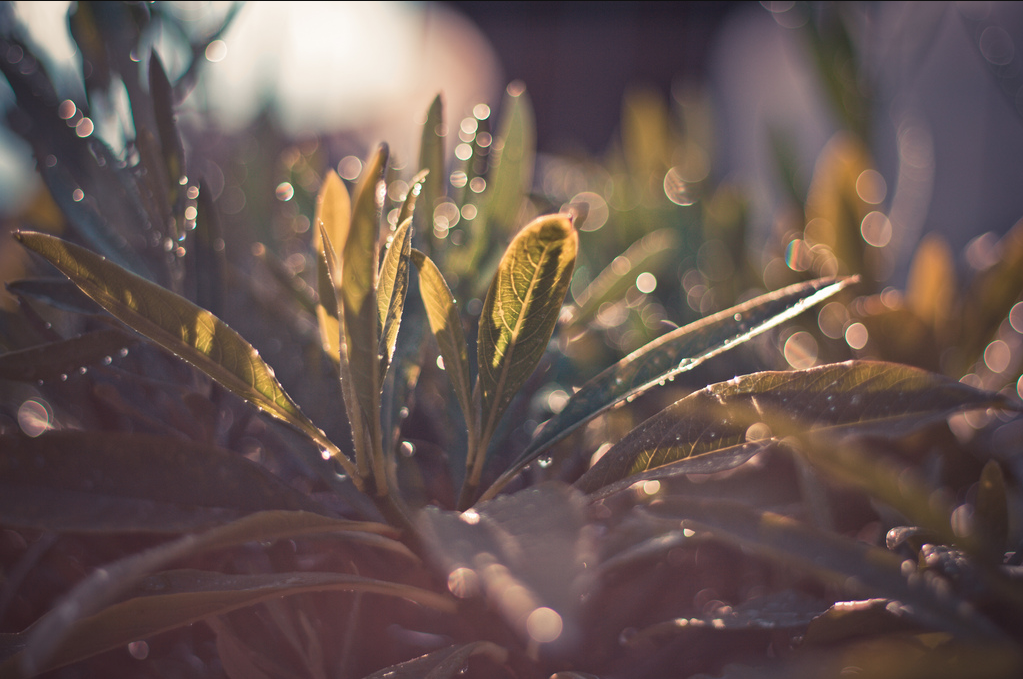
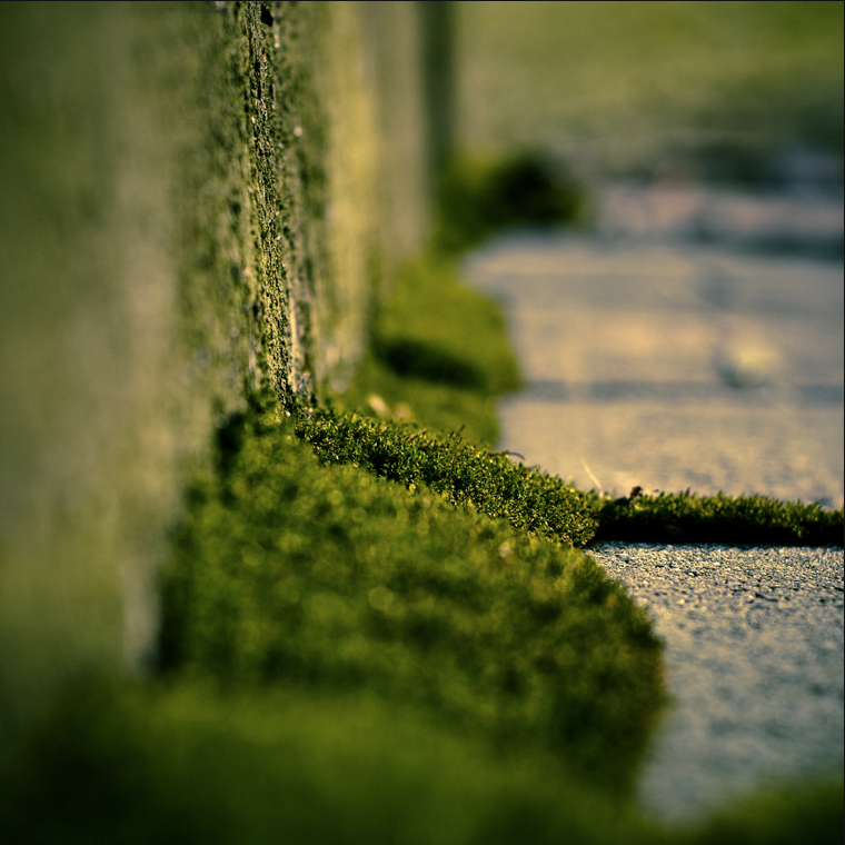
I chose this selection of photos because it shows the style of photography I want to use. I like the idea of worm eye photography to show an on the road feel through the eyes of a bug. I think it shows a better perspective that we don't usually see things from.I like how the photo's are macro because then you feel like you are experiencing life from a point of view and seeing things more in-depth than you would. I would like to enhance the pictures I take in order to make them appear more textured. I like how most of the things in this photo are not in the centre so you focus on the surroundings as well.


I like this image because of how the depth of field changes throughout the photograph, making the floor look further away than it is. I think it shows a good use of perspective. The blurriness of the ground on this photo gives a dizzy feeling to the photo that I think works well in terms of showing a bugs point of view.
|
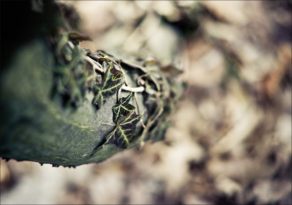
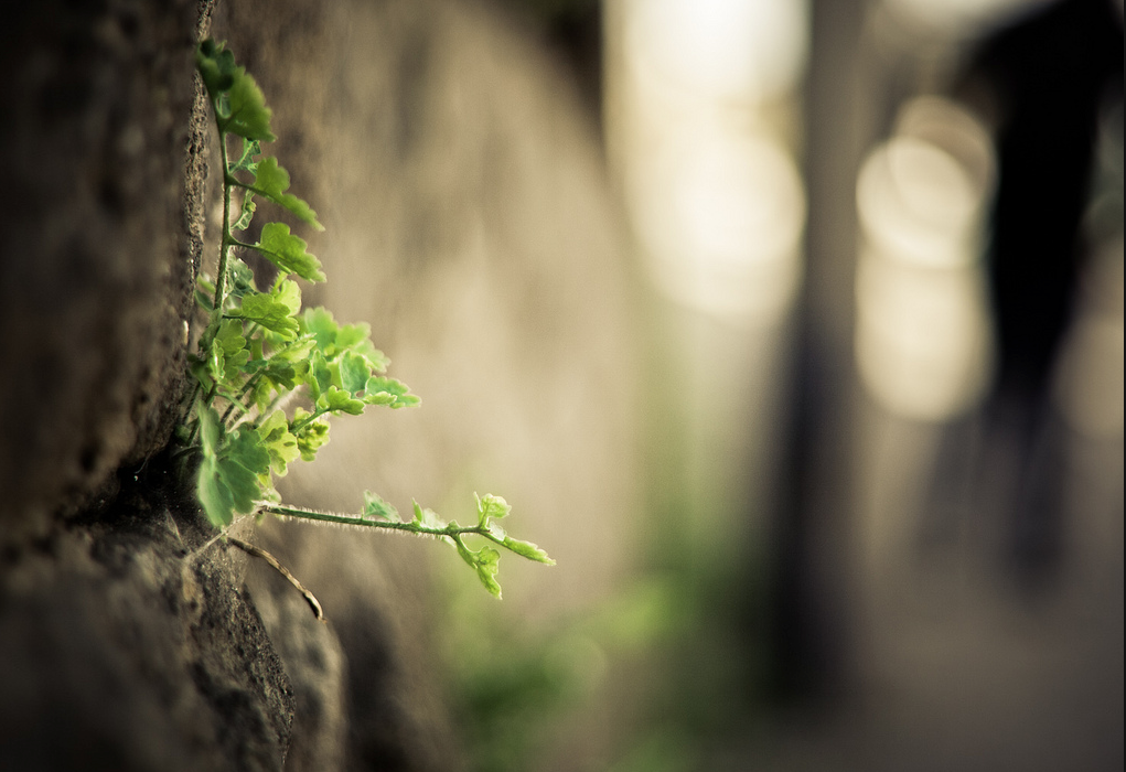
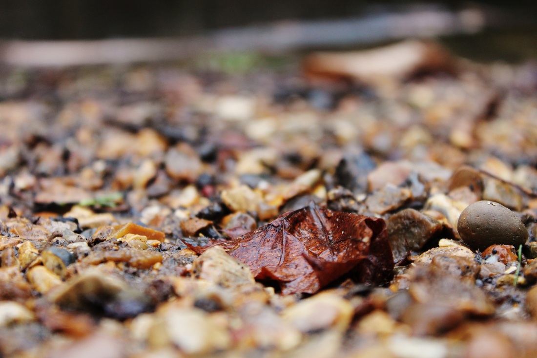
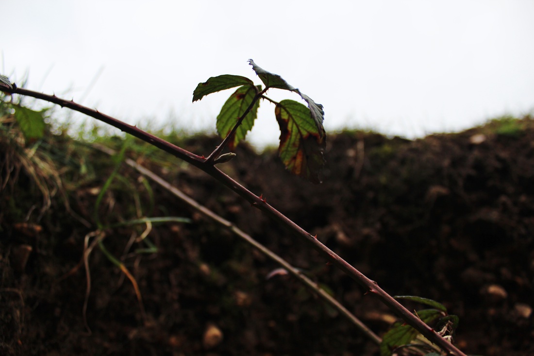
I like this image because the point of view it's taken out is more common. I like the focus on the leaf and how you can see each line clearly due to the way the light is shining. I think the contrast between the right of the leaf and the blurry background makes the photo more interesting. Also ,the focus of the wall brings more texture into the photo which makes it more appealing.
|
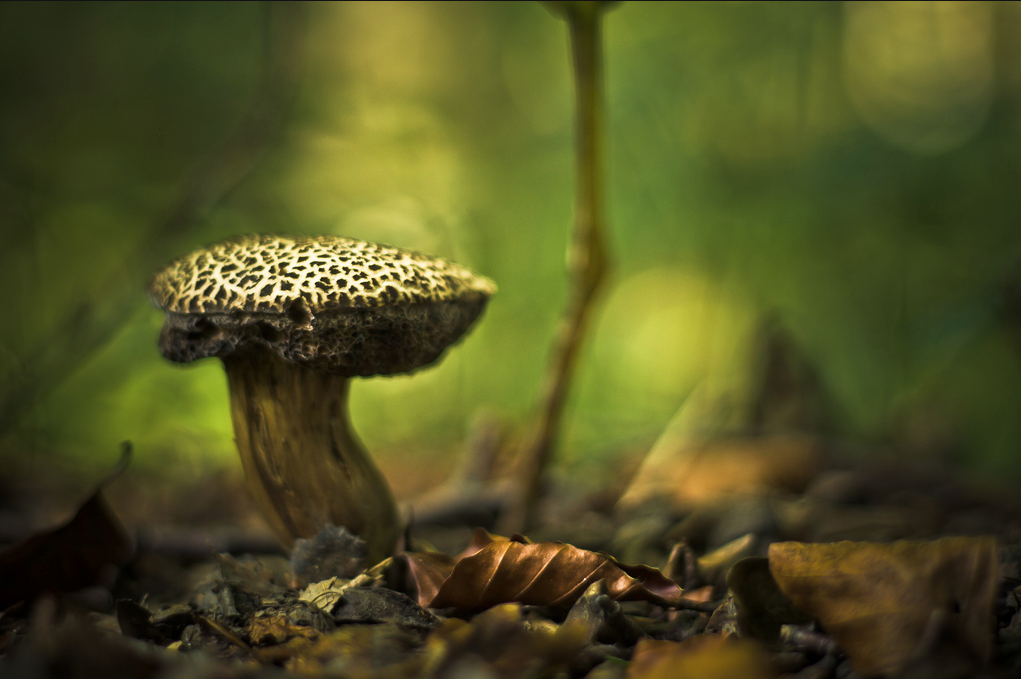
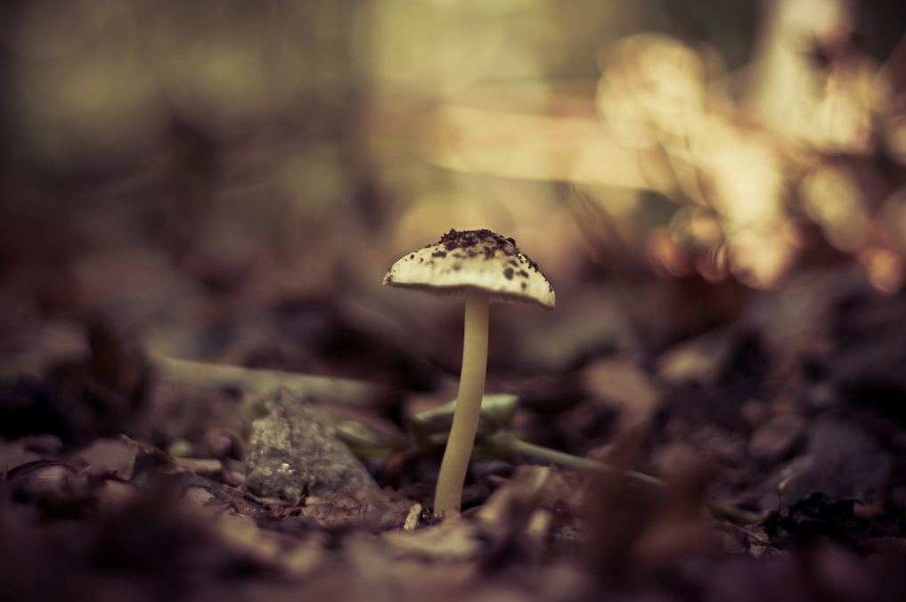
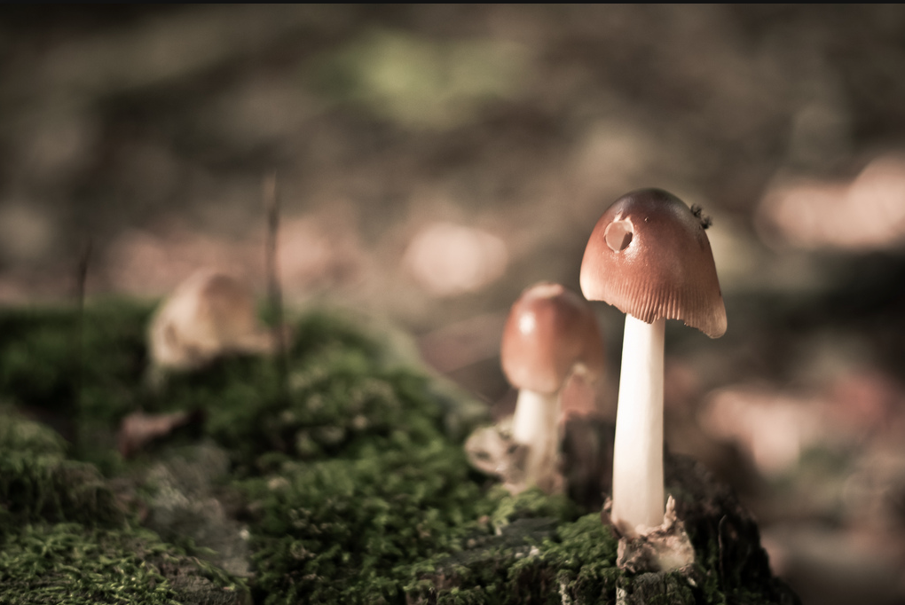
What I think make this image stand out was how the colour was mainly green. Compared to the others I think it gave a mysterious feel of the fungi and it's surroundings. Because of the use of rule of third, this photo is more visually appealing as it is not placed right in the middle. The different textures in the image makes the photo appear more real.
|
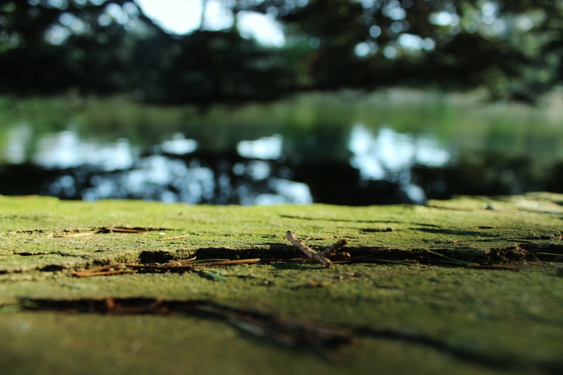
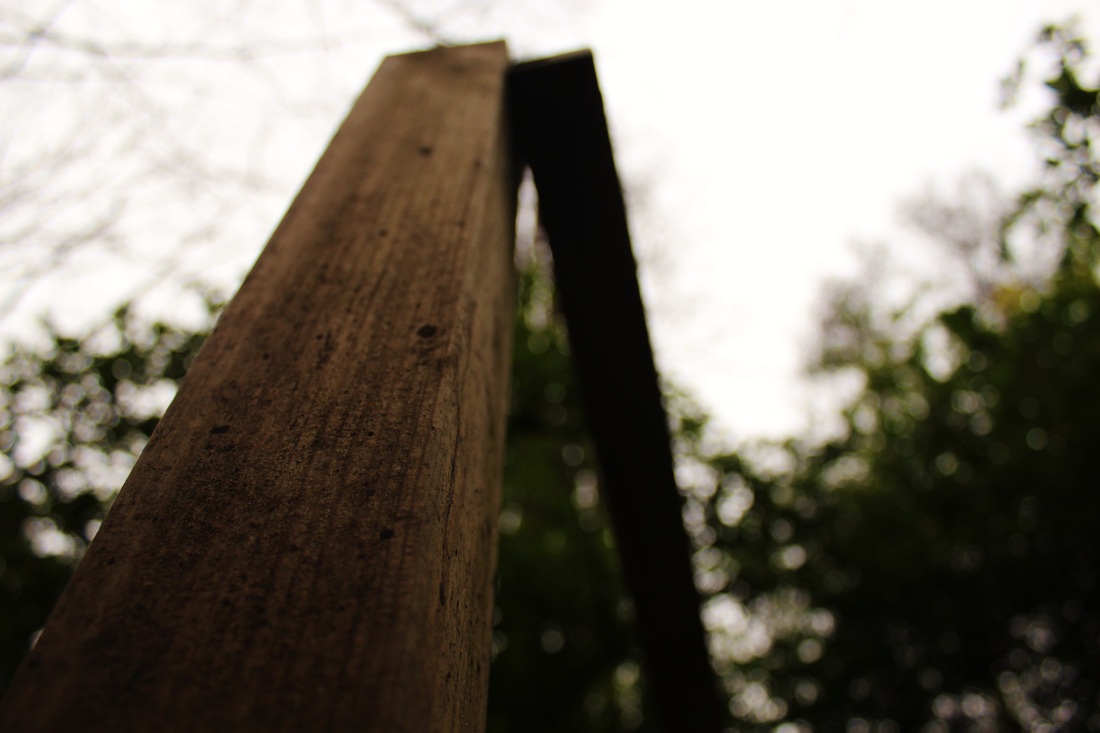
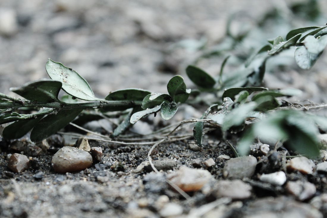
photoshoot 2: worm eye photography experimentation
For this photoshoot I went around a park and took low angle shots of the surroundings. For some of the photo's I lay on the floor and I used the macro focus setting to get a more precise image. I think the majority of them came out well. For inspiration I used all different images I found of worm eye photography. I tried to have a subject in the photo to focus on and make the rest of the surroundings interesting as-well.
worm eye photography replications
For these images I lay on the floor to get the best angles and used the macro setting on the camera to get the best outcome. I liked taking pictures of things that had a lot of texture to them so it would appear more 3D on the camera. I liked editing the pictures to make them have mainly one colour and then showing the contrasts in them. I think making the contrast higher has made the images more interesting to look at becase it creates a wider variety of tones.
|
This was my favourite of the images I edited because I likes how the season changed through the editing. It started off looking warm but I turned the colour temperature down to create a more blue effect that I wanted to take over the image. I also like how the ground still has brown parts of it sticking out to contrast against it. I think what made it similar to the other images I was replicating is that the background is out of focus and there is a main focus point which has made the image more precise.
|
|
I think this image is successful because I like how obvious the depth of field has come out. I think it makes the image look more like a bugs point of view because of how blurred the background is, making it look further away than it is. Which shows the distant it would be for a bug compared to how it actually is. The photo is quite dark with red and brown colours in it and I think it shows a nice comparison of temperature as this photo looks warm and the one above it looks cold.
|
ao2:
experiment with and select appropriate resources,media, materials,techniques and processes,reviewing and refining ides as work develops.
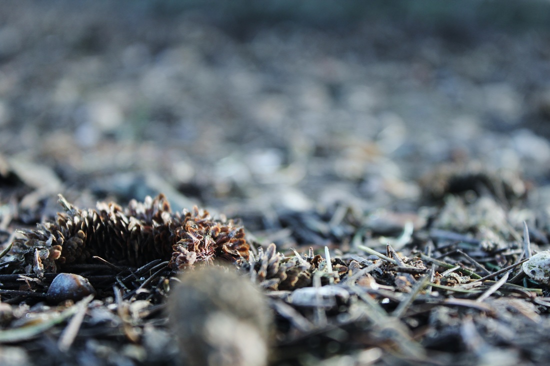
photoshoot 3: perspective experimentation
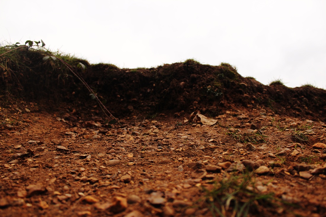
For this photoshoot I decided to take more photos similarly to the worm eye photoshoot because I became more comfortable working in that certain way. When I took these it images the ground was wet which was not my intention but it showed in some of the images.
For this photoshoot I went to a park when it was quite cold so everything was very dull and lifeless. The ground was quite damp so I liked to focus on the texture of it. I took these photo's to experiment with the worm eye view. I edited the contrast and saturation of the images to bring more life and texture into them as they all looked very dull.
|
I like this image because of how it looks more frosted than it actually was and how the dirt on the leaves look. The lowering of the saturation has created a dust-like look which I think makes the image more interesting compared to when it was extremely bright. However, this photo does not show the best use of a low perspective as much as some of the others.
|
|
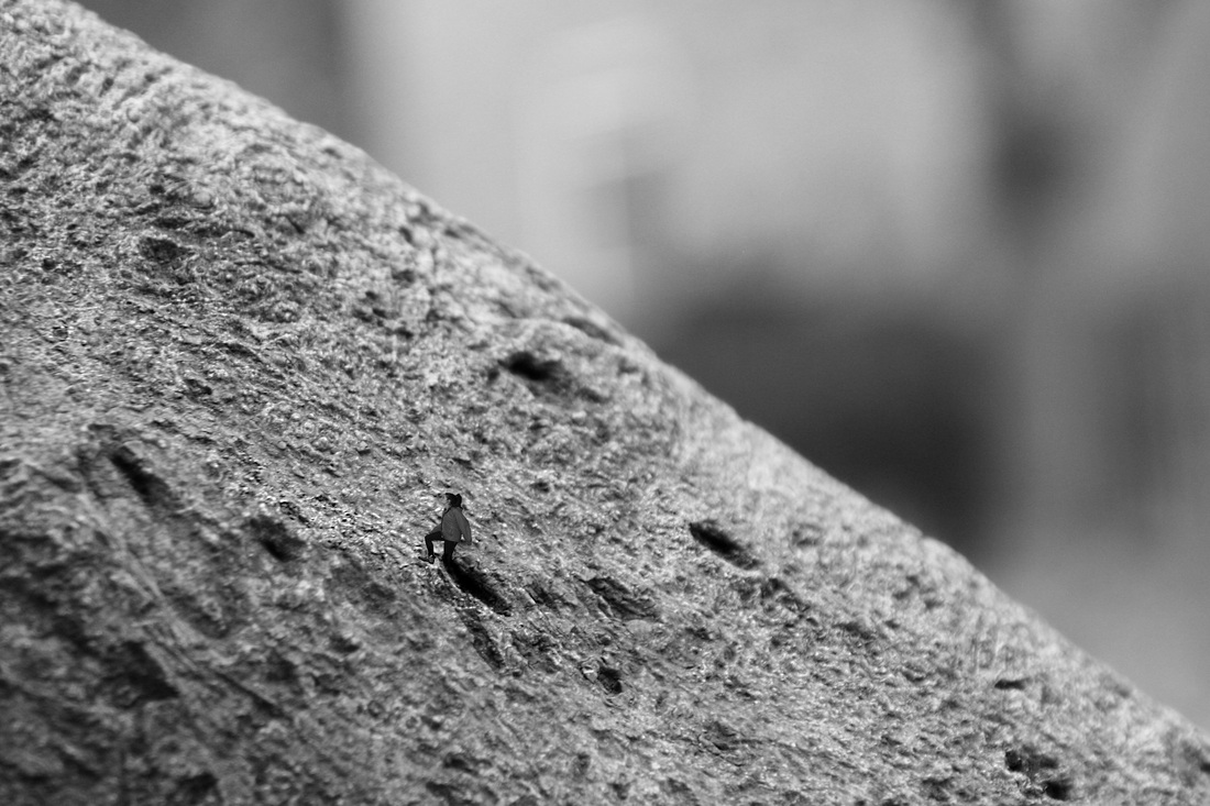
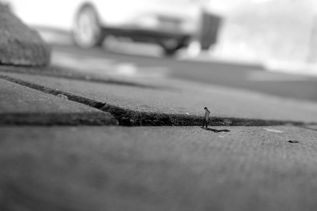
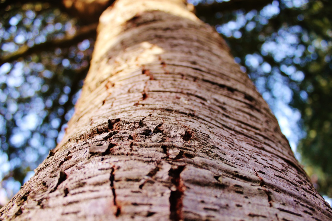
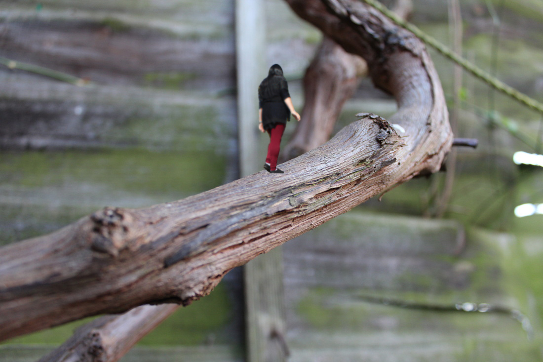
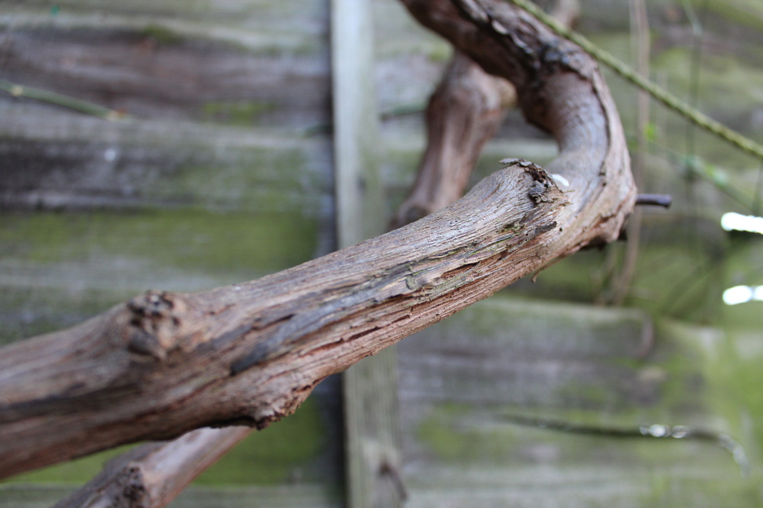
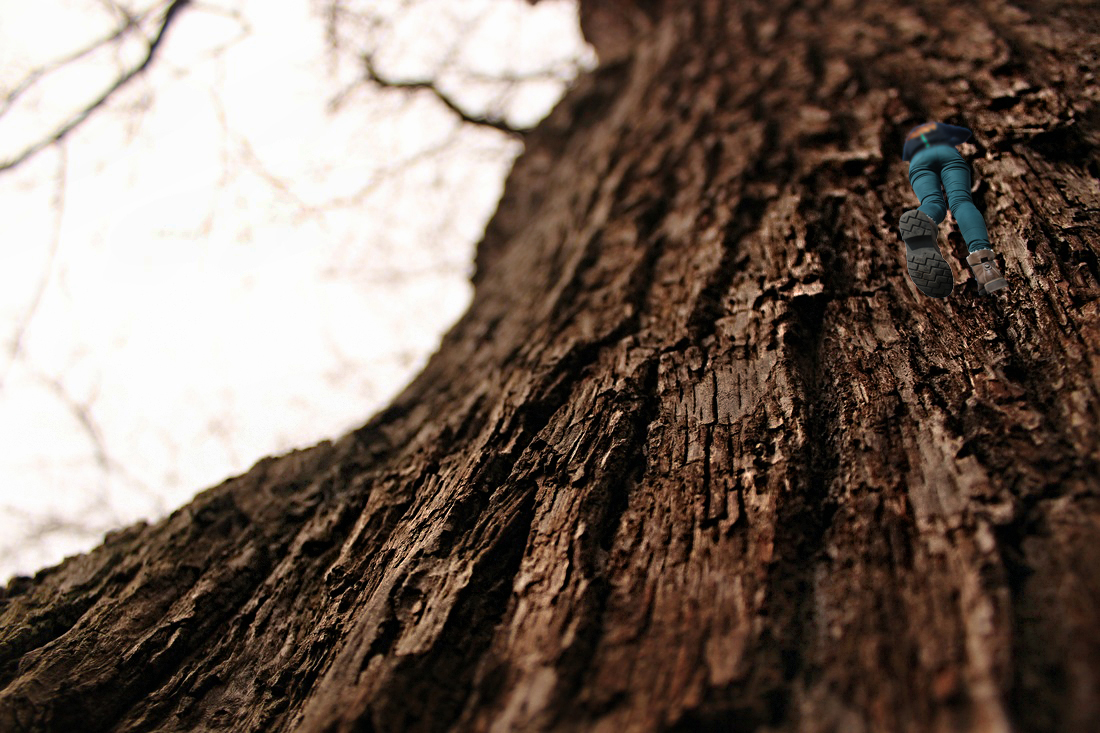
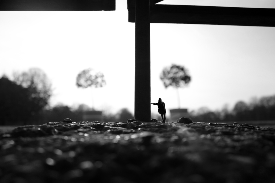
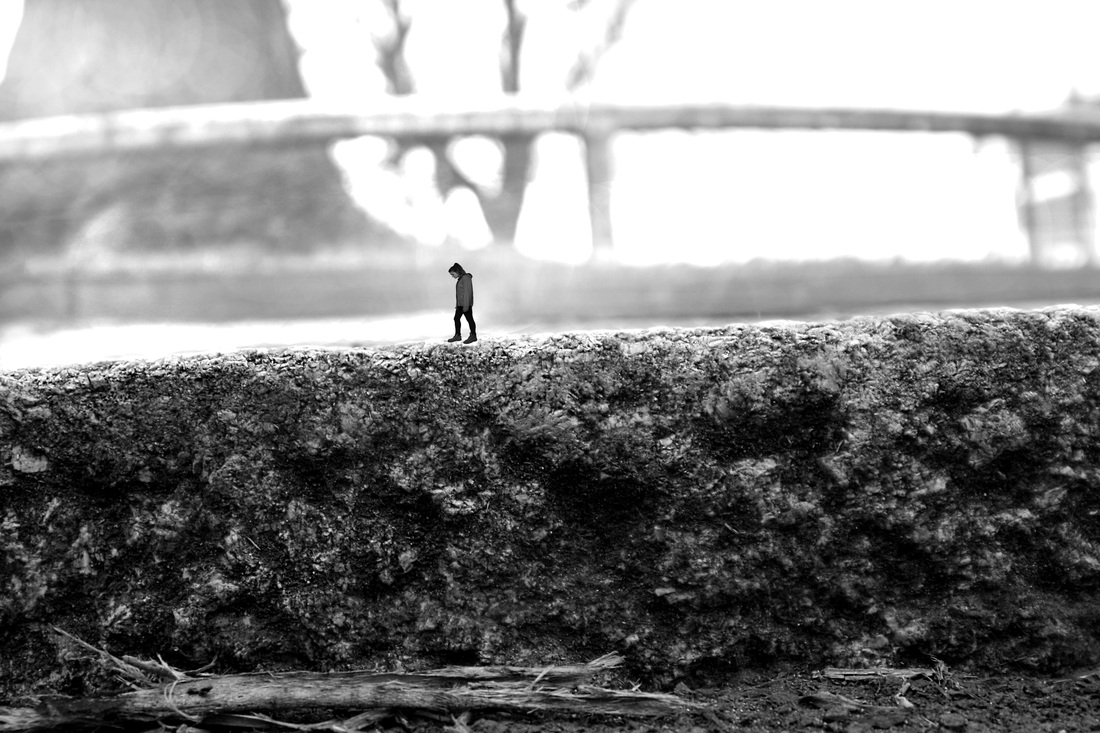
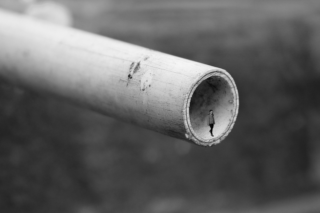
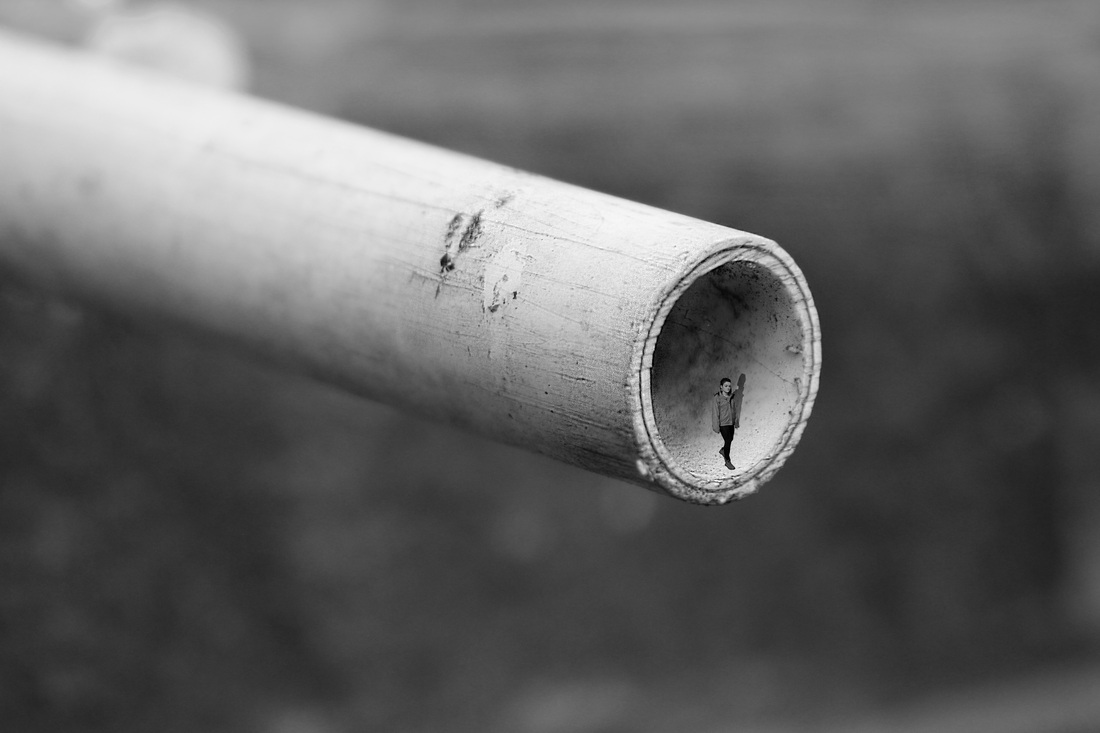
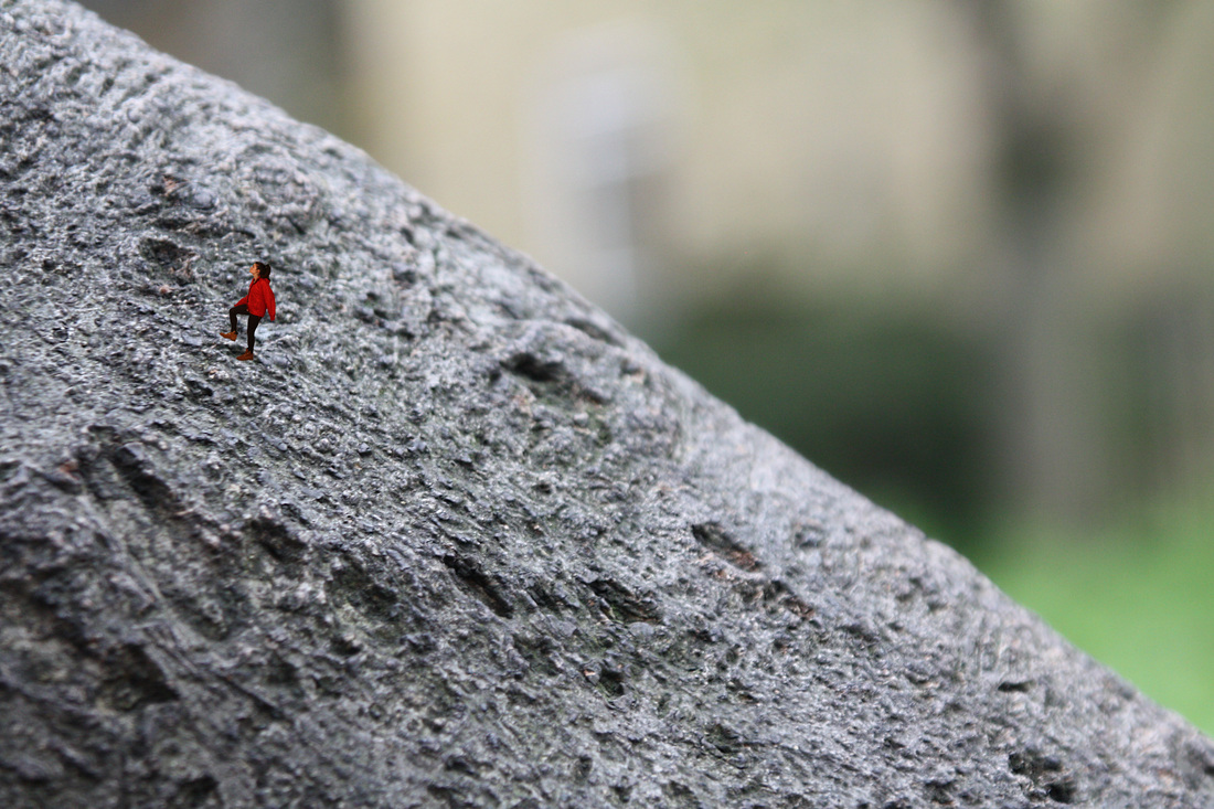
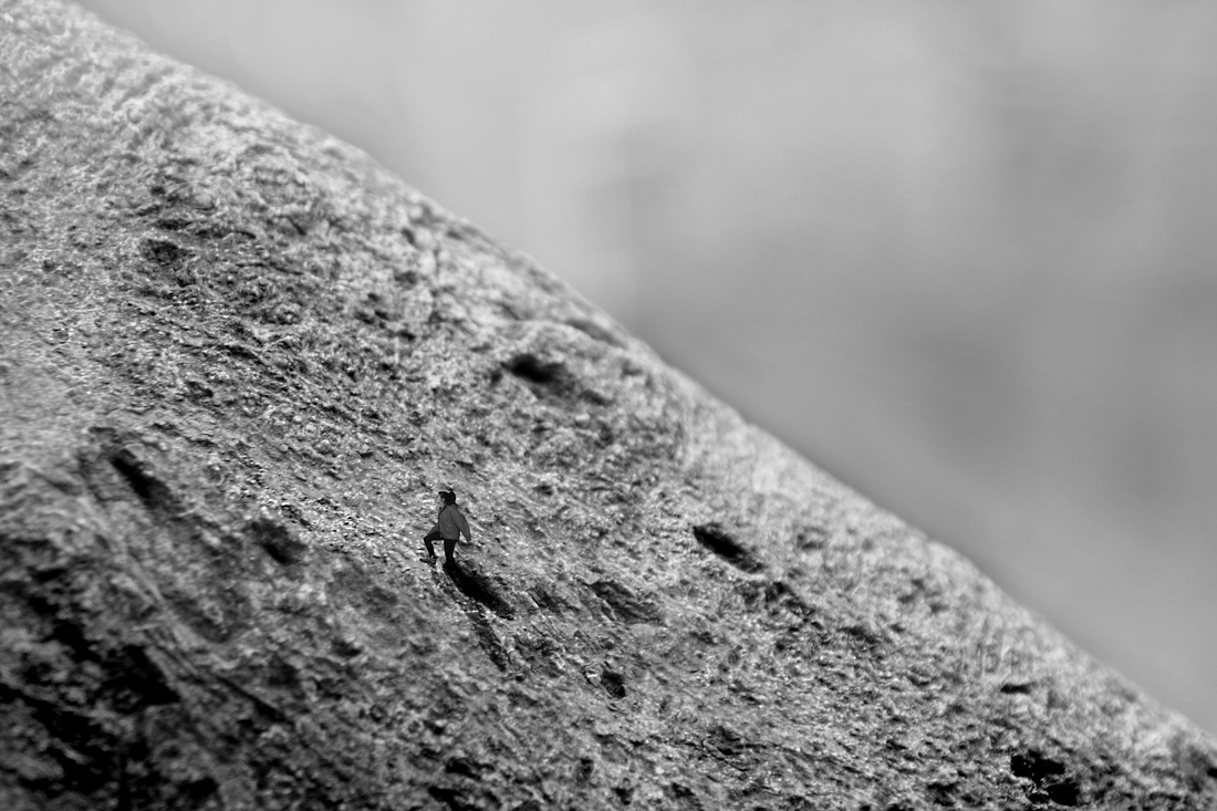
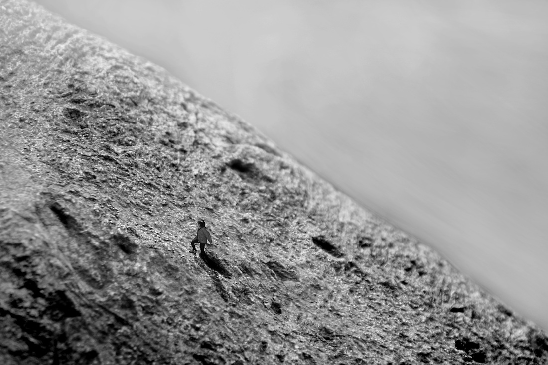
This image looks good to show perspective because of the angle that it was taken at. The further away it gets, the more blurry it becomes so you know its in the distance. I think this photo would look good with a person that has been shrunk to climb up or down it to show how the perspective of the image can be altered. By using the person in the photo it could show how the bugs would find a tree enormous to climb and by putting a person on it, it would create an illusion. If it was a higher angle then the image would have looked better but I it would have made it harder to add people in it.
|
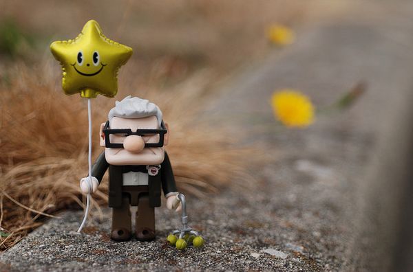
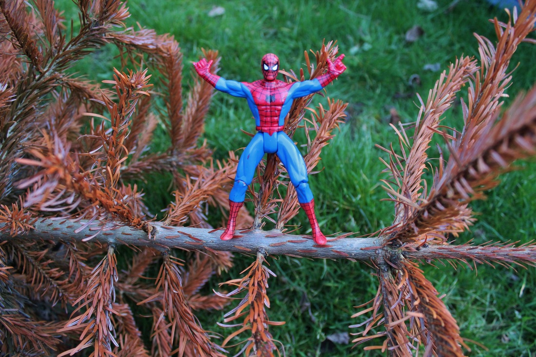
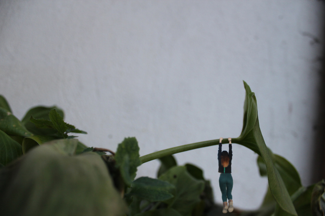
toys, on the road.
I think it would be good to use a toy in the macro images to show the size. It would be interesting to show perspective as some things may appear bigger or smaller than you think they are. If I was to recreate these images I could add the toy. I think this idea would help to get a better understanding of how perspective including a person, could change the whole image to make things look different sizes. If the surroundings are right then it looks like the toy is actually in the place.
|
I like this image because of all the neutral tones that are in it and how it makes the photo look warmer and more appealing than if it was darker or bluer. I like how blurry the background is and how there is only a trip of the photograph that is in focus.
|
|
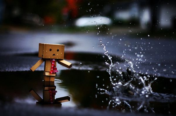
I like this photo because of the puddle. I think you can see that if it was taken with a human shoe in it would show the real size but because of the small toy the puddle looks much larger than it is. Also the use of movement in the splash goes well with the sad face of the toy and I like how the background relates to the foreground. I think the mood of this photo is quite sad, which is made by the dark colours, splash, and sad face of the toy. for my photo's I would want the expression on the people/person to relate to it's surroundings to create an overall mood.
|
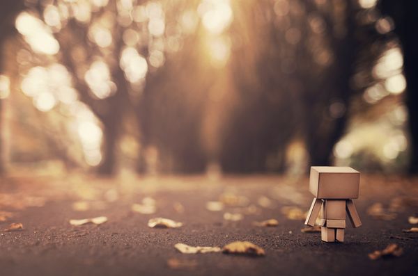
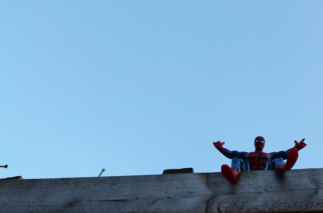
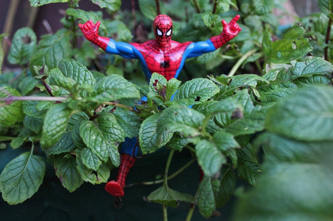
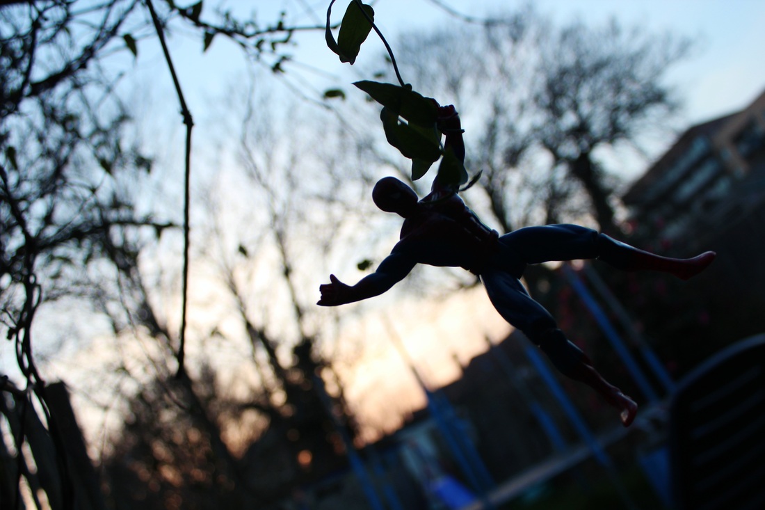
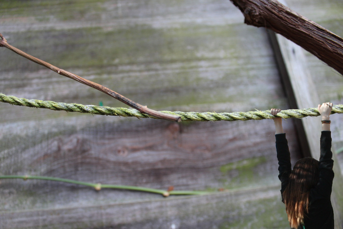
toys on the road replication
I took these photo's to replicate the toys above. Instead of using photoshop to incorporate the toy I used one and placed in certain places. I did it to experiment with perspective and see how the smaller things could change the sizes of the surroundings. I think they worked well with what was there as it was difficult to make the images look like something that they're not. I think the mood of the photos are all quite positive because of the variety of color in all of them, which works well with the theme of toys.
|
I think this image is to the point as it is clear and you can see that the leaves are leaves that would usually be small. However, in this case I tried to make it seem as if the toys are in scale with the toy and that it was sitting amongst them. I think the mood of this photo is quite happy because of the contrasting colours.
|
|
I took this image as replication for the collection of toy perspective photos. The silhouette of the toy against the background allows the image to be distorted so that you cannot tell what scale the background is. I think the mood of the image is quite peaceful as the sun is setting in the background.
|
a03;
photoshoot 4: background images experimentation 1
For these images I went out and took macro photographs of objects that I thought could be easy to use as something else. All the photos are close up so that when I add someone on them to make the perspective obvious, the person would be small. I think these images would have the right sides and shapes to add people on. For example ,a brick is small but by putting a person walking or sitting of a brick it shows how it could be big for a bug. However, some photo's have created difficult positions positions to add people into because of the grass.
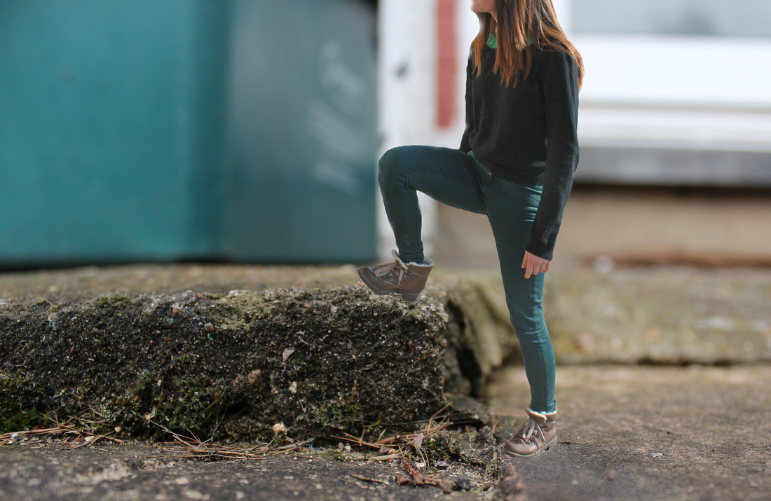
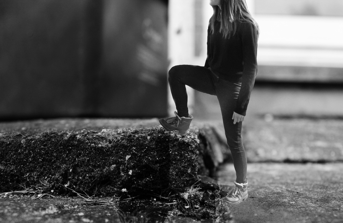
photoshoot 5: foreground images experimentation 1
For these photos I took people doing different actions to use as the subject of my photos. I used photo's of them doing various different poses so that I could use them to incorporate onto the background photo's.
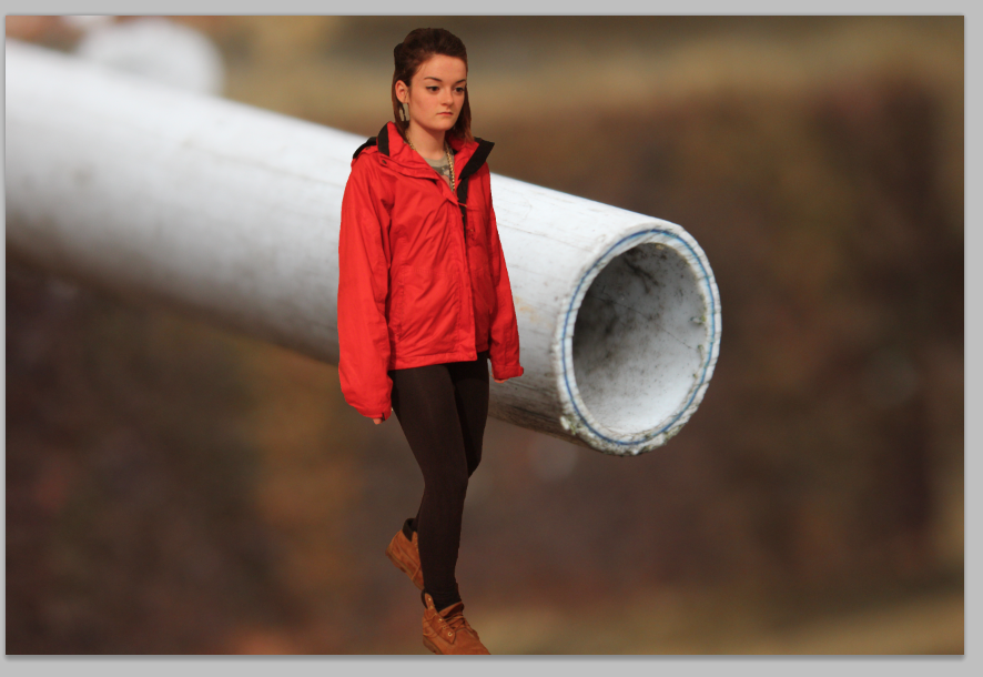
By using the quick selection tool and pasting the cut out people onto the images, I tried to create images that show how perspective ca be altered. In these images the macro photo's have been taken, so on their own, you would be able to tell how small they are. But, when I added a person is incorporated in, the sizes of the objects become harder to tell. At this stage because of the lack of editing done on the photos, they are vibrant and not at the stage I would like them to be.
photoshop a person into a picture
For the next stage I am going to photoshop a person into the macro images I took to show how the perspective can be altered. I took more photo's zoomed in to different things found outdoors, and then also pictures of people walking, climbing and hanging from various things so I can photoshop the people into the images.
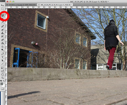
The first step I did was use the quick selection tool to highlight the body, so that I could move it around.
|
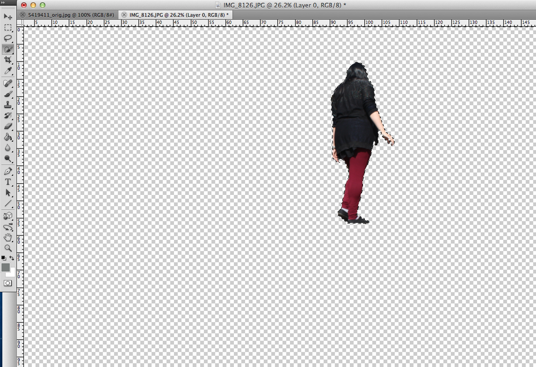
Once the person is selected I clicked 'select inverse' which highlighted the body and allows me to delete the background and copy the person body on its own with nothing around it.
|
then I pasted the cut image onto the new macro background to make it look like it belongs there, also I adjusted the size of the person to make sure everything is to scale. If necessary I would use the rub out tool to go around the edges and smooth them off so the image is more precise.
|
background and foreground photoshopped experiments
|

|
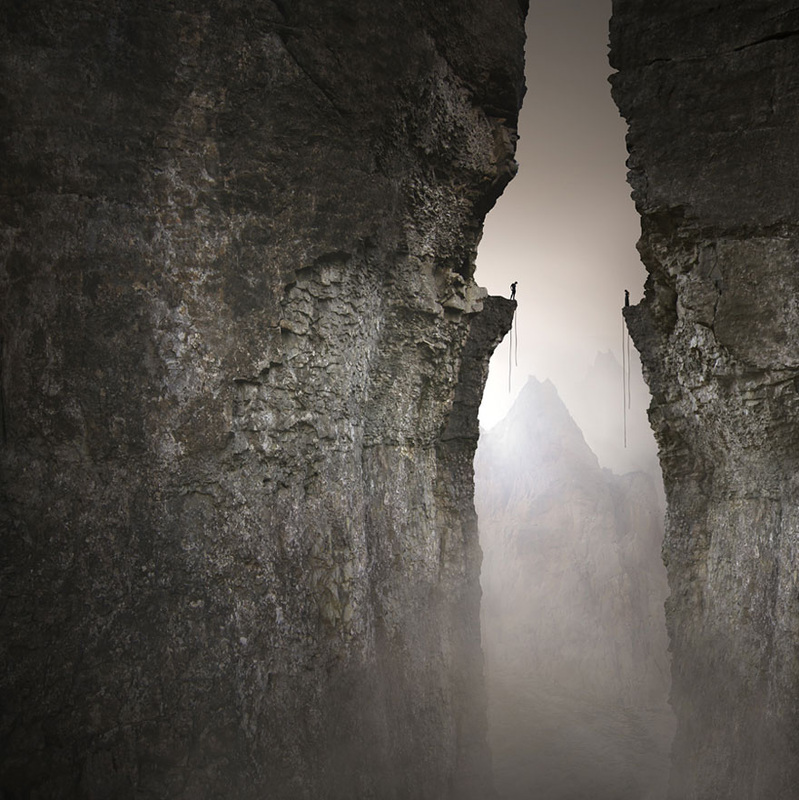
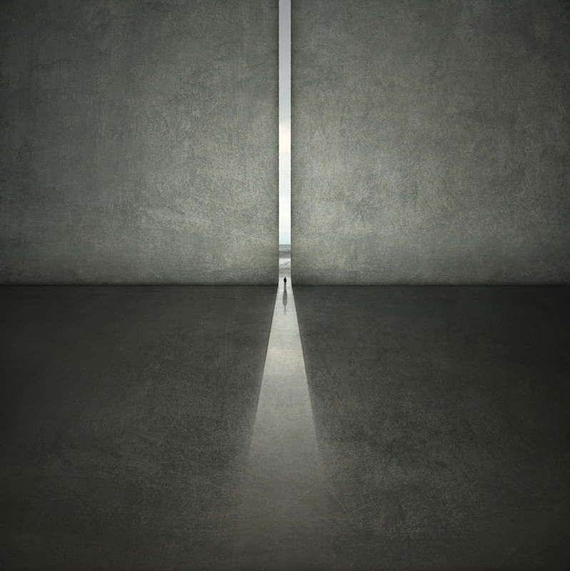
Karezoid Michal Karcz
Karezoid is a Polish photographer who started out his artistic career through painting.He uses digital photography and software to give him the unique unrealistic that are impossible to create without. He recreates images of places that he has never been to before using his imagination. He takes inspiration from many different artists. I like the tones in his work and how there is always an area of light that draws attention to the subject in his images. The mood of his photo' are quite negative as they all look quite deserted and there is aways only one person in them. This creates an isolated feeling because of the scale of the person and the 'world' that they are in. His images all give off a sense of a 'destination' because the light sources in the photo show how the people can escape.
For my Karezoid Michal Karz photo's I wanted to change the images I took into more of mono-toned images using photoshop. I edited the brightness and contrast, saturation, hue and colour. I also changed some into black and white.
KAREZOID MICHAL KARCZ replication
For these I changed the hue and saturation to get a sepia effect to create like Karezoid Michal Karz's photo's. It was hard to make the photo's look like they are all one image using photoshop so I am going to further experiment with blurring and sharpening of the right area's. This way they will look more in place and hopefully merge together as one.
bad
|
slideshow
My replication of his photos started out with less surroundings than his. I experimented with making the photo's sepia and black and white to create the emptiness of his photo through the lack of colour's. My first few attempts of Karezoid Michal Karz's photo's were quite bad.
|
slideshow
I changed the hue and saturation of this image because some of Karezoid Michal Karz's photo's contain more than one colour. The problem with this image was the depth of the photograph of the tree branch. This made it difficult to add the person into. On darkened
|
|
slideshow
Using the cut out tool I transferred an image of a person climbing that I took, and used it on top of a tree bark to make it look like she was climbing. I put the saturation and contrast up in the photo to see if it had a better effect. In the colour photo, I added a shadow to the girl by making a copy of the layer and changing it to 'overlay'. I also did another version of this image in black and white and made the person smaller to make it look like the distance she is climbing is bigger.
|
slideshow
Through further experimentation I decided I preferred the replication to have less contrast as it loses the authenticity of the image. When I edited this photo to make it looks like Karezoid Michal Karz's I simply changed it to black and white to experiment and see if it looks better than a more edited photo.
|
|
This image did not work out as well as the other because of the brightness of the two original images. I think that it was more complicated to select the body and make it look like it belonged in the image because the light was shining from different directions in the two photographs. I think the colour of the trousers matches the colour of the box in the background which gives the image a more co-ordinated feeling. The scale of the image was more difficult to work with as the 'step' was really small so I had to focus the camera a lot. This made the step be very sharp compared to the person.
|
|
I edited the image to make the step darker so it stood out less and also used the dodge tool to create sun rays of light coming from the top right. I did this to make the brightness of the back of the trousers look as if it was there in this image.
|
good
|
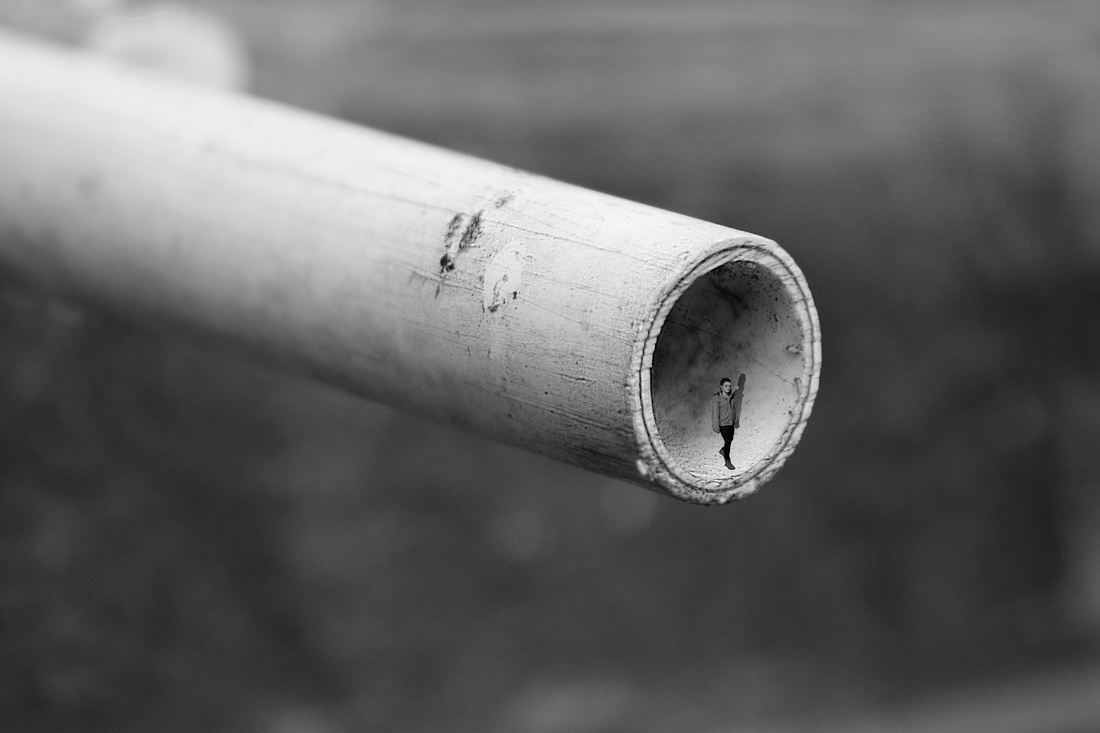
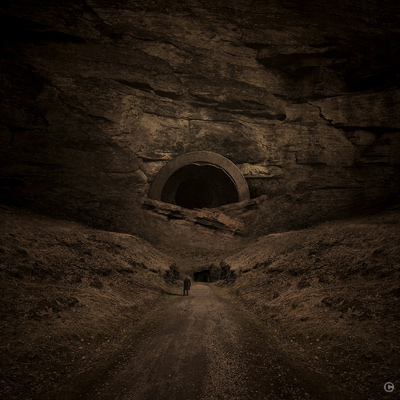
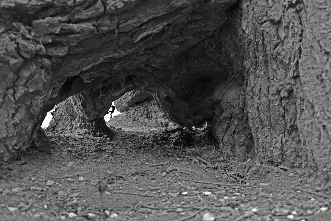
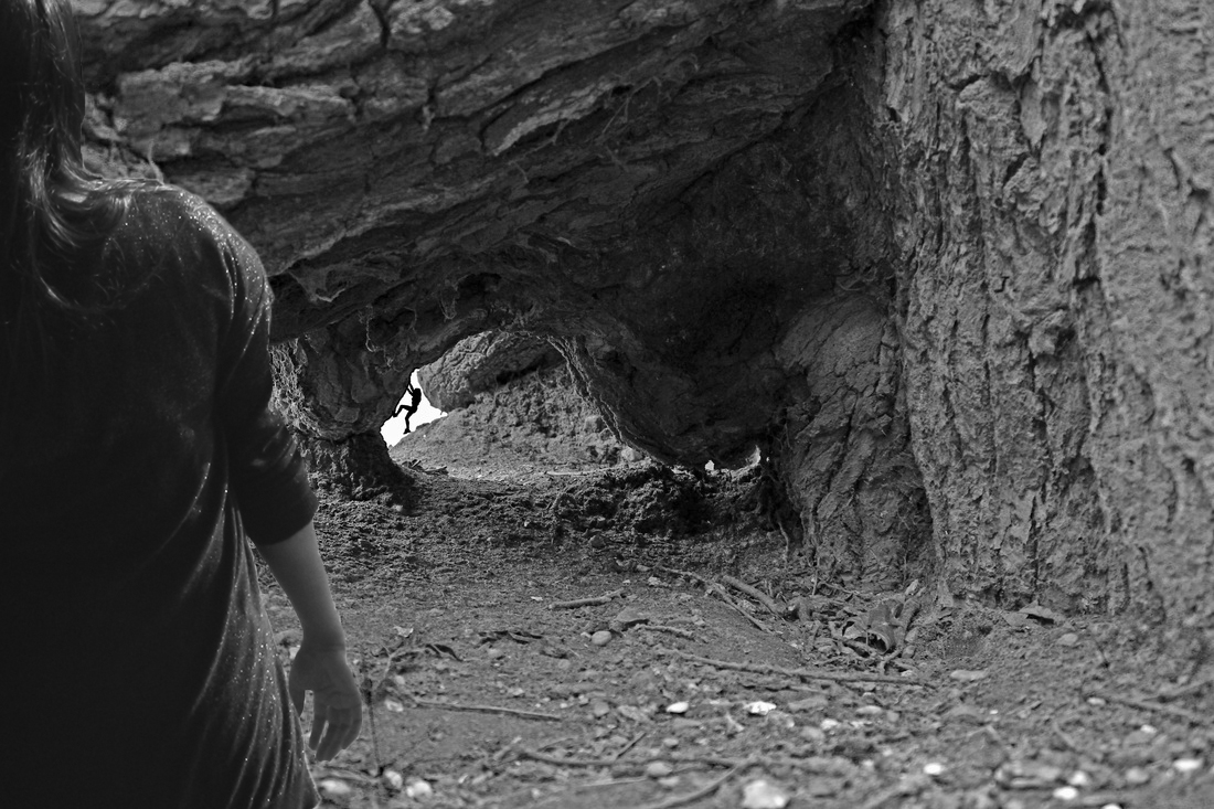
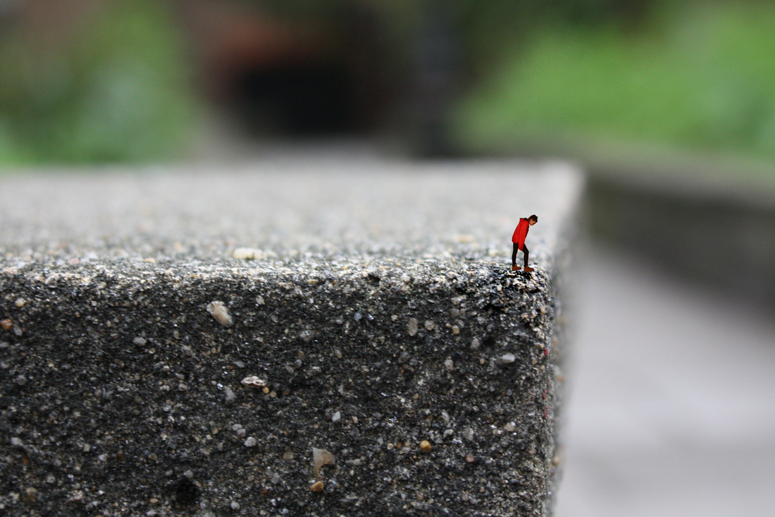
This image works better than the other as it looks like someone is climbing the inside. I wanted to show how an images perspective can be altered by adding a person. This photo is originally the bottom of a tree but I experimented to make it look more like a cave.
|
|
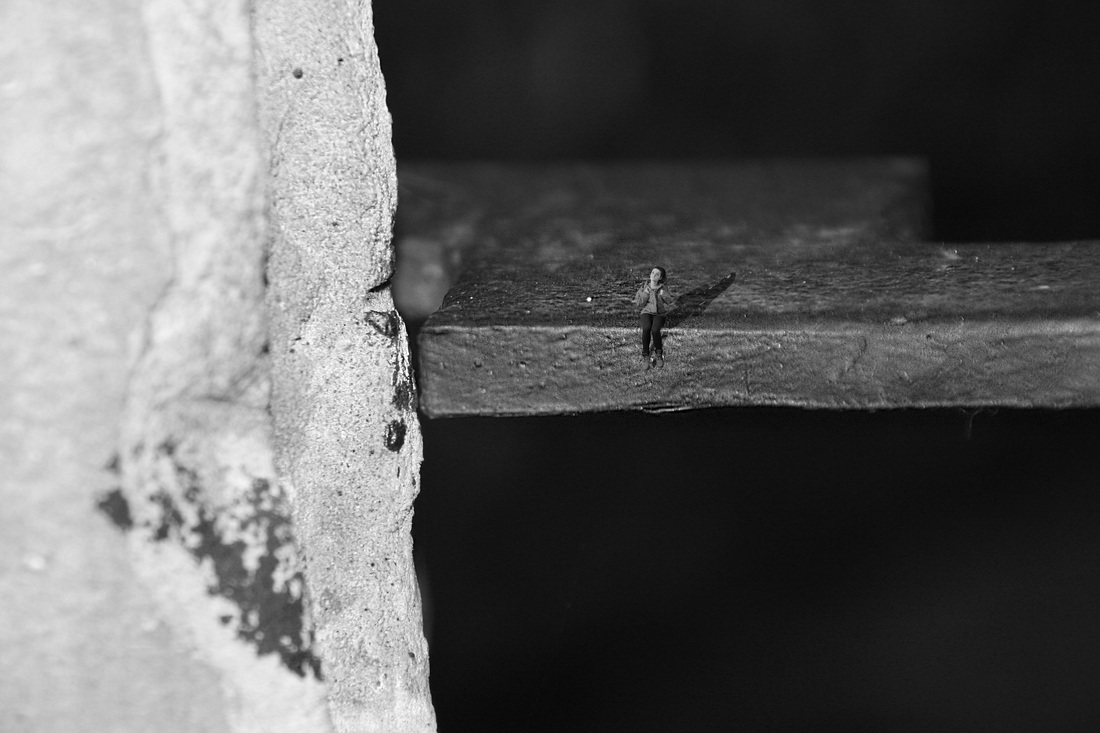
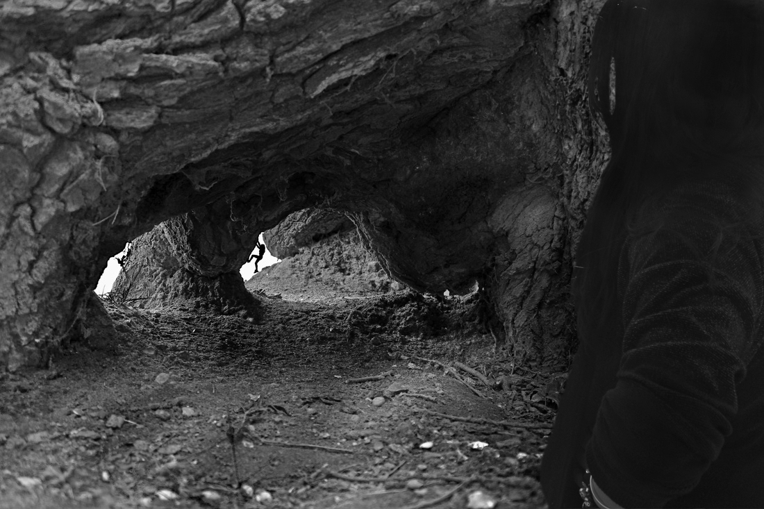
Another way to make the perspective of an image look even more obvious is to add another object. So in this image I experimented with including someone else at the front of the image as if they'r standing looking into the cave.
|
|
This image is similar to the one but I put the person on the other side of the to experiment with what looks better. As the light would be coming from a different angle, I used the dodge and burn tool to create different area's of light and dark.
|
|
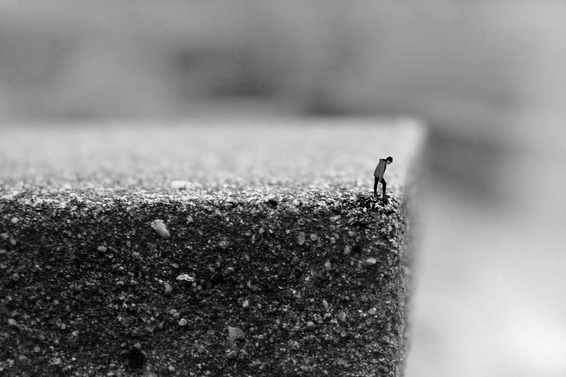
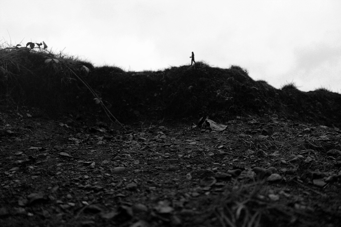
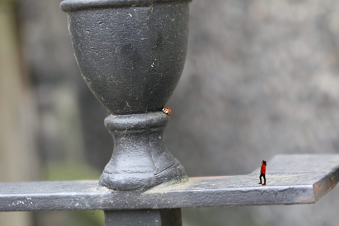
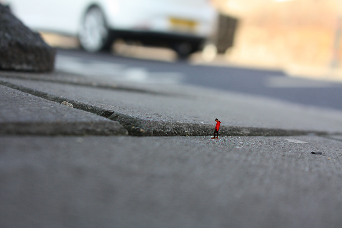
Using the cut out tool, I selected an image of someone walking and put it onto a picture of the ground. I think it worked well as you think the ground is a lot larger than it is because of how small the person is. I made the image black and white to make it look more like a silhouette against the bright sky. I also used the burn and dodge tool to make certain parts of the image brighter or lighter than it originally is so it looked more authentic. If I show the difference between the sizes of the two then it could bring in the element of a journey to be on the road with.
|
|
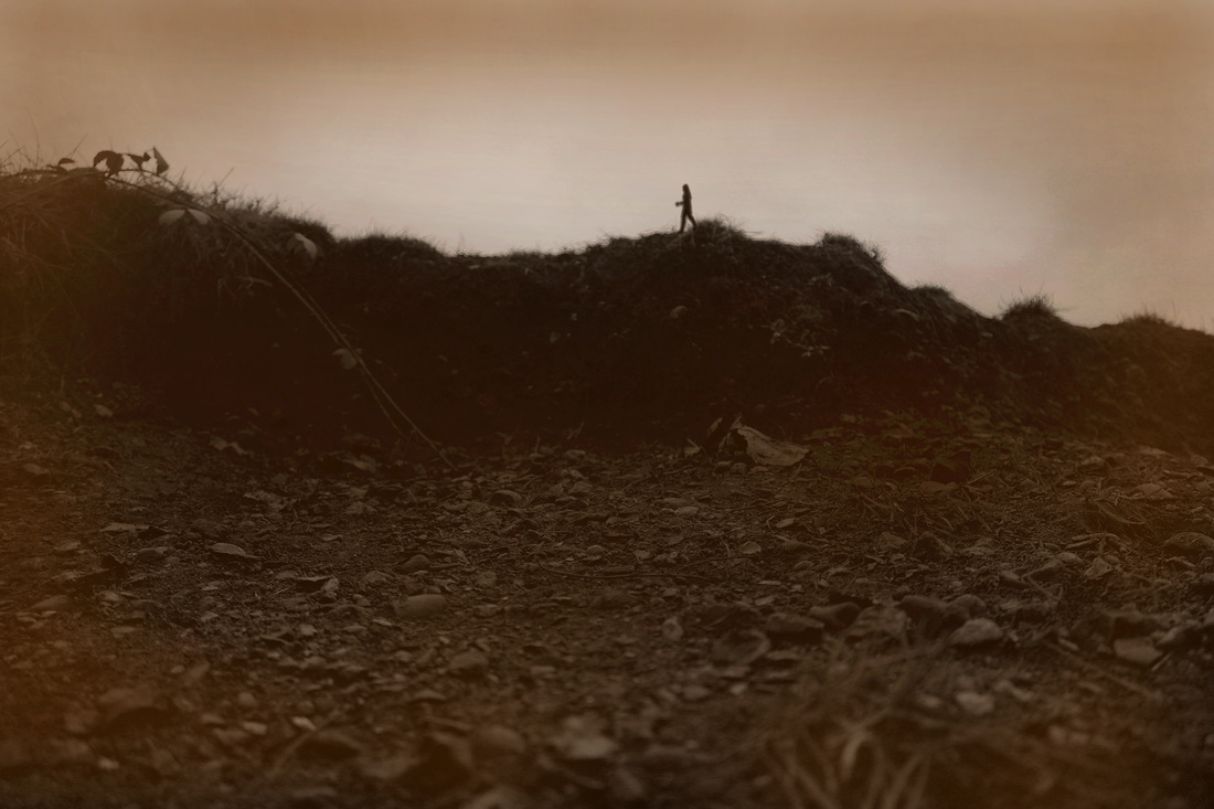
I edited this one around the edges with a brown colour to bring in the idea of mud and dirt. It made the image look a lot older and it creates a better on the road feel. I like the sky looking like it's becoming darker and the person is travelling. I think that the image would look better if other colours were included aswell as it looks quite dull.
|
|
This image turned out well because of the positioning of the lighting. I think that because the background is very bright and the sun is coming from behind (in front) of the person, it made it effective to turn the person into a silhouette as it contrasted against the background I like this image as it looks like the person is staring into the distance leaning against a large pole.
|
|
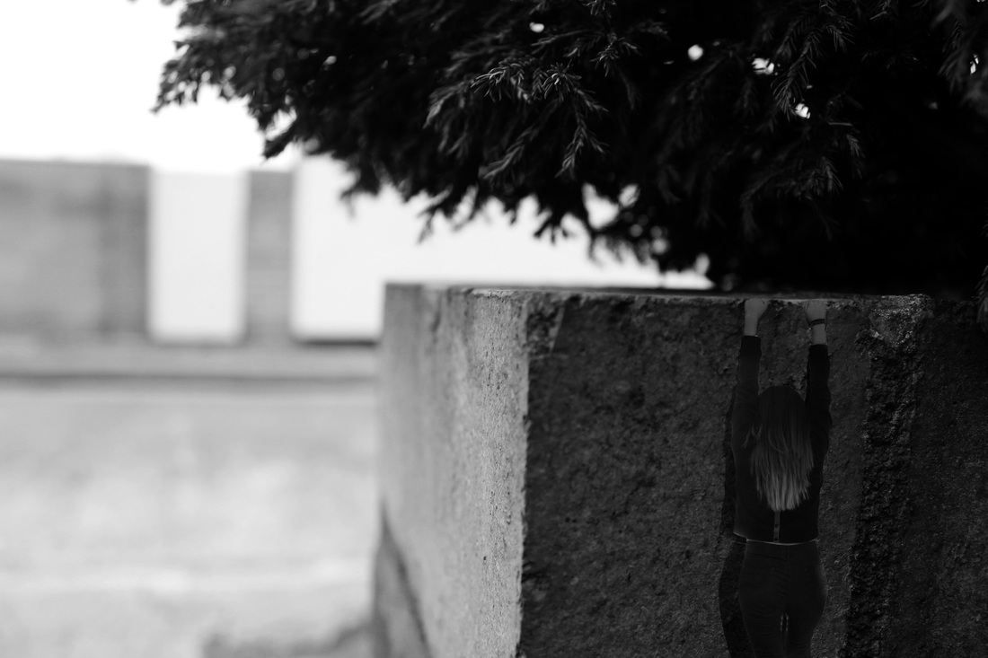
The area of the photo I wanted to use here was generally quite dark so when I was edited a person in, I made them dark also. This was to show that they were in the shadowed part. I used the overlay tool on photoshop to make a copy of the body and placed is underneath. This was to recreate a shadow of the persons body to make the image more authentic.
|
|
Because of the darkness on the main part of the image, I experimented with the burn tool on photoshop to darken a lot of the area's of the photo. This was to eliminate the contrast between light and dark so that the photo would be predominantly dark. I kept the shadow to show some that there is still light from above. I think the mood of this photo is quite mysterious as the image is dark and the person is hanging.
|
photoshoot 5: background experimentation 2
I re-took a series of images in a close up style with a macro lense. I did this because, after experimenting with the first photoshoots, I needed more, different pictures to photoshop onto eachother. The pictures are taken from all different perspectives to suit whatever the image is of.
photoshoot 6: foreground experimentation 2
I took these so I would have various poses to experiment with so that I could photoshop the body onto my macro photoshoots with a variety of choices. Some came out quite blurry but I am going to take more for my final piece where the model will be doing different poses to suit a lot more photos. Also, I would want the model to wear more one colour because it makes the image look better.
|
These are the two images before I edit them together.
I chose these two images because I think that they wold work well together as the person is walking in the right direction to fit. I want to edit it to show the journey of a person travelling and this image could show the dead end. I had to blur and change the brightness of the image for it to fit in place and look like it was part of it originally as the two image have different lightings.
|
|

|
|
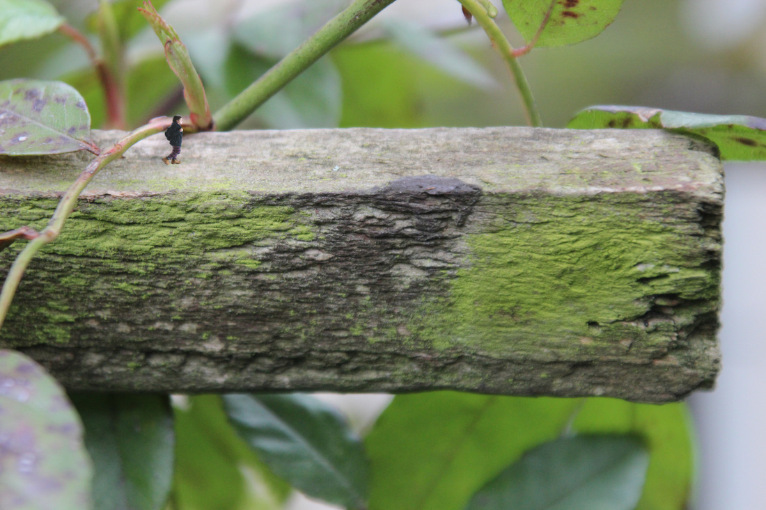
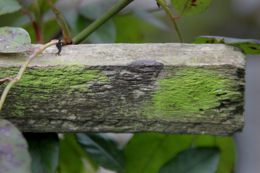
1) This photo that I edited on photoshop came out to look to bright so I wanted to tone the colours down to make it look more realistic.
|
2) In this version of the photo I made the green moss even more saturated so and the background darker. This made the whole image appear as if it was taken at a later time of night. However, I like that it illuminates the wooden stick as it draws the eyes attention to it more.
|
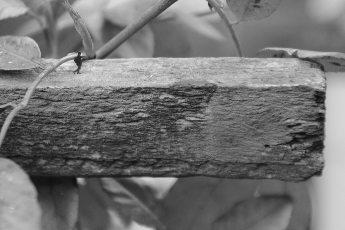
3)I changed the picture to black and white to drain it of the colour so it had a more realistic effect. For the image to look more realistic I blurred the background aswell to make the depth of field changed.
|
|
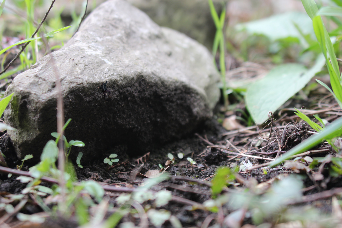
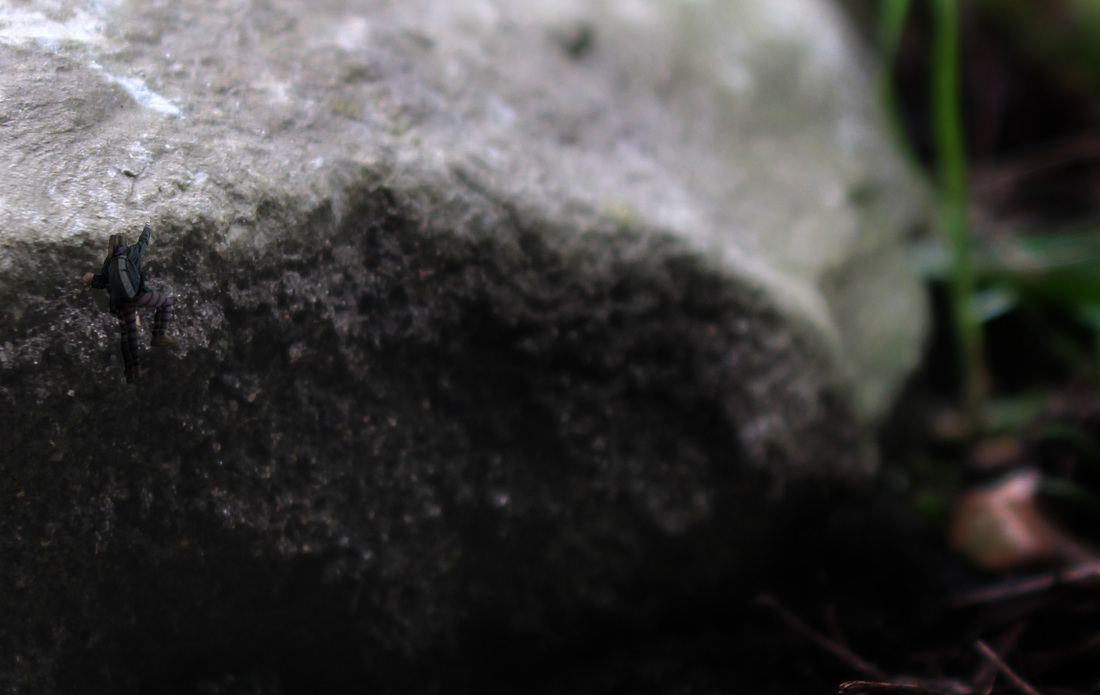
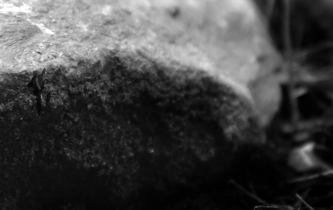
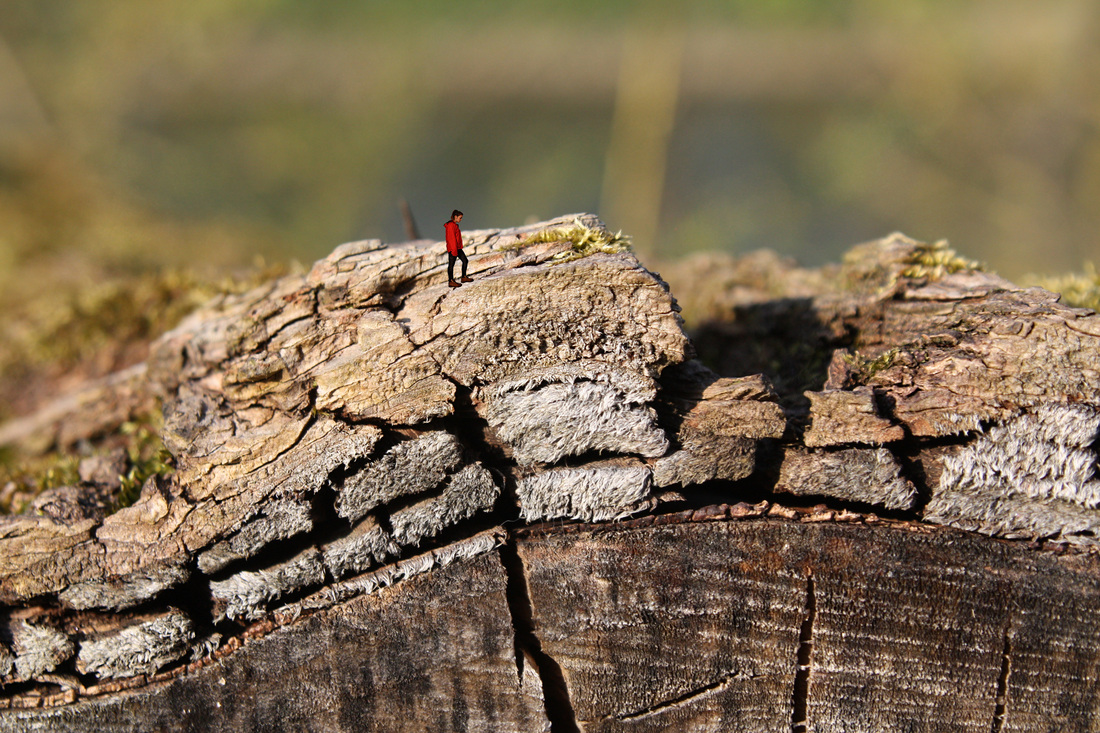
1)This zoomed out image has the person in aswell and it is still difficult to see but it shows the entire image before it has been cropped and hopefully makes the two on the right appear to be larger than they are. This original image was hard to work with because the leaves and mud also focused but all at different points.
|
2)I edited the brightness of the top of the rock to make it a darker shade than it was originally.This image makes it hard to tell if there is a person in it so it was unsuccessful however I think it is a good example of showing how zooming in and changing the size of a person can make an image look a completely different size.
|
final piece photoshoots
I took these photos with the intentions of using them of using them for my final piece. I used a macro lens and focused on things that had interesting textures. I chose to have photos that have a lot of texture in them so that when I photoshop someone into them it creates a complete new image. Some of the photos such as flowers are more obvious and it will not be as mysterious as the others about what the picture is showing. The background of the photos are all burred.
I took these to use in my final piece to go with the macro photos. I wanted to model to have a variation of poses that I could choose from.
To acheive the look I wanted for my final piece, I had to go through a few processes:
1)
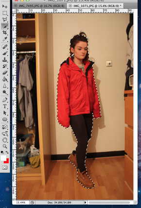
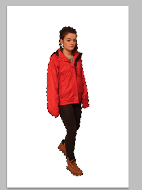
1) The first image shows how I took my original image and use the Quick Selection Tool to go around the model. I also used to to deselect any parts I didn't want.
|
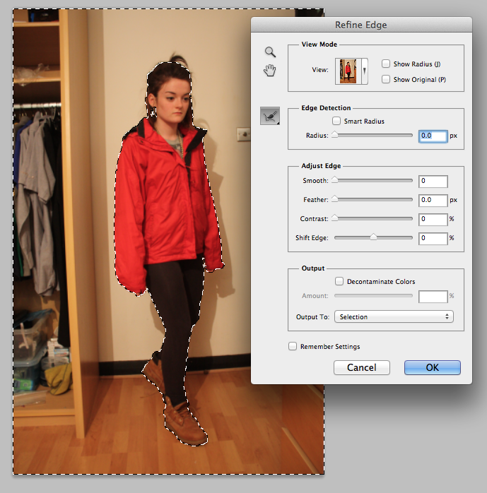
2)
2)Then I refined the edge of what I had selected to ensure that what I selected has very neat edges. This also helped to make everything smoother.
|
3)
3) Then I clicked Select Inverse on what I had selected which meant that I was in control of the model only. I cut the background out to check that everything is the right shape and size. Then I clicked copy.
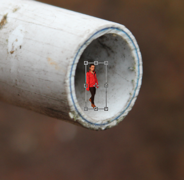
5) Once the image is pasted it is too large so I held shift down and made the image he right size. I also held down ctrl, alt and cmd to manipulate the model onto the macro photo in different ways.
|
4)
4) Then I chose the macro image that would go with the models position and I clicked paste.
|
editing process
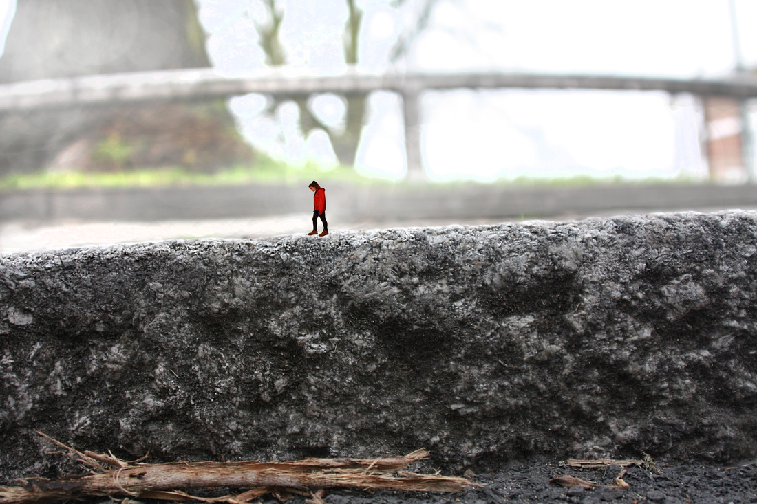


final pieces. showing a journey