|
To further look into distortion, I want to see how the texture of the face can help enhance the appearance and alter the face to make it different. I think that the colour or lack of colour on the face would change how it is perceived therefore I want to experiment with different colours also to see if it alters the face in any way. I want to experiment with different liquids of different consistencies to see how they make the face look different or out of place. I also decided to briefly look into doing landscape photography to see if it would have a similar effect on my research.
|
anonamous artist
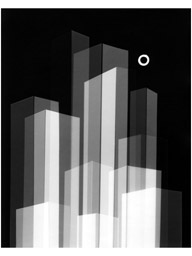
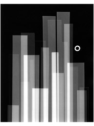
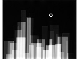
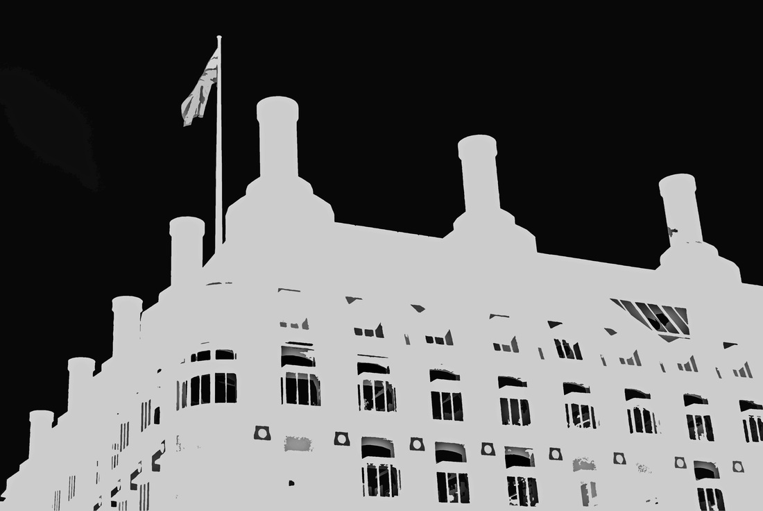
I found these pictures of a cityscape and they way it had been edited really interested me. I like that some of the buildings were translucent and it changes as the layering of it progresses. I think it shows distortion because the images still show buildings but it has been changed so that it is not obvious straigt away. Also the idea of the moon is effective because that has also been altered to look different to what it usually would however it still has the shape remaining. I would want to experiment with the cityscape because I think it would be an interesting area of distortion to explore. I want to see what it would take to make a bulding still look interesting and dimensional in black and white.
|
|
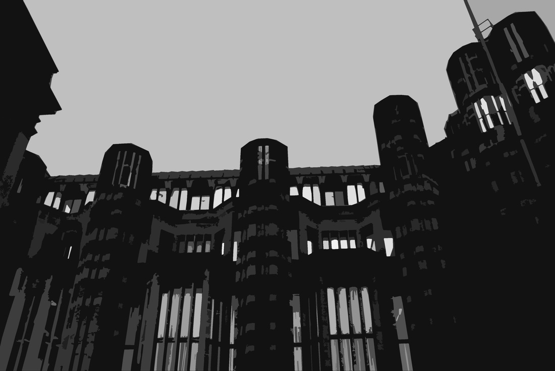
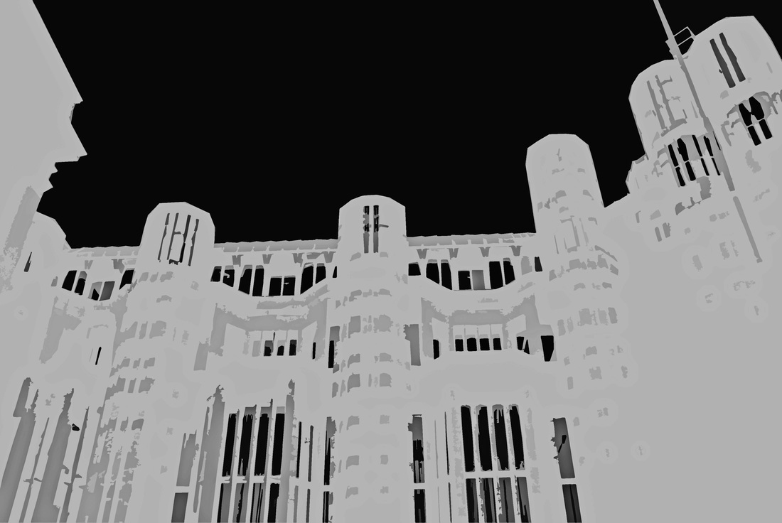
When I did this photoshoot I went around London in search of buildings that had interesthing shapes. I think that the images I chose were the most successful because of their simplistic shape yet they had alot of detail which mean that when I was editing the images and transforming then, they still looked interesting. I inverted the colour of all the images once they were done to swap the black and white buildings and background. This is because the artist that I got the inspiration from has only black backgrounds which I like more because it creates a more intense mood. I personally prefer all the images on the right more because it looks more abnormal and different linking to distortion.
|
|
|
Nick Frank.
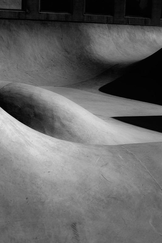
He is a very enthusiastic photographer who specifically loves architecture. He taught himself how to take pictures since 2010 and manages to capture objects from a unusual view, giving them a whole new perspective, which is why I thought he would help me develop photographs to do with distortion. He gets his inspiration from everything around him and is known for using the dodge and burn tool to create contrast in his images. He has various shoots I thought I could benefit from as they're all different but show distortion in some form.
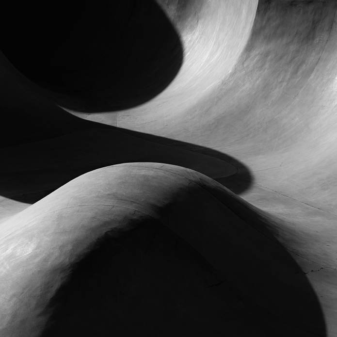
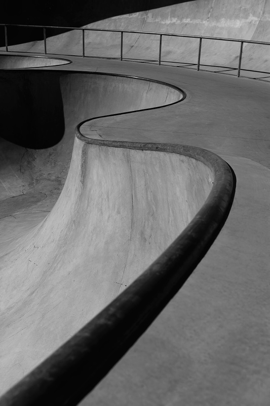
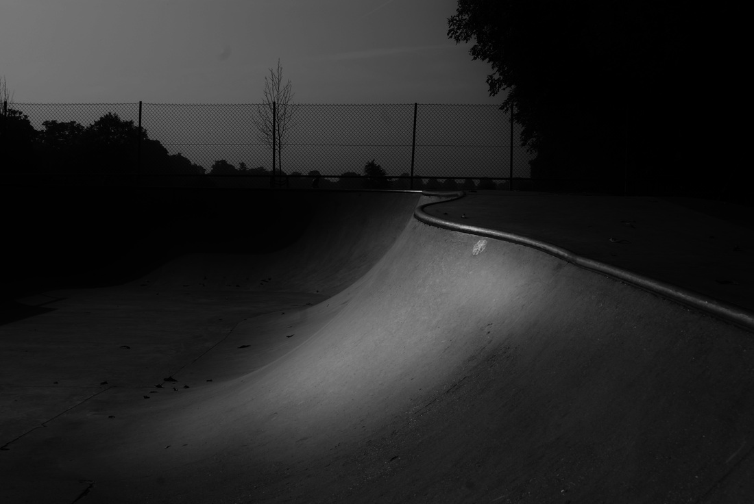
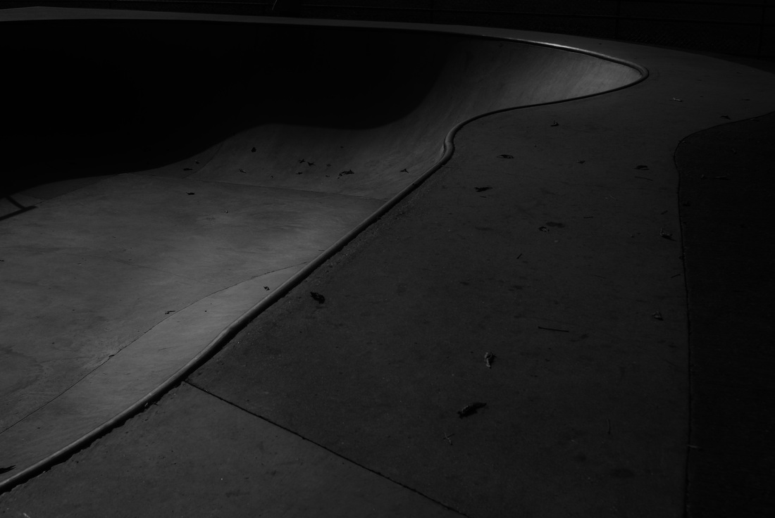
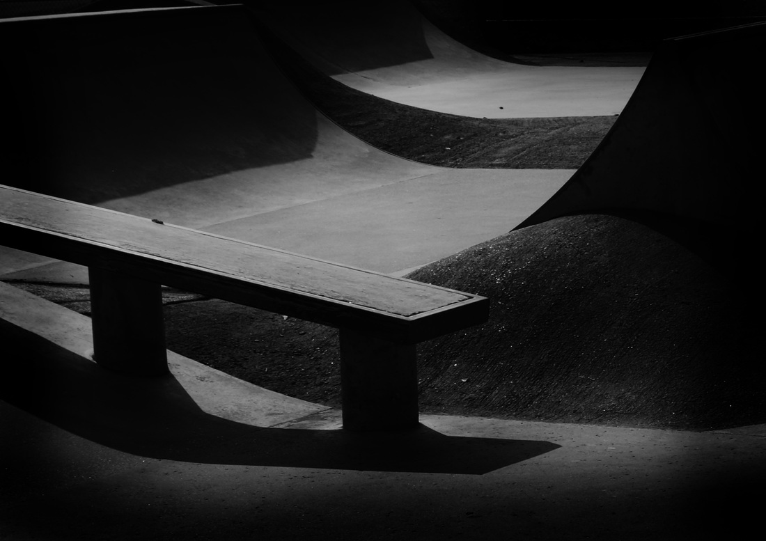
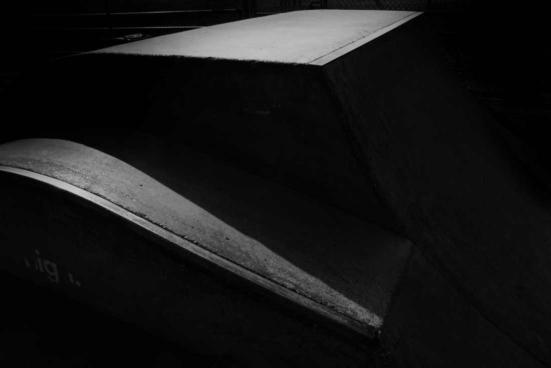
Concrete Canyons - Nick Frank said he got his inspiration from the grand canyon and saw similarities in the shapes. I liked the idea of using pictures that look like something that they're not as this could be interpreted as many other things before realising its a skate park. I was drawn to these images because you cannot necessarily tell what some if his images are because they also look like lover hearts.
Concrete Canyons - Nick Frank said he got his inspiration from the grand canyon and saw similarities in the shapes. I liked the idea of using pictures that look like something that they're not as this could be interpreted as many other things before realising its a skate park. I was drawn to these images because you cannot necessarily tell what some if his images are because they also look like lover hearts.
Nick Frank exeriment 1
|
|
I tried to replicate Nick Franks work was closely as I could which I found quite difficuly but that was mainly due to the skate park. Often I found that it was the backgrounds of the photographs that ruined them as they were very busy. However, I do like the lines that the photo created as it made a similar effect to Nick Franks. I think the shadows and lighting went really weel because his images are very dark and have black shadows and harsh lines which is what I tried to do when I edited my images as I made the as contrasted as possible. One thing that was difficult was the angle of the sunlight which obviously made strange lines appear - however this sometimes proved to be affective.
When I was editing the final 4 images I used the dodge and burn tool to create areas of light and darkness. This enhanced the contrast of the images. |
These four images stood out to me because of the shapes that were created. The first two are very smooth and the line of the metal follows through the image which makes the eye move along the curves. I think that these images were successful. Then I was editing these images I made the contrast extremely high and also enhanced the shadows. The last two are very straight cut and more edgy but I think the element of distortion is thrown because of how unusally shaped the ground looks. Unlike Nick Franks work, you can tell what these images are of, but I like that they still do not look like a stereotypical skate park because I wanted distortion to show through in some form and I feel like here it has in terms of it not being what it seems.
Nick Frank experiment 2
|
|
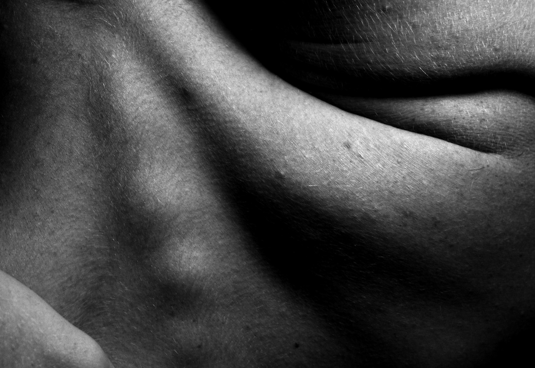
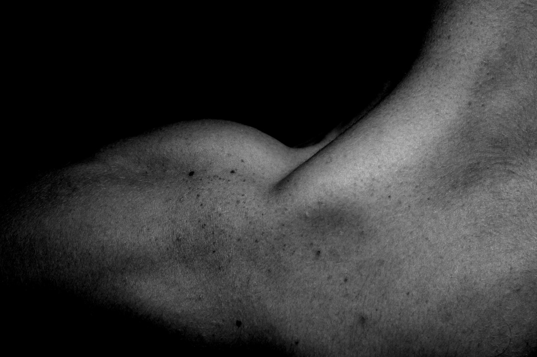
I got the idea of this photoshoot after I looked at Nick Franks concrete canyons and also tries to replicate it. Because of the uncertainty and bumpiness I think this photoshoot went well because it many of the images are unidentifyable as bodies. This was what I wanted to acheieve because I think if something is successfully distorted then it will make someone look twice to try and figure out what it is. i decided to make the final photos black and white to continue Nick Franks style because and again used the dodge and burn tool to create darkness and highlight random areas.
I was overall happy with the outcome of my final images from this shoot because I do think that with some of the images you do have to take a second look at what it is. I used two different models because I wanted a variety of images and I think that displayed together looks even more interesting because you can't tell what parts of the body are. |
|
|
lighting distortion experiment
|
|
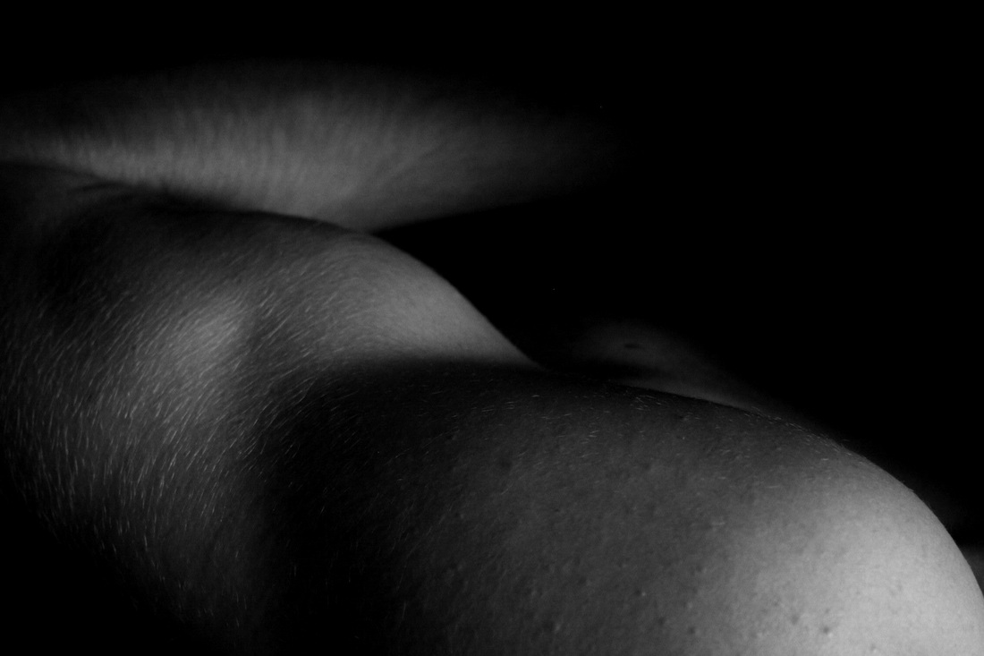
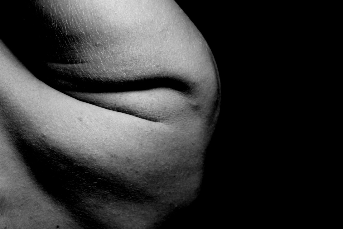
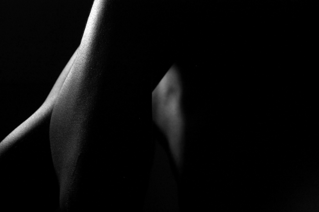
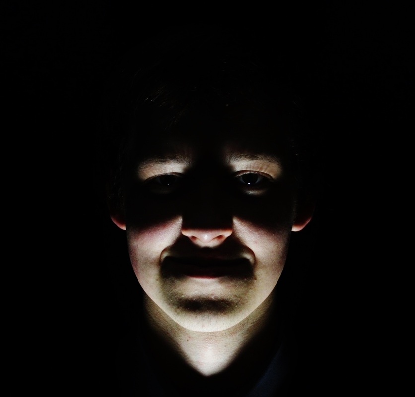
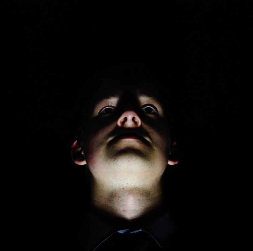
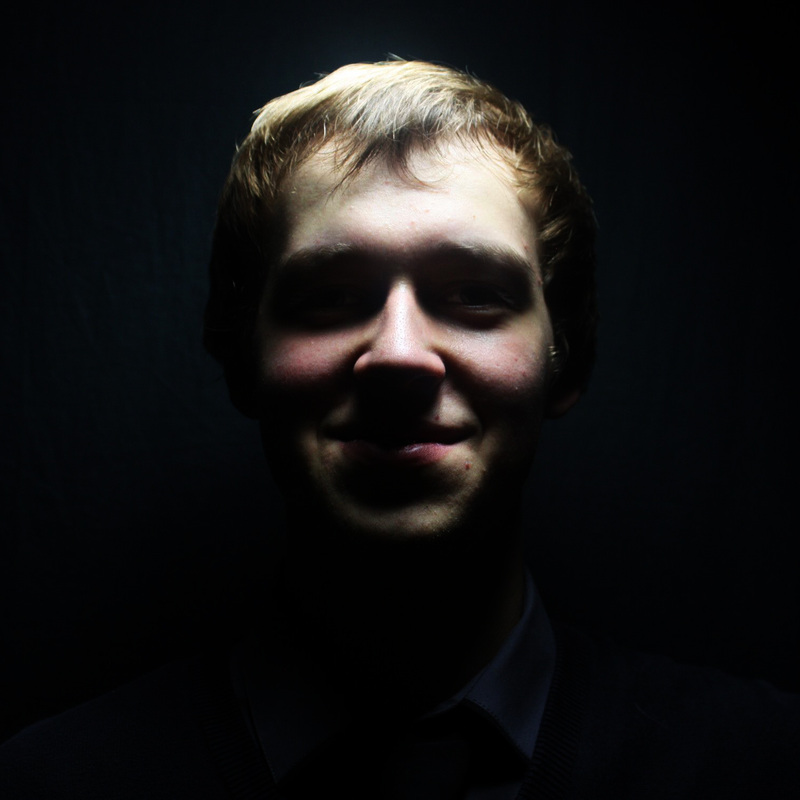
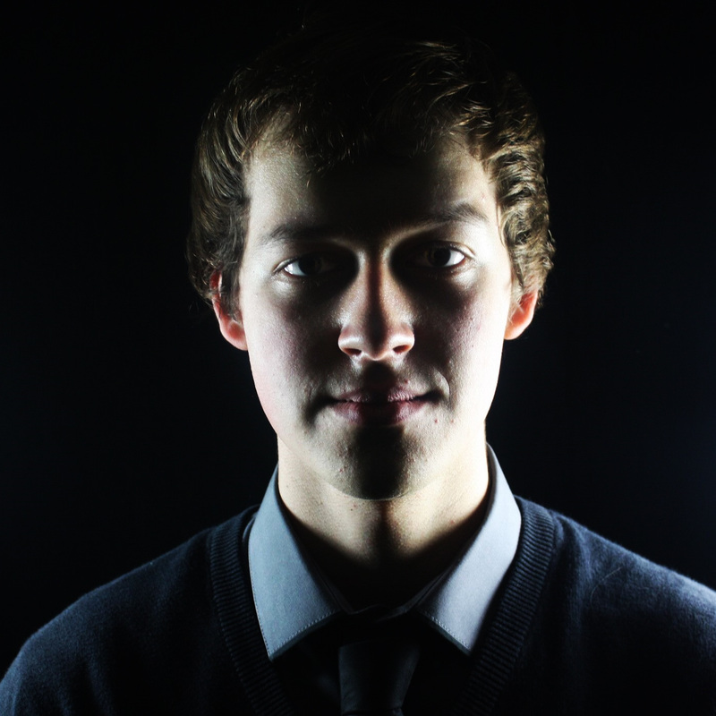
One of the basic things I have to consider when experiemting with distortion is the lighting. I did a photoshoot to see if the different shadows could create any usual shapes because when I go on to do different photo shoots I want to know which lighting would create the right effect for what i'm doing. I think it was effective because of how different each face looked depending on the lighting. |
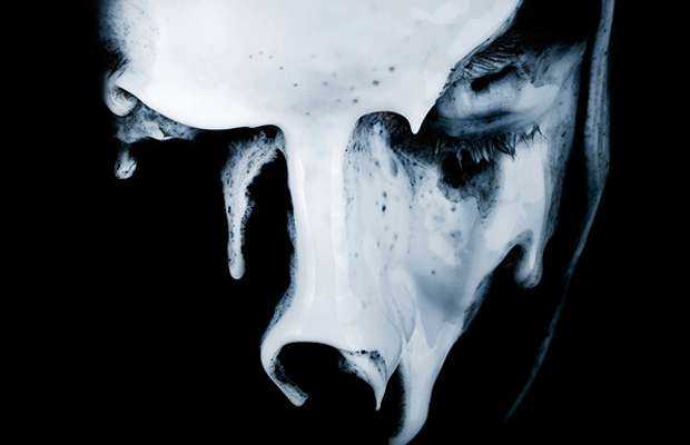
Nadia Wickers.
I liked this work alot because of the many different textures that she uses. I think that the eyes are really important because they, in the first and last image, the eyes are cadireectly looking into the camera which I think really captures the emotion. With or without the eyes the images are very powerful because the emotion is still shown through the texture on the face.
Nadia wickers experimentation
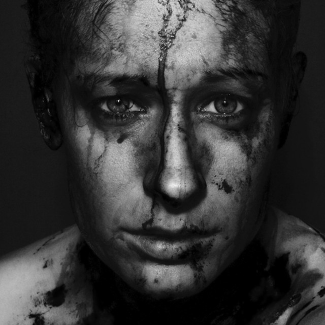
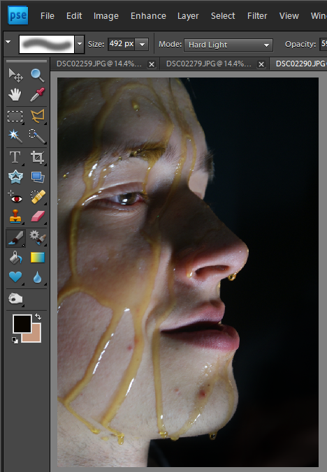
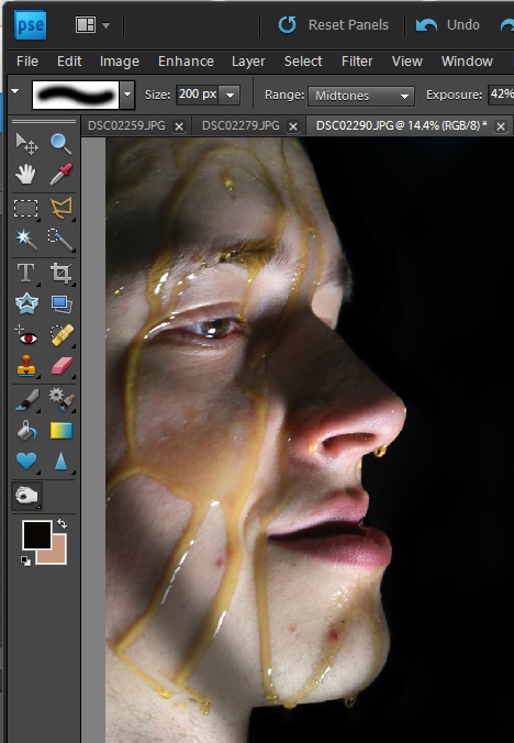
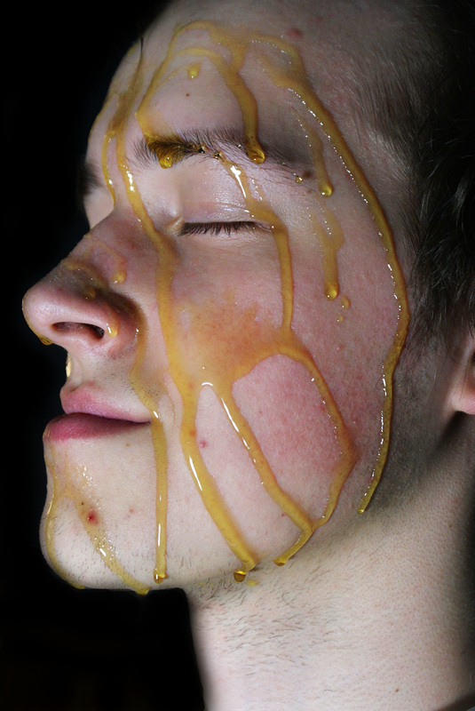
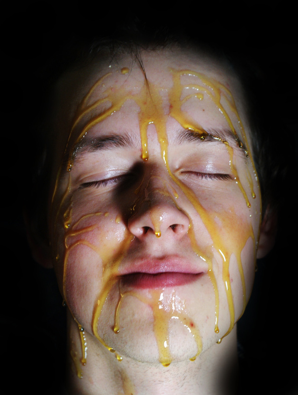
Golden Syrup.This golden syrups shoot was done because I wanted to experiment with a runny liquid on the face to see how it effected the face of the shape in any way. I think that the images came out well but the shoot was unsuccessful as if does not serve a purpose. The shoot would have been more successful if there syrup was all over the face and had made it look more alien. One thing that did turn out well was the droplets on the face which I think create a interesting new skin texture. The part where the cheek is mostly covered shows how the fully covered image could look.
|
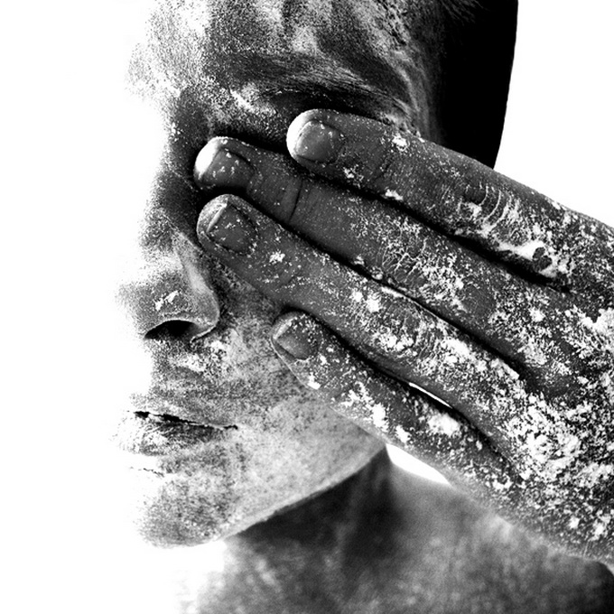
I did a mini experiment with flour also but it was not the right consistency and I found that the golden syrup looked much more effective. I like how the flecks stood out but I do not think they make the image look distorted in any way.
|
green paint photoshoot
|
|
On its own the metallic green was not much to work with as its texture was very dry and did not go around the models eyes. However, it worked very well when contrasted with the purple paint photos because the two colours work well with each other. When I did this shoot I took pictures from facing the front and also side on because I thought that overall it would be useful i had many angles to work with. It did come in handy when I ended up blending in the purple.
|
I like this photo because of the symmetry that is being created through the eyeball. The effect is quite illusional and I think it has a nice composure as you look at the centre first and then the creases also create lines to follow. This image is the same pic twice compared to the other which is two different images. I think what made this photo work well was the flaking of the paint because on the lips and around the eyes the paint started to take shape of the models face and go into the creases and also flake. This creates a more rusty look to the images and therefore made me think of metal and mould.
|
This image contains two separate photos therefore it is not symmetrical like the other. The overlapping of the eye does not have the same effect on this image because they do not line up well. Therefor this image is not as neat as the other however I still like the unevenness of the image and how the features are not in line. By using the difference tool on photoshop it created the metallic blues, purples and pinks that run through the centre of the image which I like as it adds more colour. If I was to improve anything about these images it would be the background as I think it is very untidy.
|
Purple metallic paint.
|
|
I then went on to do the same photo-shoot on a different model but in a different colour paint. This allowed me to work with the two images on top of each other and create new colours and textures by layering them. The outcome of this photo shoot was very messy but I think that when its layered onto another one mess goes away.
|
|
When I was editing this image I thought it would be best to join all the eyes of the models together to make sure that the photos were as symmetrical as possible. However I did not mirror the green model which is shown in the hair being mostly on the left side of the image. I think the photo is eye catching and quite alien looking because of the direction of the eyeballs and the combination of colours. Again the background of this image is something I wish I worked on but it did not look effective all one colour.
|
Red paint experiment
|
|
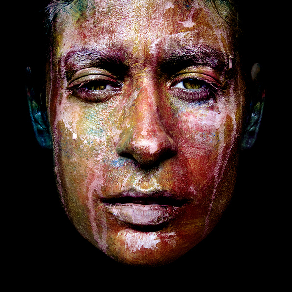
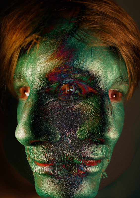
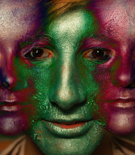
The green metallic shoot inspired the following photoshoot because I decided to try another colour of paint and then edit them to see what effects it could create now that I knew what the most effective way to edit them would be. I decided to do this photoshoot to experiment to see if this playing around with the colours of a models face could effect the shaping of it. By painted the whole face on colour it eliminates the natural tones which makes it more like a blank canvas. I think that red was a good colour to start with as it s bright and eye catching and using the negative version of it would be very bright also. I wanted to change the texture of a persons face but use the same/similar effects as the images above to see if they would be more successful.
|
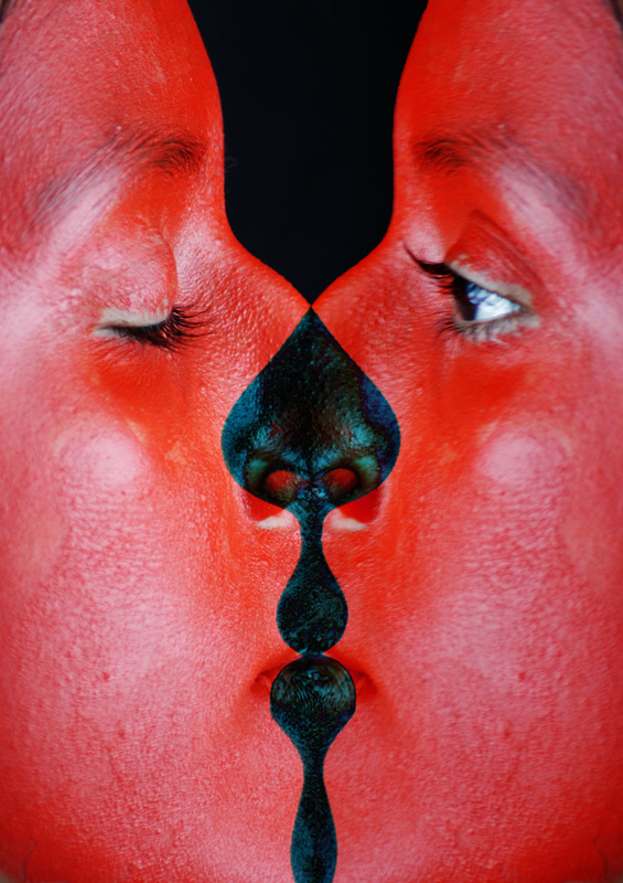
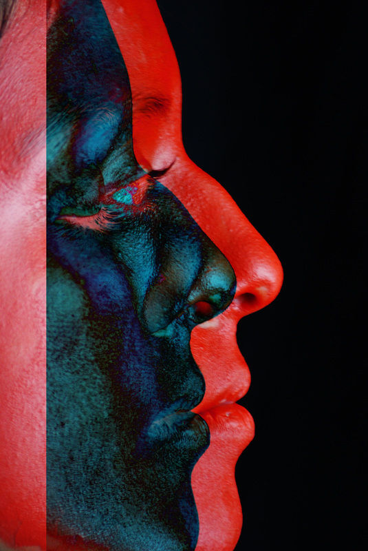
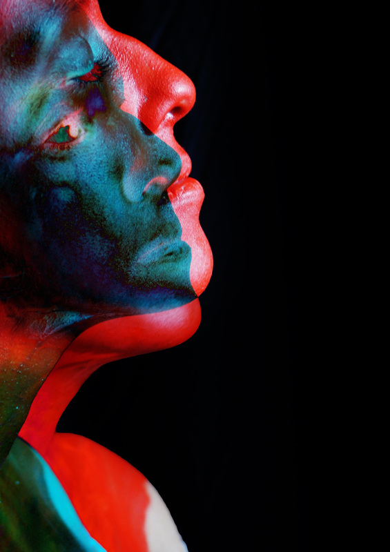
I like these images because of the contrast in colours. I liked the outcome and I think it shows distortion because of the new navy colour that it created. I think it created an eye catching image and has a uncertainty to the mood of the images. When I was choosing which photos to overlay on top of each other I decided to work with images of the model with eyes open and closed because I thought it showed diversity. I particularly like the images that have eyes both open and closed because they create more interesting layers and make it obvious that the photos are different to each other.
|
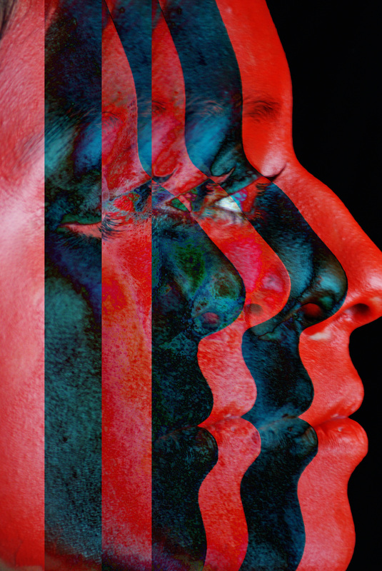
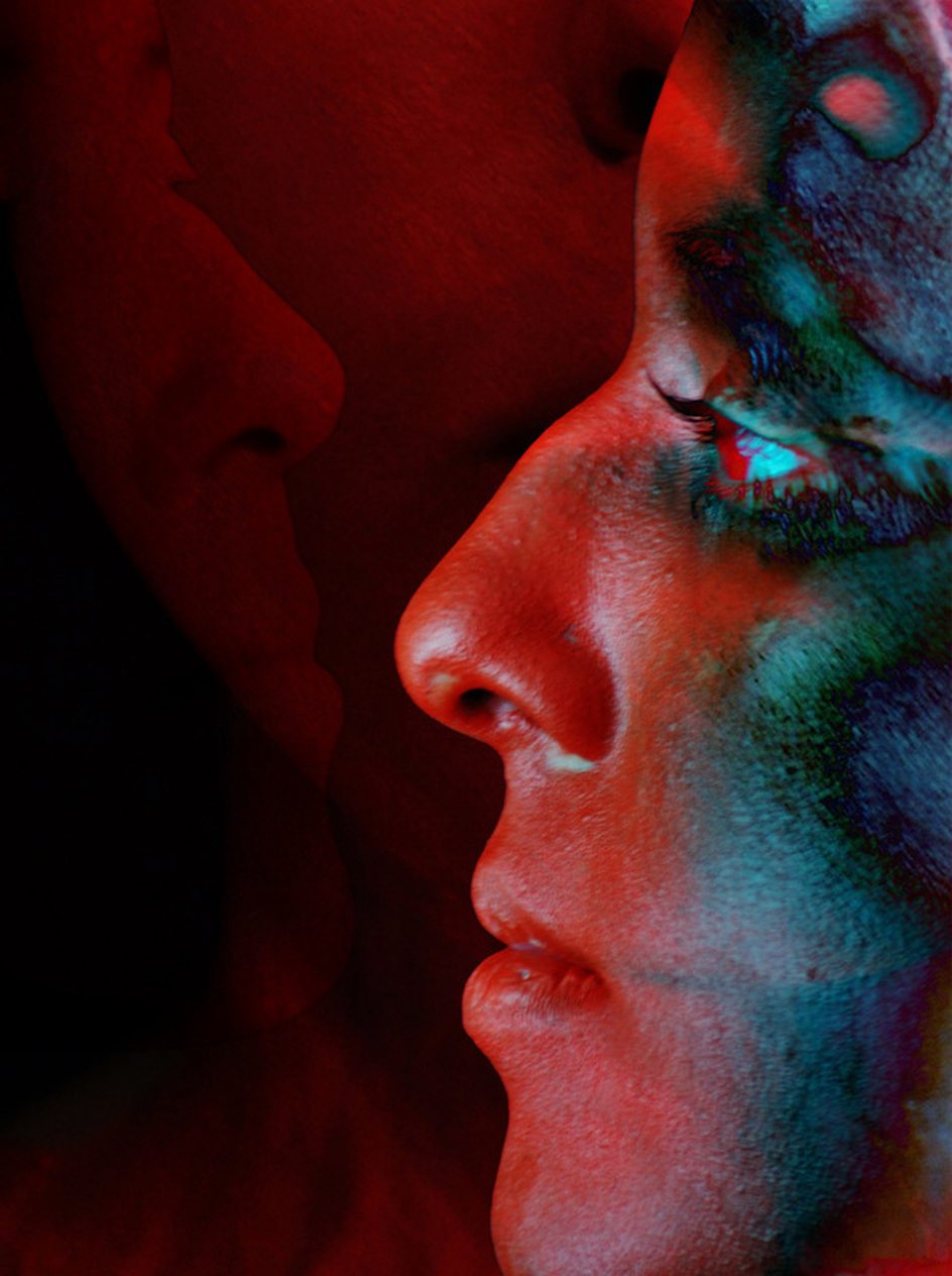
3 Faces
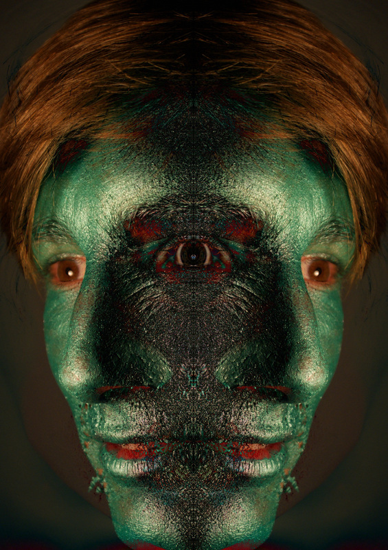
This image was my favourite outcome of the bunch because of how it shows the most layers. This image has a very strong rule of thirds running through it which I think makes the picture very alive because everywhere you look there is a face to take in. I like the left face because its moulding into the middle one and has become a part of it. The face on the right is the main focus and also you can see a little bit of the middle face running through it such as the nostril. The new blue-green colour that appears when the difference tool is used on photoshop made me think of mould and I like tat new textures have been created. Because the red colour of the face was so successful, it has made me want to experiment with more textures on the face to see if they can make distortion look more interesting. |
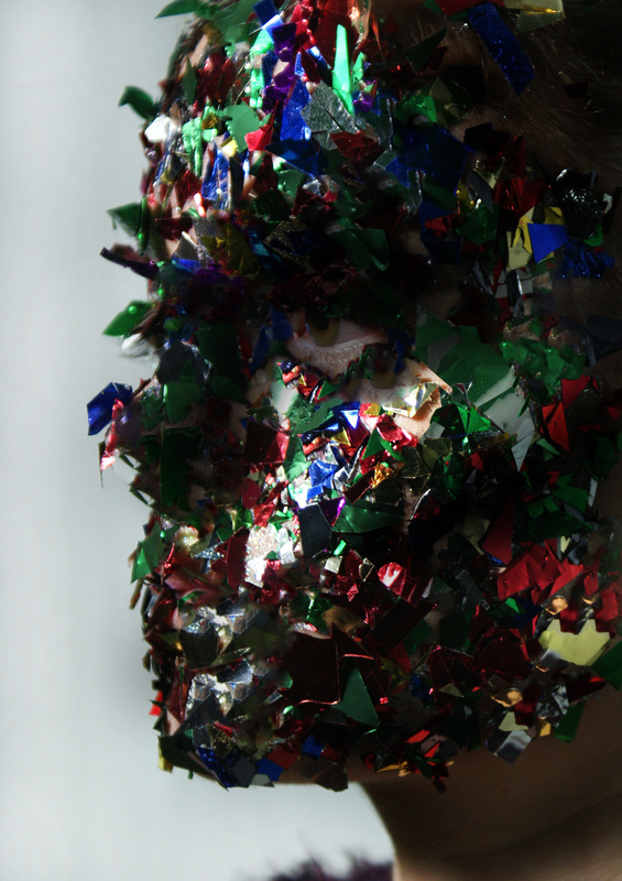
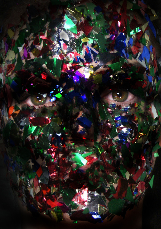
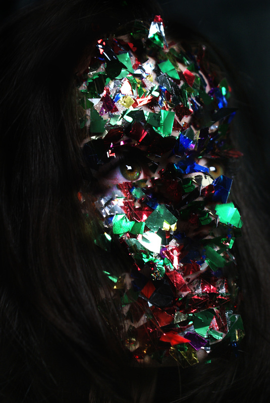
Glitter.
|
|
This shoot was to concentrate on the texture of the face by putting glitter on the model because it has more texture than paint or honey. I enjoyed doing this photo shoot because it was interesting to see the way the light reflected off the different pieces of glitter even though this made it difficult to find the correct lighting for this shoot. I think the closer up versions of this image look much better because they show the flakes of the glitter and give it more depth.
|
|
|
|
