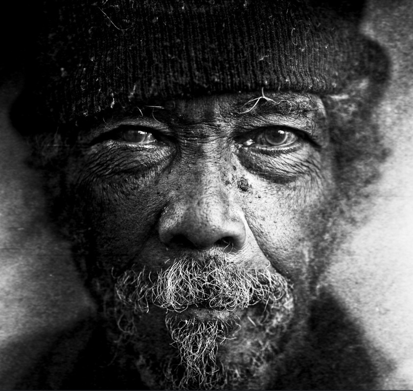
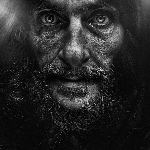
Lee Jeffries
When I started looking at Lee Jefferies work I was mostly drawn to the sharpness of his images. Its unlike the other black and white work I have looked at because the quality of his images are so fine and combined with the perfect lighting. I think his work links well with texture therefor it sums up the previous work I have done because I wanted to include that in the images as I did not want them to look flat and simple. The work I looked at of his was called 'Homeless' which I think would be interesting to experiment with.
Experiment 1
|
The idea behind this photoshoot was that I wanted to recreate Lee Jerefferies's images in my own style. Because I looked at other black and white photography with much more intense looks, I thought it would be interesting to strip down the models and take away everything that was on the face. Initially I liked the idea of not using as much makeup and then towards the final shoots it recurred more but gave the effect of less. I think that this first photoshoot was unsuccessful due to the fact that I did not attempt to use makeup. This is because I wanted the first shoot to be edited on photoshop to see if the effects would be as useful.
|
|
Experiment 2
|
|
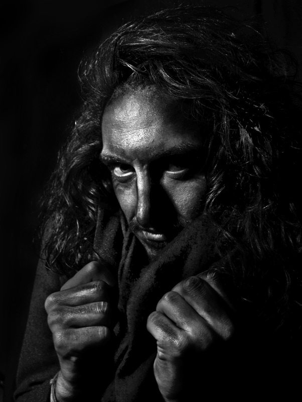
This photo shoot was the second time I tried to work in the style of Lee Jefferies and I think it went well because the make-up stood out really well on the model because of the lighter skin tone it mades the dark makeup look more aggressive on the face. Also the texture of the blanket in the photos added some more character. I experimented with various different lighting because they all created different looks and I also changed the composure of the image a lot because they created different effects in each photo. I wanted to keep the background light in order for each of the photo shoots to look different to each other because I am going to be working with a variation of background colours because when I present all the images as a final I want them to have a mixed background.
|
These images worked well because of the darkness of the images which meant that when I went on to experiment with the dodge and burn tool, it really made the brightness of it look quite rough. However the quality of these images are not up to standard. I did like the texture of the material draped around the model because it added definition to the photos.
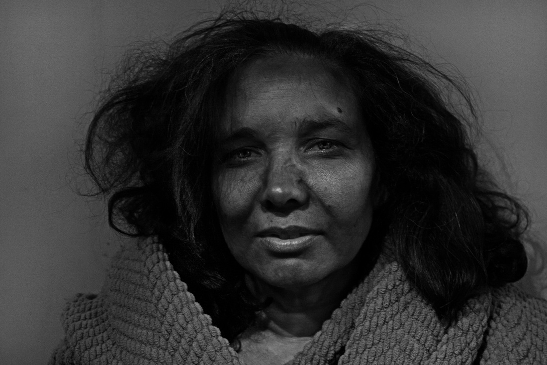
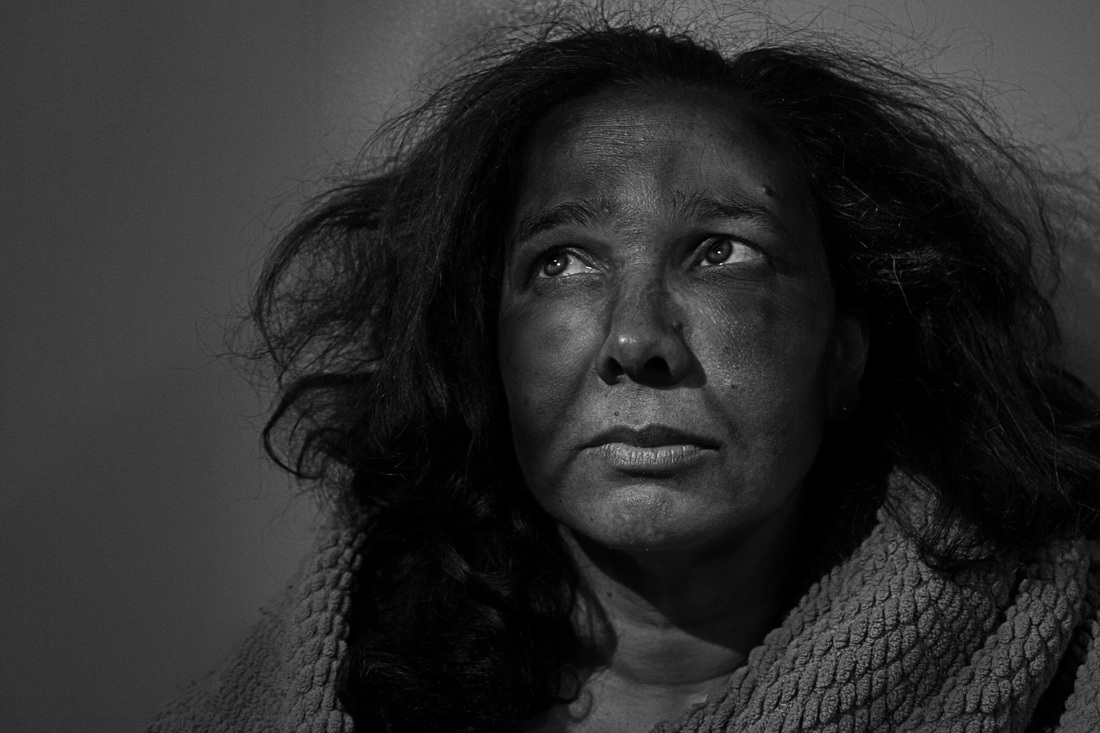
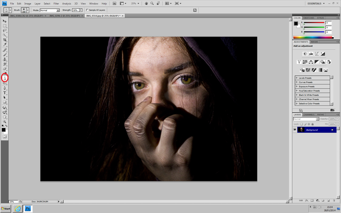
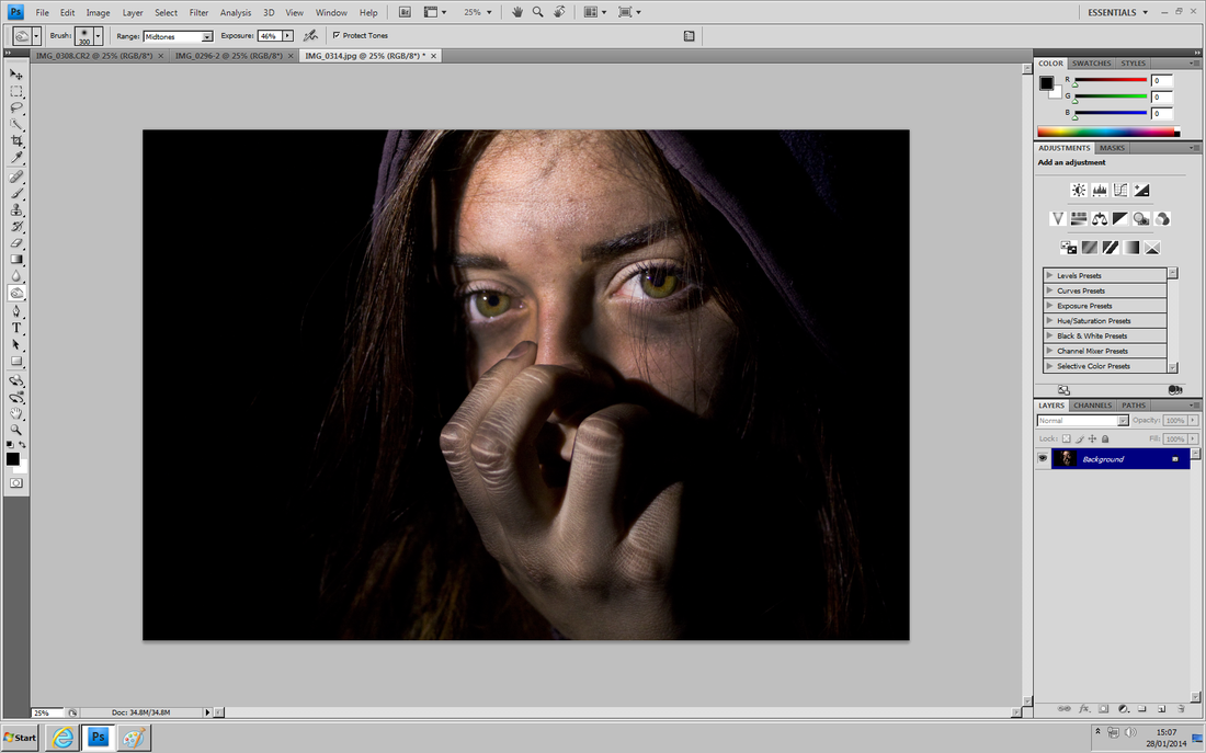
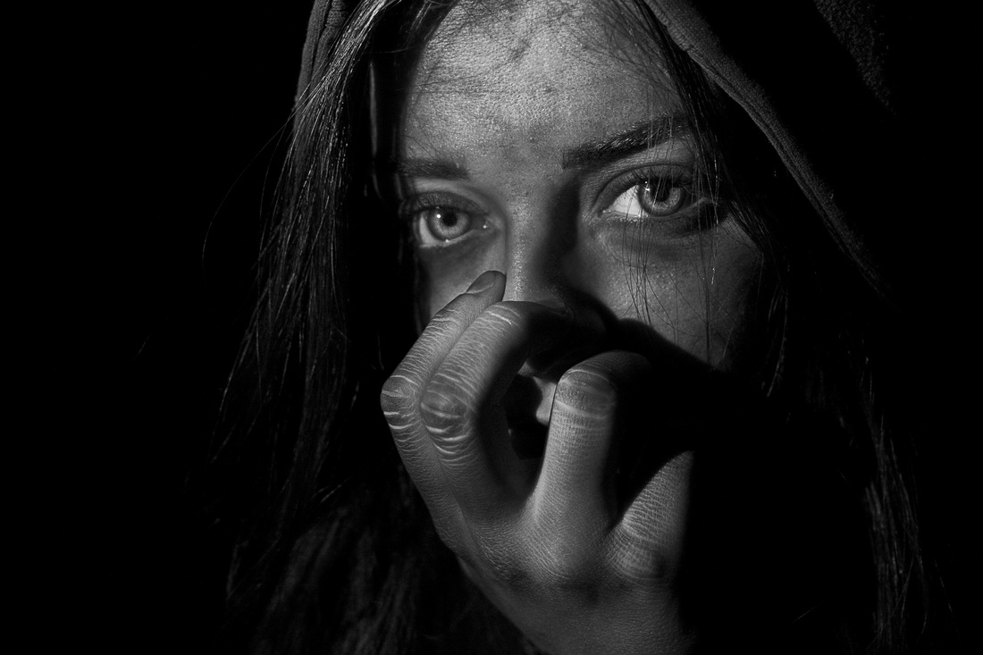
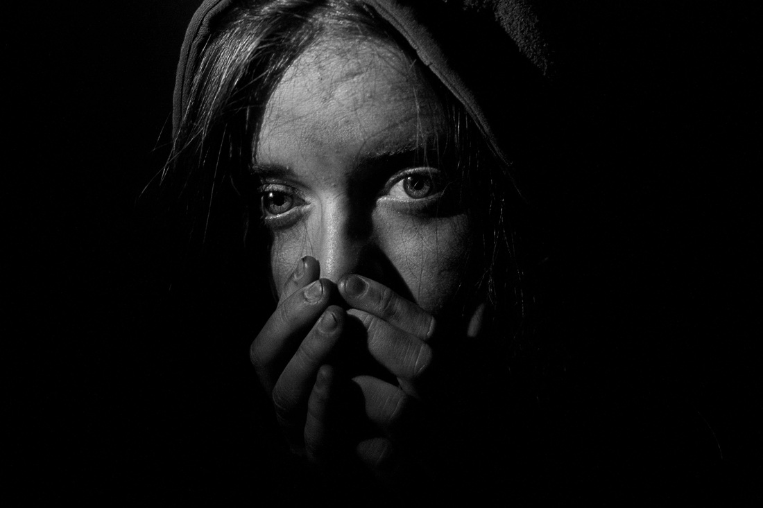
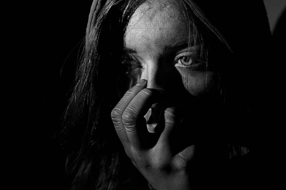
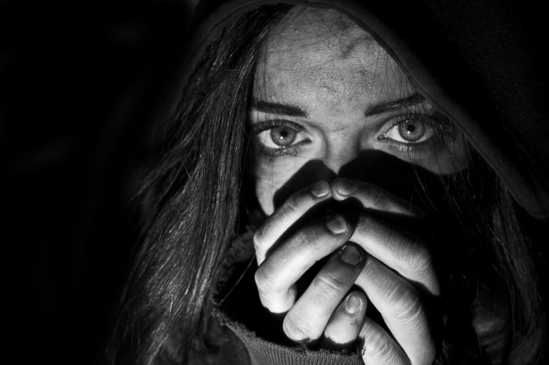
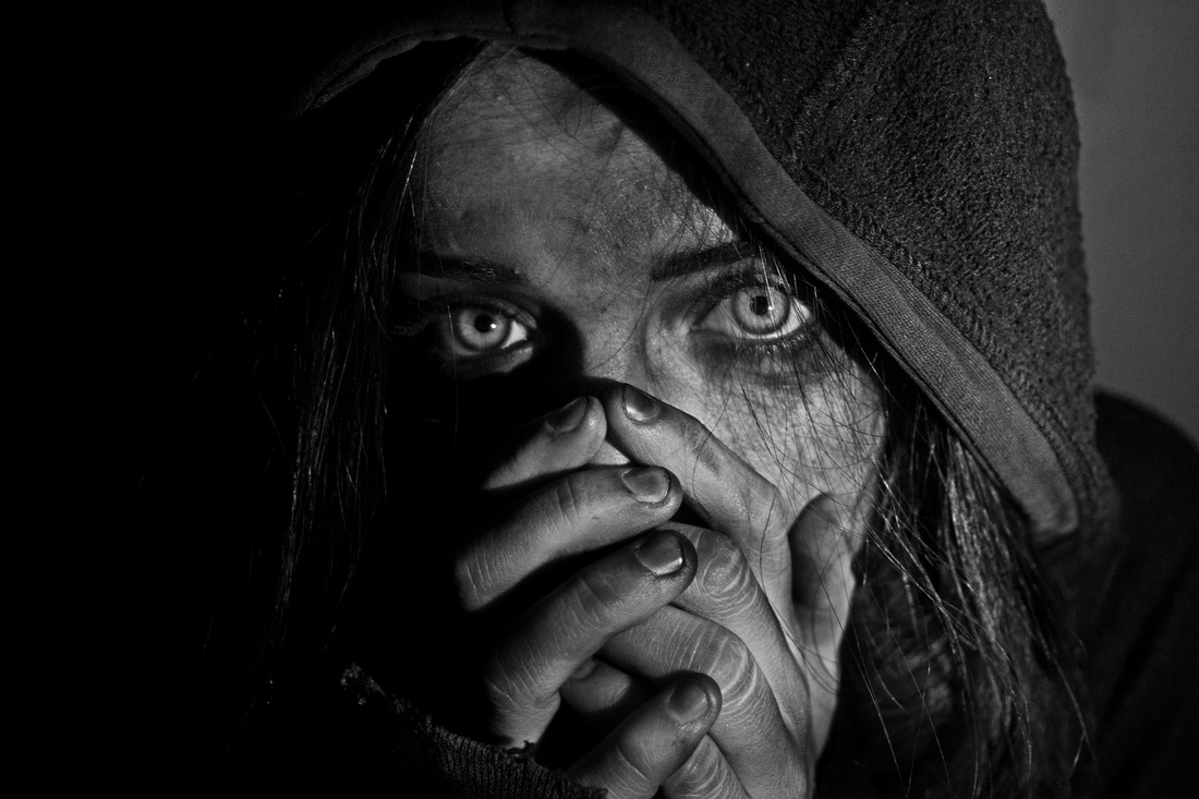
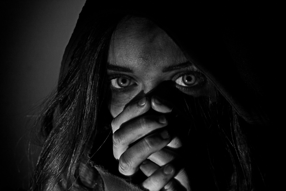
experiment 3
|
|
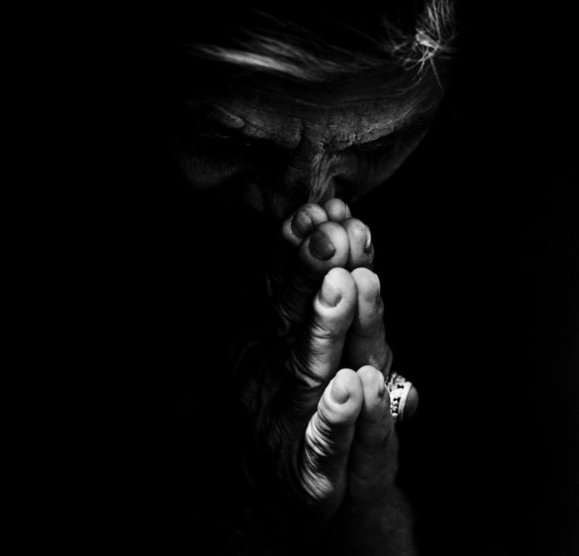
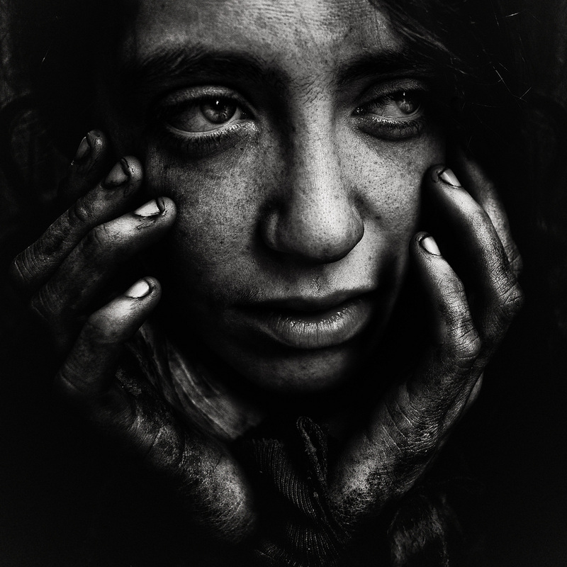
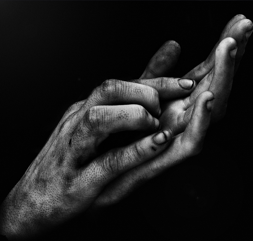
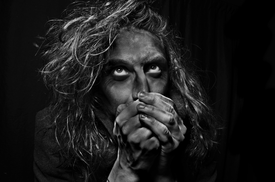
This was the third photo-shoot I decided to do was a lot more successful because I has added the dirt onto the models face again. I put it in areas that looked very pale and had a lot of surface area such as the forehead and cheeks, covering most of the face. Then I went into the more detailed areas and added dirt under the eyes and on the crease of the models eyelid because this would make it appear more sunken in. The final place that I added dirt was on to finger tips. Later on in the photo shoot I added more dirt onto the knuckles and over the whole hand. I felt like after this the photos looked a lot more dirty because the models skin was being covered more. The photos looked brighter than I wasted them to but I edited them on photoshop to make them darker and dirtier.
|
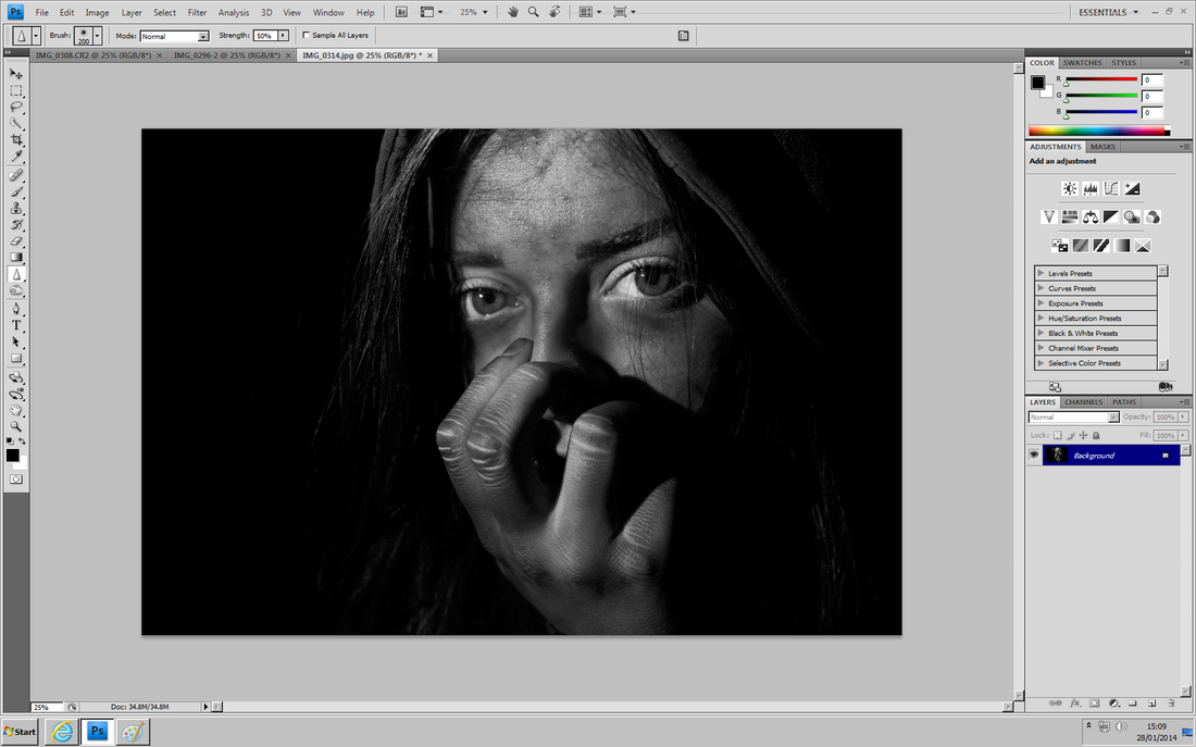
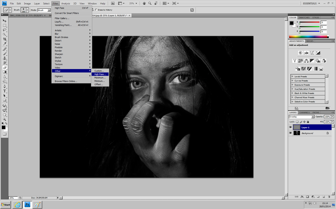
I think this links to Lee Jefferies work well because of the lost look in the eyes which really connect with the homeless affect that I was aiming for. I think the main thing that helped accomplish this was the lightening of the eyes because they really draw your attention in. The photos look quite moody and dull because of how dark they are but the eyes are bright and hopeful looking. This was mainly inspired by Lee Jefferies work because I found my favourite images of his were the ones that had a strong connection with the eyes. One thing I did not like about the outcome of these images is that I had chosen images all included the hands as they seem to have made the images appear much stinger than the ones without the, which is probably due to the amount of darkness and dirt they bring to the images and also the sense of being scared and innocent as the model covers her face. These images were my four favourite of the group. They turned out more successful than I thought they would be and as I got used to editing them all the same way to each other they began to look well next to one another. I was pleased with the effect that I achieved mainly using the high pass and erasing the right bits of it and when I do another shoot I hope to use the same effects.
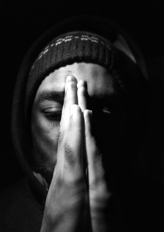
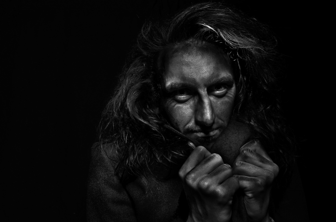
experiment 4
|
|
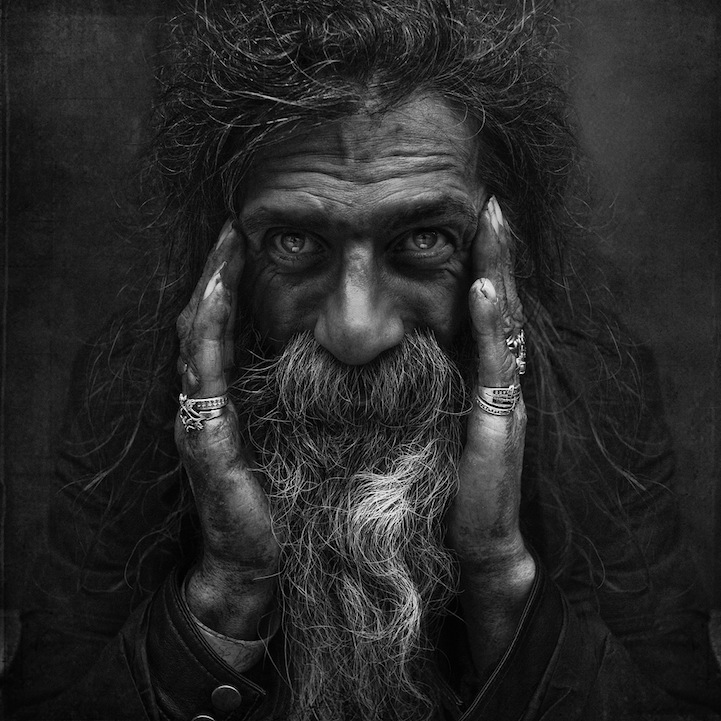
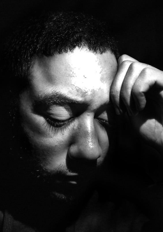
This photoshoot went very well because I knew what I wanted to achieve. The photo shoot went very well but what I realised about the results was that the photographs ended up looking like they were a character out of a movie. They looked very theatrical because of the costume and smug expression on the models face. I think that there is an eerie element to this photoshoot that worked really well. During editing I noticed that the images almost looked silver which I think was a nice effect. As usual I added a high pass layer on top of the original background image and this gave the photos some texture. I think that the models hair also worked really well for the shoot because it stands out against the shininess of the skin and hands.
|
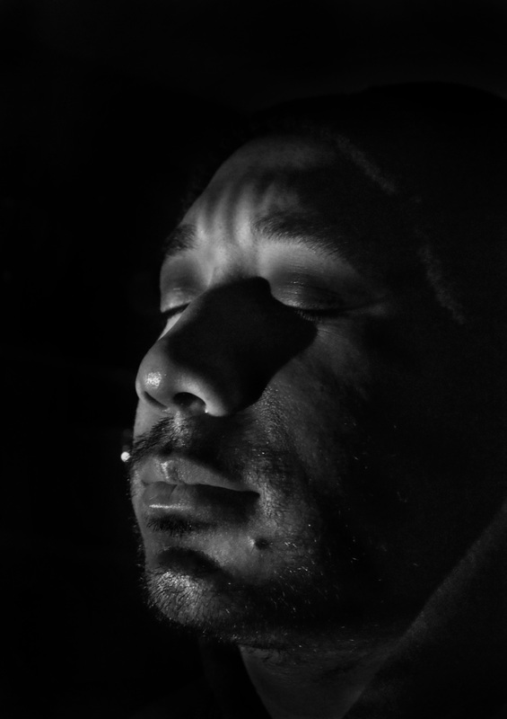
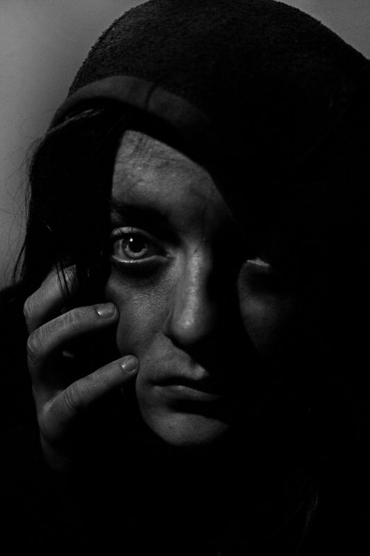
experiment 5
|
|
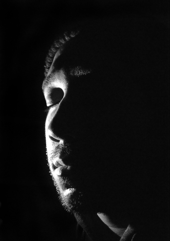
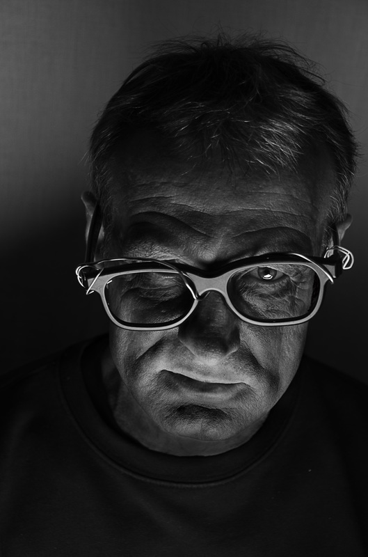
I worked with two different props when I started this photoshoot such as a pair of glasses that needed to be made to look broken. To achieve this I wrapped a paperclip around it and it added a bit of variety to the colour scheme of the photos also. Then I also used a hat which created shadows that I really liked on the models face depending on where I positioned the lighting. What I enjoyed about this shoot was finding different angles and expressions that make the model seem realistic. I think that the photos came out a bit dark but it worked well when editing. I used the same process to edit these as I had in the other shoots too; using a high pass cover to increase the definition.
|

I put the best ones that I thought worked well together because they look better collectively and what I liked about all of these was how defined they were. I enjoyed working with multiple different models and I think thats what made it so effective. I like how they had different propers which created different textures to each one of the photos. The composition of the images was something that I found very interesting from the beginning and I found that the photos looked better when they were directly in the centre, however, these final images all are in the centre and I think its because it shows a more clear picture of each person now that I have separated them from the others.

|

|

