AO1 Contextual Understanding
Develop my ideas through sustained and focus investigations informed by contexual and other sources, demonstrating analytical and critical understanding.
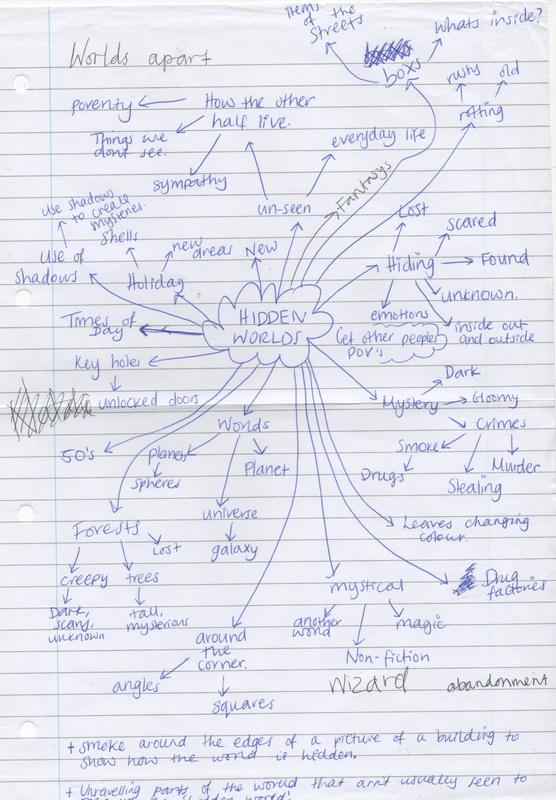
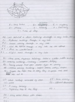
brainstorm
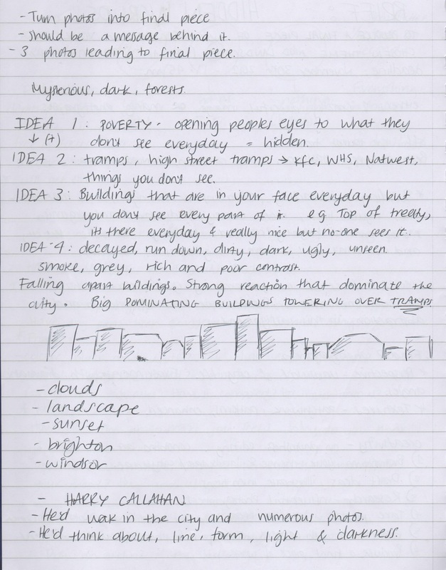
idea sheets
|
|
ARTIST RESEARCH
MAUREN BRODBECK, urbanscapes.
She was first trained in in visual arts e.g. painting and drawing and then studied in cinematography as producer of shorts films, documentaries and ads. She won three prizes and participated to several festivals. She graduated in photography and design from an art college in CA. now she's a photographer and is famous in countries like Switzerland, France and Germany. Her training in painting and drawing means she can give an eclectic dimension to her work, the resulting projects have a pictorial and sculptural vision and composition
|
|
|
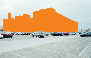
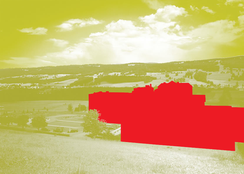
This piece of work is a building in a field. The building has been edited green, the grass is yellow and the sky is green. The colors are bold and bright but are quite similar. The picture gives of a peaceful feeling because of the combination of color and that fact that there isn't much detail in the photo other than the grass. The sky (clouds) is still a bit visible. Rule of thirds could have been used in this photo to separate the colors.
|
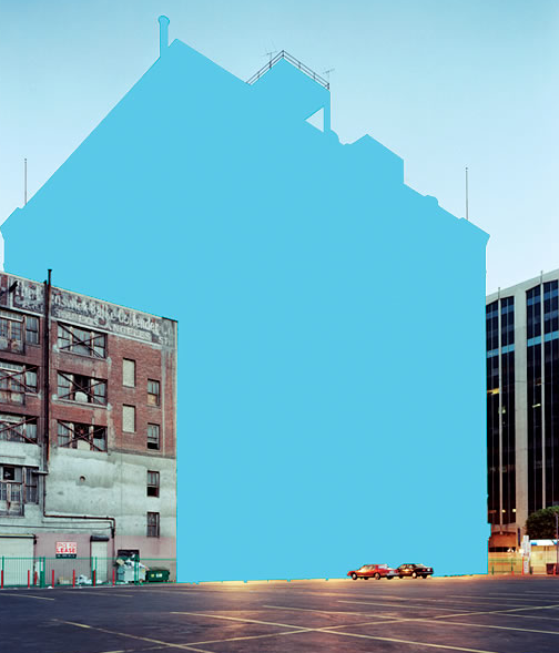
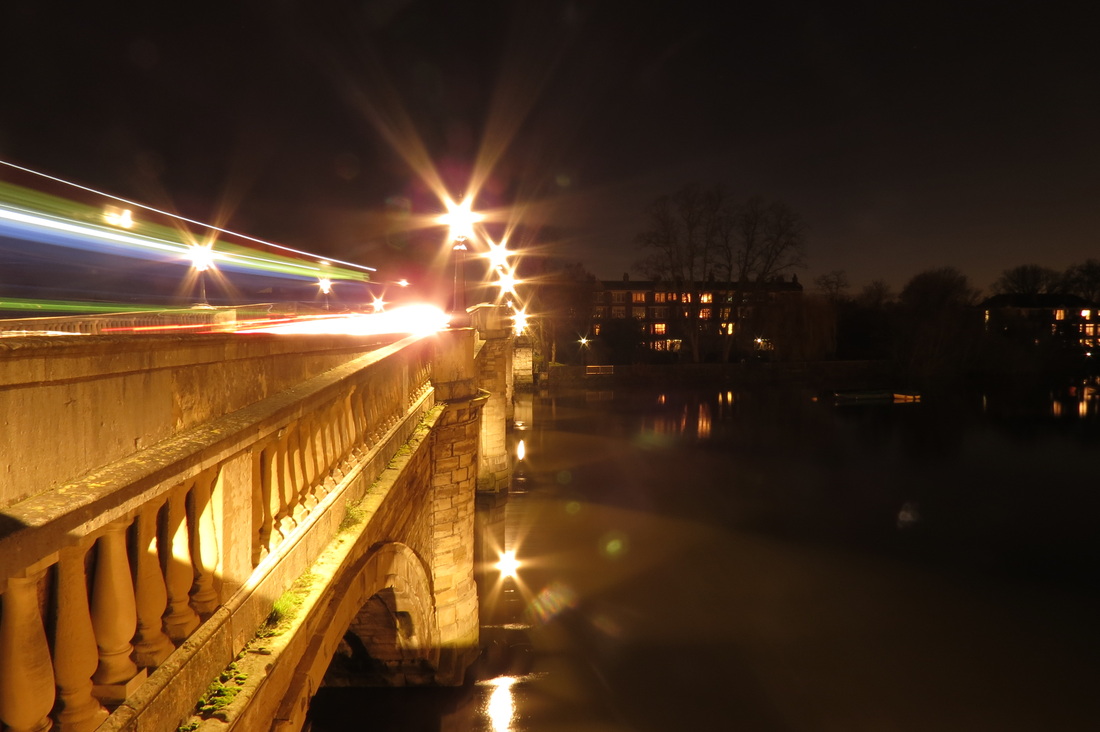
I think this photo is interesting because of the two buildings on either side of the middle one. Because of the two that haven't been edited out (like the other ones) and it makes you look at the photo more carefully because you can really see what she has taken away and left in its place. I also thinks its clever to have the cars in the photo (coincident in front of the 'missing' bluing) because it gives the photo a more 3D look. I think I like this photo the most because the least has been done to it so there is a lot going on. The mood of the photo seems to be busy and it makes me think of the city.
|
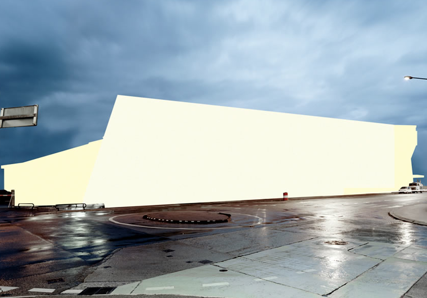
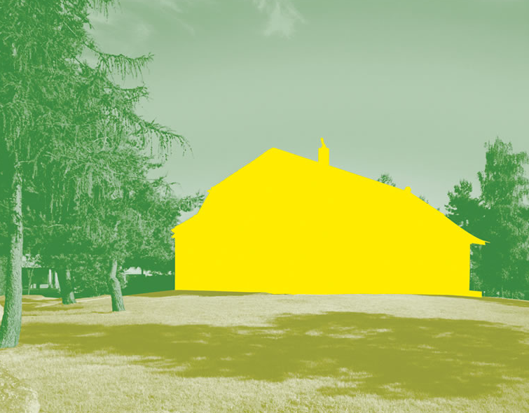
I prefer this photo to the others because I like how the rest of the picture hasn't been edit too much. You can see all the lights hitting of the floor even though you don't know where the main light is coming from since the building has been blocked out. I think (compared to the other photo's) this ones stronger because the buildings boldness looks more interesting now that it's against the natural sky and ground. Some parts of the bluing are a darker yellow to show that they're behind. The mood of the picture is quite dull because of the weather and darkness.
|
mauren brodbeck experimentation
For these images I took the pictures that I took walking around my area and used to Photoshop to turn them into Mauren Brobeck . These are some photographs I took at different times of the day . The ones at night have street lamps in which give of a glare. I took these photos to help me with Mauren Brodbeck and look at different parts of where I live to see which buldings would be easiest to transform to look like hers pieces' of work.
|
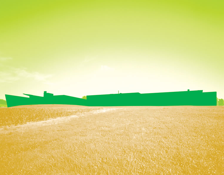
This image reminds me of Mauren Brodbecks because of the huge building is all one color and its a simple image. The life is still going on around the buildings but its the main focus. I like the exaggeration of this building because of the way it goes of to the distance. I think this image is interesting because it has a vanishing point.
|
This image (above) was my first attempt at copying Mauren Brodbecks work. I went on photo shop and used the lasso tool, outlined the building, then used a brush tool to go over it in the color that I wanted. I found this quite easy to do but this is because I was only using one color. Then I did the other buildings as well to make it more colorful.
|
This time I tried using the same picture but adding a bit of shading. I think that its helped with my photo shop skills. I like these 2 pictures because of the different colored roofs and the way that the building looks 3D. I think that it was more difficult to do these because of using photo shop. The angles are hard to re-create so I used the first image and saved on top of that to do the second.
|
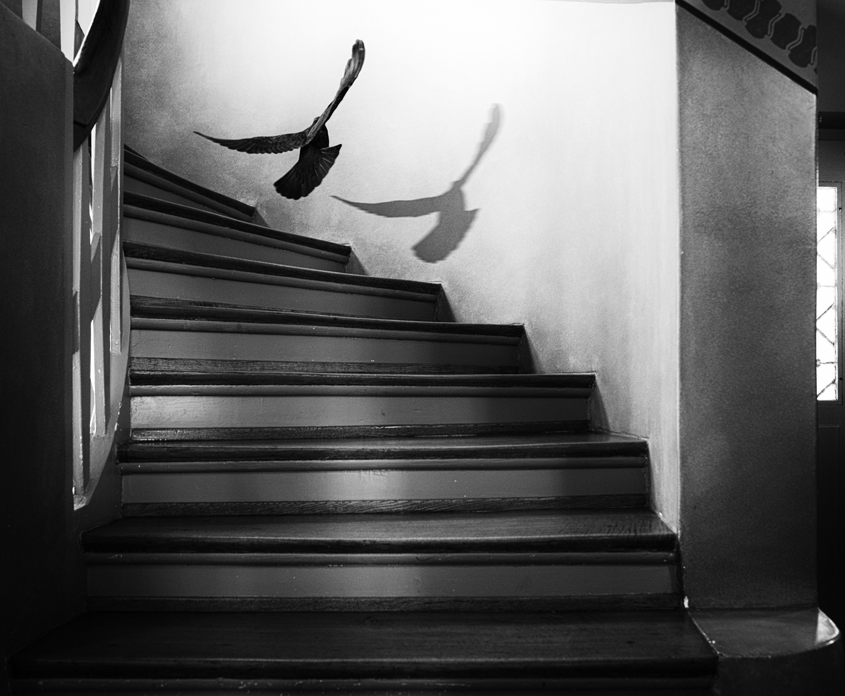
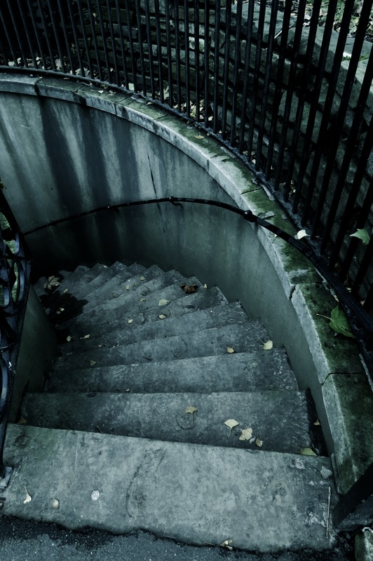
Holger Droste, black and white
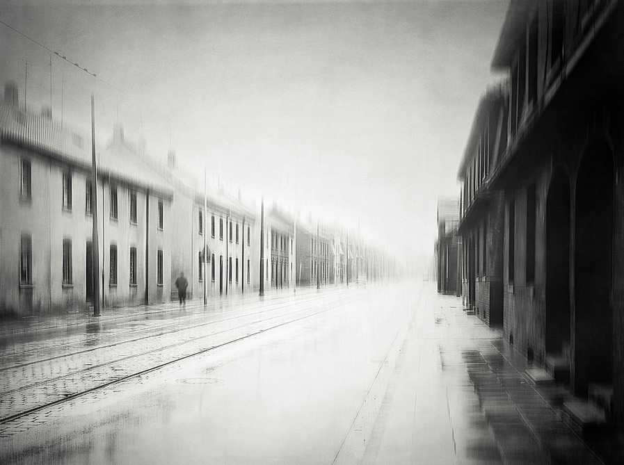
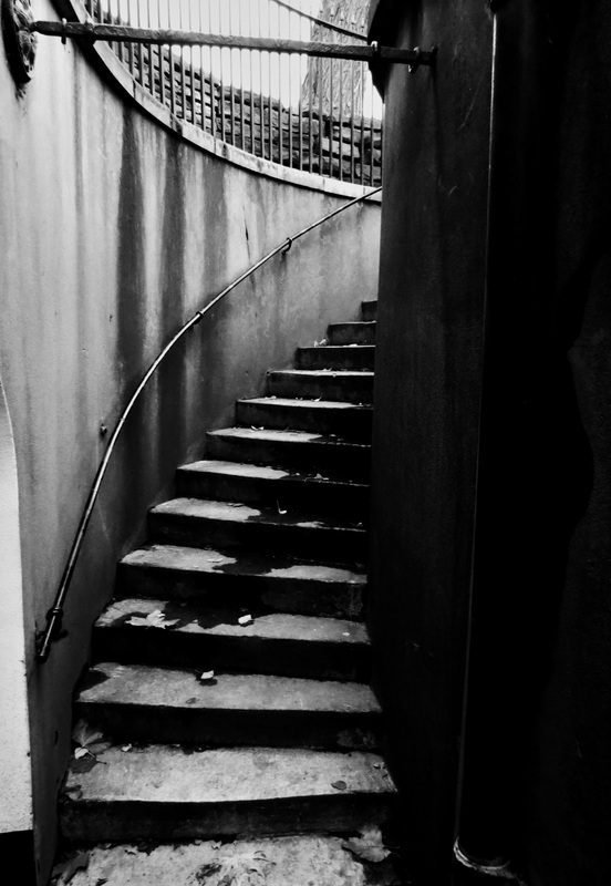
He is from Dortmund in Germany and he likes his pictures with 'soul and a little story'. He takes photos mostly in black and white and in Germany. I like his work because they are quite eery and dull. I like the angles in this photographs of staircases because even though they have not been distorted, they way they have been taken and the angles make them look never ending and I think that the street photographs look effective because of the lighting. Even though the photo isn't that dark, it still looks UN-inviting and 'dark' in the evil way. I think he goes well with hidden worlds and has made me want to take more phoographs of staircases - because of the curved, ongoing lines of the photographs that you can get lost into.
|
|
|
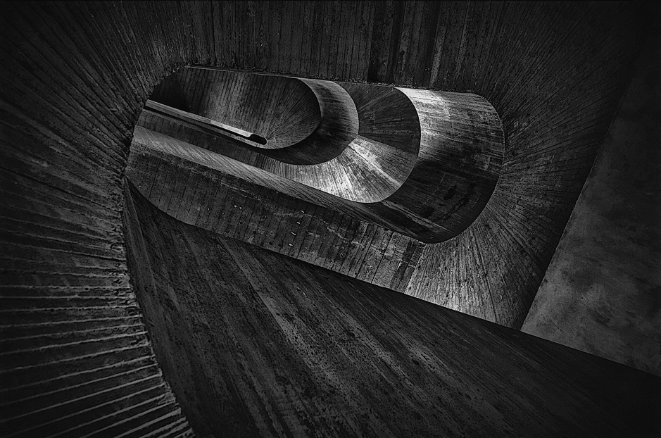
I like this photo by Holger because its illusional and its hard to figure whats going on straight away. I like the contrast in the photo where the light hits the stairs and all the darker markings and of the dirt .Also I think the lines and curves in this photo make it more visually appealing to look at.
|
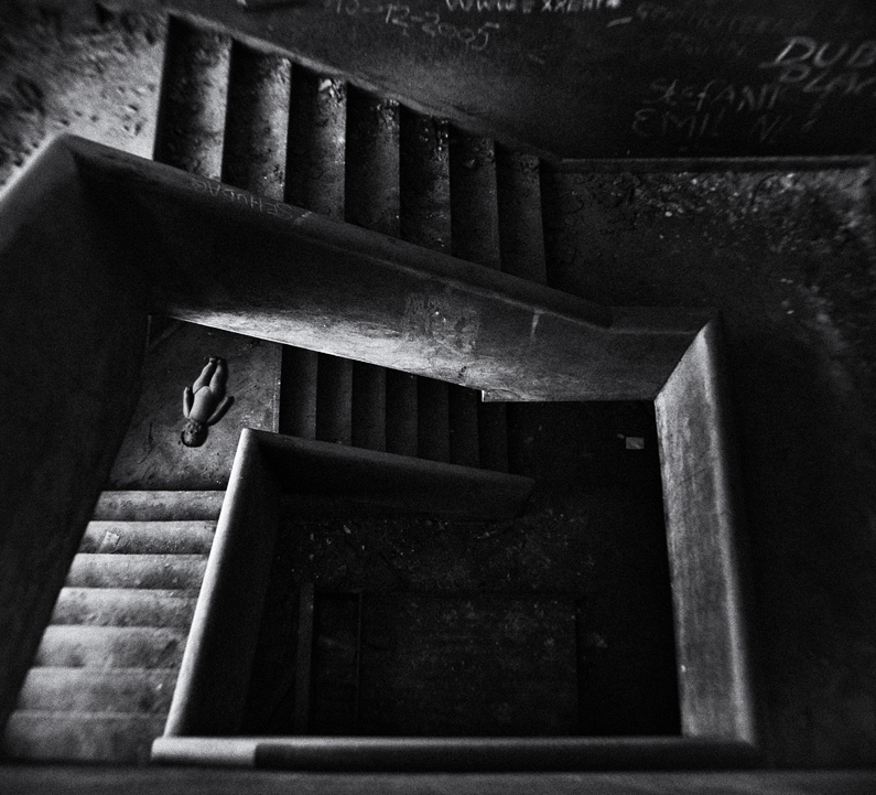
I would like to recreate something like this photo (above) because I like all the qualities of it. I think its quite nightmarish and the dolls body adds a childlike element to it. I also like the amount of darkness in the photograph because you don't know whats there. The walls have writing on which makes the photo look dirtier than it is. The contrast on the photo is high and it picks out the lightness and darkness. The black and white in the image suggests that its meant to be dull and emotionless. Vantage point has been used in this photo to make it more interestign because if it was taken at a different angle it would be much more boring. All the lines in the photo help to focus on the doll.
|
holge droste, black and white experimentation
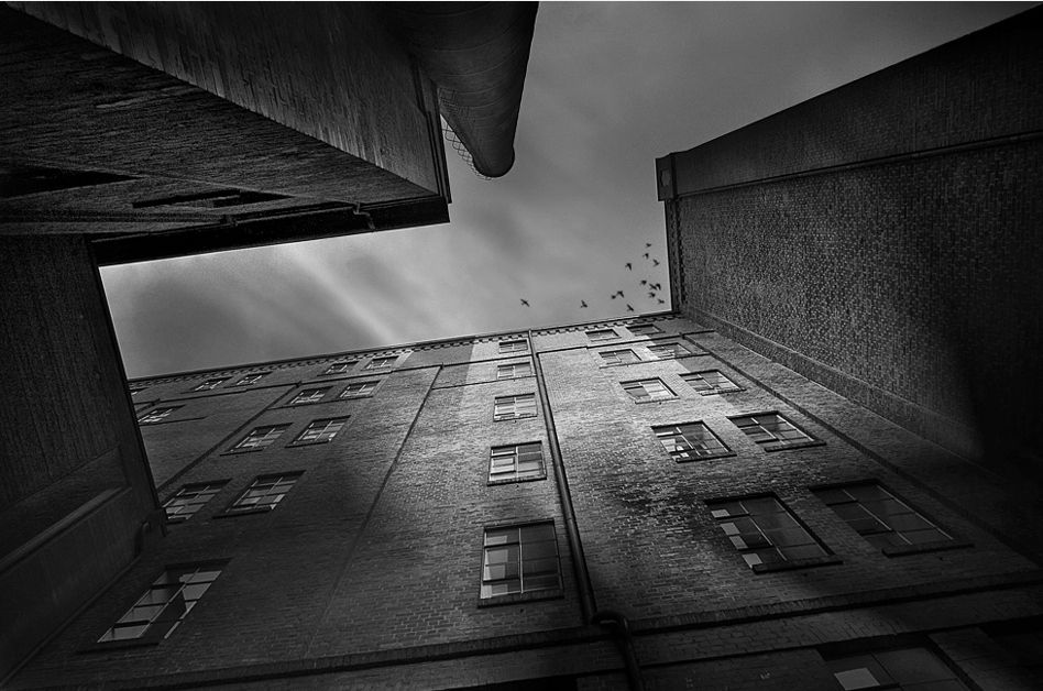
For this picture I tried to recreate the height of the buildings by pointing the camera to the sky. I like the lines and points in this picture which is why I decided to try and get a picture like it.
|
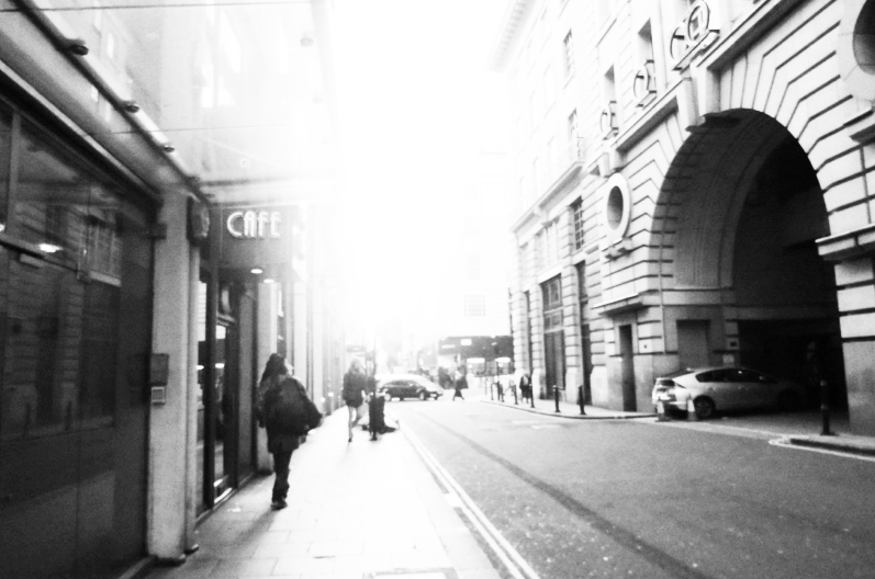
I think this image by Holger is nice because I like the brightness in the center and how it goes of into the distance an you can't see anything. I did the with my image by making sure there were buildings on both sides and a bright center.
|
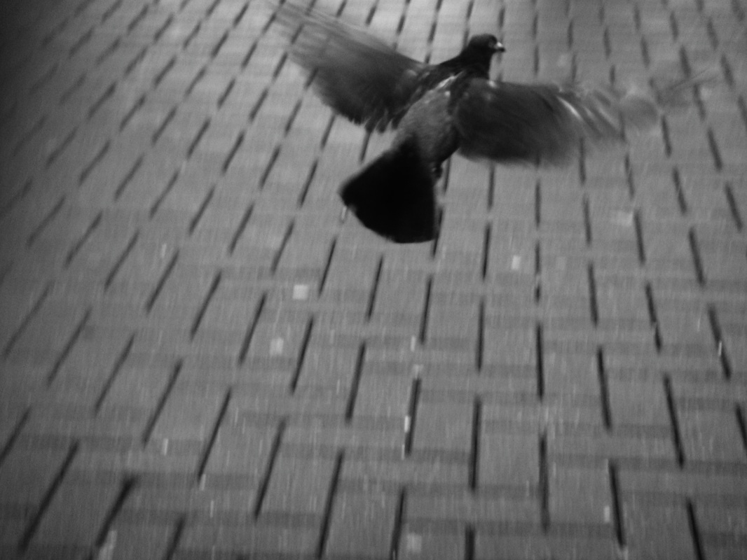
With this image I tried to do the same and capture a bird in flight. I think it went well as my image is similar to the artist's because of the movement in the wings.
|
Reinkarnacja, staircases
She is a polish woman who take photos indoors and of staircases. I like her photos because they are mysterious and dark. The lighting in the photos both look like they're coming from the top. I looked at staircases because i think they lined to hidden worlds quite well as they can be very different and spiral staircases look like they could go on forever.
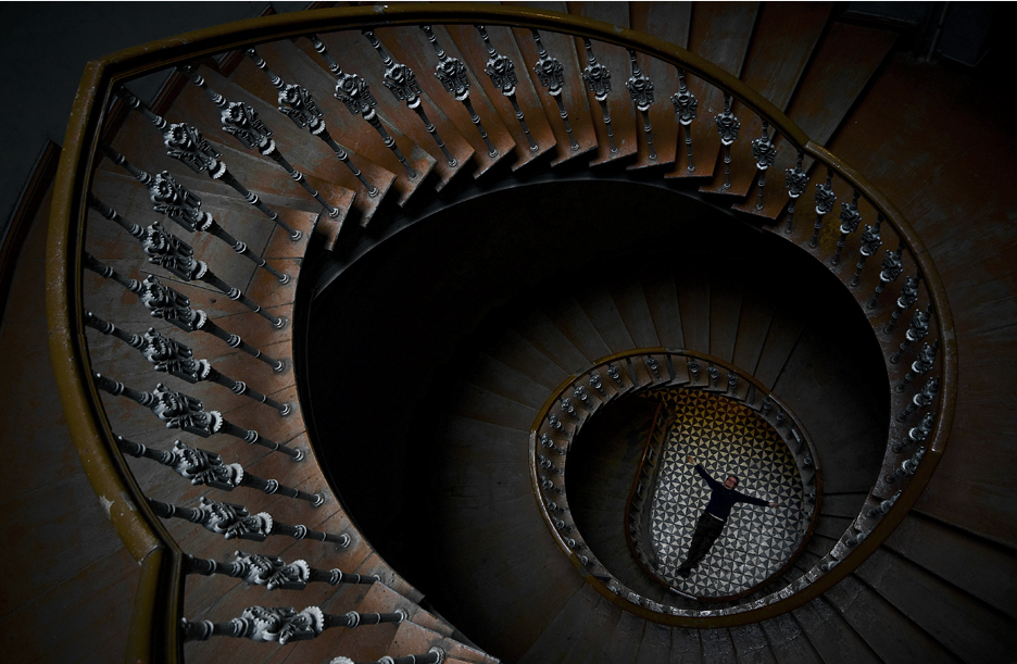
I think this image is quite similar to Holger's photo of staircase which a doll on it because it makes you wonder what it's doing there. I like the use of brown in this photo and that the staircase is spiraling downwards and you cannot see whats at in the shadows. |
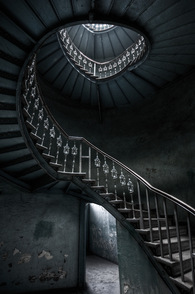
I think this image is similar to the other because the staircases look alike. However the shape of this staircase is less simple and so it makes the image less smooth and flowing because the lines are not consistent. There is light shiny from the top and bottom of this image (through the skylight and through the door and the angle of the picture is quite illusion and unusual.
|
REINKARNACJA experimentation
When I edited this image I wanted to make the colors more dull and similar to Reinkarnacja's. I liked this image because it looked dirty just like hers and like an unappetizing staircase to walk on.
john shaw .
I like photos by John because they are all very unique. He has photographs of nature which I found quite useful because I want to take pictures of places that have never ending paths. I like his images because each one of them almost tells a story and they also make you think of different scenarios of what could be happening. However, I prefer the darkness of Holger droste's photos and I want to work in black and white so I would make my photographs look like a mixture of the two. I realized I wanted to take more photos of the outdoors and I think John Shaw's photos are inspirational.
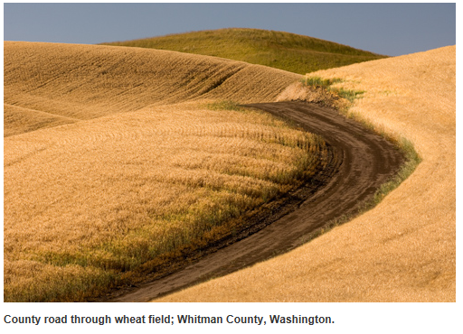
These images by John Shaw were my favorite because they all have a path to go down. The lines go off into the distance and you do not know what is there or where it is going. They're all very different. I would like to take pictures similar to him to try and capture the same never ending paths.I think they are all interesting because they have vanishing points.
|
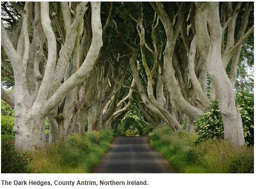
I chose this one because it was brighter than the others and stood out the most because of the trees. This image has more life in it because of the green sides and the white trees bending inward. It generally looks more inviting than the others.
|
I liked this image by him because there are more than one line running through it. However it is my least favorite because it's all one color which look less appealing than the others.
|
john shaw experimentation
I liked recreating images in the style of John shaw because it mean looking at pathways and which way looks the most interesting. I like this one because its the most plain and simple.
|
I think the texture of this image is the best and the tree's framing the path made it more interesting.
|
I like the line of this image I took because it's very central and creates more of a shape for the trees, almost as if the trees are lining up the path.
|
AO2 Creative Making
experiment with and select appropriate resources,media,
materials,techniques and processes,reviewing and refining ides as work
develops.
camera parts
|
|
|
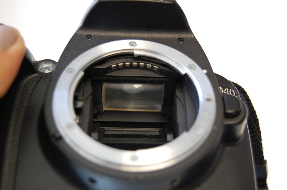
The mirror inside the camera (that is located behind the lens) is used to reflect the image to another mirror above it. And then to the pentaprism which is still above that, so the lens is able to see what is visible through the view finder.
|
The shutter release determines he amount of light that is let in by only being open for a certain amount of time.
|
screen.
|
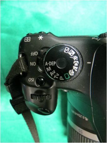
Dial
M= Manual - You choose the shutter and the aperture. Everything is under your control.
Av= Aperture priority - You choose the aperture and the camera chooses the shutter speed. Tv= Shutter priority - (opposite of AV) You choose the shutter speed and the camera chooses the aperture. P= Programme - Chooses the aperture and the shutter speed and takes an average of everything. Green square= Auto Face= Portrait - You focus on the foreground and shallow depth of field. Mountains= Landscape - a landscape shot with everything is in focus. Flower= Macro- Opens the aperture so you can focus close up. Running man= Sports - The shutter goes of at its quickest. |
|
second hand
|
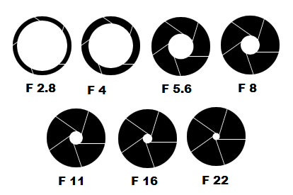
shutter and apertureShutter speed ( aka exposure time ) is the effective length of time a camera's shutter is open. The total exposure is proportional to this exposure time, or duration of light reaching the film or image sensor.
For a wide depth of field the shutter will be open a lot ( F 2.8 )and let in a lot of light, everything will be focused - this is god for landscape photography and things like mountains. For a shallow depth of field the shutter will be closed ( F 22 )and not a lot of light will be let in, the background will be blurred - this is good for taking portraiture photos as you want the face to be the main focus and the background is not as important. 2.2 is shallow, so the aperture increases, the shutter size gets smaller. The lower number the wider its open. A fast shutter is 1000th of a second and slow shutter would be 1/60th of a second. |
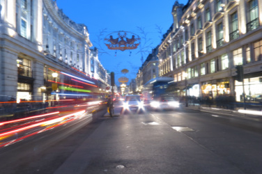
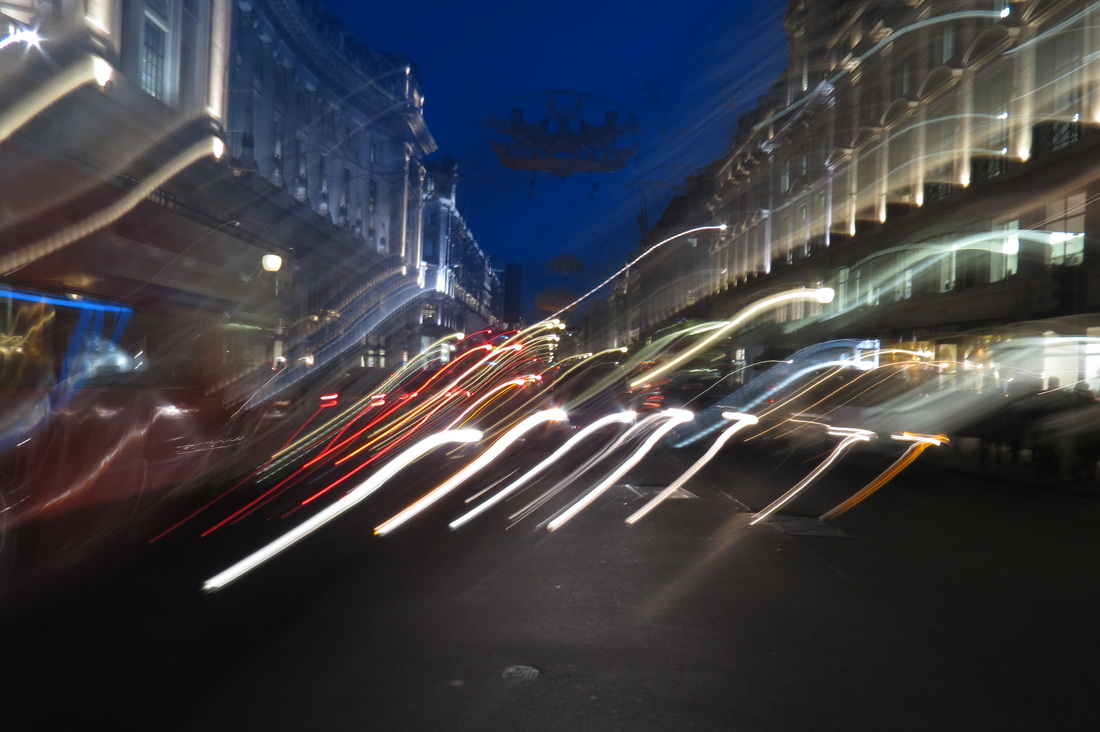
Long Exposure photoshoot
Long-exposure photography or time-exposure photography involves using a long-duration shutter speed to sharply capture the stationary elements of images while blurring the moving elements. The paths of moving light sources become clearly visible.or these photos I went into London and changed the shutter speed to seconds. I put my camera on the ground to make it level and steady and to get a nice angle of the cars. The fastest shutter is faster than the human eye and wouldn't let a lot of light in, so its usually used in areas that are too bright. Because I left the shutter open for so long, the pictures came out lighter than in actually was and all the moving objects in the image came out blurred. I don't I'd be using long exposure photos.
|
|
|
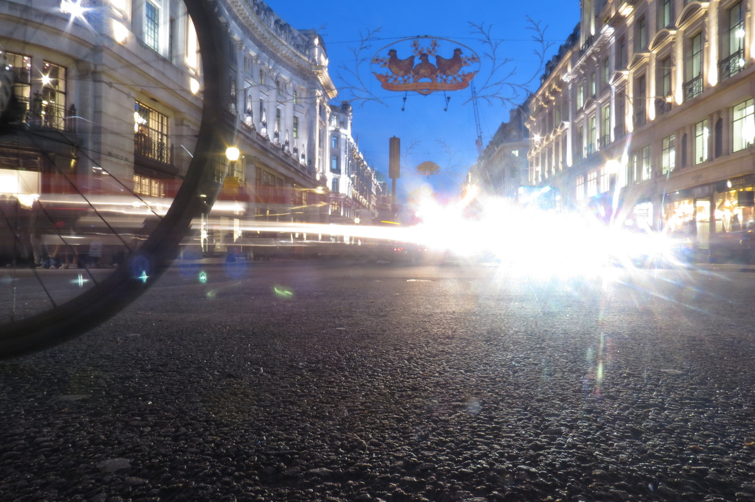
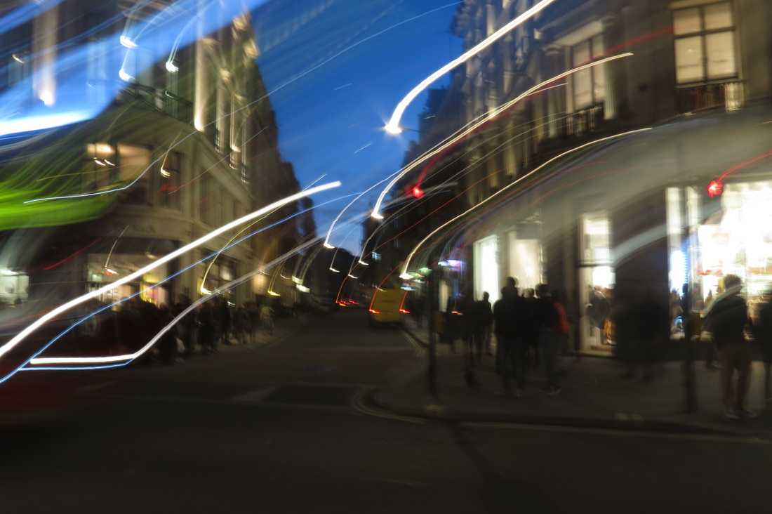
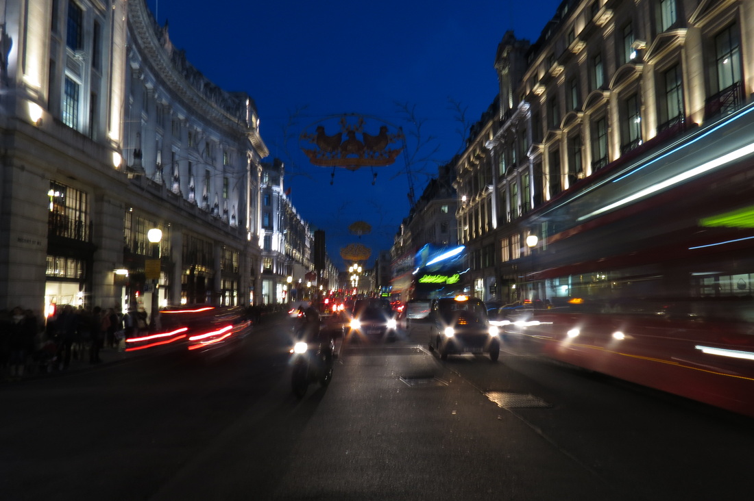
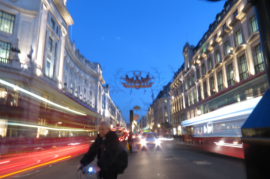
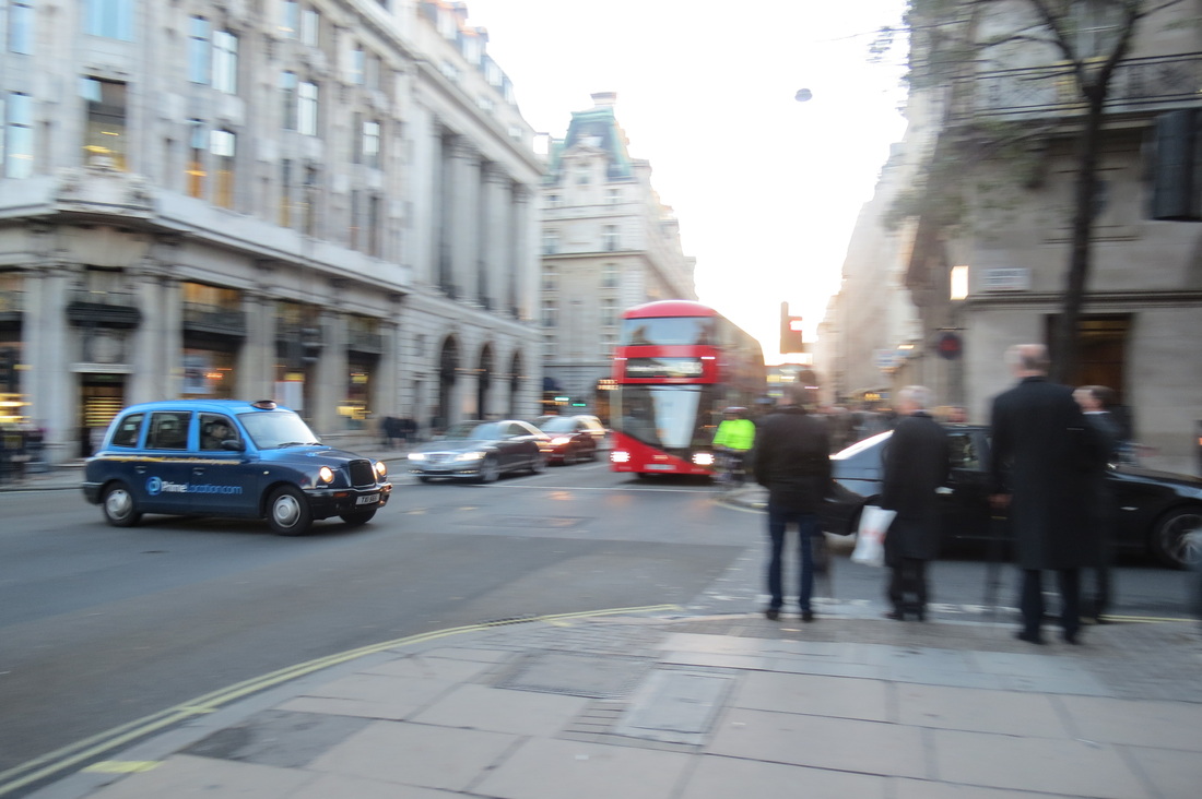
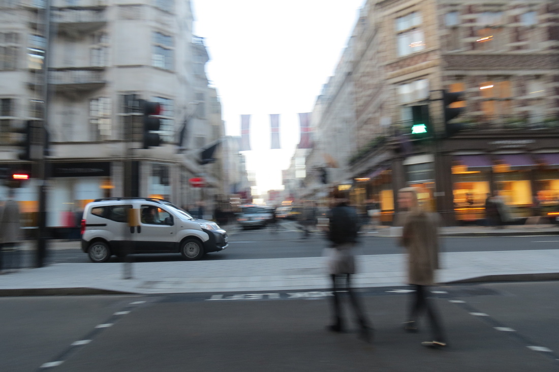
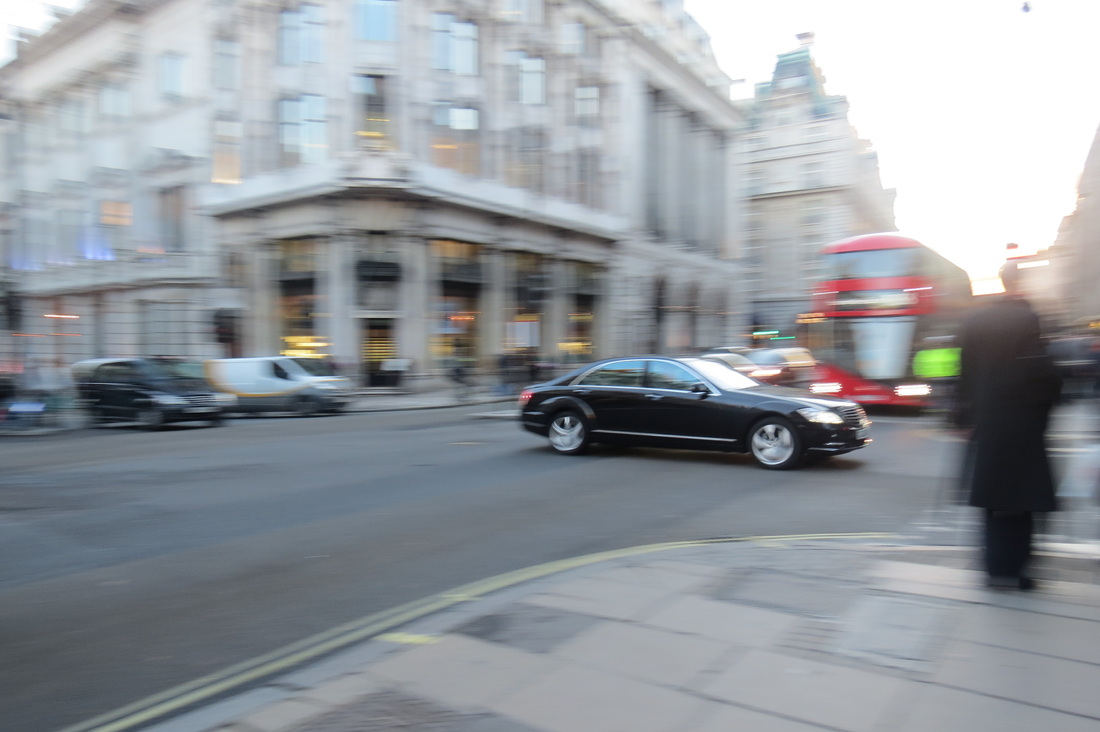
Panning photoshoot
Panning is used to suggest a fast motion and to bring out the moving subject in the frame. the foreground is usually streak in the direction of movement to show the main object, which is not blurred, is moving at that speed. To achieve panning, you must keep the moving subject in the same position of the frame for the duration of the exposure.
For my photos I went into London and focused mainly on cars because I thought it was the easiest moving thing to capture. The main focus in the photos are less blurry than the backgrounds.
For my photos I went into London and focused mainly on cars because I thought it was the easiest moving thing to capture. The main focus in the photos are less blurry than the backgrounds.
|
|
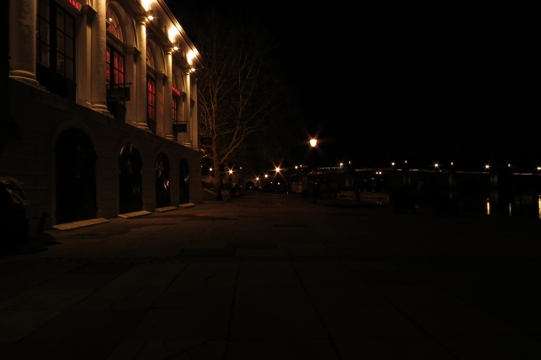
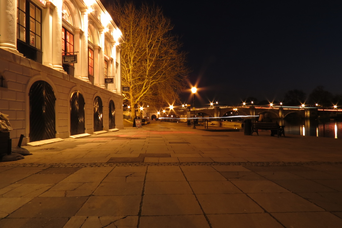
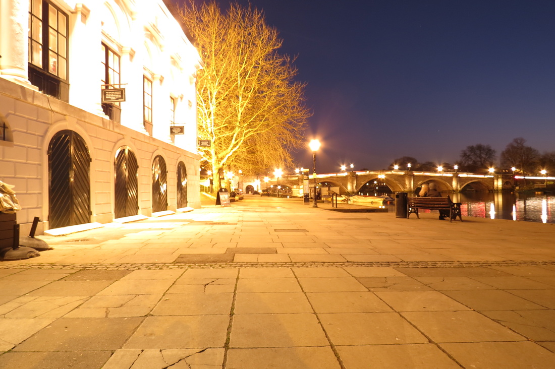
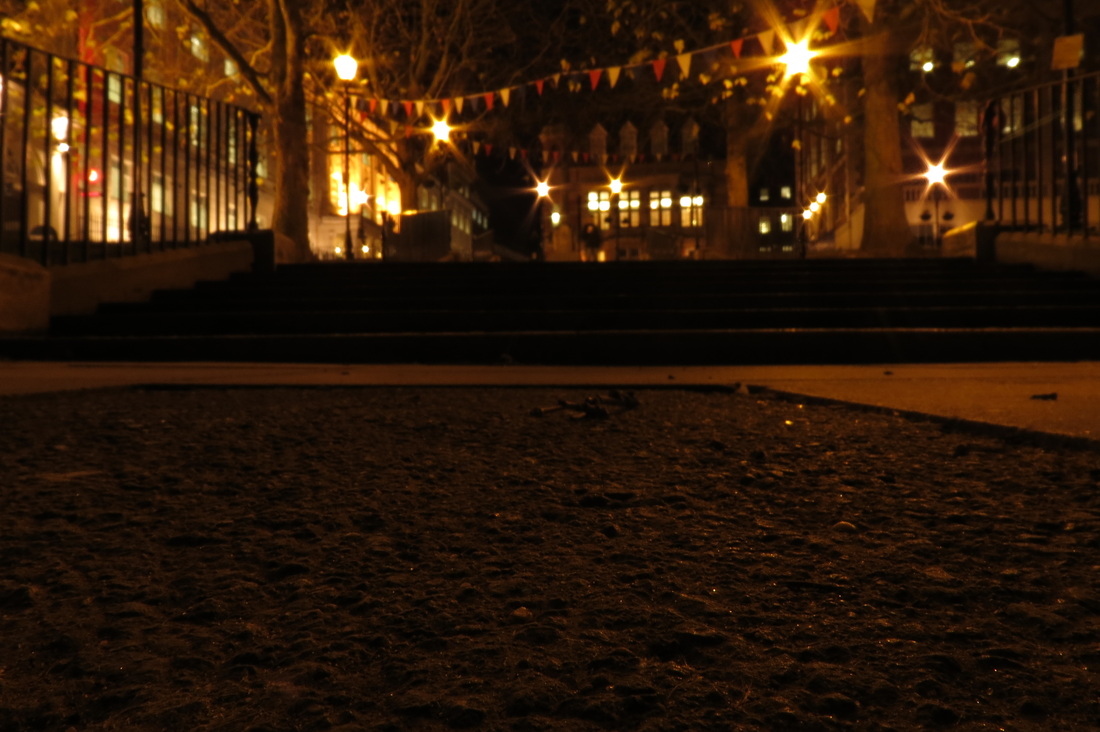
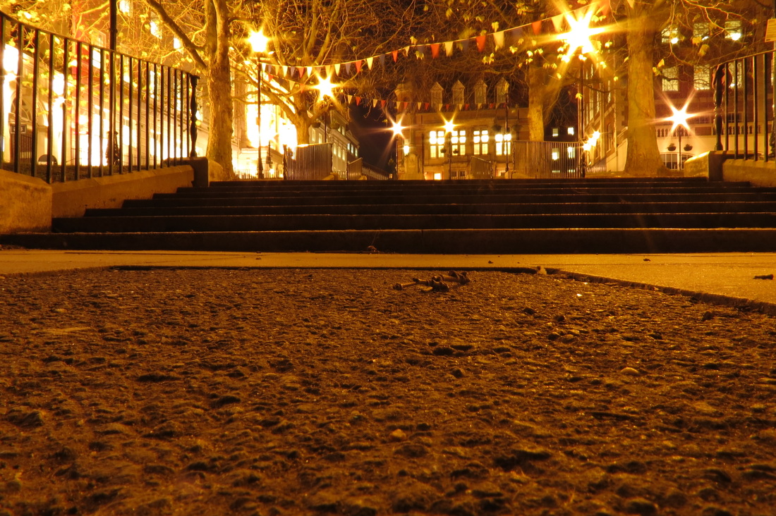
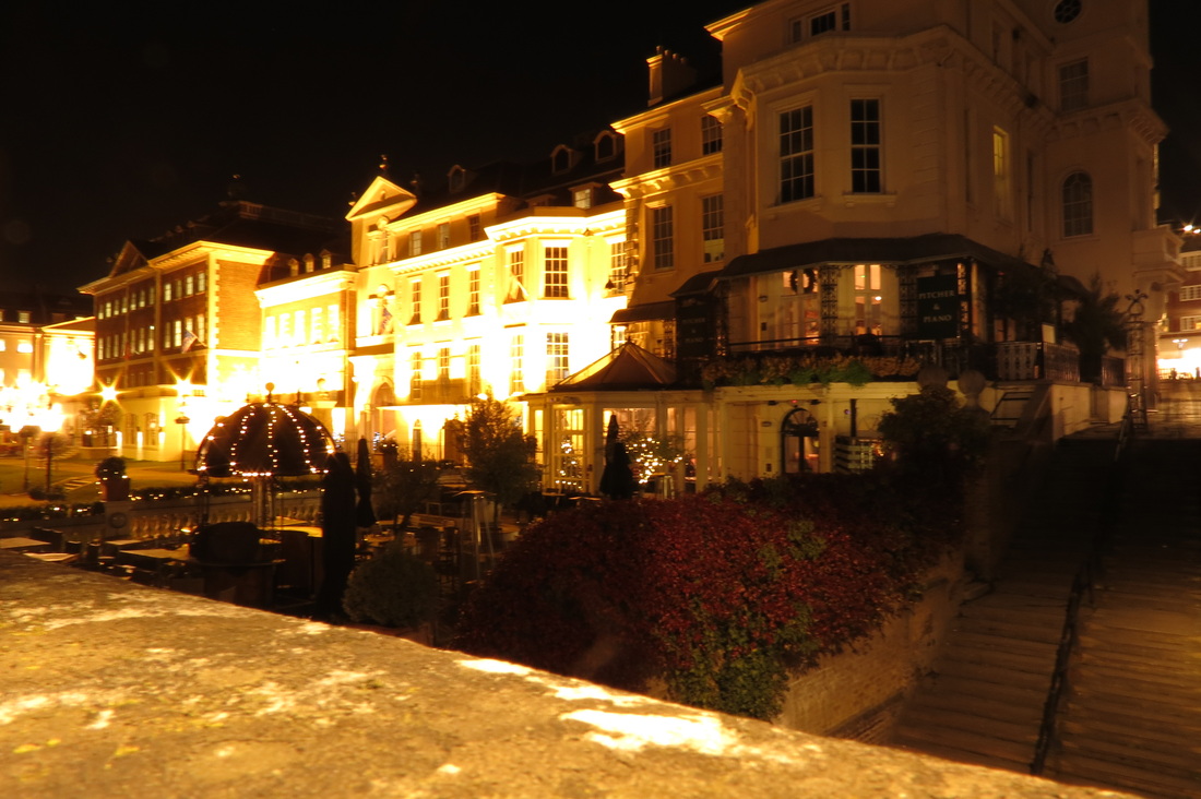
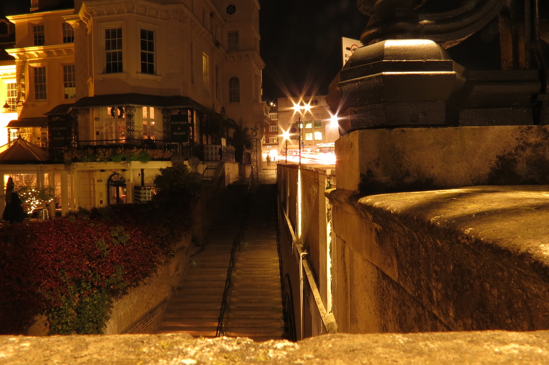
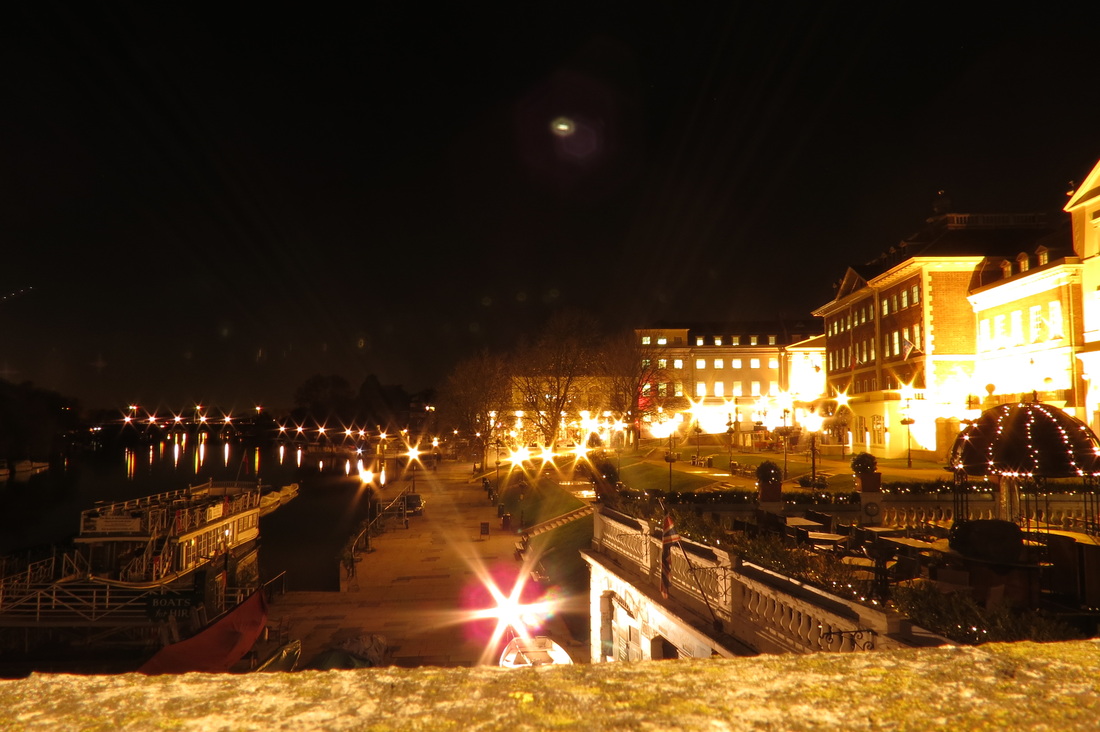
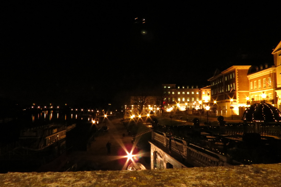
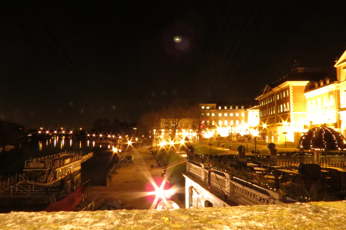
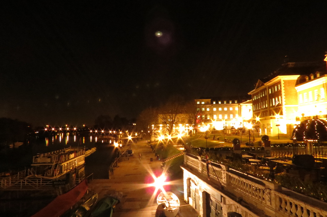
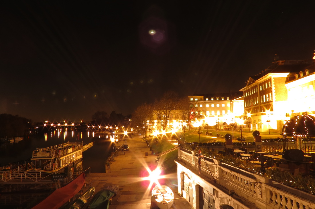
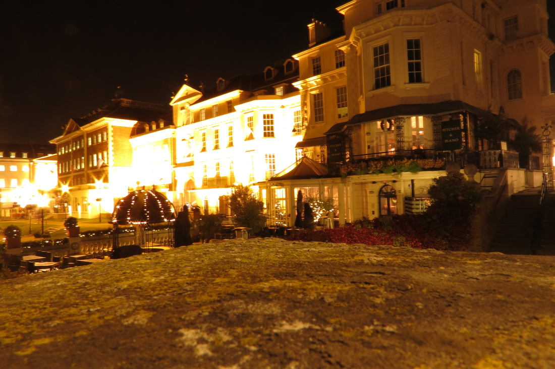
richmond at night photoshoot
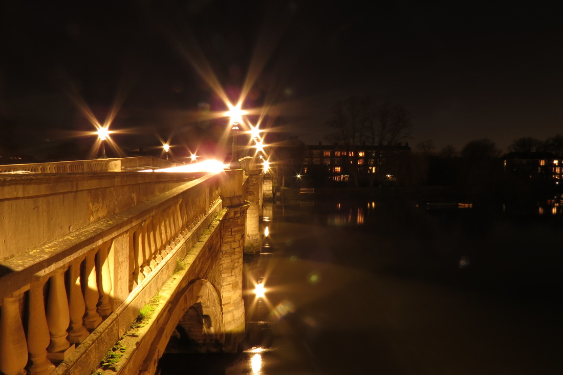
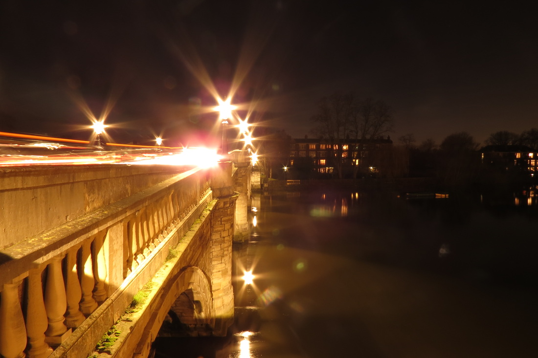
For these images I went to Richmond at night to experiment with using different shutter speeds and different apertures. the images came out well and I like the range between the light and dark photo's. There were a lot of lights on already during the photoshoot so it's nice to see how they created star-like shapes in the camera.
Ae-lock.The ae-lock is used as a sort of face (or object) recognition. Looks for correct exposure. It chooses how much light gets into the censor, this is called filtering.
In this picture I used the ae-lock on my camera. This was to make sure the persons face didn't come out black like in the image below. I had to go up to her chin and take a metering and step back to where I wanted to take the picture. This recognized her face and lit it up.
|
Back-lit.A backlit is a form of illumination to produce a visible light. Its illuminated from behind.
In this image I used back-lit effect. The outcome of this was that the background came out light (lit) and everything else turned out as a silhouette. I like this image because of the contrast and the fact that the sky and the person are both eye catching parts of the photograph.
|
Flash.The flash is a light produce by a camera when it thinks there is not enough light/more light is needed.
For this picture I made sure my camera would flash so that the persons face (as well as the background) would be visible. I think its the easiest technique to do but its the least effective because to me the image is not as interesting as one with ae-lock or back-lit.
|
Iso & Exposure Compensation.
Iso is the sensitivity (originally of the film). It is how much light is needed to expose the sensor. Iso is the speed of film.
Grain - how fine it is Lossy - blurred edges (same as noise) Noise - how fuzzy Resolution - how fine it is. Exposure compensation. Compensation in a photo makes it brighter. the + and - means lighter and darker, it changes the shutter speed to compensate for the light. |
|
THE 6 RULES.
FILLING THE FRAME
Getting up close. To fill the frame you must take a photo that doesn't have too much free space around it in order to make it more obvious. The effect it has it that it makes you focus on certain things because its taking out any distractions in the photo. It stops unwanted information and makes the pictures more powerful and have more impact if there's no negative space. My photos of filling the frame.
|
|
FRAMING THE SUBJECTThis is when you find natural or man made objects and take advantage of the positioning/shape by using it as a frame for a person (or thing). Creating a fake frame. This technique draws attention to a subject.
|
|
VANTAGE POINTVantage point is the position that a photo is taken. Most photographs are taken at the same angle (the average height of a human being). This technique can help to make an image look more interesting. Changing the angle that the photo is taken by getting higher or lower can drastically change the way something looks. Some different angles can give an illusion to what is happening in a photo.
|
|
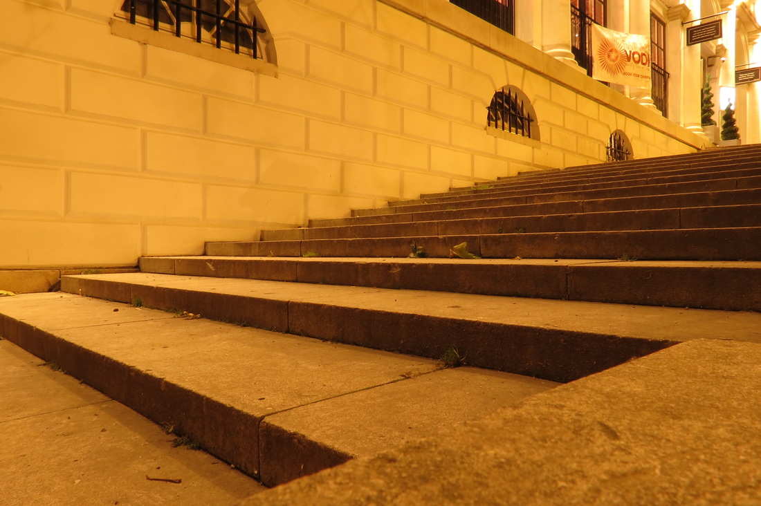
RULE OF THIRDSThe rule of thirds is when you break up a photo either horizontally or vertically. You use 2 lies across and 2 lines down to make a total of 9 squares. Its a theory that's been used with photographers and its believed that using this rule will make a photography more visually appealing. Will Pearson's photos inspired me to take photographs of my own using the same technique that he uses in his to get the same sort of effect with landscape photography. I tried to visualize the lines on my camera and take photos that apply along them. I particularly like the first photograph because its sits along the lines both vertically and horizontally. I think that using the theory of rule does help my photographs to look stronger than if i wasn't using it.
|
|
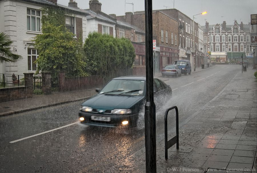
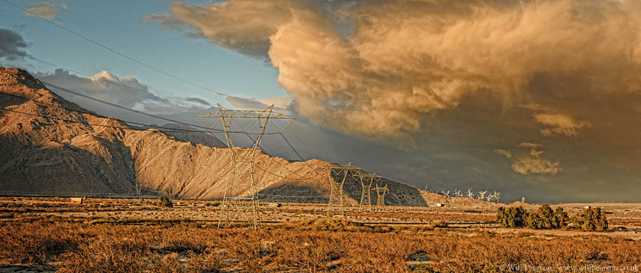
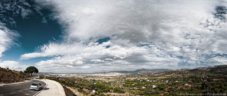
will pearson, rule of thirds
Is a professional panoramic photographer based in London. His work comprises of cities and landscape. he emphasizes capturing images at a massive resolution.
|
1) I think he used rule of thirds in this photo but he captures the car directly in the middle; therefor he's not using it vertically but horizontally. On the left is the houses, middle is the car and right is the pavement. Horizontally along the top there's the shops, the middle is the road and the bottom is the ground which is a good example of using the rule of thirds.
|
2) This photo has qualities of the rule of thirds because there is something different in each layer (horizontally). The top is mainly sky, the middle is the mountain and the bottom is the dry grass. I think these 3 things have been spread evenly into the rule of thirds. Vertically, the picture has been separated because of its lighting; darkest (where the mountain is shadowed) part on the left, in the middle the mountain is bright and on the right there is no mountain left and you focus on the grass.
|
3) In this photo he has broken the rule of the rule of thirds by using the lines more extremely. He has pushed the image towards the left so that there is not much in the middle and he has made sure there is not much ground and pushed that downwards also. This is because he wants the main focus of this photograph to be the sky.
|
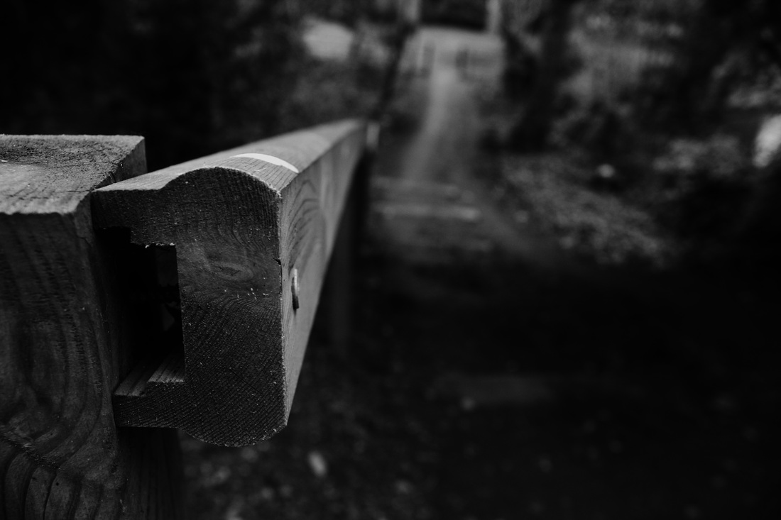
USE OF LINESThis is when the lines in an image increase the impact. The lines can lead the photos to a main subject and keep the viewers attention focused. Lines can be horizontal, vertical and diagonal. All of the lines in my image are wooden surfaces and I used the lines to draw the attention onto one single thing.
|
|
DEPTH OF FIELDSThis is the distance between the nearest and furthest objects in photograph so the camera can focus all everything. Its to do with the objects that appear most clear in the photo. Some photos are macro shots.
|
|
Narrow depth of field using Photoshop.
For these 2 images I used Photoshop to create a fake narrow depth of field. I used the blur tool to make the background look as if its further away than it is and the sharpen tool to make her hands and shoes more detailed than they actually are. The effect this has is that it tricks the eye into thinking that things are further or closer than they actually are.
|
|
|
AO3 Reflective Recording
Record in visual and/or other forms ideas, observations, and insights relevant to intentions demonstrating an ability to reflect on work and progress.
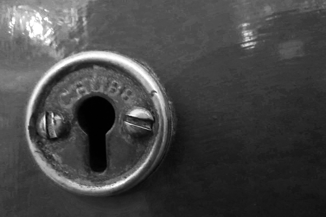
PHOTO SHOOT 1: london keyholes and staircases
For these photos I walked around Piccadilly and looked for things that made me think of hidden worlds. Originally I wanted to find people or objects that would shock everyday people - things that you don't look twice at and are hidden to your everyday eye, but as I walked around my focus changed and I moved onto key holes and staircases because they give off a mysterious feel as to whats inside/on the other side of them (or for staircases whats at the bottom.) Some of the photos I took (mostly the ones of key holes) are macro shots and I like that you can see the dirt on them. I think this gives them a more rustic look and makes the whole thing more mysterious. I want to change the images I took into more eery photographs. I chose my favorite photos and edited them on Photoshop to make them look the way I prefer and so that they suit 'hidden worlds' more.
adaptation ideas
|
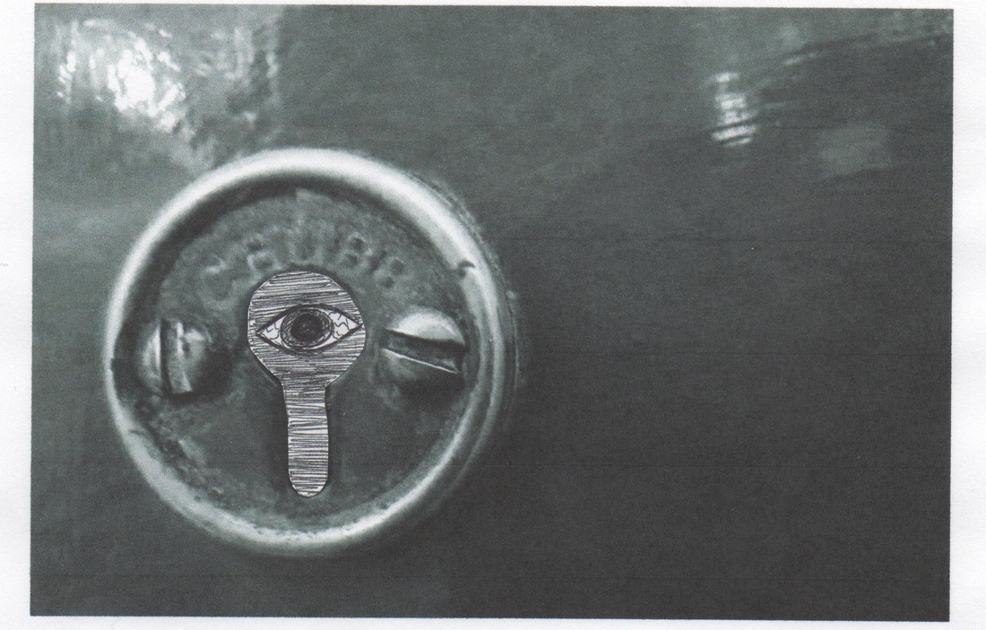
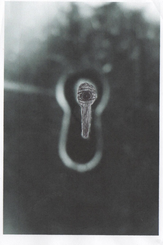
I chose these as my favorite images because I like that inside the key hole there is complete darkness and its quite scary. Also because of the angle it doesn't look inviting. There is a shine in the image made my artificial light and I prefer the way it looks on the edited photo because the black and white looks more spooky. For the black and white photo, I edited it on Photoshop and I changed the color hue and make the yellow (gold metal) light than it actually is so that it contrast more with the darkness around it. I added an eye inside to experiment.
|
|
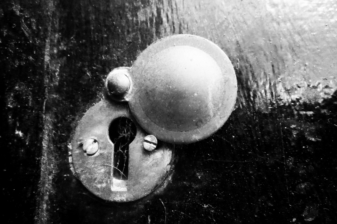
I like this image because the key hole ( like the other one ) shows another opportunity of hidden worlds. It looks very secretive and the cobwebs around and inside the key hole make it look like it hasn't been used for years. The photo is strange because the key cover was up as if used often but there are cobwebs inside so its odd because it hasn't been used. I experimented with biro and drew and stuck on an eye inside the keyhole.
|
|
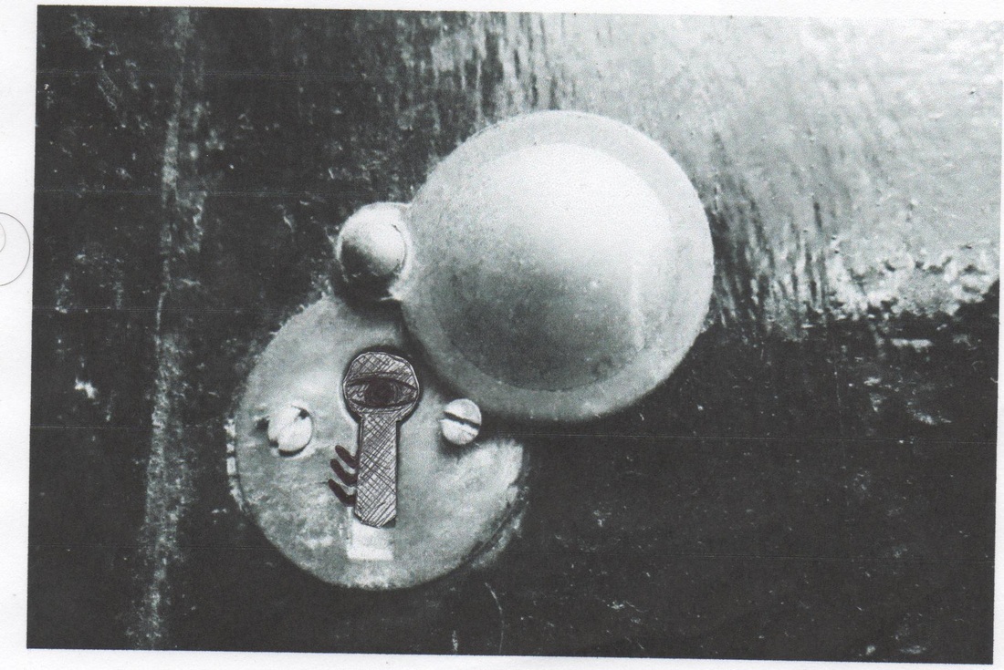
I edited this photo on Photoshop and made the inside of the keyhole sharper. I did that because it was blurry and didn't look the way I wanted it to.
|
|
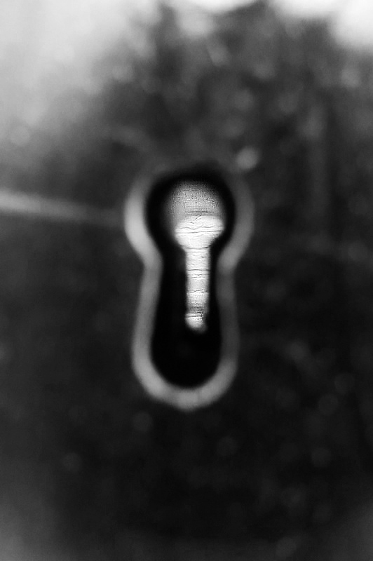
I liked this image more once it was edited because the dark space in the middle looks quite scary. I think that the image would look better with something in the middle to focus on.
|
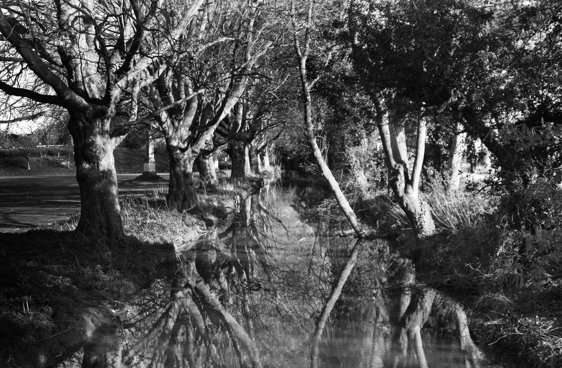
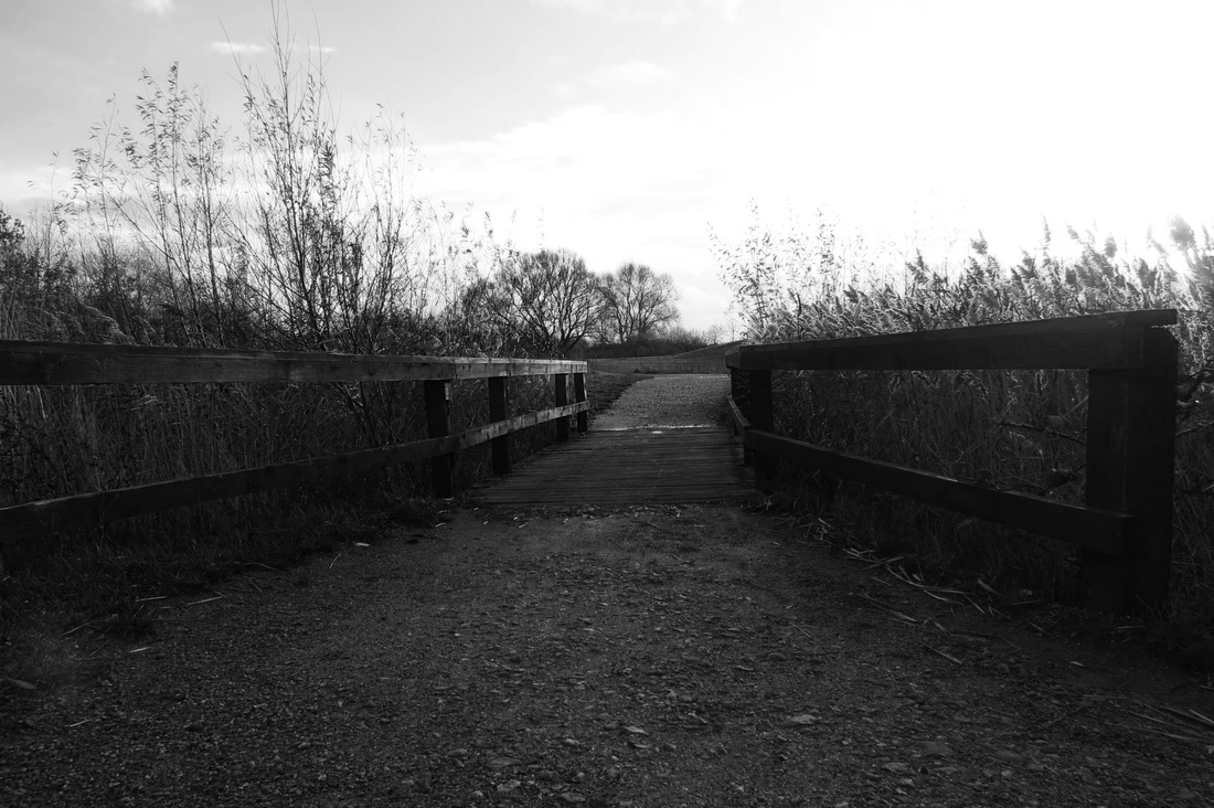
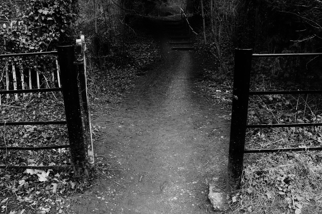
photo shoot 2: 1st pathway experimentation
When I took these photos, I had a very different idea in mind. The first photoshoot was more about locked doors and secrets behind keyholes and it was hard to add things to the photos to make them scarier. I decided to take photos of a more natural place such as a forest because I think it portrays hiddens worlds better.
For this photoshoot I took images in a more natural environment because I thought it would be easier to turn the photos into a childish nightmare.
|
From my photo shoot this was my favorite image that I edited because it looks quite scary. I want to add different things on top of this image by editing it or re-doing it to make it haunted like the others. I like the way the pathway is going off into the distance and disappears so the image becomes unknown. Framing the subject would look good if i had a young child standing in the center of the photo. This would make the photo scarier as well and it would add to the illusion of hidden worlds. I think the contrast between the trees and the pathway looks good because it shows that the hidden parts of the forest are dark and haunted in comparison to the lightness of the path.
|
|
I think the mood of these photos is quite dark and eery and could be made worse with a presence. The photograph makes you feel quite cold and i think the different shapes and heights in the photograph make it more interesting to look at.
|
|
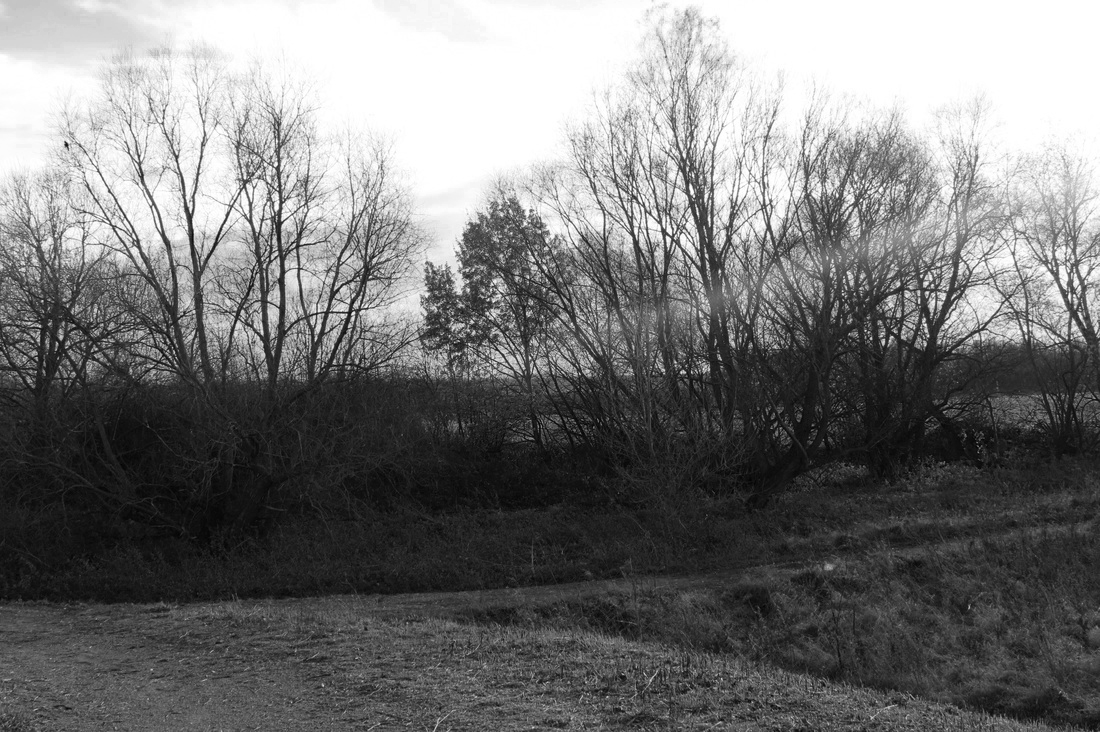
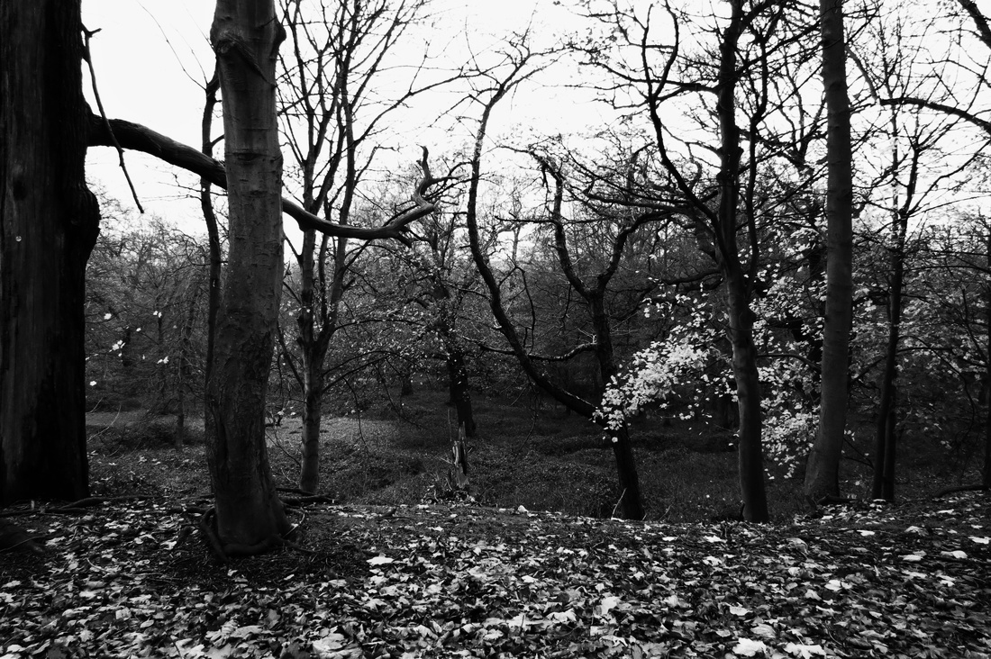
This image looked good to me because of all the trees and how much darkness is created. There are a lot of spots that are black and look scary because you can't see if there's anything there. I like that all the branches are messy and interlocking because they could look like long arms stretching everywhere. The way the sun stretches across the photo could symbolism light trying to overtake the darkness.
|
|
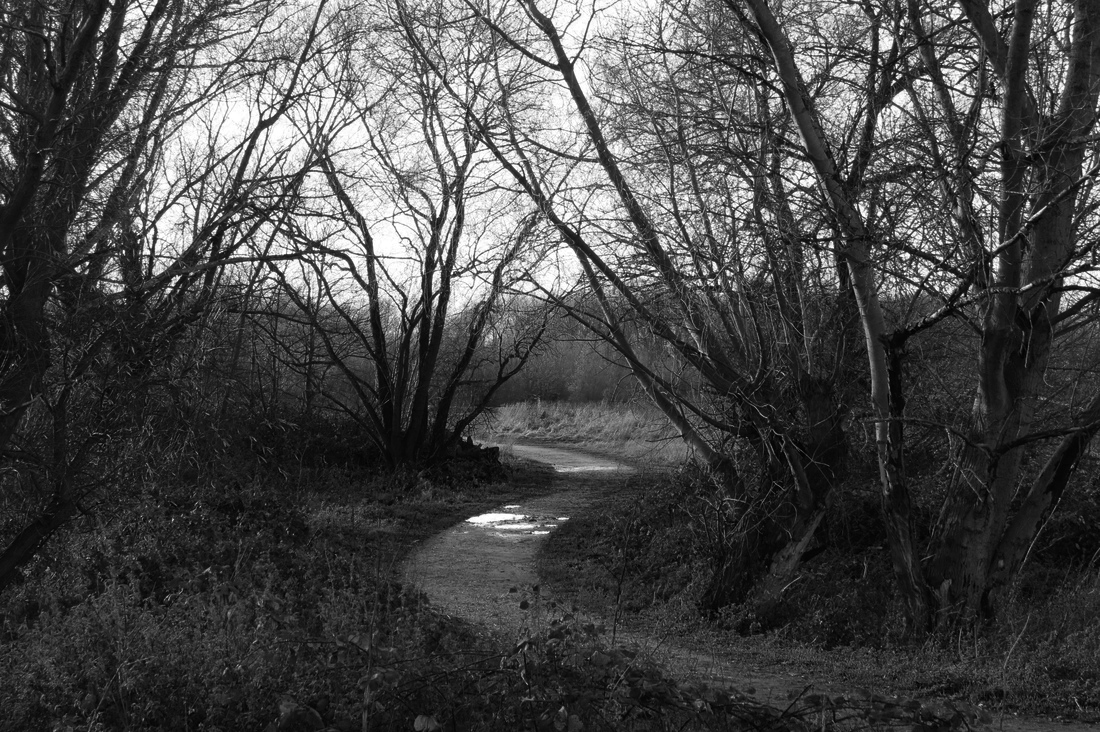
I like this image because of how dark it is and the way that it gets brighter the further into the distance it is. This image looks quite scary and shows a clear, straight path which path which I think could relate to john Shaw and the way he uses lines and paths. I think could relate to john Shaw and the way he uses lines and paths.
|
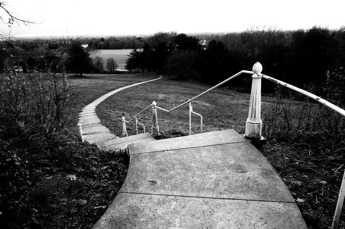
photoshoot 3: 2nd pathway experimentation
|
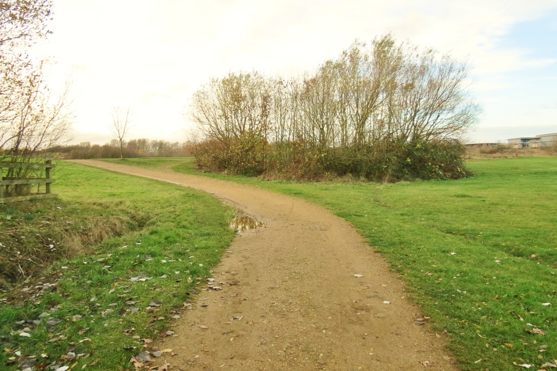
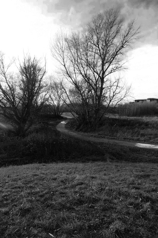
I liked this image because of the shadows that were created because of the positioning of the sun at the time. I think it shows a good use of line as your eye is drawn to the centre of the photo but I dont think it shows hidden worlds as well as some other photos because there is alot of space
|
|
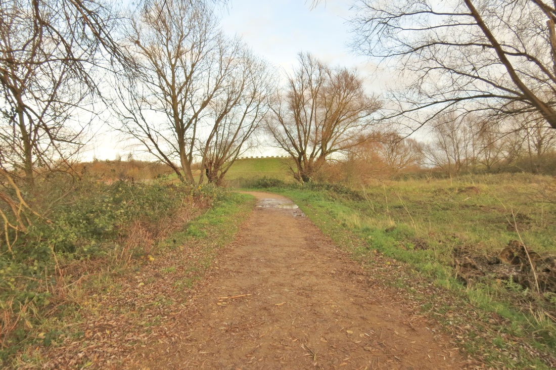
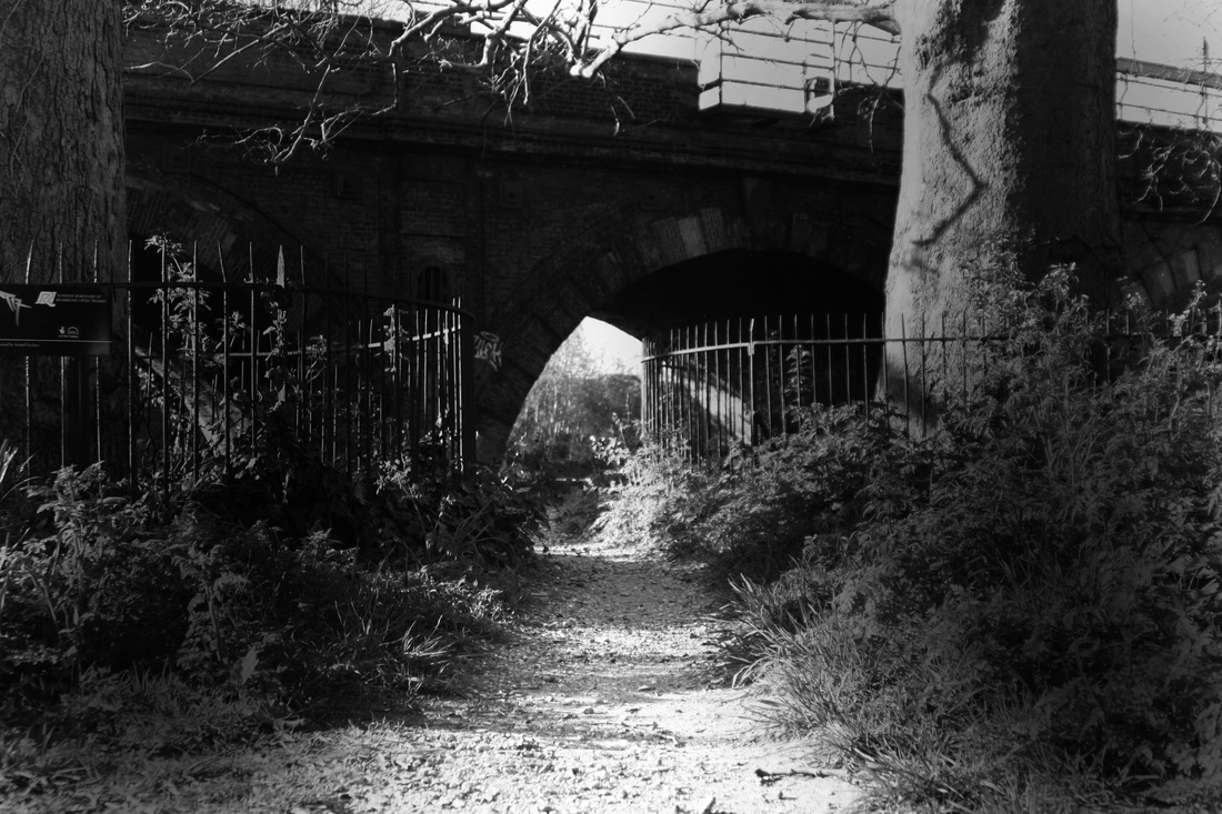
I decided to edit this image as it continued to show pathways and hidden worlds, which I think is because of the darkest area's of the images around the bridge and the lightness that is shown through the centre of the photo which look like the light is guiding you to another world.
|
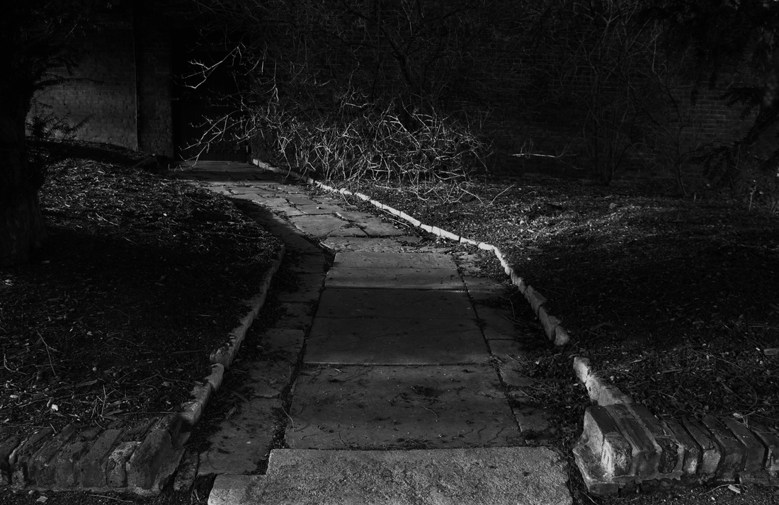
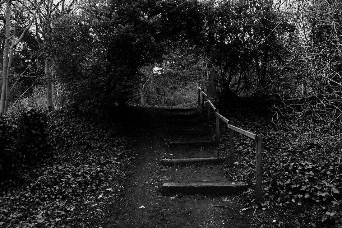
photo shoot 4: 3rd pathway experimentation
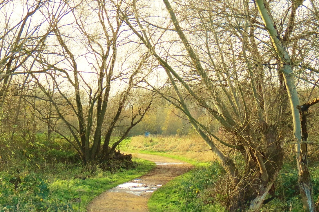
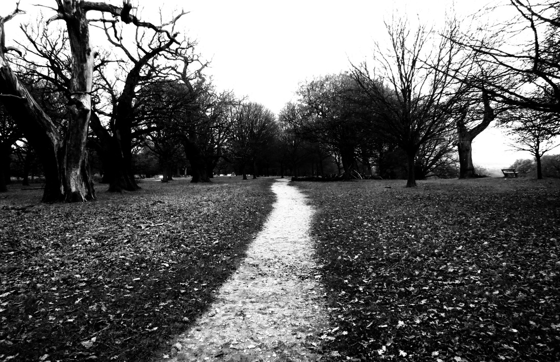
for these images I decided I wanted to take pictures of pathways that go off into the distance. I used John Shaw as inspiration because of all the ways different paths could lead to hidden things, i thought it would be a good idea to experiment with them. I like these because they all look lost and the texture of the images are quite rough looking.
|
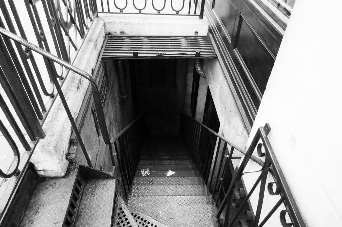
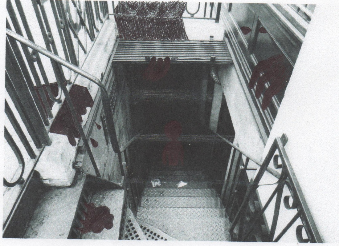
When I took this photo I thought about Holger Droste's photograph of staircases and how the difference in contrast makes the staircase look haunted and dirtier than it actually is. In his photo the staircase is curved and its similar to his because the lines make you eyes travel along to photo as if trying to find whats at the top of the staircase.
|
|

|
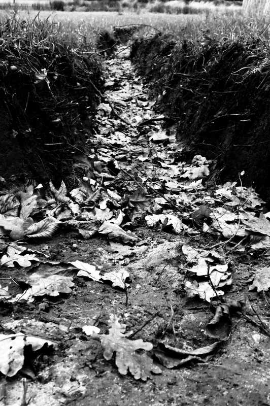
I grouped these photos together because I thought they were successful representations of vanishing points . I think it works particularly well with hidden worlds because you can see how the paths all go off into the distance and each photo tells a different story. The main thing I liked about these is that the paths are all very bright in comparison to the surrounding because I made the contrast high on all of them. I made sure there was complete blackness in each photo because they represent hidden parts.
|
|
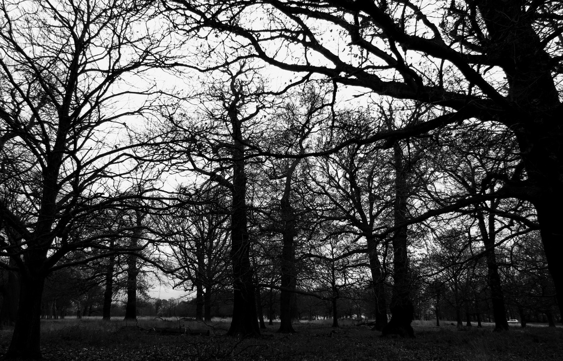
With the photo's that are mainly tree's, I think they look quite ghostly and dark. I wanted to use the trees as representation of people when I didn't have anyone to be in the photo. I like that use of the branches and how they can be looked at as arms of people waving in a ghostly way. In the darker photo, you cannot tell what is in the distance and it looks scary. But I wanted both to be UN-inviting.
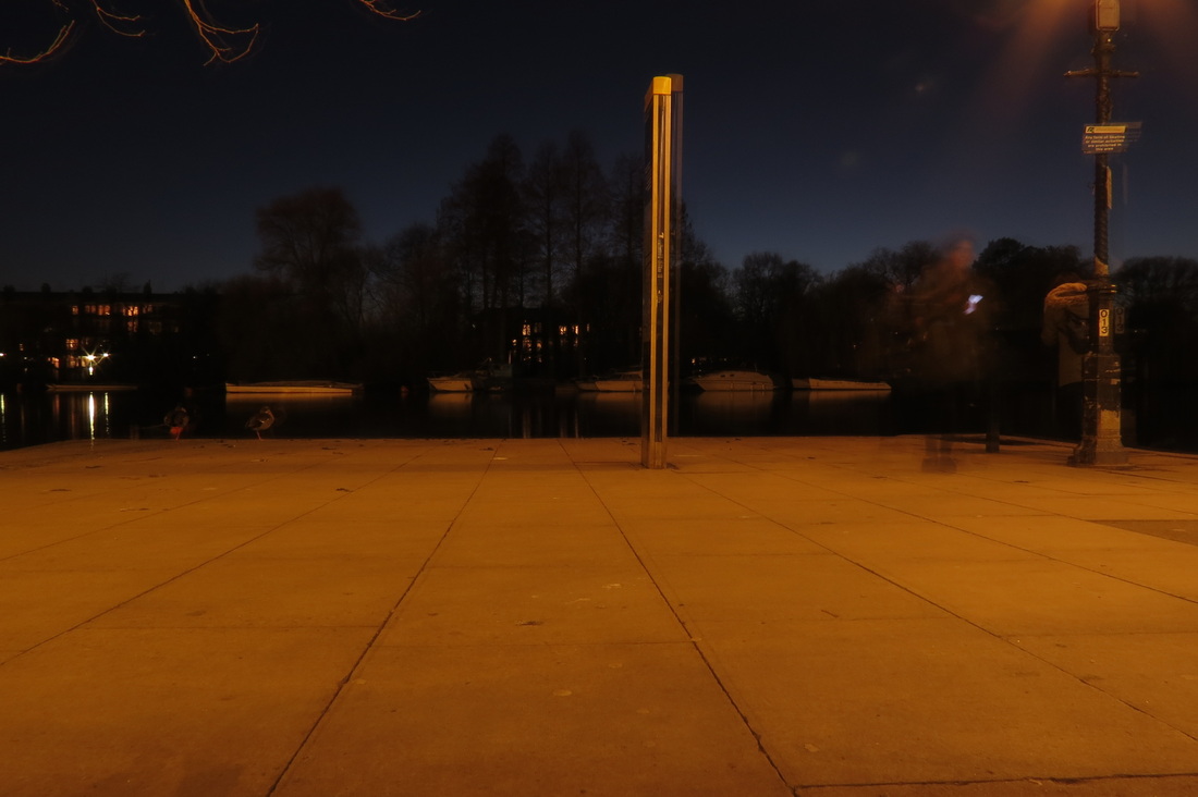
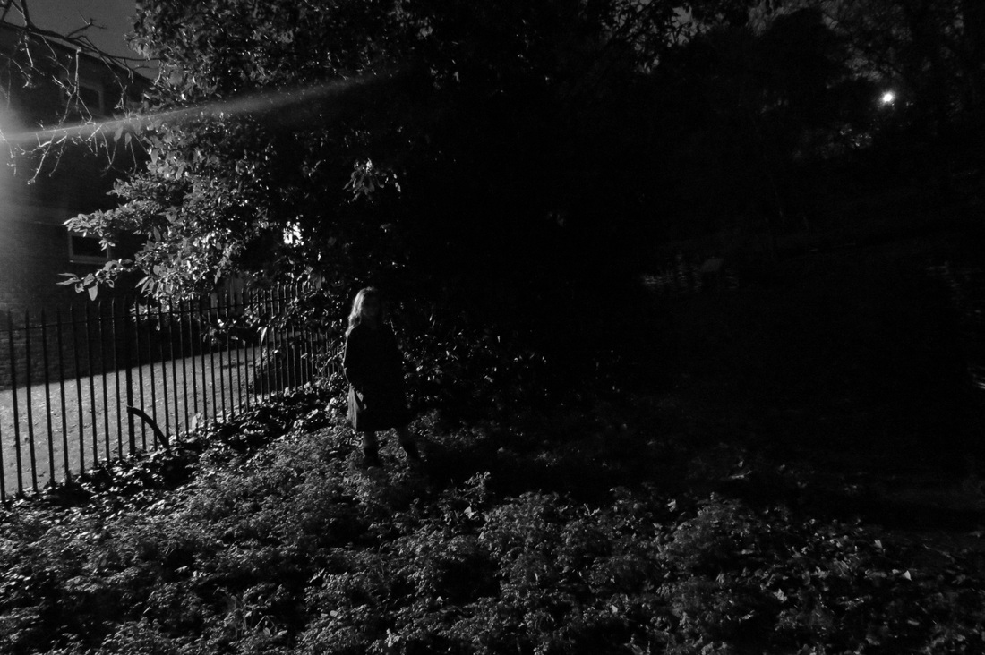
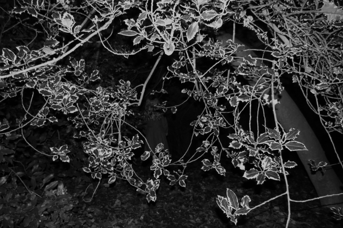
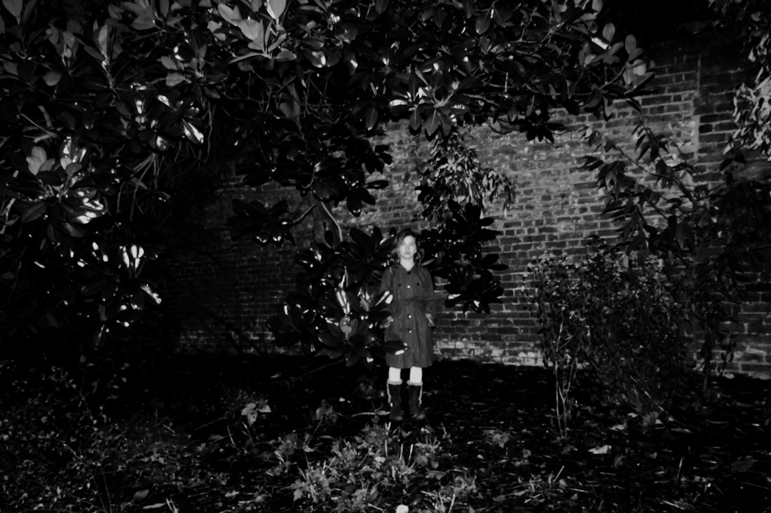
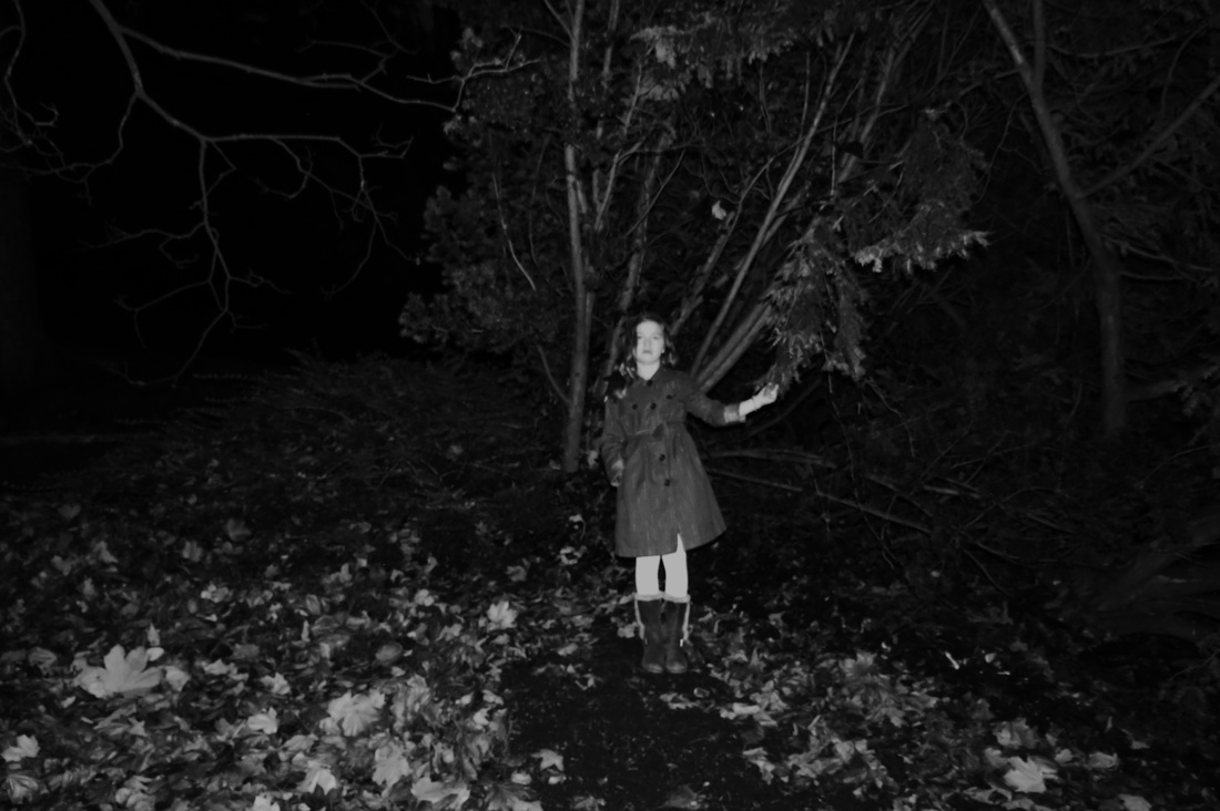
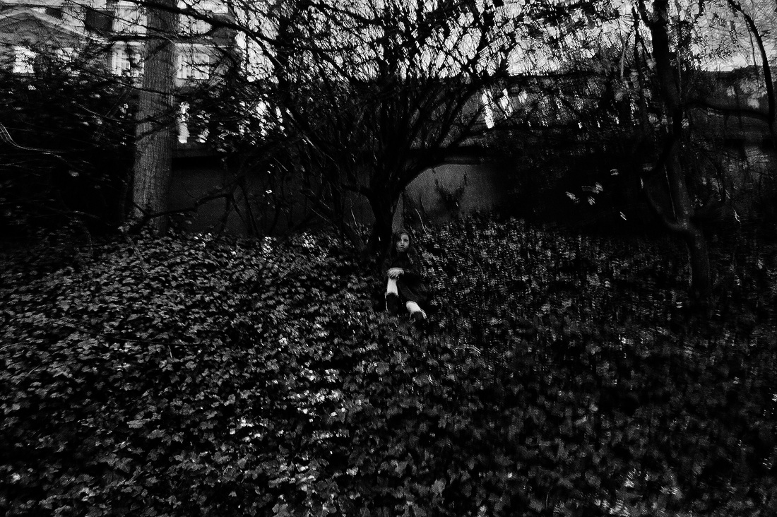
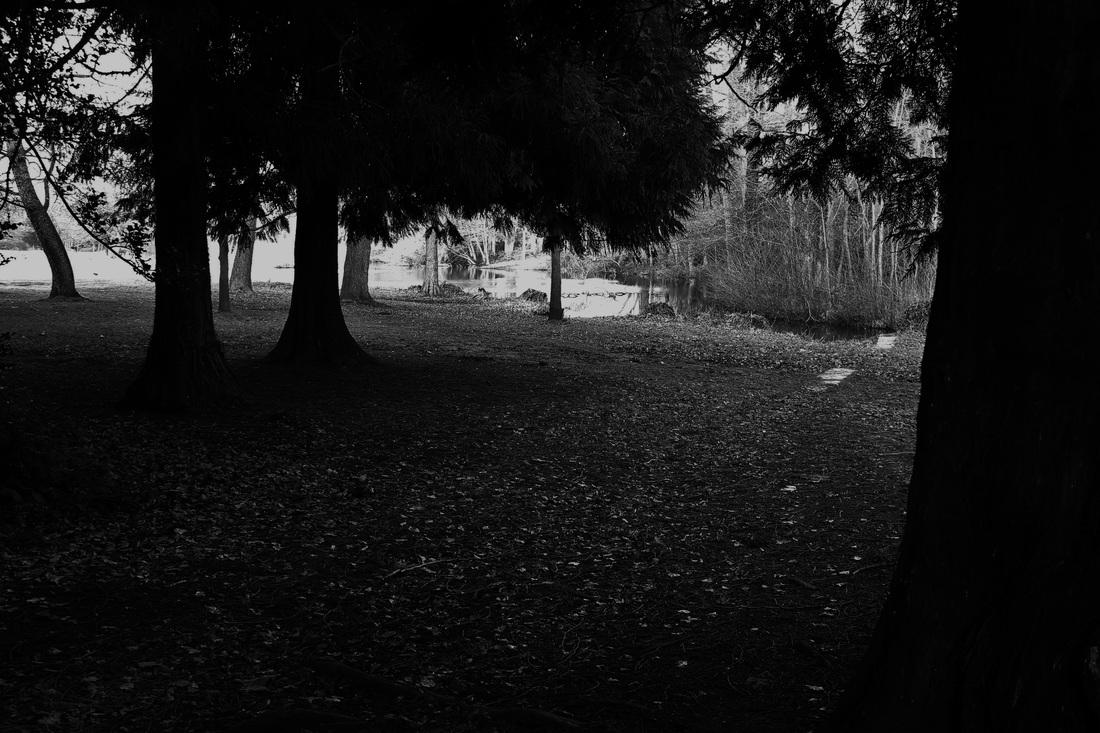
photoshoot 5: a spooky PRESENCE
The idea I had when doing this shoot was to include a person in the photo's to make them scarier. I thought a child would work best for this. This photoshoot could have been better because of the conditions at the time. For the photo's with a subject in, I think went well in terms of being scary but, as it started to get dark, the quality of these photo's went down because it was hard to shoot in the conditions.
|
This image came out to dark and you can't see most of the tree's. However I think the outline of the body looks ghostly with the light hitting her right side so it works well in terms of being scary.
|
|
I like this image because you wouldn't notice there was anyone in the photograph but there is. I think the leaves that are bright from the flash, create a good frame around her. I think this photo goes well with hidden worlds and it seems very Alice in wonderland.
|
|
This photo was not as successful as the others because of the lighting at the time which caused the flash to go off, making the photo loose it's naturalness.
|
|
|
photoshoot 6: eerie atmosphere

a04
FINAL PIECES