14. Create A Sense of atmosphere.
Atmosphere - the pervading tone or mood of a place, situation, or creative work.
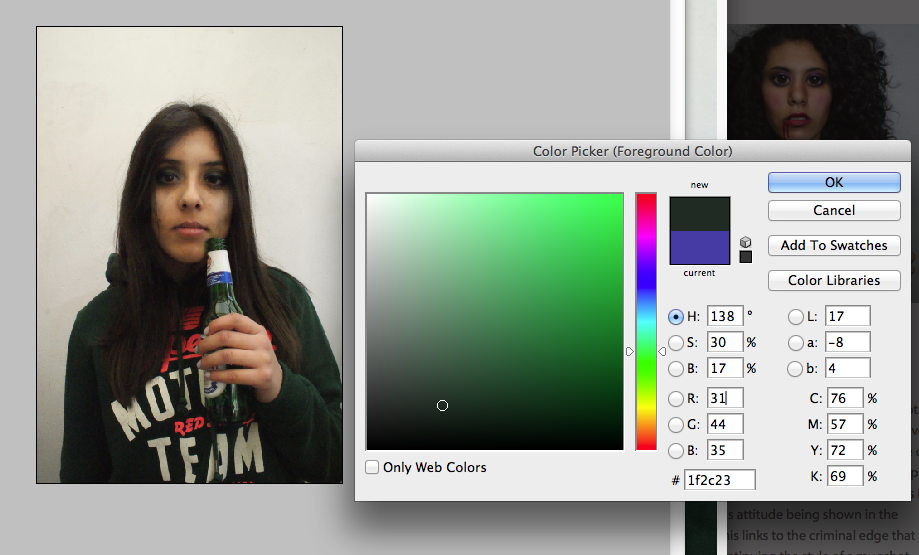
Atmosphere made me think of create a specific emotion through images whether it be happiness, uneasiness, tense, sadness, anger, love, worry, confusion. I want my overall images to convey a specific atmosphere whether it be by facial expression or editing. A 'sense' of atmosphere sounded appealing to me because it allows you to experiment with things whether they look nice or not as it does not have to be positive. I think that a good way to create atmosphere is through colour and the connotations that they have.
Atmosphere made me think of create a specific emotion through images whether it be happiness, uneasiness, tense, sadness, anger, love, worry, confusion. I want my overall images to convey a specific atmosphere whether it be by facial expression or editing. A 'sense' of atmosphere sounded appealing to me because it allows you to experiment with things whether they look nice or not as it does not have to be positive. I think that a good way to create atmosphere is through colour and the connotations that they have.
|
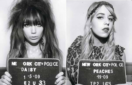
This made me think of situations that make you feel a strong emotion such as nostalgia. Before I received the paper I thought of recreating old movie scenes and when I read this brief I thought about bringing old cartoons to life. This is because they are recognisable characters and I like the idea of creating a recognisable piece of work. I think it would be good to show them as humans to see what they would look like. I had possible ideas of putting them in working situations or making their lifestyles negative by including crimes. The atmosphere will change dramatically depending on the setting which I will vary to see what works the best. I think the image will have a comical feeling to them because the characters that are not serious will be out into the real world. One of the more serious ideas I had would be to show characters in mugshots because it would create a different emotion by seeing young children characters in such a violence situation.
|
|
|
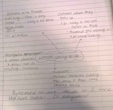
idea 1My first idea was to choose only cartoon animals because they would be the most interesting to look at once they had been transformed into humans. By showing the well known characters in the everyday world I think it would be quite comical and different. I think this would be harder to do because it would not be obvious who the characters and also I dont think this would create as strong an atmosphere as my second idea.
|
|
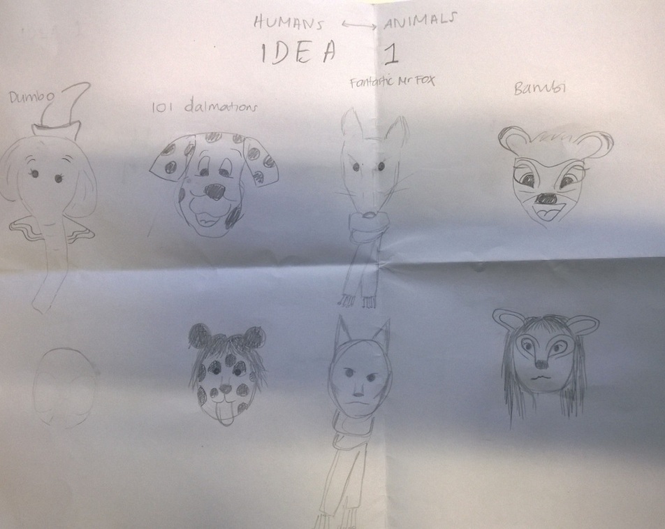
idea 2I like the idea of mugshots alot more because they are more personal to the characters and I think the photos would look good. To achieve this I would want to get a different model for each character and try and make them look as close to the character as possible and include a prop if necessary. The crime that they would have committed would be linked to their character. This is the first thing I want to experiment with.
|
|
|
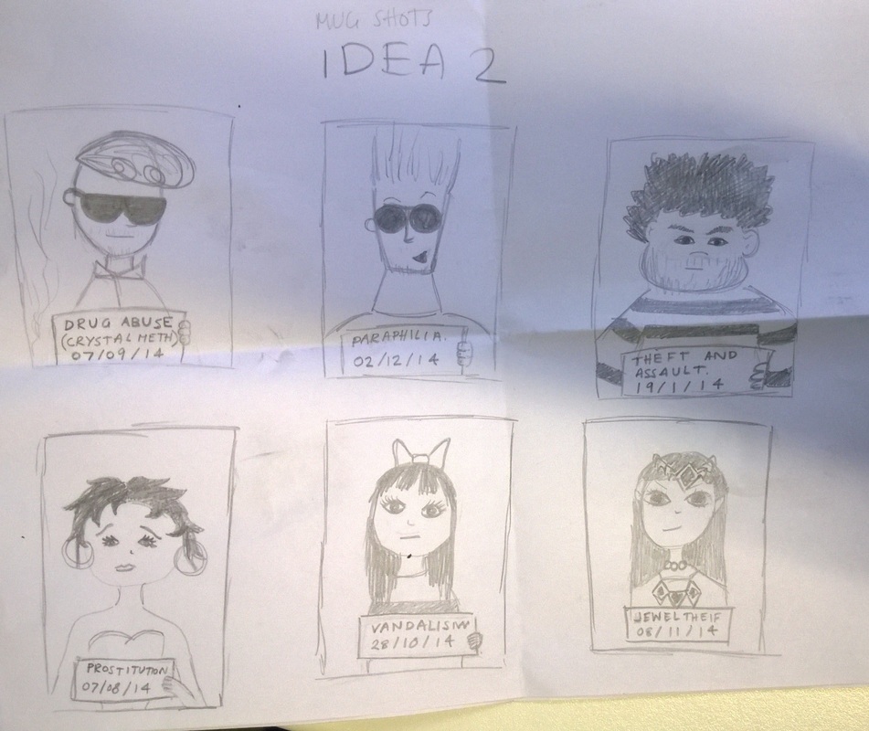
secondary imagesI like this collection of images that I discovered and they are very similar to my second idea. As these are cartoon they portray the characteristics a lot better so when I experiment with taking mugshots I want the outcome of the images to appear very cartoon like and for each character to hold an element of the character too. It was coincidental that I found this collection of images because it linked to the idea that I wanted to try and therefore helped me to think of more effective ideas.
|
Character mugshot experimentation
What I wanted to do was experiment with my second idea that I had which was to turn characters to live and then produce a mugshot for each of them for a crime that they commented that links to their character. I think that it was a very difficult task as I tried to find models that looked like each character which was a very difficult thing to do. The images turned out to look like what I had imagined but they did not turn out as effective as I had hoped because the characters were not extreme enough and I wanted to do work in a more extreme style.
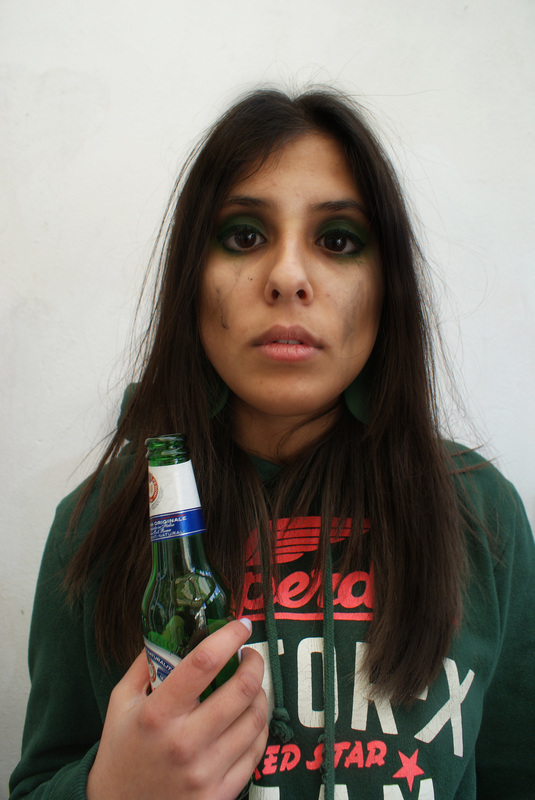
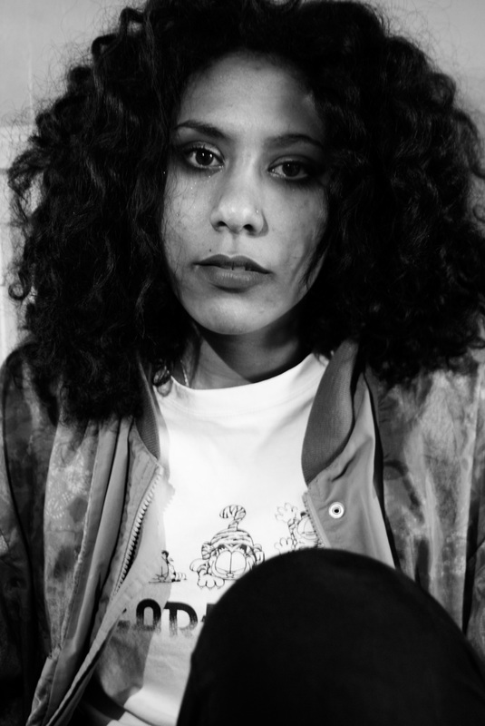
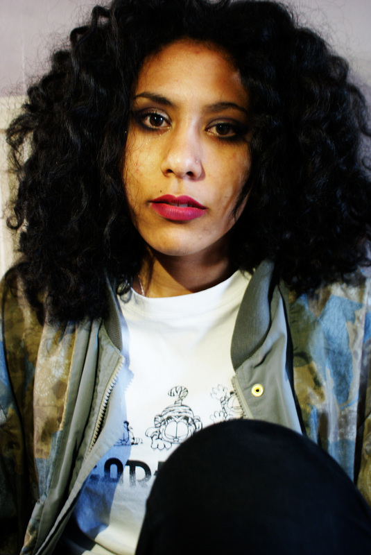
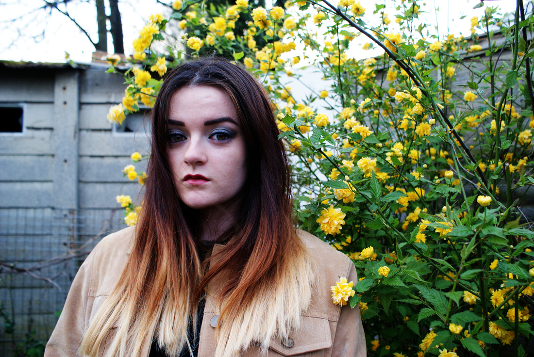
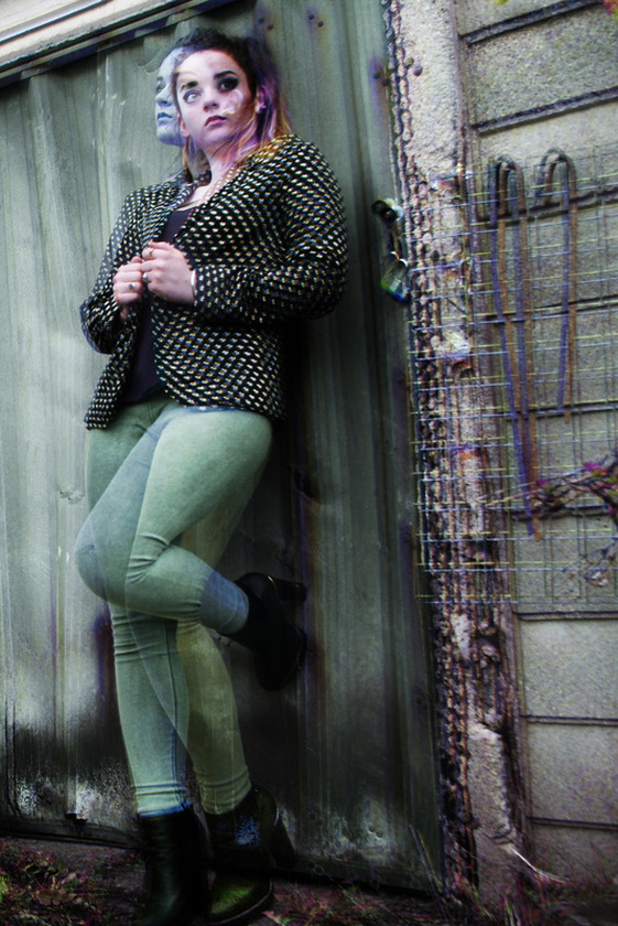
buttercup powerpuff girl - drink driving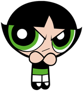
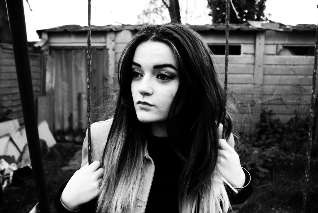
This was the first photoshoot that I did to experiment with mug shots for the cartoon characters. I chose buttercup the powerpuff girl because I believed it would be easy to colour coordinate everything to her cartoon character. However this shoot was not as successful as it could have been because the photoshoot lacked any real purpose. Her prop of a green glass bottle was to go along with the colour scheme and to show that her crime was alcohol related e.g. drunk driving.
I chose this model because the hair is dark and straight, then I did the characters make up and i wanted it to all be as green as possible. |
|
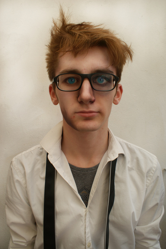
Dexter's laboratory - Chemical experimentation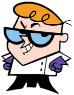
The idea behind this image was to recreate the character of dexter's laboratory by using similar features in the character. I used the glasses as props to suit the character because Dexter's glasses are a famous part of his character. When editing, I turned his eyes blue to further stick to the character as his glasses are tinted blue so I thought this showed a deeper connection. I then thought that because he is supposed to be a teenage version, he would not be wearing a lab coat, so I thought that the white shirt would be more suitable for the age.
Then, because he is a scientist, I wanted his appearance to look as if he was near an explosion so I made bruises on the models eye and jaw to indicate a form of danger has that been inflicted and because of his character it was appropriate to go with drug experimentation. his glass were blue but I made his eyes blue instead because i feel as if it still makes the model link to the character . |
|
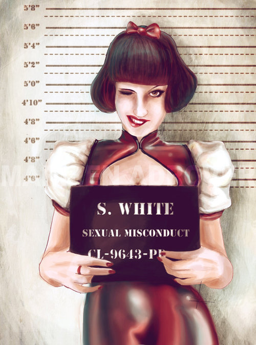
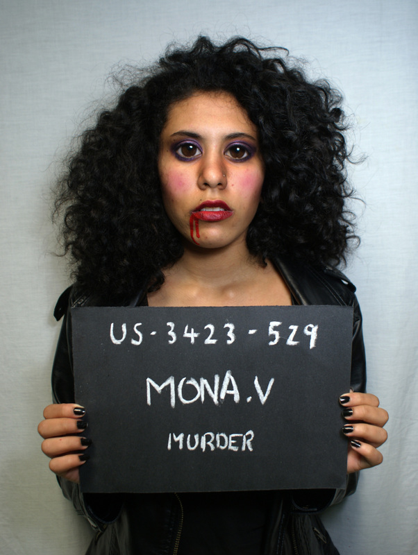
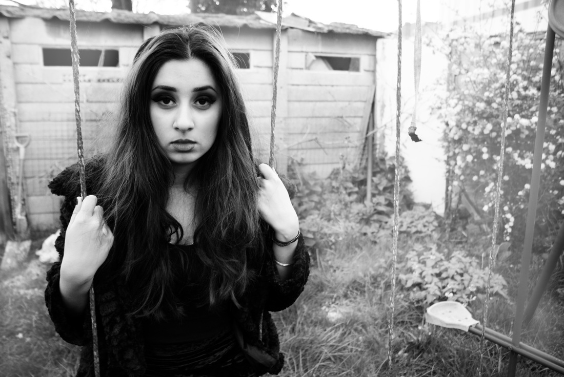
mona the vampire - murder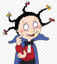
This character was easier to do because she is a vampire therefore I put blood on the modes face and waited for it to dry and become crispy like real blood. I thought that was this is a children's show it would be more extreme to show the vampire as more realistic. Also this hair was already suited to the cartoon because of the volume of it which is a modern day version of the cartoon. Makeup was close to the cartoon because all the cartoon has is purple around the eyes and pink cheeks which was believable for a human to have which made the links between the model and the cartoon more recognisable.
|
|
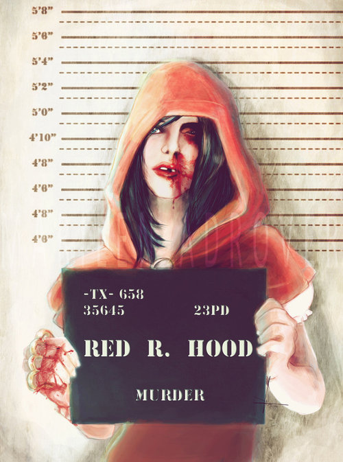
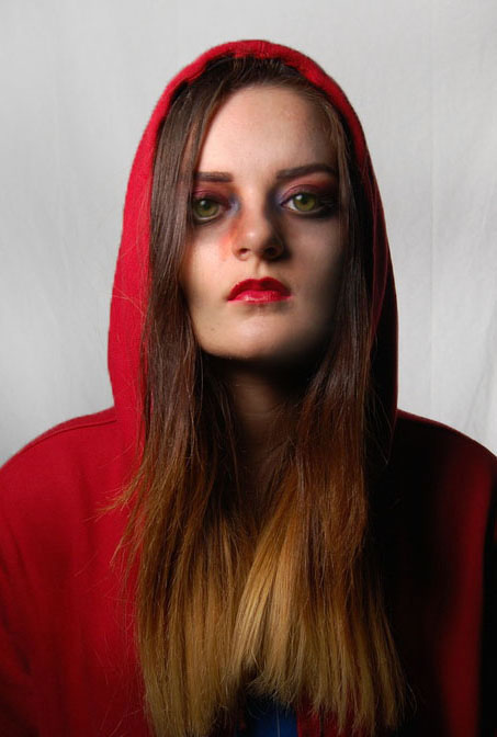
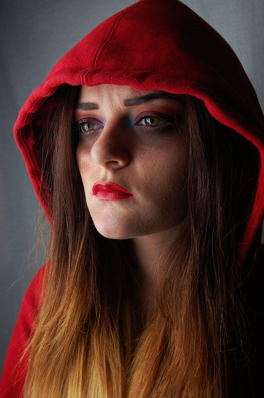
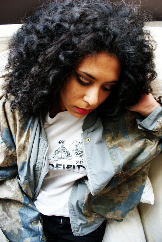
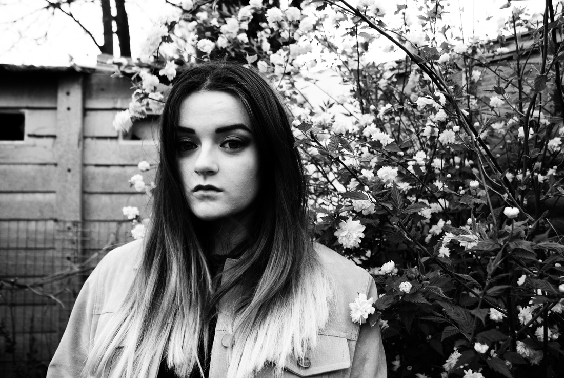
Red riding hood - theft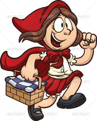
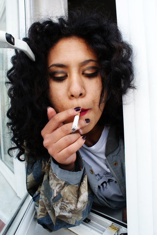
The Red Riding hood photo shoot came out quite well because towards the end of the photo shoot I decided to take a few close up shots because the makeup for this look was very specific and effective and seemed to stand out quite well all the colours were quite vibrant. The images looked good and embodied the character well. I think I wanted the hood to be the main focus just to show characterisation through the familiarity of it. The first few that were meant to continue the mugshot idea were not as effective so I wanted to capture more of the attitudes of the character through the close up facial expressions.
|
|
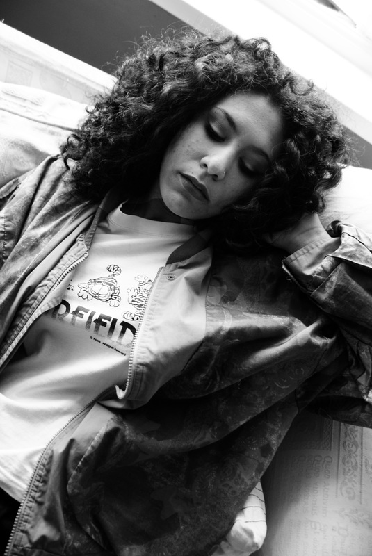
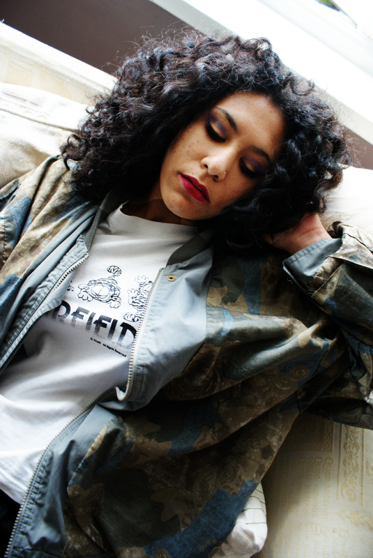
Process (captions appear when the image is clicked on)
outcome
|
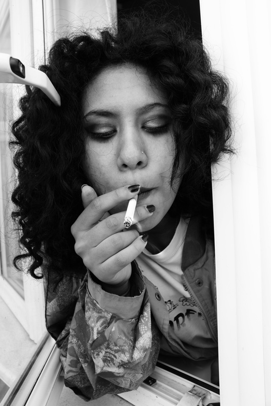
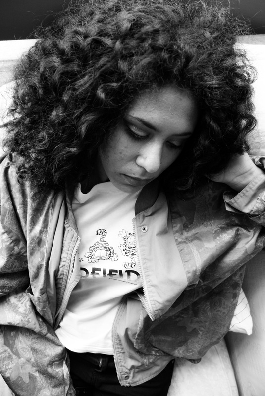
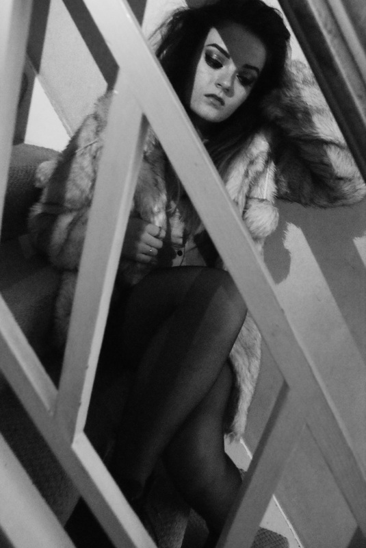
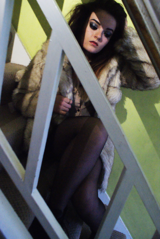
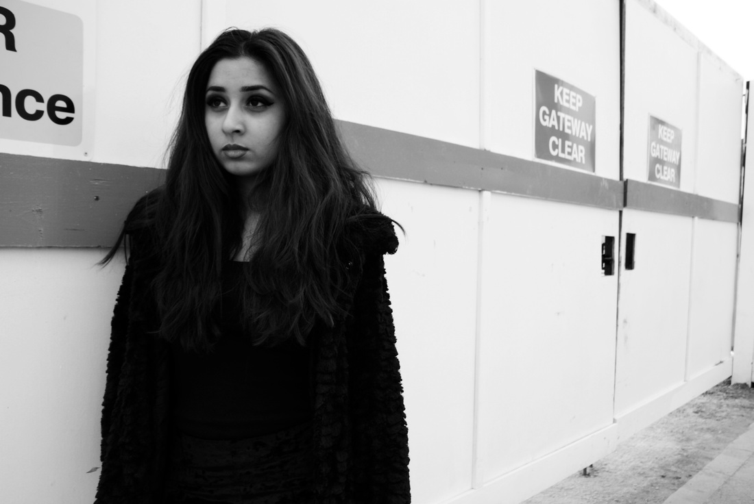
Transition from 'mugshot' to 'headshot':My intentions for the little red riding photoshoot were the same as any other that I did as I wanted to portray a mugshot photo of her character, however, as the outcome of the images looked much more effective when they were close up of the face and you could see all the different colours that the makeup created and how nicely it contrasts with the models eyes. I think that this image in particular worked well because there is attitude being shown in the expression on the face and I think that this links to the criminal edge that I wanted the photos to have without it continuing the style of a mugshot.
This image has led me on to want to focus more on the hair and makeup of the models and make them look less like well known cartoons and more like their own real life criminal characters. |
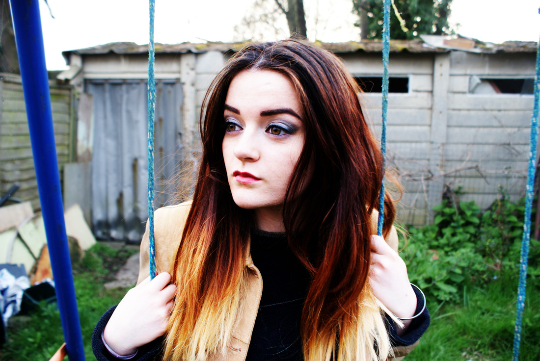
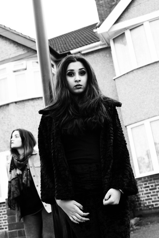
I think that overall the mugshots did create a sense of atmosphere through the use of such different vivid colours that have connotations to different emotions. Also I think that as they were recognisable characters it would be interesting to see them in their mugshots. I think when they are next to each other they look much more appealing and suit the mugshot style.
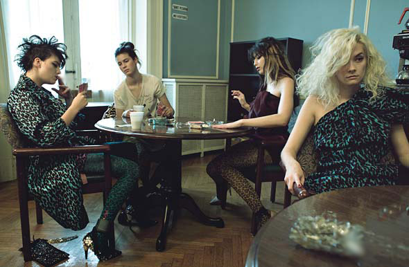
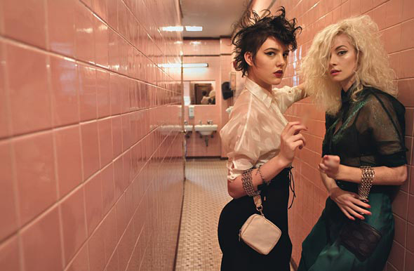
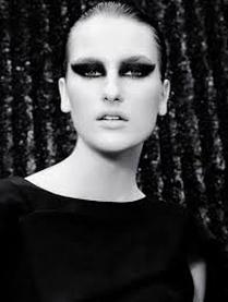
Magazine Law & Order Editorial by Steven Meisel
Steven Meisel (born 1954) is an American fashion photographer, who was known for his work with US and Italian Vogue and his photographs of friend Madonna in her book. He is now considered one of the most successful fashion photographers in the industry, shooting regularly for both US and Italian Vogue. What I thought linked his work to mine was the way he made everyday people (particulary females) look out of place. I like how the hair and makeup is well thought through but still made to look effortless and I think his work relates to how I want my photos to look because I think it would look more effective if the characters had a natural look about them and also his use of mugshots as a more serious yet relaxed shoot looked appealing to me and I wanted to experiment taking photos that still looked more edgy but in a less comedic way than my previous photos.
|
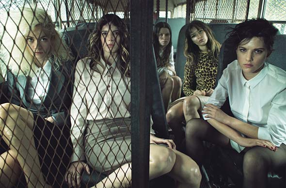
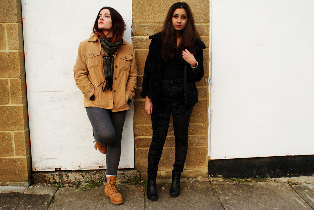
I like this image because its dark and shows the blonde girl as the main character in the scenario rather than both of them being the main focus. Because of this lighting, it shows a positive attitude towards her even thought She is looking at the camera with hate and I think it is much more effective than having the female look soft and happy. I like the composition of the photo because the girl on the left blends in with the wall on her side making her a part of the scenery and framing the other girl, making her the centre of attention. The set is very well thought out yet it also doesn't draw too much attention away from whats happening. I think the use of props is very good because it specifically links the two girls together without forcing them next to each other. The eye contact with the camera also helps to dismiss the girl on the left because of how she is looking at back us. If her eyes were looking at the other girl we would follow them.
|
|
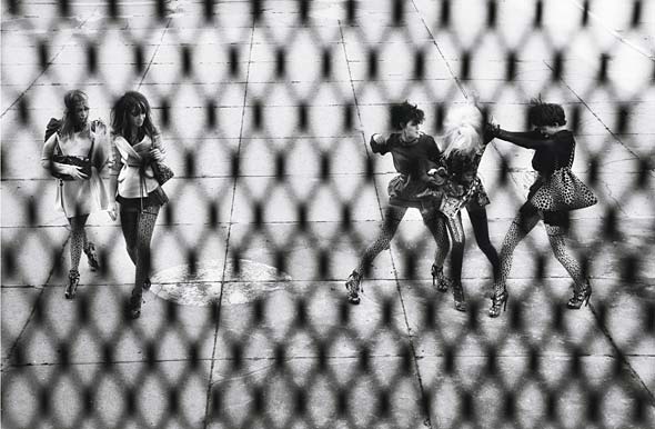
This image caught my eye specifically because it linked to the mugshots that I had already done. I like that the characters still look tidy and clean but also look guilty because this would be appropriate for what I want to do with my characters. I like how the models have different expressions to each other rather than the stander straight face because it shows attitude and individuality. This is important to me because if I experiment with using multiple models I do not want them to look the same. I think the individuality of the models is important so that they stand out. I prefer the photo on the left because of how straight on the face is which transfixes us more with her eyes.
|
|
|
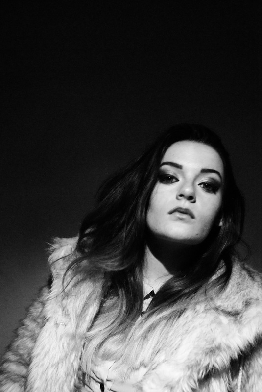
my artist replication 1I did this rough photoshoot in the style of Steven Meisel that I did to experiment with the style that he work he does and see how to find what works best. What I wanted to achieve was a female with alot of attitude which I tried to experiment with but it I didnt think that is was successful enough as the models lack of character was showing in the work. Compared to the previous mugshots I did I think it was difficult to bring through a character without pretending to be someone so when I next do this I want it to be a bit more extreme. When I next do this I want the models outfit and makeup to be thought out more precisly because I feel as if a higher focus on these would make it look better. The overall outcome was okay because I got photos that looked really bright and contrasting to each other.
I displayed the images below in both black and white and colour to help me decide what I thought looked better. This is because the 'Law & Order' by Steven Miesel was in both so I wanted to mix mine up also. |
process (captions appear when you lick on the image)


|
|
|
|
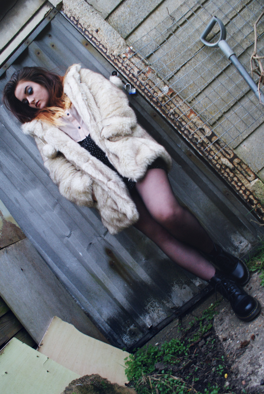
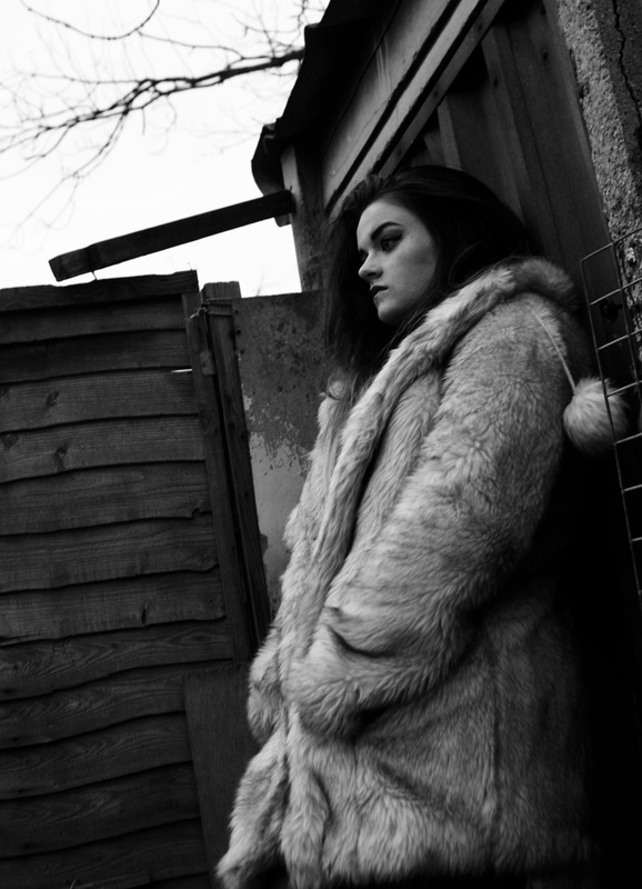
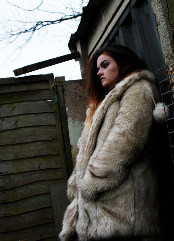
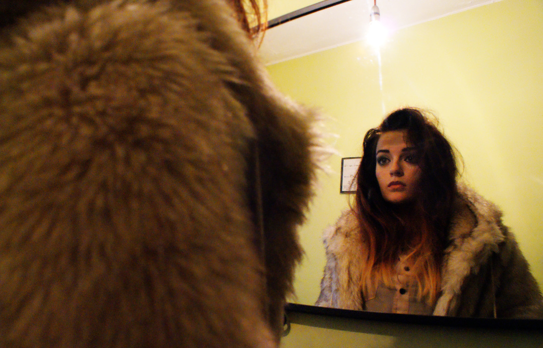
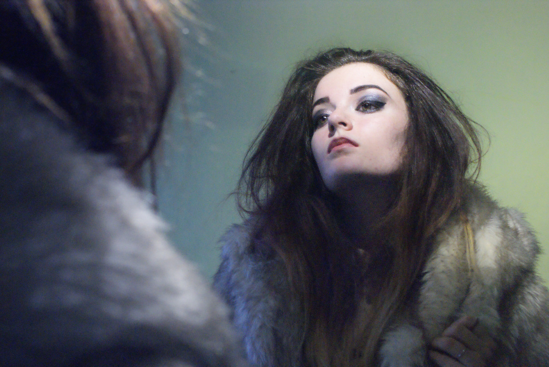
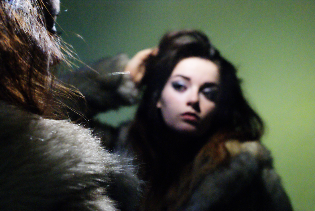
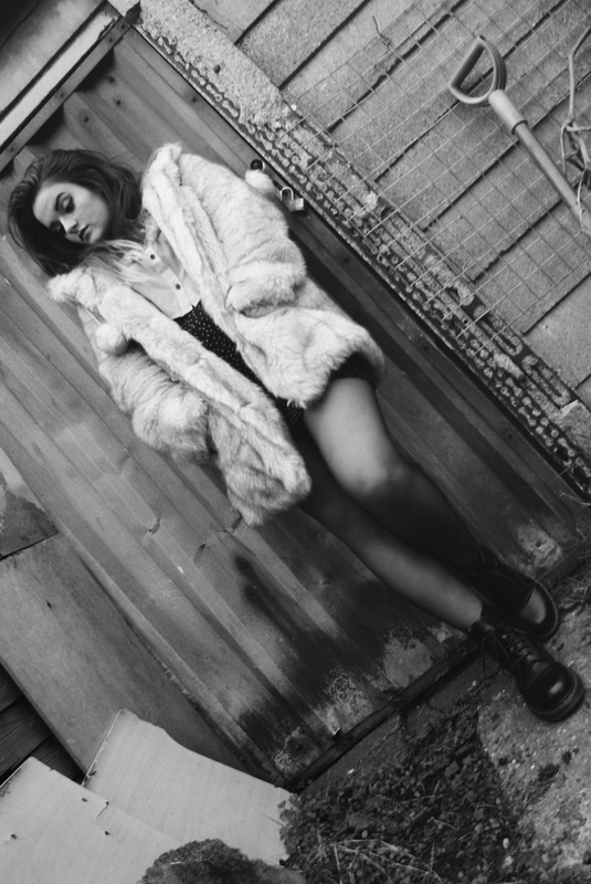
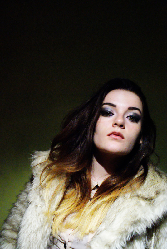
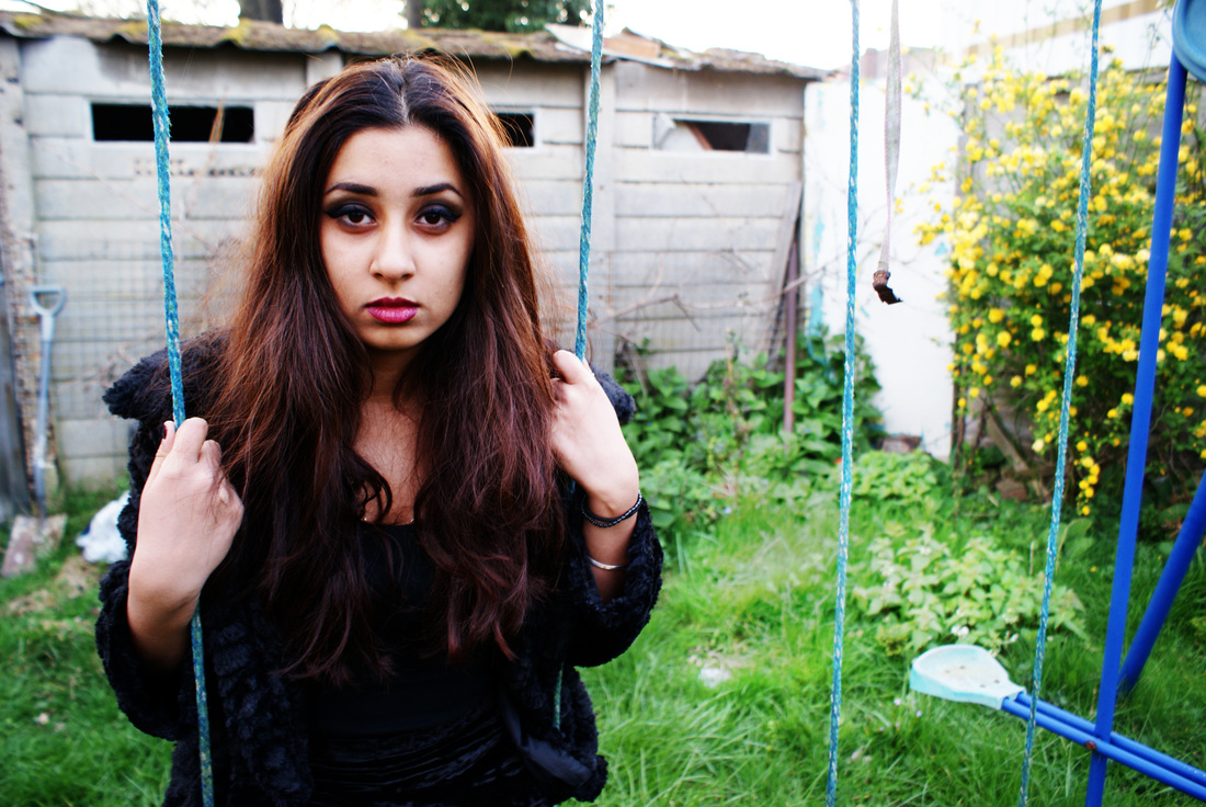
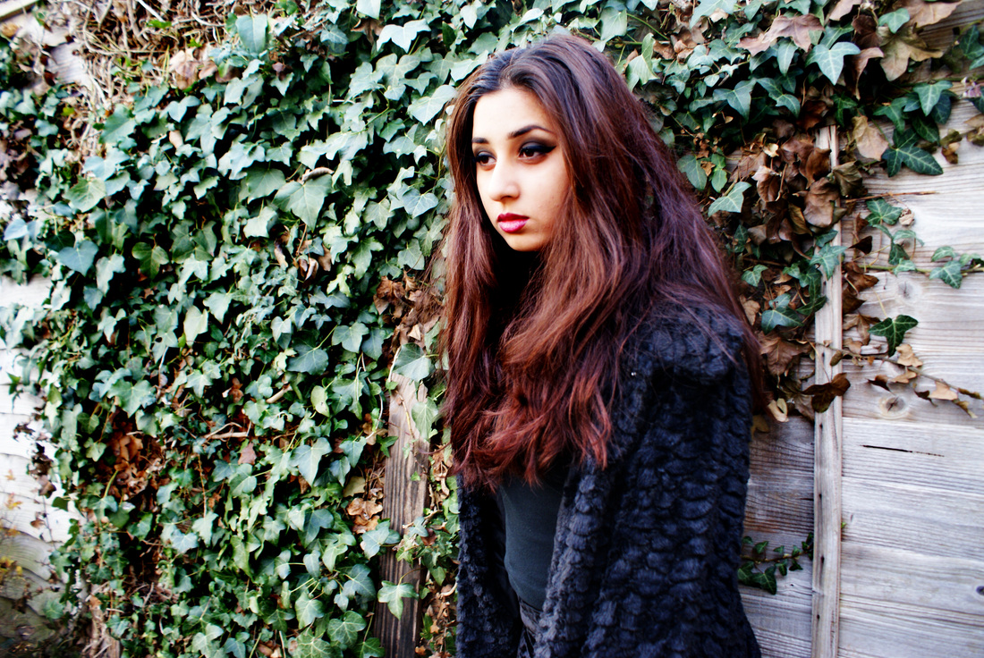
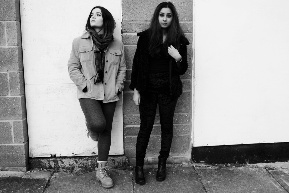
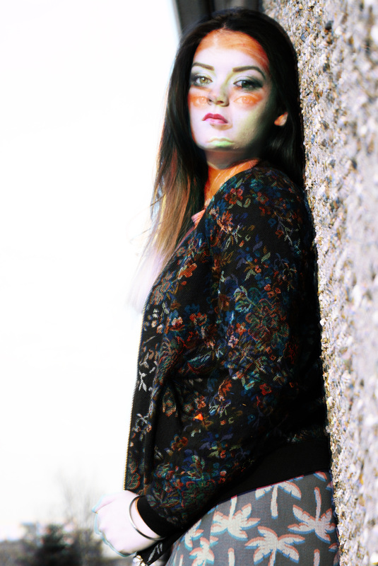
my artist replication 2My inspiration behind this photoshoot was the collection of photographs by Steven Miesel. What I wanted to achieve was a sense of disorganisation as his photos are all about law and order. What I liked mostly about the photoshoot was the different backgrounds I used in all of the images because when they are displayed together they all look different from one another. The different textures that I used in the photshoot was important to me because I wanted to create a sense of atmosphere through the clothes and hair and make-up. I chose the fluffy coat because it created a strong sense of character which is something I really wanted as my first shoot lacked it. I think that it related to the leopard print in the photographers original images as both textures/prints are very bold and make a statement. The outcome of the images was overall good because I think that by using a variety of different backgrounds I was able to capture the dishevelled atmosphere I wanted. Also by making the model do different things each time and different positions in the certain locations it made it more exciting to find the best outcome. |


|

|
Because of the black and white that Steven Meisel works in, I edited each photo in the exact same way but then made a copy of them into black and white because I felt as if the only way I could find which ones looked best was to lay them next to each other and compare. I like that his work was a mixture of both black and white and colour because it shows variety which was important to me whilst I did this photoshoot as I used multiple backgrounds. I like the way that the images turned out because they were all very different to one another and showed the model different each time.
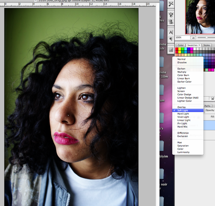
The composition of these photographs were very important to me because I felt that if there was a large variety of angles and the model was often placed in different places then there would be a better outcome because there would be more to choose from. I think that this links back to Steven Miesels work really well because of how different each one of his photographs are. I tried to experiment with colour and black and white just as he did to see what looked better and I think that it is a combination of both that keeps his work interesting however I feel that black and white creates a different atmosphere to colour photos. On every photo, I made another layer on Photoshop and chose the option 'soft light' to create a thickness in the photos that I think works really well and makes the photos more intense. I want to do this type of photoshoot again which a different model or featuring more than one person. Because I think it would further experiment with what Steven Miesel did and help to create a sense of atmosphere through the rebellious characters that I want to embody. It added extra contrast to the already bright photos and the atmosphere.
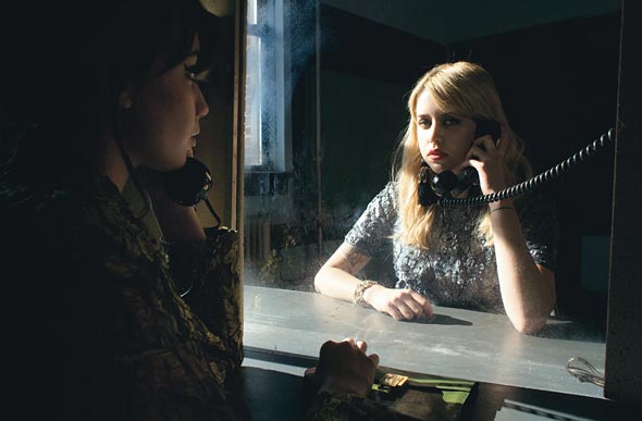
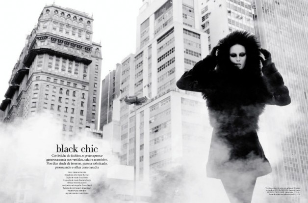
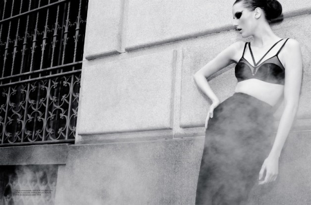
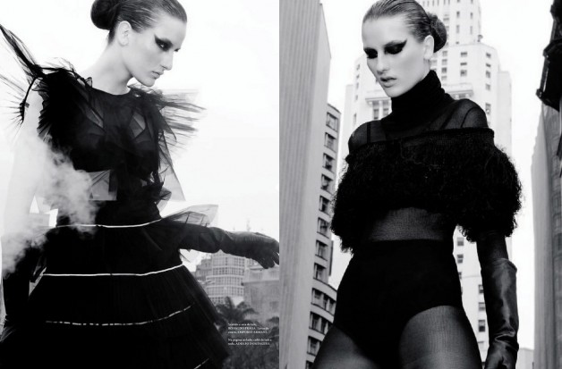
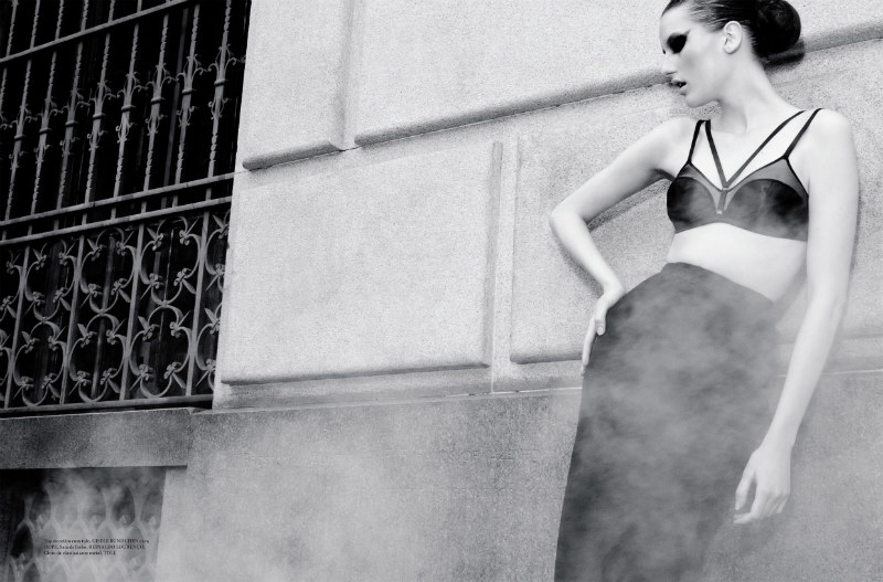
Katia Selinger for L'Officiel Brazil Photo-shoot.
The main thing about these images that caught my eye was the composition. The costume of her in the photos are different in each one. Because of the female character being at the front you can sense her authority/importance.. This image is very useful because the costume highly represents her character and she is expressing herself through her poses which don't look overdone because of the setting which makes it look like she is just in her environment. This is something I would want to show in my images because i want her character to own the set.
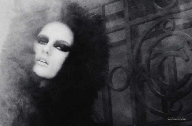
|
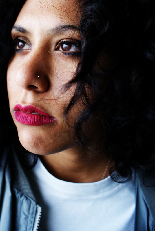
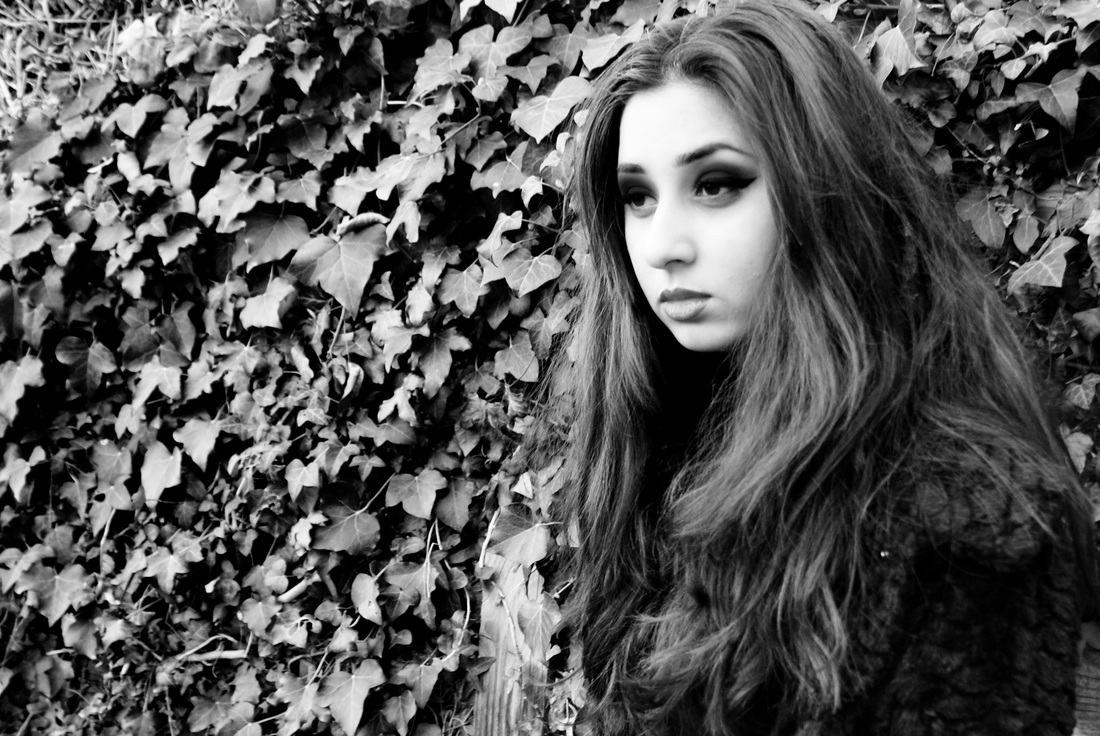
This photo was very striking because of the models make up. What I thought was nice was the contrast of colour with the black eyeshadow against the models pale face. Her connection with the camera was something that I wanted to achieve too which is why the black makeup intrugied me as it framed the eyes and created the fixation between the model and the camera. Also the background in this image makes her contrast even more which has been carefully thought through along with the black outfit. Again, the female models face is not happy and feminine which is why I was drawn to this shoot.
|
|
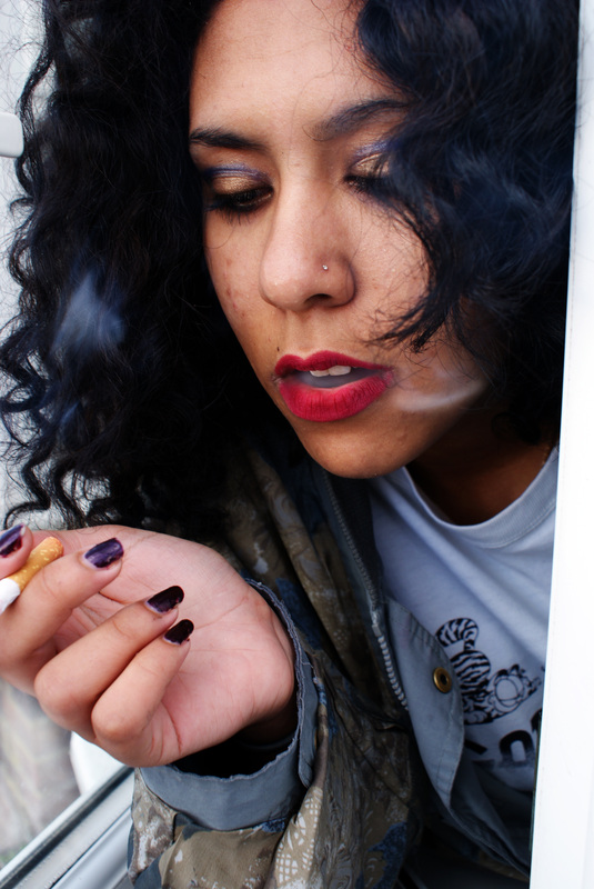
This one was more appealing to what I wanted to do with my work because I like the focus on the models body shape and background as well as her face. I like how the contrast is continued throughout this photo because of the black and white which makes everything simpler. Even though the model is not looking at the camera in this image i think it is is still effective because the positioning of her face is very specific and interesting. What I think brine a sense of atmosphere to this photo is mainly the smoke which I think could add more intensity to the photographs because its a very strong idea to have. I did not think of using external props but now I feel as if when doing this photo shoot that the outdoors would appear to be more useful than indoors. I think it would create a different atmosphere to the indoor photos and give an overall new feel to what I want to do.
|
replication
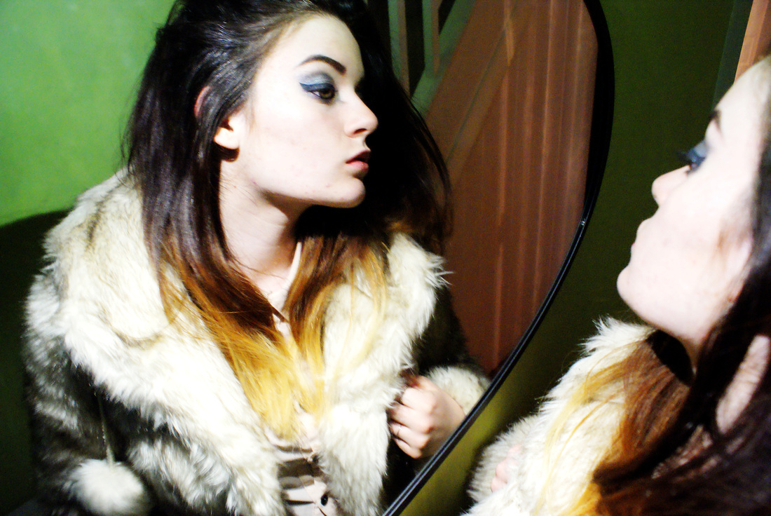
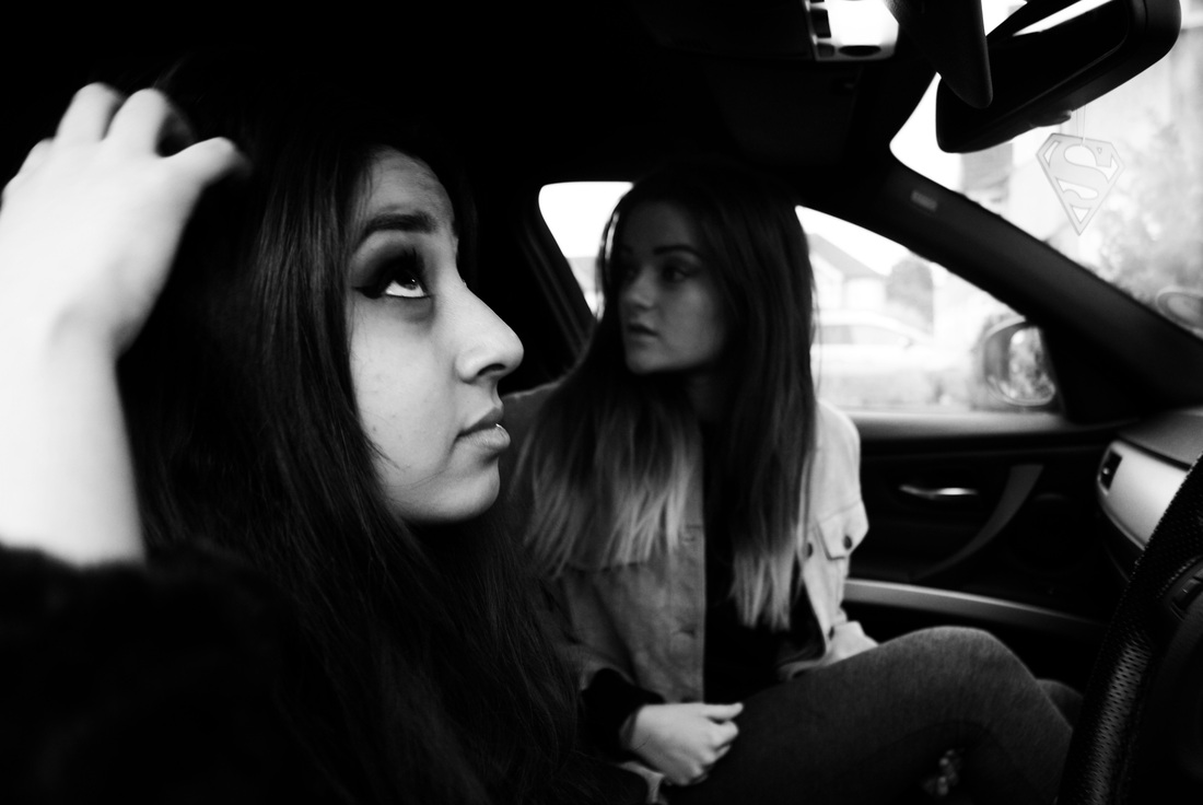
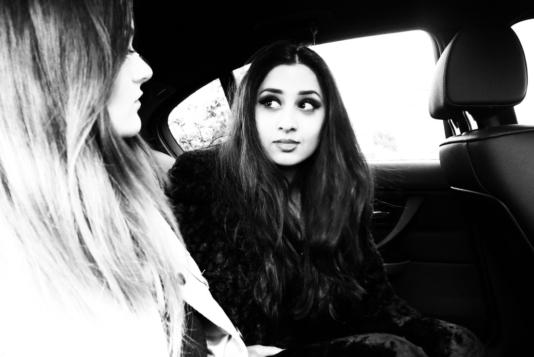
This photoshoot was insired by Katia Selinger because of the makeup and outfit of the model all in black however the use of the two models was because of the Steven Miesel shoot as he had multiple models in it. I think that the use of more than one person makes the images lot more interesting as there is more too look at and it creates more of a story. The editing process and outcome of the images is where I really want to show Katia Selingers style because I think the majority of photos will look better in black and white as they are very hectic already and the black and white can calm some of the images down and make them look more refined. The outfit choice is something that I thought about a lot more in this shoot considering there was two models so I had one in all black and one in light tan as contrasting to each other. I like the images in colour however they are very bright and the contrast is high because I wanted to achieve the same look as the shoot of Katia Selinger which I think needed to be high in contrasts as it suits black and white.
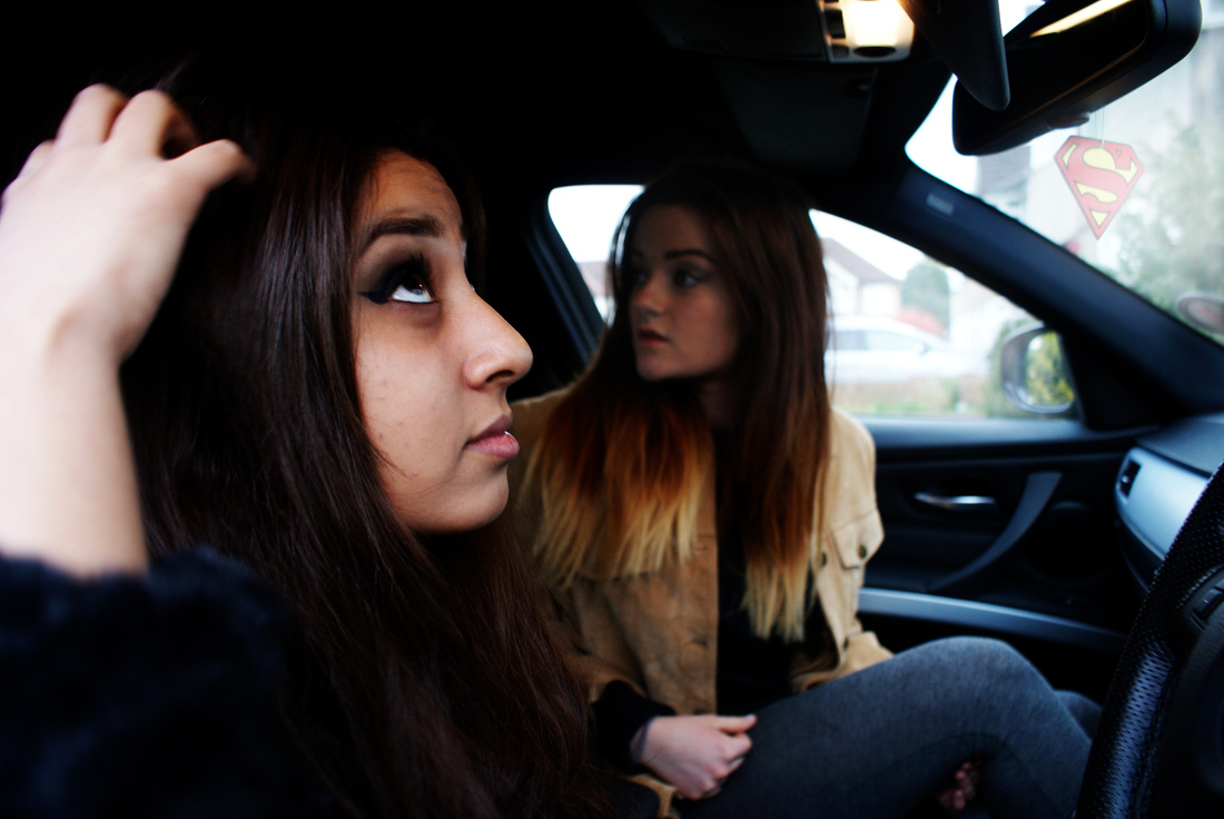
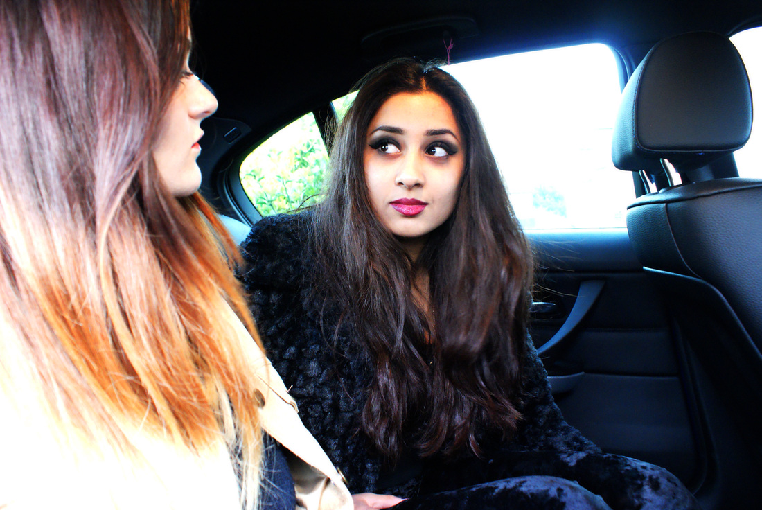
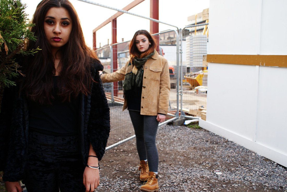
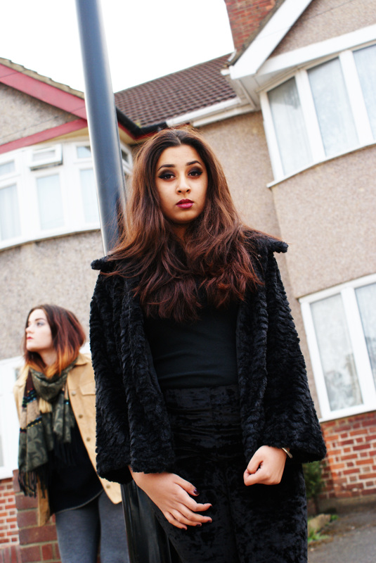
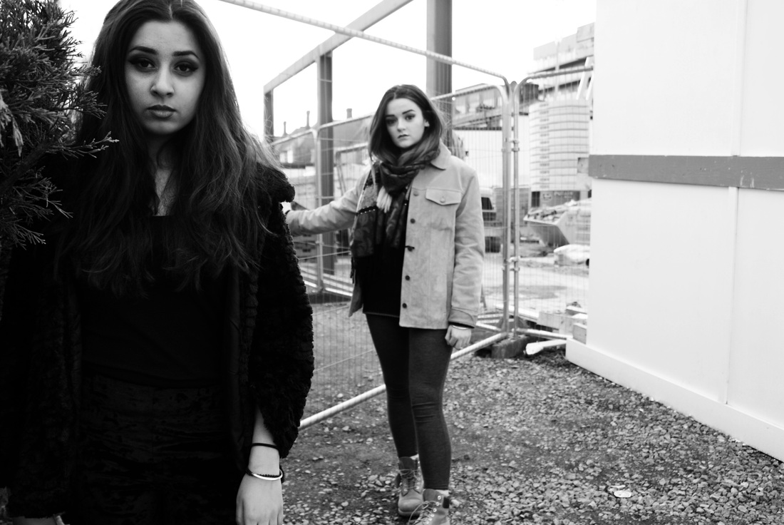
The outcome of these photos are very similar to what I want to produce later on when I experiment later on. Because of how I edited the photos (making another layer and using the soft tool to create more definition and colour) they came out very highly contrasted. Composition was key to me in all of these photographs and what I particularly liked was how the two models did separate things in each photo. When taking these I had in mind the image by Katia Selinger which is what inspired me to go outdoors and try new settings. The inside of a car was an idea I had because I think it is very different to the mirror photo taken inside the house and is more of an action shot as they get ready to go. I edited these images in black and white to experiment with Katia Selinger's style of work as I feel it made her images look much more high quality. I personally have always been drowned to black and white photography because I like the simplicity of it, therefor I liked the outcome of these images even though I did look at them in both black and white and colour. The model wearing all black was massively inspired by Katia Selinger's photoshoot again because I liked the simplicity of the outfit.
|
|
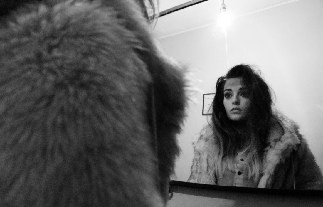
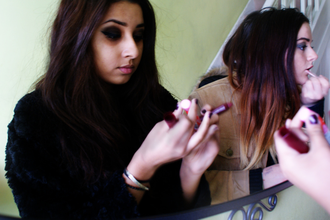
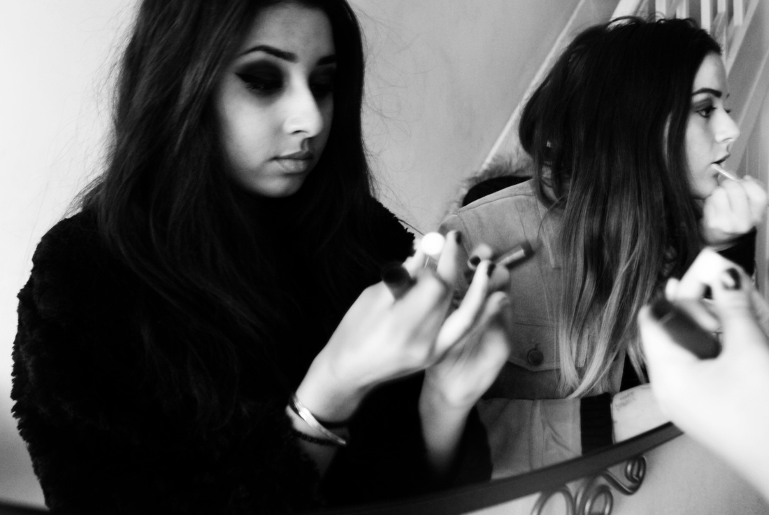
What I liked about these two images in particular are that they both feature the females getting ready together which I paired together because it is different to the others below where they are all posed and looking at the camera. These two photos look as if they were not known they were being photographed which differs them to the other ones. I found that I enjoyed the blur in the image on the right because it makes the photo seen even less posed which I did find was a positive thing.
|
|
I found that these black and white images created an interesting sense of atmosphere because when they are shown in colour they have a similarity to my previous photoshoots but when they are shown in black and white the style of the images change to something more serious. I think the getting ready element creates an easy atmosphere and I find that these images look more professional and seem more serious than those in colour. I also think the setting for these are more mature.
final
|
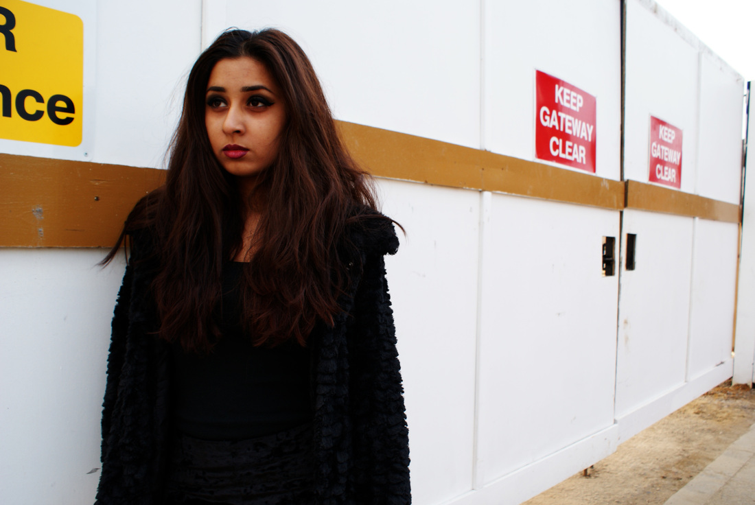
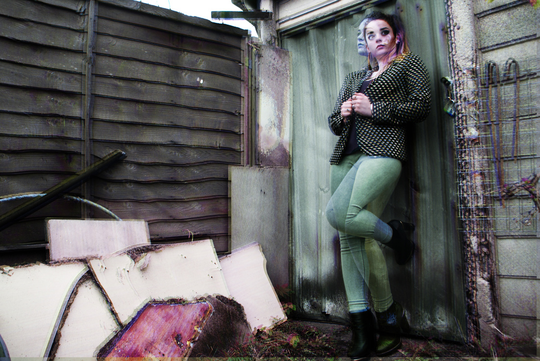
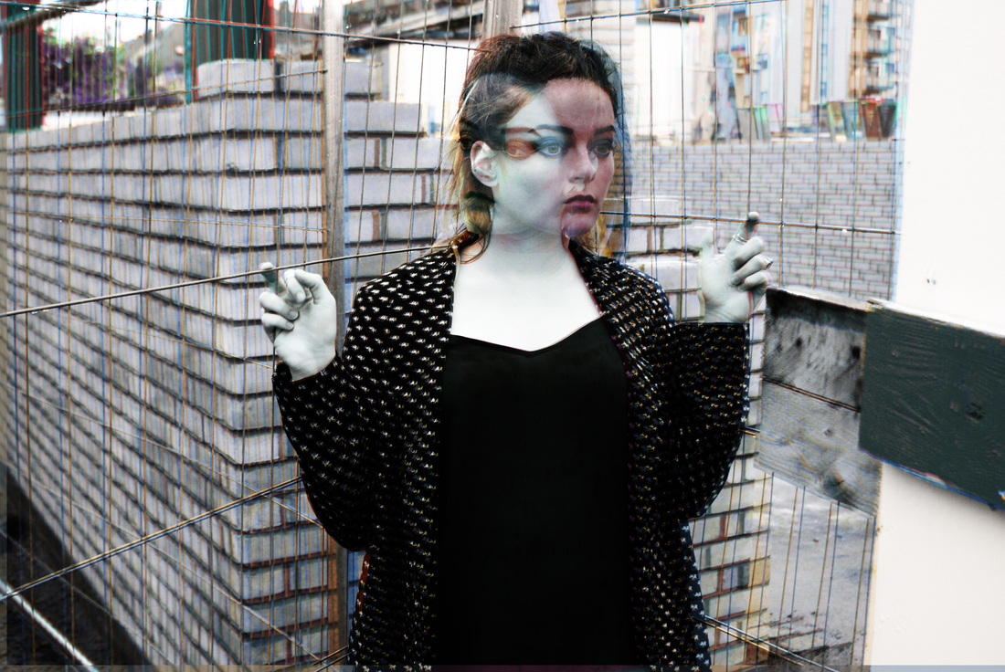
This time, I thought about the background in the images aswell as the models hair and makeup. I experimented with different backgrounds this time to show how the model works well with an interesting background which is what , I think, makes these photos because if the background was not real (a backdrop/greenscreen) them it would only focus on the models face and costume. This is, of course, what my photos are about however I would not want it to be the only thing in this image because I enjoy the rebellious look to the photoshoots. What I liked about this photoshoot was the use of natural light; the sun worked as a great light source and I moved around the model to get light from various angles.
|
I chose the outfit carefully because I wanted the model to look different from the last time. This time I worked with brighter colours because my intentions were to not edit the pictures too harshly. Therefor the bright outfit and patterns looked eye catching enough already. The bright pink colours work well against the backgrounds of mostly green blue and brown and I like that the model looks quite girly when the location of some of the photographs towards the end look very gritty because it is a nice contrast. The makeup is also quite soft and I used gold and green to bring out the models eyes . Then I enhanced them and made them more interesting by adding black because it makes it look more intense and catlike which brings it out on the camera.
|
processes
I decided when I took this shoot that I wanted to experiment with layering the images because I liked how plain and raw the images were compared to the previous soots I did. What I think seperates those from this newest shoot is that background. In the first two shoots the backgrounds here mostly indoors because I first started of capturing the women getting ready to go out because I was inspired by the images of women looking at their reflection . This made me want to experiment with more natural backgrounds but still keep the element of fashion. I especially think that this will create a sense of atmosphere because on their own the images are still strong and show a female standing out in her environment however with the extra and enhanced colour I think it shows how she is so vibrant it makes her surroundings appear to lack life. I also think that I got inspired by steven meisel to keep the expression and attitude of the model quite moody as I did not want the shoot to come across to 'pretty' and 'girly' as I like the edgy element.
The process i used in all of my final pieces (captions appear when you click on the images)
final photos
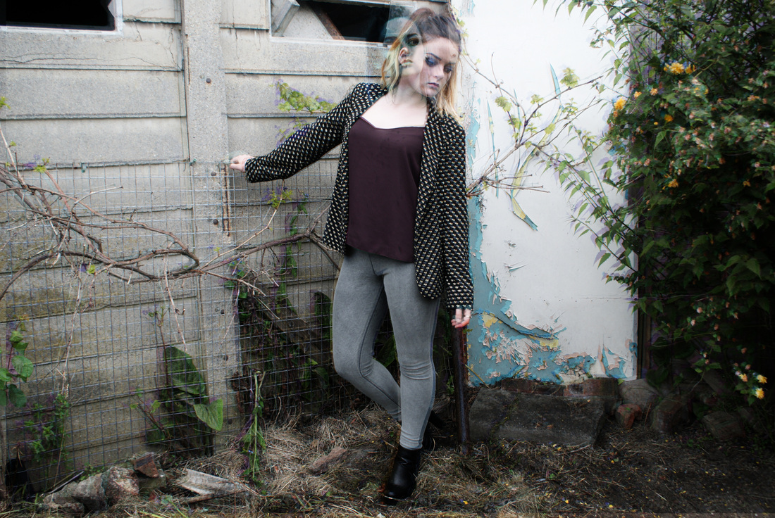
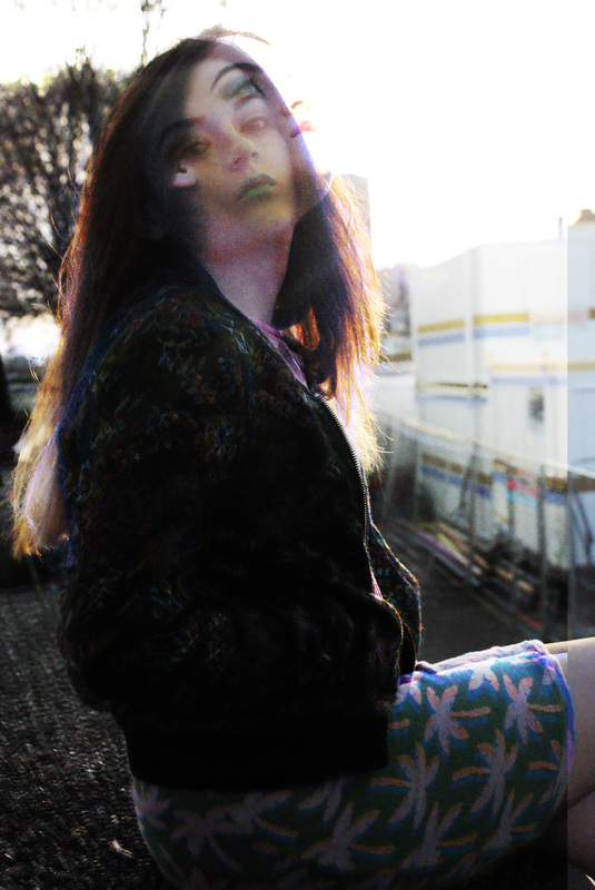
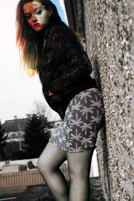

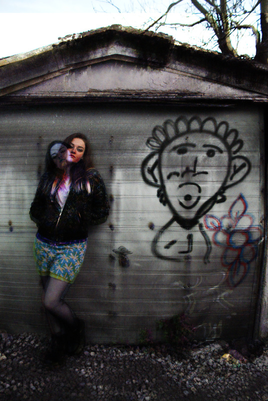

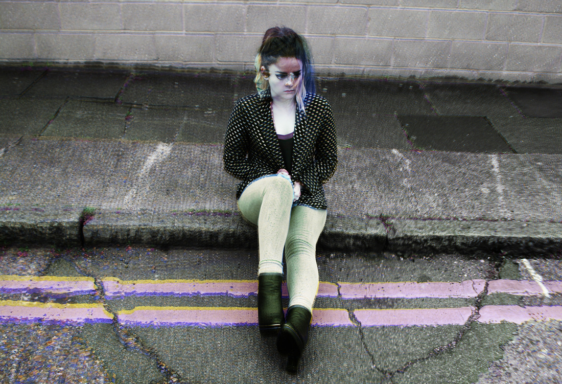
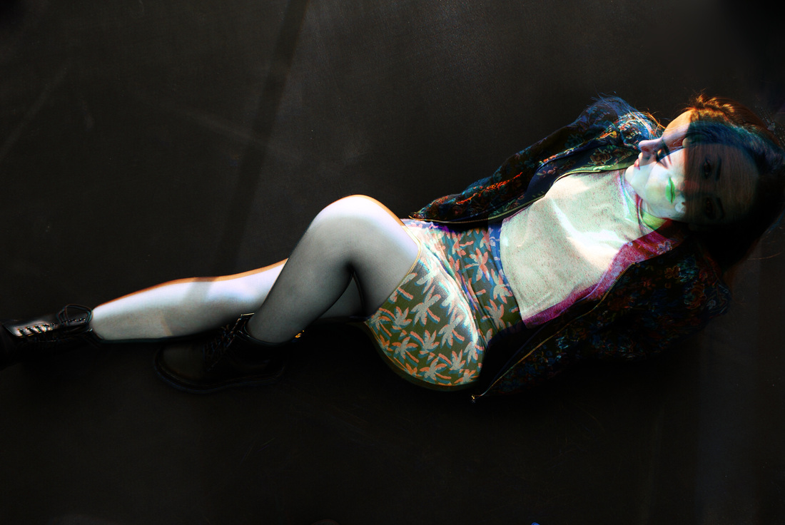


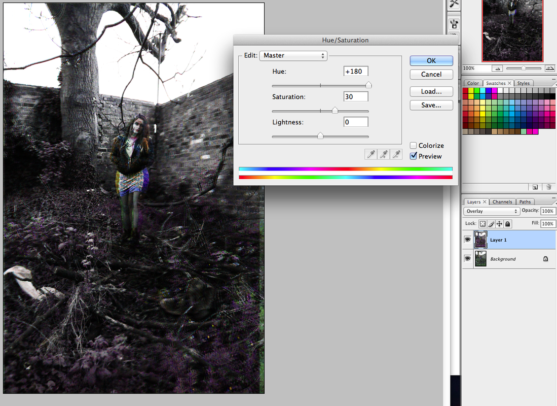
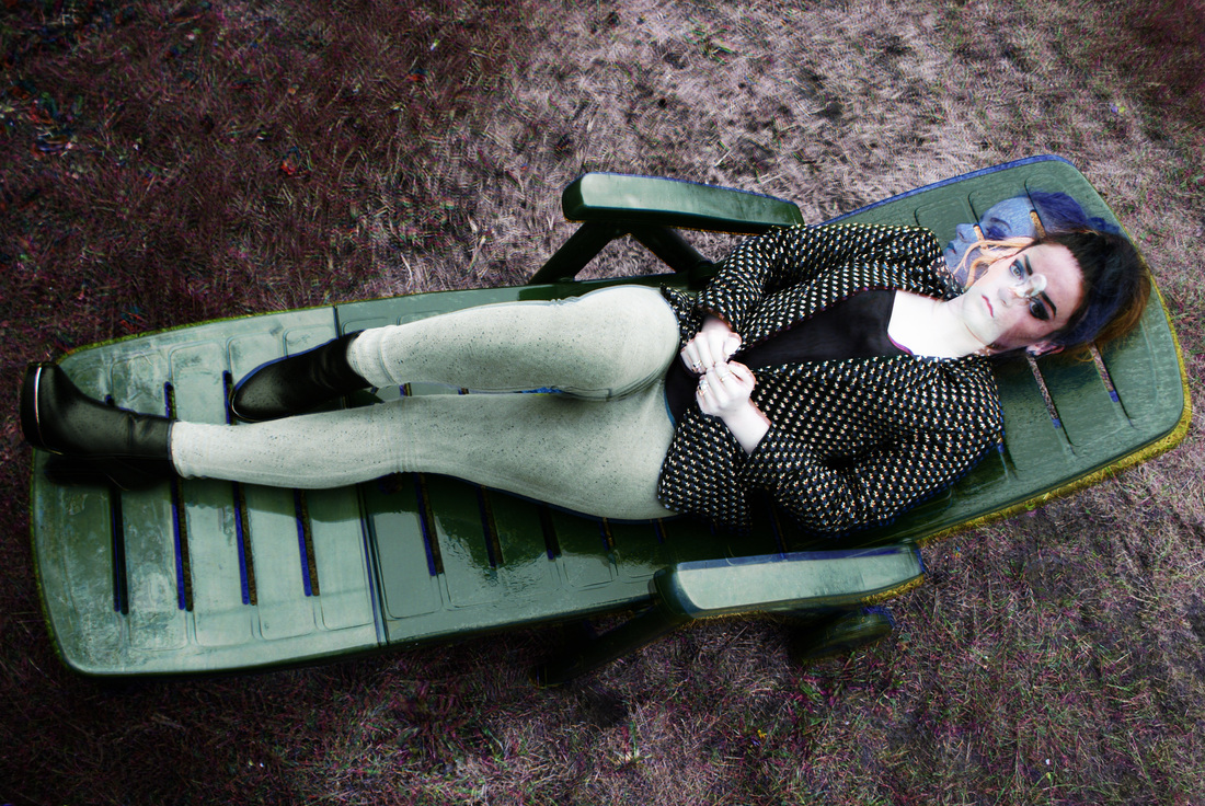
This image was my favourite from this photo shoot that I did because I like the lying down position of the model because I think it makes it stand out a lot from all the others as they are all in upright positions. I think that it could have been improved by the positioning of the hands also I think they make the photo look a bit interesting as they look quite symmetrical which draws the eyes towards the centre of the image. I also like the anger on the models face because I think that it makes the atmosphere more aggressive. It was raining during this photo shoot which was my intention however I wanted it to be a lot heavier. The raindrops on the hair create a nice texture to the image which I think contrast well wit the grass. I also like how the colours turn out after I played around with the saturation as I like the purples against the greens.
|

I took two main photoshoots for this piece and I wanted to narrow them down to my favourite most appropriate photos. I found that I preferred all the photographs from one shoot much more than the other. I think that it was because of the colour scheme. When I did the first shoot it was raining with effected the photo shoot because there was less light to work with which is also what made the other shoot more appealing to me. I like both of them and my original idea was to use images from both shoots in my final piece but I found that they did not go well together.
|
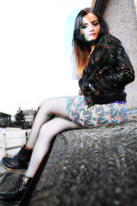
final pieces

|
|
|
|
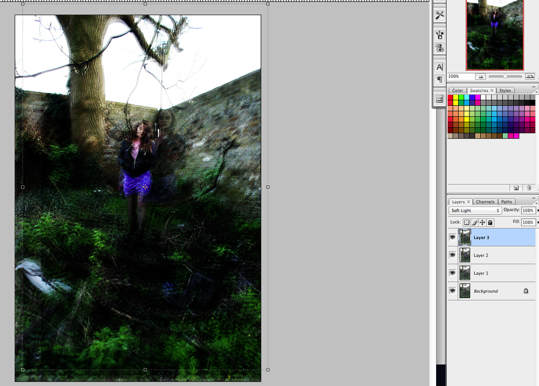
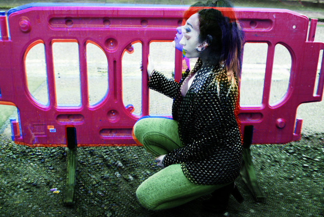
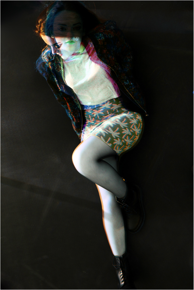
During the editing process, I tried to think of a way to combine the experimentation of artist replication I did without it looking too dramatic. This is because I personally prefer the simplicity of black and white images but the coloured photographs looked much more interesting. Also, all of my images from artist replication were very extreme and high in contrast so this was something I tried to stay away from. I combined images that I picked specifically. I tried to pick a focus in each individual image and line two layers together (mostly I tried to align the pattern on the skirt) and then the rest of the photo (usually the upper body) would be doing something different. I made sure that the photos were similar so that the layers overlapped in a way that shows two different faces. This is because I feel like throughout these photos I wanted to embody a character without dressing the model up in a 'costume'. But because of the bright colours of the costume and the makeup I wanted the models attitude to be like different and not 'girly' which I think creates a strong sense of atmosphere as the setting is contrasting with her feminine attire but working well with the expression on her face as she is calm and relaxed in many of the photos whilst remaining edgy and showing an undesisiveness. The reason I overlaid two images was because on their own they still looked effective but I think that the sense of atmosphere was truly created when the two different facial expressions and body languages were put onto of each other. This is because with the low hue (whack drained the colour almost making it appear black & white) created a very dull blueish grey tone over the images which I personally think has connotations of sadness and usually drains the life out of images; but because there are two layers onto of each other, the edges of the images (and other parts where the photos do not line up) have a slight burst of colour. The main focus of the face is where I wanted the atmosphere to be created. I chose images with different facial expressions to overlap to show different emotions in the model and make it feel as if many things are going on at once in her head. I think it was a more exciting way to work in colour and the brightness and pattern of the outfit is still shown in the images but just less dramatically. The two different expressions create a sense of unease and shows that the setting doesn't change but only the mood of the character.
