Glitch Art.
|
This is very similar to my Picasso inspired work because of how broken up the image are. Glitch Art is when data makes an error and then turns into a mistake that looks good. I thought I would experiment with it because it shows how distortion can be done through sharp lines which shows a different type of texture. I like how the chunks of ruined and missing images create new layers and elements to the pictures. Multiple features is something I would like to explore to see if it creates a successful distorted effect.
|

Scans.
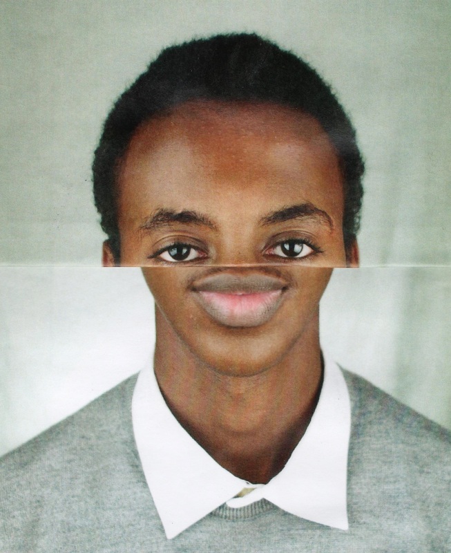
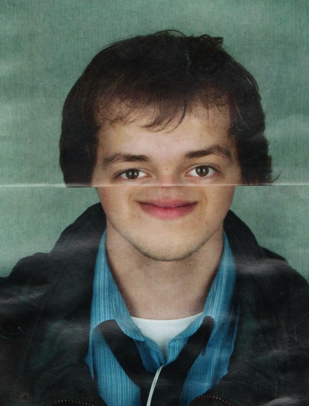
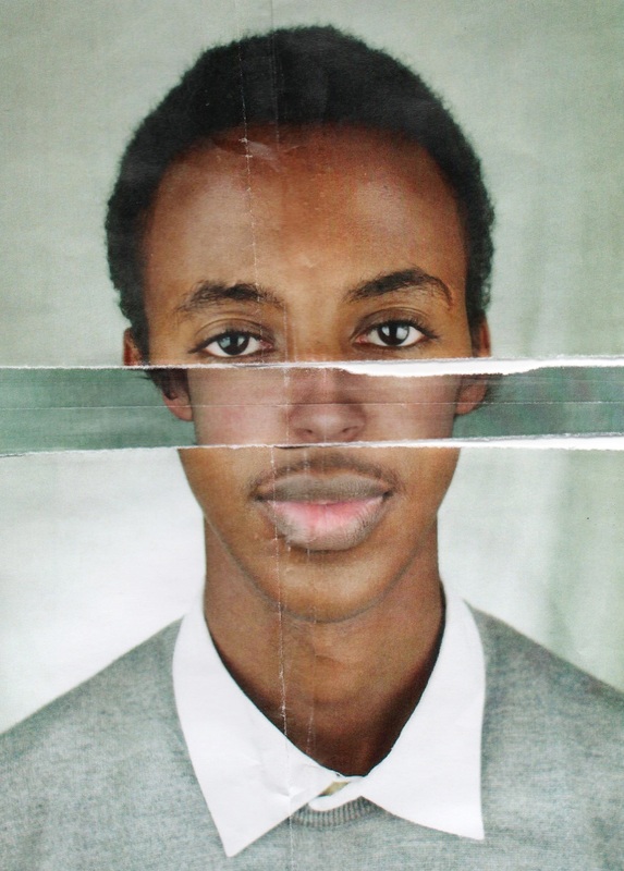
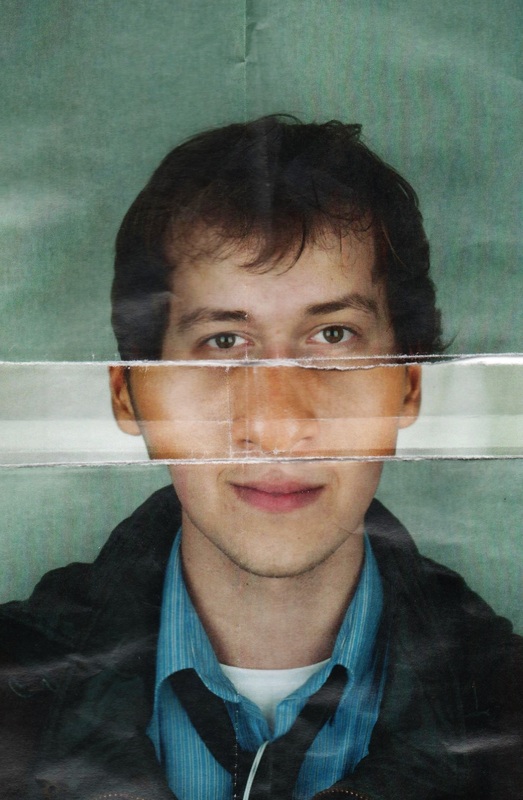
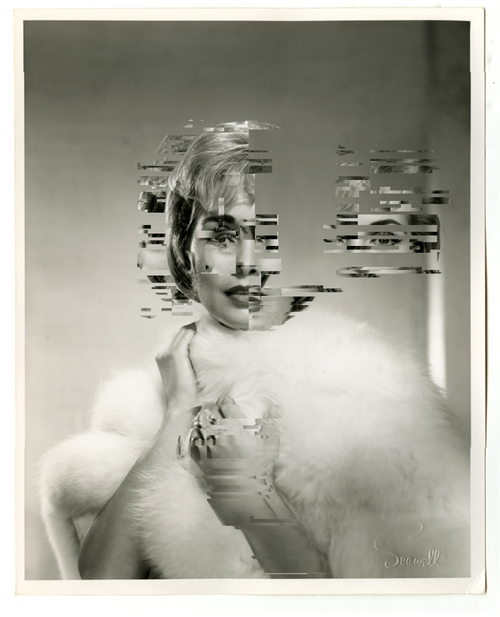
Here I scanned in from printed out photographs, ripped them up into mainly 3 stiles (separating the eyes, the nose and the mouth). In the first two photos I have taken the mouth out to create a comical image where the two models don't have noses and it almost embodies a cartoon-like creature. In the second two images I swapped the noses around which again crated a comical effect.
Distortion through Glitch Art.
|
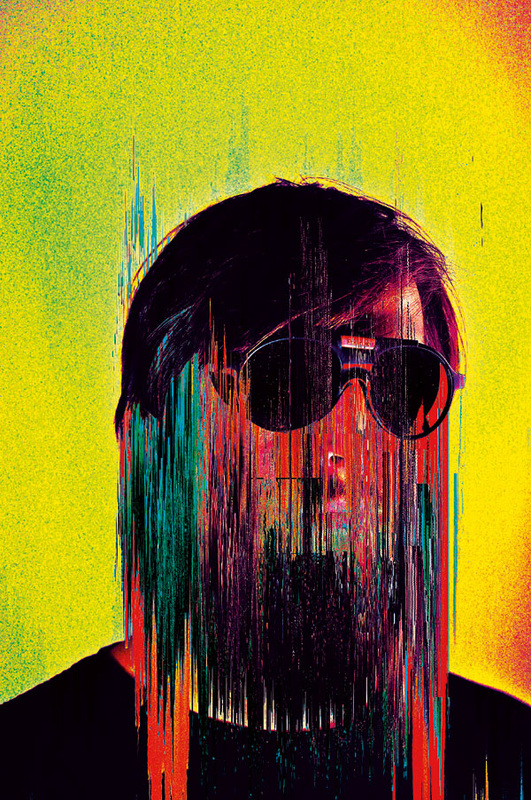
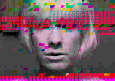
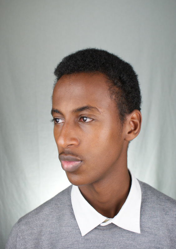
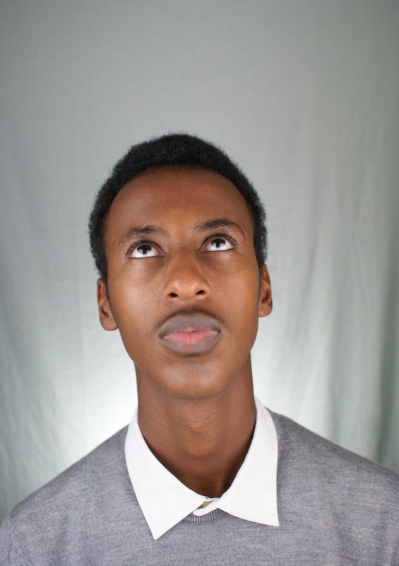
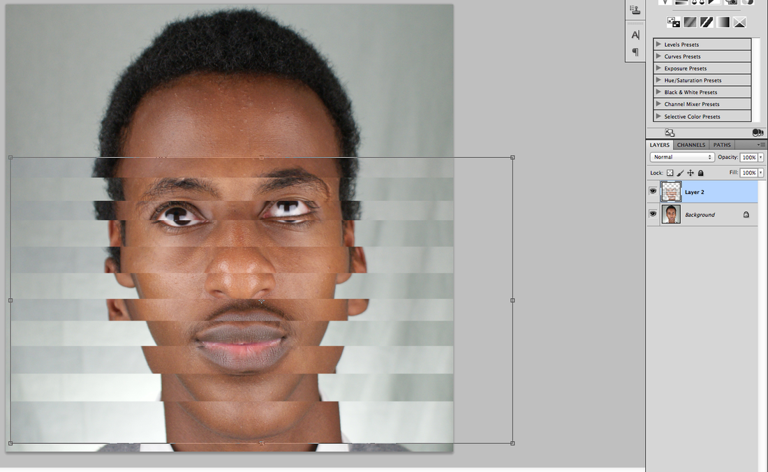
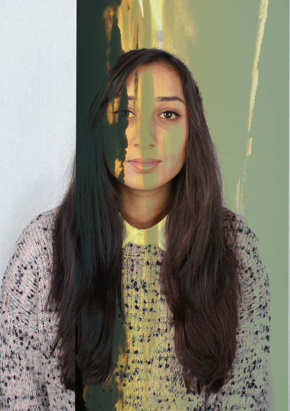
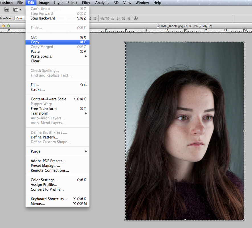
I thought I would continue using the Picasso inspired images for the glitch art because they required similar effects however with glitch art i wanted the images to look less put together as a glitch would insinuate that its a malfunction. These images are the only images that I used to layer. I used two lights on either side of the models face to light it really well because I didnt want any shadows on the face incase it created unecessary lines. I also made sure I used images of the model looking in various different angles.
|
|
|
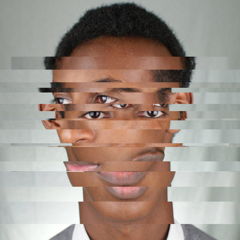
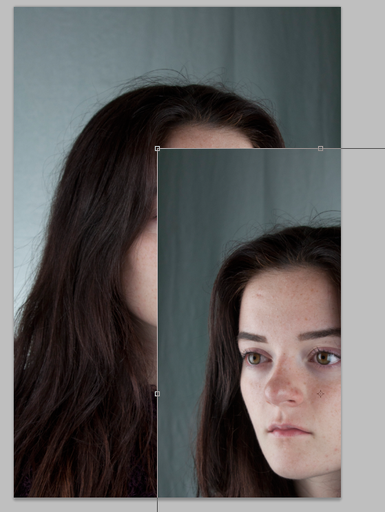
I thought this image was effective because of the shape of the face and how it's still noticeable because of the alining, however, I think the amount of eyes makes the photo lose itself because there is no focal point in the image. I think to improve this image it would look better with less layers. All the layers in this image are horizontal. Another thing that make these photos seem less focused is how the lighting is hitting certain parts of the models face and then because of the different angles that the face is in, there are loads of different highlighted parts. This also takes away the realness of the image but does add onto the distorted effect.
|
|
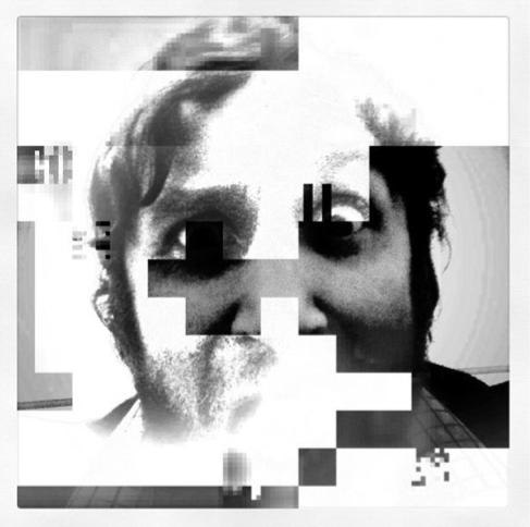
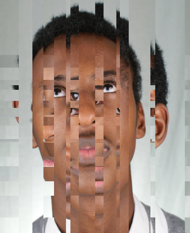
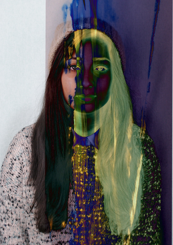
To edit it further, I added vertical portions of the face as well. I think this looked more like glitch art but even less concentrated. The shape of the face has been lost a bit in the image. I think what made this look more like glitch art was the different directions of the eyes because its usual for them to be looking both left and upwards compared to the previous photo of just left and right.
|

|
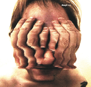
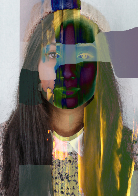
This is the image that I decided to make blurry because I wanted to see if the melted effect would make distortion look more complete. I think it shows how the straightness of the lines can make the image look neater and how in this image, the curves created by the blurs make it look more comical and less serious. I do like how the image blurs into the other parts of the image too.
|
Process (captions appear when you click on the images)
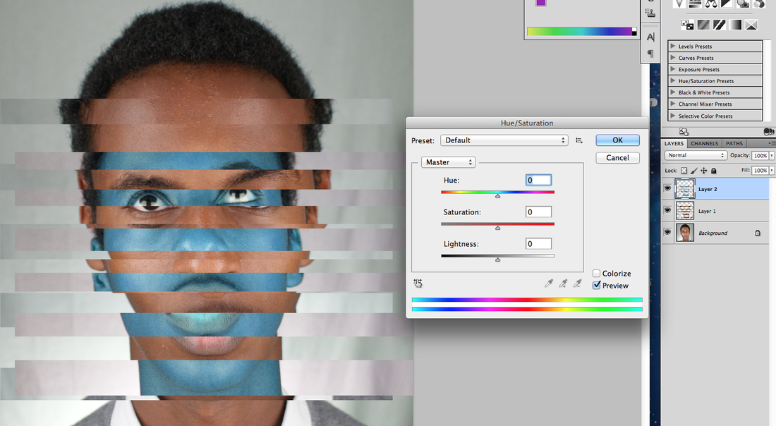
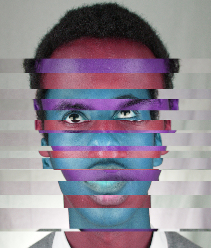
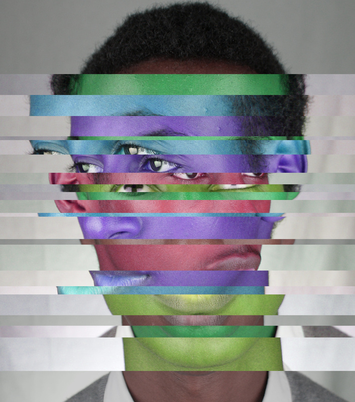
The idea behind the glitch art was untimely to also explore with working in different colours and paring those together. I think they look nicer in colour as they are much more eye-catching and just overall more interesting to look at. It makes the images more fun.
|
|
I took this photoshoot in hopes that I would have some simple images that i could work with. I think the colours that the model is wearing needed to be quite nurtral because it makes the overall image slook more put together and serene. I think that the texture of the jumper is good because it adds more to work with as these images will be used for glitch art.
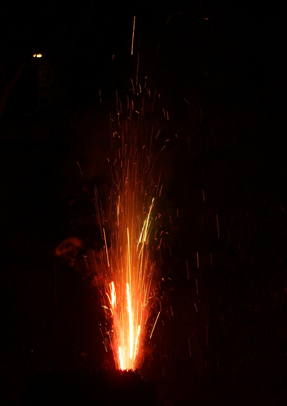
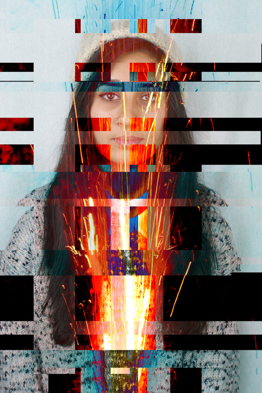
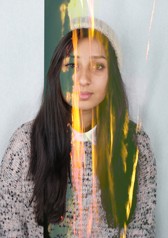
Fireworks.
|
To continue the glitch work, I wanted to continue using colour but without simply changing the hue. Then I got the idea to combine fireworks with the faces because it could create a new texture.
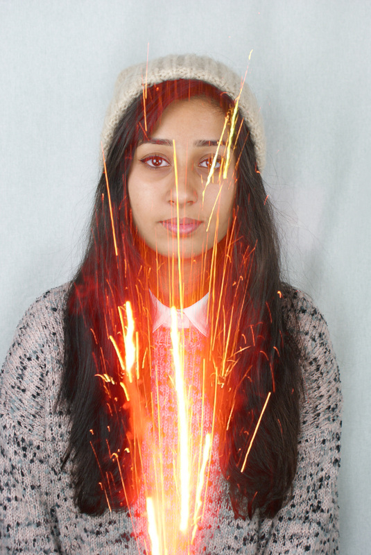
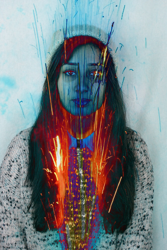
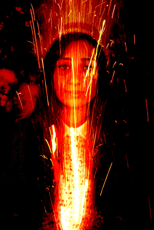
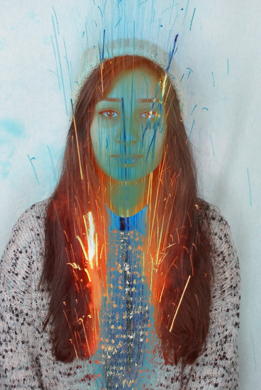
I decided to use fireworks because they show a bright pop of colour which i thought would look good on someone face because it could represent how I want the images to pop out and look unusual. I think it helped create good glitch art because of the small sparks that fly out of the place and acheive the 'malfunction' look.
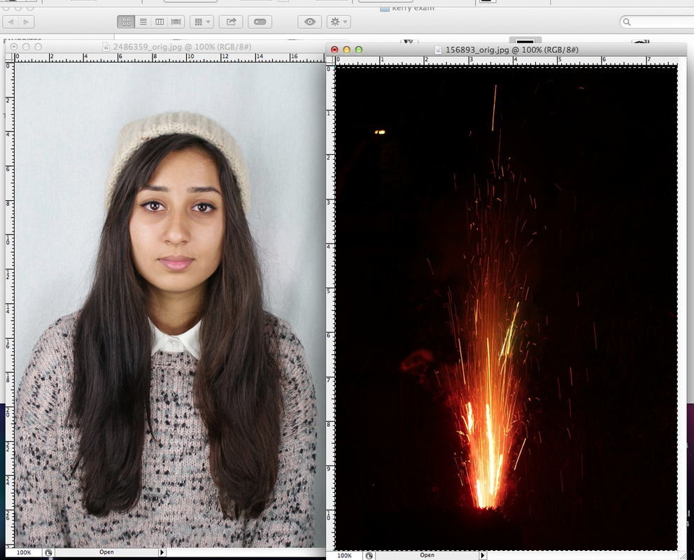
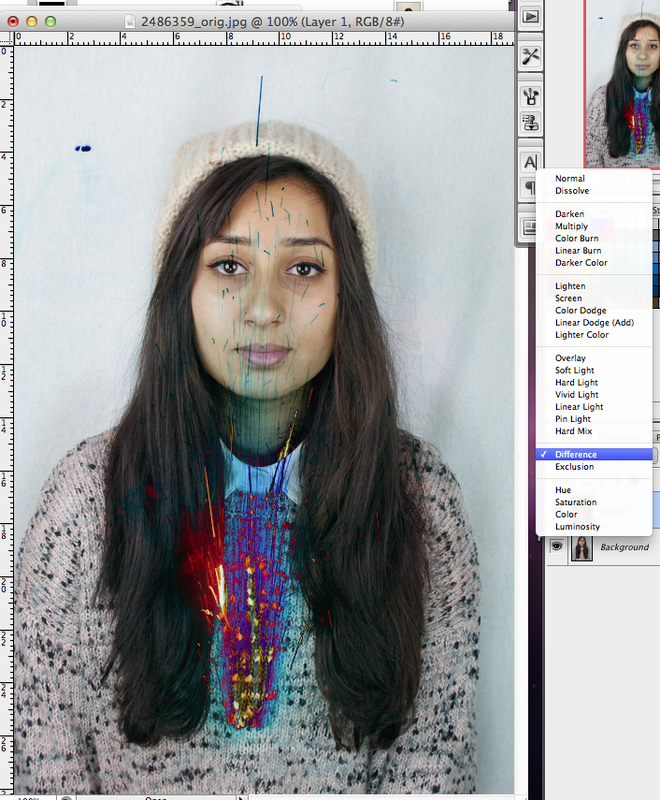
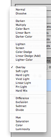
This is the outcome of the combination of the firework image and the models face. I used various different photoshop combinations such as 'difference' and 'pin light' to make sure that the firework came out different colours.
I was happy with the outcome of these images because I think they look more interesting this way than they did when there was no colour. It seperates the layers of the picture and almost creates more obvious dimentions that wasnt there before the colour was added .
|
|
process (captions appear when you Click on the images)
|
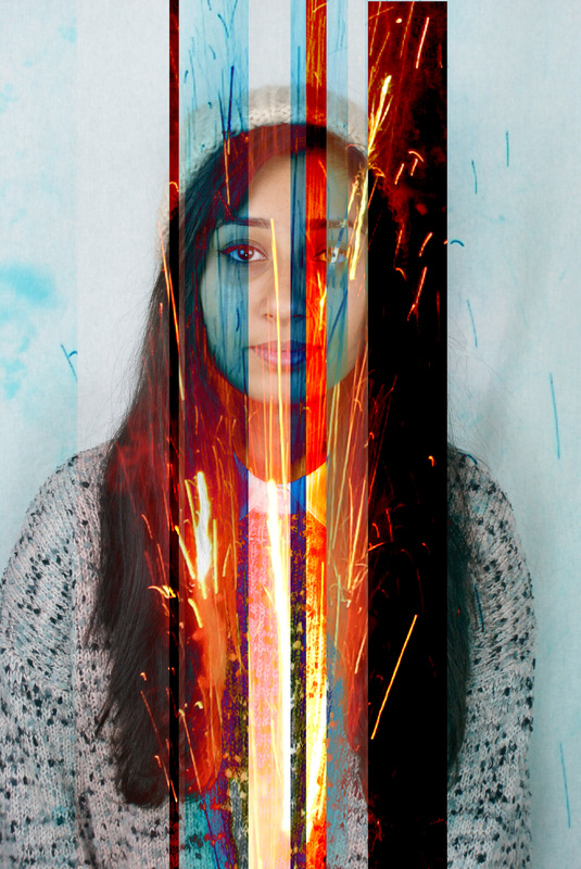
When I was making these images I copied and pasted all the different coloured images and layered them on top of eachother. I liked the effect it created and I think it was successfully replicating glitch art.
|
Compared to the other image, which is only verticle lines, I decided to do one with horizontal lines also. I think the square cut outs look the most effective and the brightness of the image is really eye popping.
|
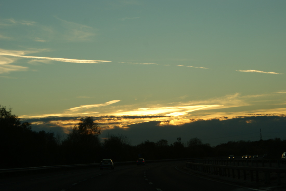
Sky.
|
I used an image of the sky because it represents freedom and and I wanted the next bunch of images to look less neat and structured than the previous ones. I rotated then overlayed this image of he sky and used the same effects to get different colours out of it. I like how the clouds created glares in the images looking like torn photographs.
|
|
|
When I was editing this imageI selected specific bits of the image to cope and paste onto the main one. This is because I wanted the lines to be soft and not straight so that it looked more like ripped photographs. I like how almost each feature has a different effect covering it. I think this shows a distortion in terms of the fave and body because it was been turned into something new.
|
Negative experimentation.
These next few images turned out to be really effective because of the symmetry, By using the images in their original colours and then using the different tool, the images created some new interesting colours when they were made to be negative on-top of the other. For the majority of these images I flipped an original photo and thats what I made negative, then i moved the photo until it was in line with the other side until I found effective and then cropped the image so that the composure of it was easy on the eye and most the the models were remaining int he centre of the shot. The lighting was soft because I didn't want too much shadow to be created otherwise the images would be over-crowded with lines and shapes.

Layering Disortion.
Alma Haser
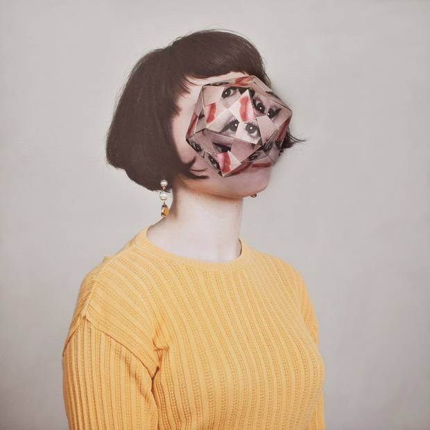
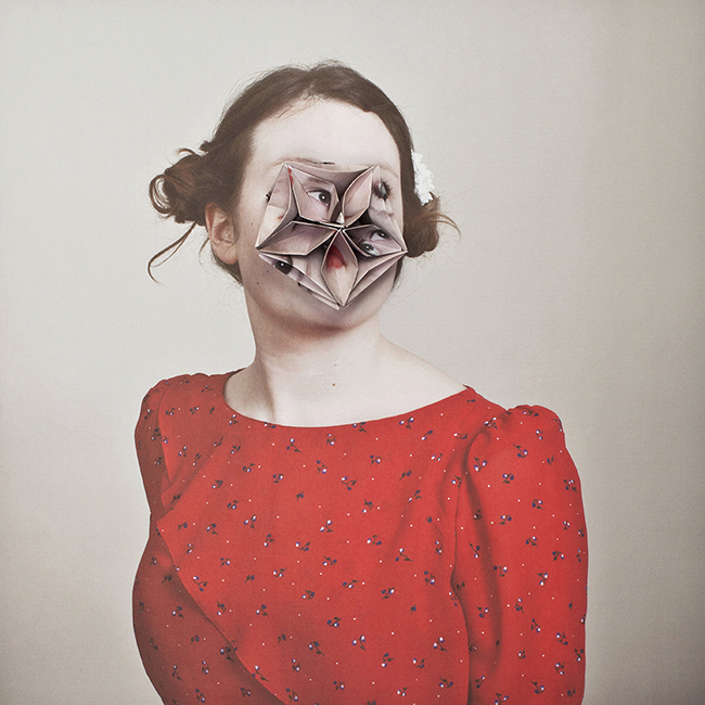
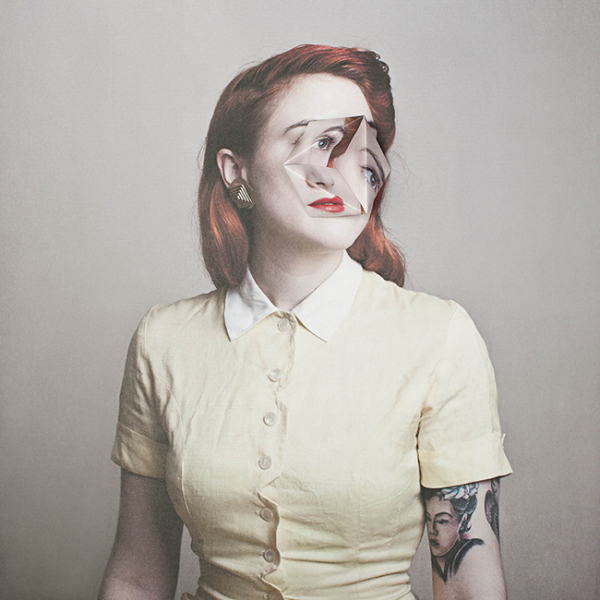
Cosmetic Surgery
Alma Haser graduated with a degree in photography at Nottingham university. Her inspiration comes from her family as they are all arty and she also travels a lot. She experiments with portraiture and created a strong body of work which got her recognition. She always makes things with her hands and therefor tried to combine her art background with photography. To achieve this look she printed multiple images of the model and then made a complicated origami shape. Then she placed it back onto the face and re-photographed everything. There is something alien about the new faces which is what drew my attention to her work.
Alma Haser graduated with a degree in photography at Nottingham university. Her inspiration comes from her family as they are all arty and she also travels a lot. She experiments with portraiture and created a strong body of work which got her recognition. She always makes things with her hands and therefor tried to combine her art background with photography. To achieve this look she printed multiple images of the model and then made a complicated origami shape. Then she placed it back onto the face and re-photographed everything. There is something alien about the new faces which is what drew my attention to her work.
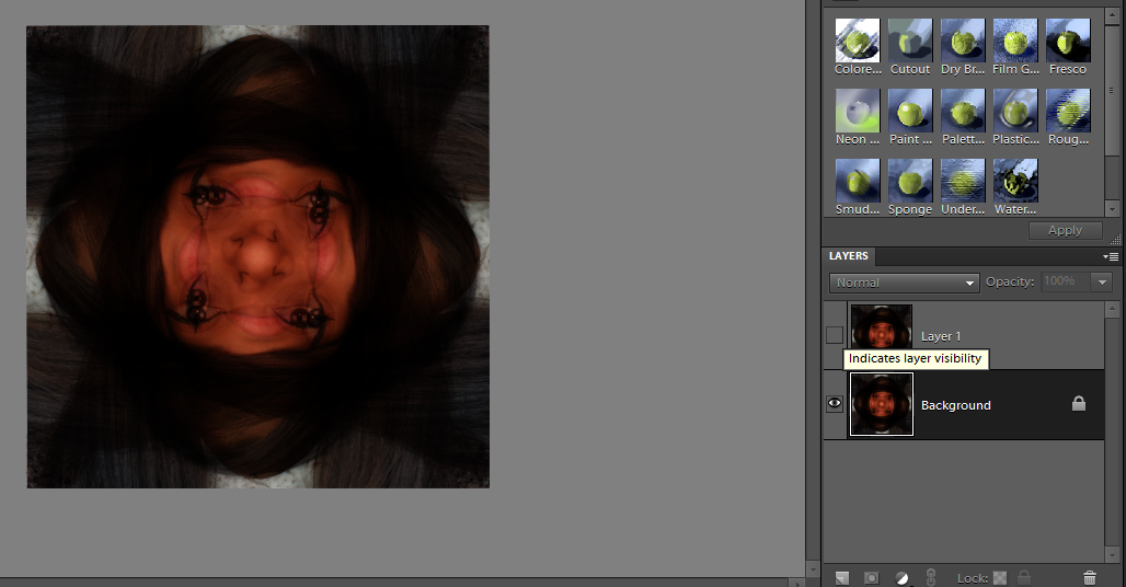
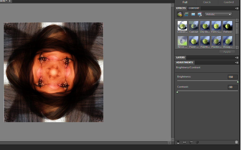
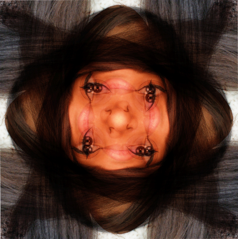
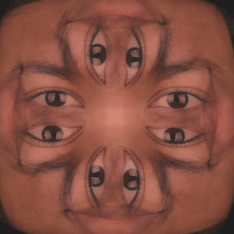
Distortion through Kaleidoscope.
process (captions appear when you click on the images)

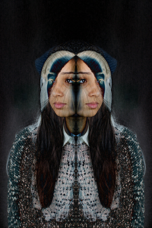
I liked the outcome of these images because I think it does show distortion of the face. I think it shows how good the image when you zoom in because the zoomed in photos till looks interesting. I think the colour of the image was off because of all the overlaying of the face but the features overlapping created an interesting effect.
|
process (captions appear when you click on the images) 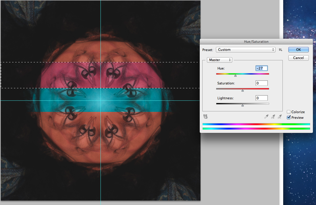 |
|
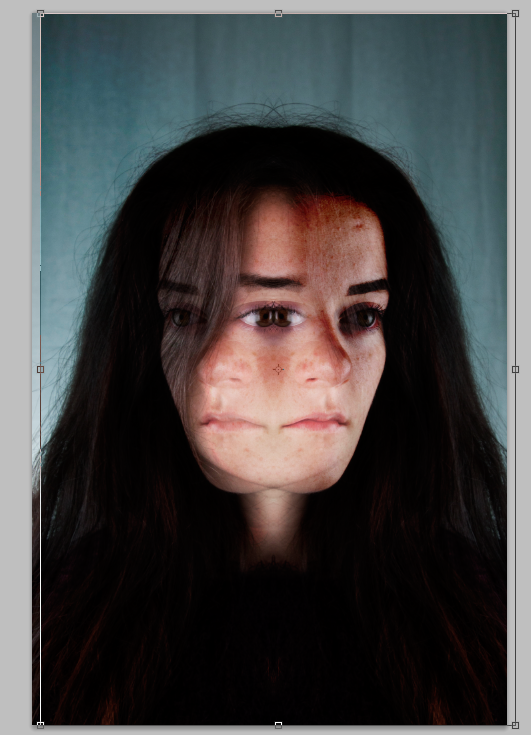
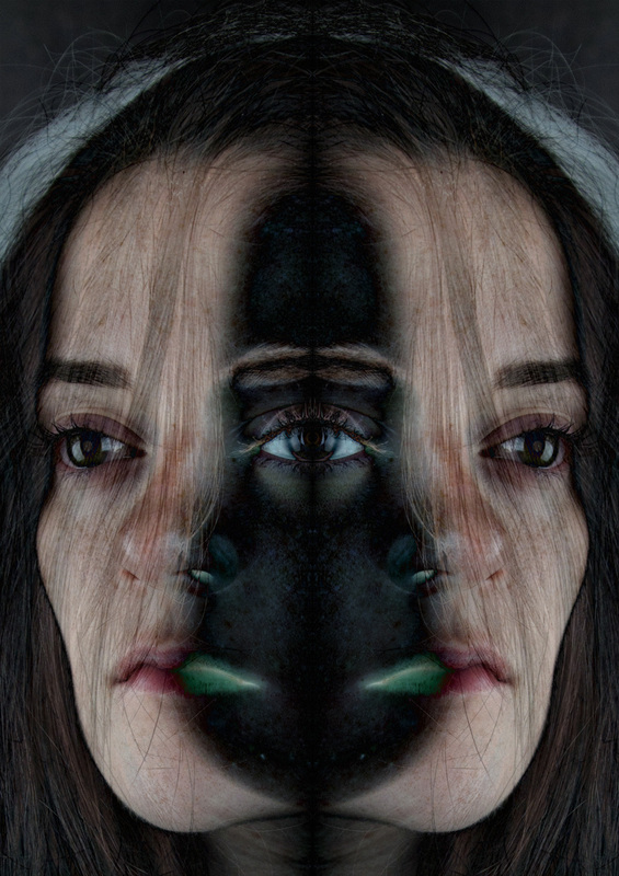
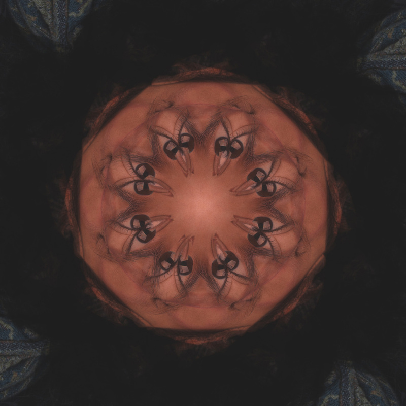
I like the eyes in this image because of the strange effects it creates and how it engages you even though the multiple eyes means there more choice of where to look. When I was editing this photo I wanted it to be different from the other types of kaleidoscope images I had done because they were all very vibrant and colourful. But in this image, I wanted to keep it skin coloured so that the main focus was on how all the features have been manipulated.
|
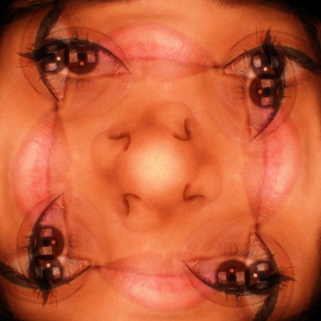
The close up was because of the way that all the features have moved positions and therefore they now touch but in different ways than they would have originally. I like that the lips are now in line with the eyes and eyebrows and the eyebrow hairs actually cross over the lips to create a whole new face.
|
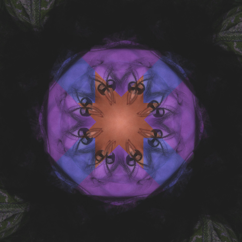
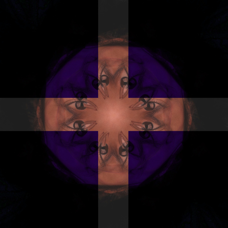
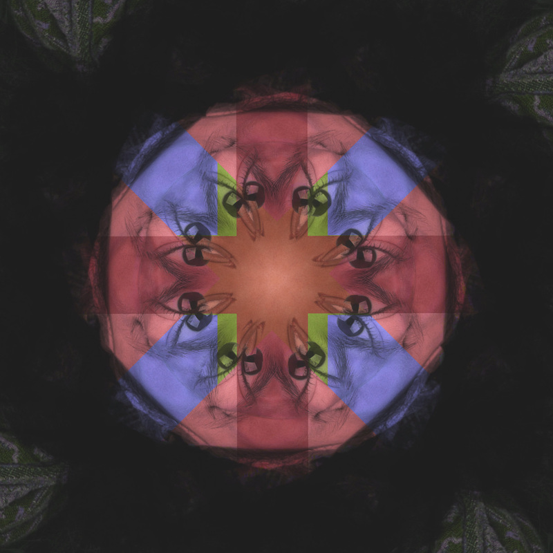
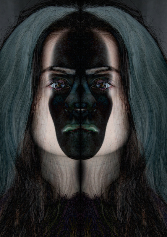
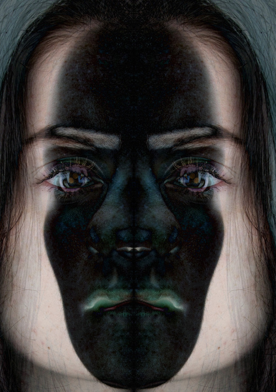
These are some of the effects after I changed the saturation and hue of the images. I also changed the cut out selections that I made and then I rotated a copy of the images to make more eyes and more layers to be manipulated. I like the dark colors although I think it suits the brigher version too. The centre of the picture has been kept the original colour and I think it draws a lot of colour. I think that the choice of colour could change the mood.
